Introduction
In our last lesson, you made a crucial strategic decision by selecting a navigation structure, defining the high-level pathways users will take through your gifting boutique's website. We've established the architectural blueprint (sitemap) and the main travel routes (navigation model). Now, it's time to start designing the destinations themselves: the individual pages.
This lesson marks our transition from abstract structure to tangible layout. We'll focus on the foundational practice of low-fidelity wireframing, specifically through rapid paper sketching. This is the fastest, most cost-effective way to explore different layout ideas before committing to a digital design. For a freelancer, the ability to quickly generate and discuss multiple concepts on paper is an invaluable skill for clarifying a client's vision early on. You'll learn the visual shorthand for common UI elements and a powerful technique called "Crazy Eights" to generate a wealth of ideas in minutes.
The goal isn't to create a work of art—it's to get ideas out of your head and onto paper as quickly as possible.
Why Sketch First? The Power of Speed and Simplicity
Before we dive into software, we start with pen and paper. Why? Because it’s fast, cheap, and forces you to focus on the most important things: structure, hierarchy, and flow. It removes the distraction of colors, fonts, and pixel-perfect alignment, allowing you to focus purely on the core idea.
The goal is to explore many possibilities, knowing that most will be discarded. This process of rapid, low-stakes exploration is fundamental to effective design.

For someone with your background in structured analysis, you can think of this as the "back-of-the-envelope calculation" for design—a quick way to test the viability of an idea before investing significant resources.
The Visual Language of Sketching
One of the biggest hurdles for people new to sketching is the fear that they "can't draw." The good news is, you don't need to. UX sketching relies on a simple, standardized set of conventions to represent common UI elements. Learning this "visual alphabet" is all you need to communicate your ideas clearly.
The Nielsen Norman Group provides an excellent, structured guide to these conventions.
How to Draw a Wireframe (Even if You Can't Draw)
This article breaks down wireframe sketching into a simple, step-by-step process. It reinforces that sketching is a technical skill based on conventions, not artistic talent.
Read the article from the beginning through the end of "Step 4: Fill in the remaining details." Pay close attention to the visual examples for each UI component (images, text, buttons, inputs, etc.). These are the building blocks you will use.
To see these conventions in action, let's watch a video that walks through sketching a comprehensive set of UI elements. This will help solidify what you've just read.
UX SKETCHING techniques 101 | How to sketch & use wireframing in User Experience UX Design
This video by Niki Tisza provides a fantastic visual glossary of how to sketch everything from basic page layouts to complex components like modals and sliders.
Watch the video from the beginning up to the end. Notice how simple shapes—rectangles, lines, and crosses—are combined to represent sophisticated interface elements. You don't need to memorize every single one, but aim to get comfortable with the most common ones: Viewports & Navigation Content & Buttons Form Elements Misc. Components
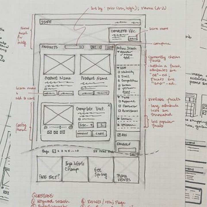
When you combine these simple elements, you can create a detailed and communicative sketch, like the annotated wireframe for an e-commerce page shown below.
A Method for Rapid Ideation: Crazy Eights
Knowing how to sketch is one thing; knowing what to sketch is another. To avoid getting stuck on a single idea, designers use structured brainstorming exercises. One of the most effective is Crazy Eights.
The premise is simple: sketch 8 distinct ideas in 8 minutes. The tight time constraint forces you to move past your first "obvious" solution and explore more creative alternatives. It prioritizes quantity over quality, generating a wide range of starting points for your design.
Let's watch a short video that explains how to run a Crazy Eights session.
How to generate more UX design ideas with Crazy Eights
Femke van Schoonhoven, a designer at Uber, gives a clear and practical demonstration of the Crazy Eights exercise in this video.
Watch the video from the beginning to the demonstration's end. Focus on the core mechanics of the exercise: The purpose: Why it's about quantity, not quality. The materials: Why a thick marker is better than a fine pen. The process: How to fold the paper, set the timer, and get sketching.
For a quick reference, the article below summarizes the steps and common mistakes to avoid.
What Is the Crazy 8s Method in UX? | by Designer Lifestyle - Medium
This article provides a concise, step-by-step summary of the Crazy Eights method.
Quickly read the sections "How Crazy 8s Works (Step-by-Step)" and "Common Mistakes." This will serve as a handy checklist for the exercise.
Your Turn: Sketch Eight Ideas for a Product Page
Now it's time to put theory into practice. We'll use the Crazy Eights method to generate layout ideas for a key page in your bespoke gifting boutique project.
Task (approx. 15 minutes):
- Define the Problem: Your goal is to explore layouts for a Product Detail Page. Let's imagine it's for your "Custom Wedding Hoops." The page needs to show the product, describe it, allow for customization, and have a clear call-to-action to purchase.
- Prepare Your Tools: Grab a single sheet of A4 paper and a thickish pen or marker (like a Sharpie). Fold the paper in half three times to create eight rectangular sections.
- Set a Timer: Set a timer for 8 minutes.
- Sketch!
- Start sketching one distinct layout idea in each of the eight boxes.
- Use the visual shorthand you learned (e.g., a box with an 'X' for an image, lines for text, a rectangle for a button).
- Don't erase or judge! If you get stuck, make a small change—move the image to the right, make the button bigger, stack the description differently—and move on.
- Explore different arrangements for the key elements: Product Image Gallery, Product Title, Price, Customization Options (e.g., text, colors), Description, and "Add to Cart" button.
Once your 8 minutes are up, review your sketches. You've just generated a week's worth of ideas in less than ten minutes.
Conclusion
In this lesson, you've acquired a fundamental skill for any designer: turning abstract requirements into concrete layout ideas through rapid sketching. You've learned that effective wireframing is not about artistic talent but about using a clear visual language to communicate structure and hierarchy.
Key Takeaways:
- Low-fidelity sketching is a fast, low-cost method to explore many design ideas and focus on core structure.
- A standardized set of conventions (the "visual alphabet") allows anyone to create clear and communicative wireframe sketches.
- The Crazy Eights technique is a powerful, time-boxed exercise for pushing past obvious solutions and generating a wide range of layout alternatives.
Preview of the Next Lesson:
You now have a collection of promising ideas on paper. But how do we bring them into the digital world and add more detail? In the next lesson, you will learn to build mid-fidelity wireframes in Figma. We'll take one of your strongest sketches and translate it into a more structured digital format, using placeholder content and basic components to create the foundation for our final design.