Introduction
In our last lesson, you mastered the art of annotating wireframes, adding a crucial layer of communication to explain the how and why behind your design decisions. You learned to make your designs unambiguous for stakeholders, a skill that leverages your meticulous background in finance and audit.
Today, we will combine that skill with the principles of UX psychology you've learned. We're moving from a single page to designing a complete user journey. Your goal is to wireframe a low-friction sign-up or checkout flow, annotating where cognitive principles are applied. For any business, but especially for an e-commerce venture like your bespoke gifting service, the checkout is where a visitor's interest turns into revenue. A clunky, confusing flow directly translates to lost sales. By designing a low-friction experience, you make it easy for customers to complete their purchase, which is a powerful, marketable skill for any freelance designer.
Part 1: Anatomy of a Low-Friction Flow
Before we can design a flow, we need to understand its components. A user flow is a sequence of steps a user takes to accomplish a task. For a "low-friction" flow, our goal is to make this sequence as smooth, simple, and effortless as possible.
Let's start by seeing how to map out the basic steps of a sign-up flow.
UX Design Method - Task Flow Tutorial
This video from the "Wired to Design" channel provides a clear, practical demonstration of how to think through and diagram the essential steps of a task flow.
Watch the section on defining the task flow. Focus on how the presenter breaks down the sign-up process into a simple, linear sequence. Notice the deliberate decision to "skip any steps to fill in your profile and leave that for later." This is a core tenet of reducing friction.
The video demonstrates the what—the sequence of screens. But the why—what makes a flow feel effortless—comes from applying principles of user psychology. A low-friction design minimizes the mental effort, or Cognitive Load, required from the user.
Key principles for reducing friction include:
- Hick's Law: More choices lead to longer decision times. We reduce friction by limiting options.
- Default Bias: Users tend to stick with pre-selected options. We can use smart defaults to speed up form-filling.
- Progressive Disclosure: Show only the information needed at each step, revealing complexity gradually.
- Commitment & Consistency: Once people start a process, they are more likely to finish it. We can leverage this by starting with easy steps.
These principles are part of a larger framework for understanding user behavior. A great model for this is the Fogg Behavior Model.
How to Design an Ecommerce Checkout Flow that Converts - CXL
This article from CXL provides a fantastic framework for thinking about checkout design. It introduces a powerful psychological model to guide your decisions.
Read the introduction and the section "A framework for thinking about ecommerce checkouts: The Fogg Behavior Model." This will introduce you to the formula: Behavior = Motivation x Ability x Trigger. A low-friction design is all about maximizing Ability (making the task easy to do).
Part 2: Best Practices for Designing Checkout Flows
Now, let's look at specific design patterns that apply these principles to create a low-friction checkout experience. The most infamous example of high friction is forcing users to create an account before they can buy something.
How to Design an Ecommerce Checkout Flow that Converts - CXL
Continuing with the CXL article, this section tackles the single biggest point of friction in most checkout flows: forced registration.
Read the section titled "Sign-up process: To create an account or not?" Pay close attention to: The "$300,000,000 a year" story by Jared Spool. It's a classic case study on the business cost of friction. The four alternative registration options presented, especially Option 3 (defaulting to guest checkout) and Option 4 (post-purchase registration). These are excellent patterns for reducing friction.
Once a user is in the flow, how we structure the forms is critical. A key strategy is to apply the "foot-in-the-door" technique, which aligns with the principle of Commitment & Consistency.
How to Design an Ecommerce Checkout Flow that Converts - CXL
This final reading from the CXL article focuses on the payment page itself, offering actionable advice on form design.
Read the section titled "The Ecommerce Checkout Page," focusing on the first principle: "Ask for credit card info last." This explains how sequencing the form fields from easiest (name) to hardest (credit card) can increase completion rates.
Let's summarize the key strategies for a low-friction flow and the cognitive principles behind them:
| Strategy | Cognitive Principle(s) Applied | How it Reduces Friction |
|---|---|---|
| Offer Guest Checkout | Cognitive Load, Default Bias | Removes the burden of creating an account. Defaulting to this option respects the user's primary goal: to buy something, not start a relationship. |
| Use Social Logins | Hick's Law, Recognition Over Recall | Reduces multiple form fields to a single, recognizable button click. |
| Show a Progress Bar | Goal Gradient Effect, Feedback Loop | Motivates users by showing them how close they are to the finish line and provides clear feedback on their location in the process. |
| Highlight the Primary CTA | Von Restorff Effect | Makes the primary action button (e.g., "Continue to Payment") visually distinct, guiding the user's attention and making the next step obvious. |
| "Billing Same as Shipping" Checkbox | Default Bias, Cognitive Load | Pre-selecting this common option eliminates the need to re-enter information, saving time and mental effort. |
| Start with Shipping, End with Payment | Commitment & Consistency | By completing the easier shipping fields first, users are more psychologically invested and likely to complete the final, higher-friction payment step. |
Part 3: Your Turn: Wireframe and Annotate a Checkout Flow
It's time to put this all into practice. Your task is to design a low-friction, three-step guest checkout flow for your bespoke gifting business. You will create mid-fidelity wireframes in Figma and, most importantly, annotate them to explain why your design choices reduce friction.
Here is an example of what mid-fidelity checkout wireframes look like. Use this as a visual guide for the level of detail expected.
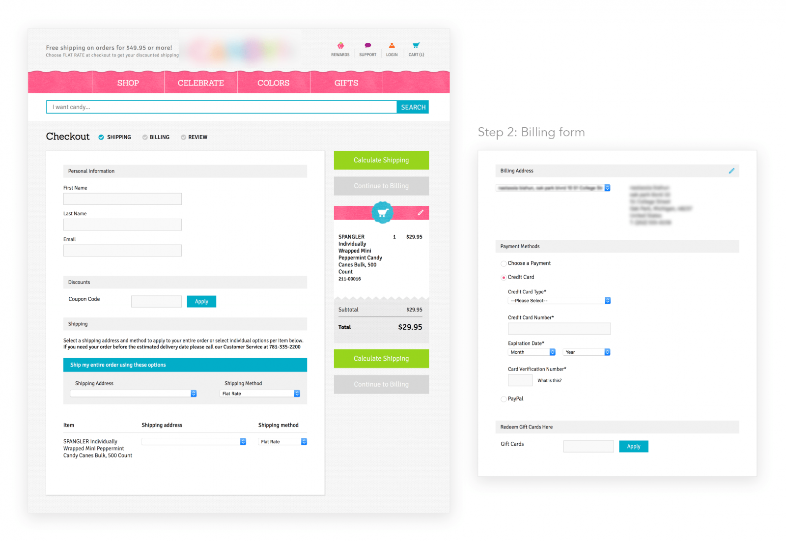
Your Task:
In Figma, create three frames for a guest checkout flow:
-
Frame 1: Shipping Details
- Include fields for Email, Name, and Shipping Address.
- Ensure there is a clear, primary CTA to proceed to the next step.
- Think about the layout. How can you group information to make it easy to scan? (Hint: Chunking).
-
Frame 2: Payment Details
- Include a checkbox for "Billing address is the same as shipping," defaulted to
checked. - Include fields for Credit Card information.
- Include a primary CTA to review the order.
- Include a checkbox for "Billing address is the same as shipping," defaulted to
-
Frame 3: Review & Confirm
- Display a summary of the shipping and payment information.
- Show the final order total.
- Include a final "Place Order" CTA.
Annotation Requirement:
After creating the wireframes, use Figma's annotation tools (or text boxes with arrows) to add at least three annotations that explicitly connect a design decision to a cognitive principle.
- Example Annotation 1: On the "Billing same as shipping" checkbox, you could write: “Principle: Default Bias. This is checked by default to reduce clicks and cognitive effort for the majority of users, creating a faster path to completion.”
- Example Annotation 2: On the primary CTA button, you could write: “Principle: Von Restorff Effect. The button uses a high-contrast color to stand out from other elements, clearly signaling the primary path forward.”
- Example Annotation 3: On the sequence of steps, you might add a general note: “Principle: Commitment & Consistency. The flow starts with easier, less sensitive information (shipping) before asking for payment details, which encourages users to complete the process they've already started.”
Conclusion
Well done. You have now designed one of the most critical and high-impact parts of any digital product: the checkout flow. More importantly, you've moved beyond just arranging boxes on a screen. By consciously applying cognitive principles and annotating your rationale, you are designing with intent and can articulate the business value of your work—a key differentiator for a successful freelancer.
Key Takeaways:
- A low-friction flow is designed to maximize a user's ability to complete a task by minimizing cognitive effort.
- Proven strategies like offering guest checkout, using smart defaults, and applying the "foot-in-the-door" technique are rooted in psychological principles.
- Annotating your wireframes with the cognitive principles you've applied demonstrates your strategic thinking and justifies your design decisions to clients and developers.
Preview of the Next Lesson:
Your annotated wireframe is a powerful hypothesis for what a good user experience should be. In our next lesson, "Conduct a wireframe usability walkthrough with a peer and document key findings," you will put that hypothesis to the test. You'll present this checkout flow to someone else, using your annotations as talking points to explain your design and gather invaluable feedback.