Introduction
In our last lesson, you learned to compare the distinct UI patterns of iOS and Android, enabling you to design interfaces that feel native to each platform. You now know how to select the right type of component—like an Alert on iOS versus a Dialog on Android. However, a professionally designed mobile app requires more than just picking the correct pattern; it must also be physically comfortable and effortless to use.
This lesson bridges the gap between visual design and physical interaction. We will focus on the ergonomics of mobile design, specifically how to optimize your UI elements for touch targets and ergonomic thumb zones. Understanding how people hold and interact with their phones is crucial for creating designs that not only look good but also feel intuitive and prevent user frustration. This is a core skill that separates amateur designers from professionals.
Part 1: The Ergonomics of Touch – Designing for Thumbs
Unlike desktop interfaces that are navigated with a precise mouse cursor, mobile interfaces are primarily operated by a much less precise tool: the human thumb. Research consistently shows that a large percentage of users interact with their phones one-handed. This simple fact has profound implications for where we should place the most important elements on the screen.
To understand this, let's start with a foundational concept in mobile ergonomics: the "Thumb Zone."
Touchscreen Interface Design: The Mobile First Era
The article "Touchscreen Interface Design" provides an excellent breakdown of the biological and ergonomic principles behind mobile design. It explains why designing for hands is paramount.
Read the section titled "The Ergonomics of Touch (The Foundation)". As you read, focus on: The Science of the “Thumb Zone”: Pay close attention to the definitions of the Natural Zone, Stretch Zone, and Hard/Owl Zone. Hand Holding Postures: Note the three main grips—one-handed, cradled, and two-handed—and the percentage of users who adopt each.
The concept of the thumb zone is best understood visually. The video below offers a quick, clear demonstration.
Top 5 UX/UI Design Tips and Tricks Everyone Needs to Know About, Part 2
This clip from uxpeak's "Top 5 UX/UI Design Tips and Tricks" provides a concise visual explanation of the thumb zone.
Watch from Design for the thumb Zone. Notice how the video illustrates the difference in effort required to reach buttons placed inside versus outside this primary interaction area.
The following images consolidate this concept, showing how reachability changes based on how a user holds their phone and which hand they use.

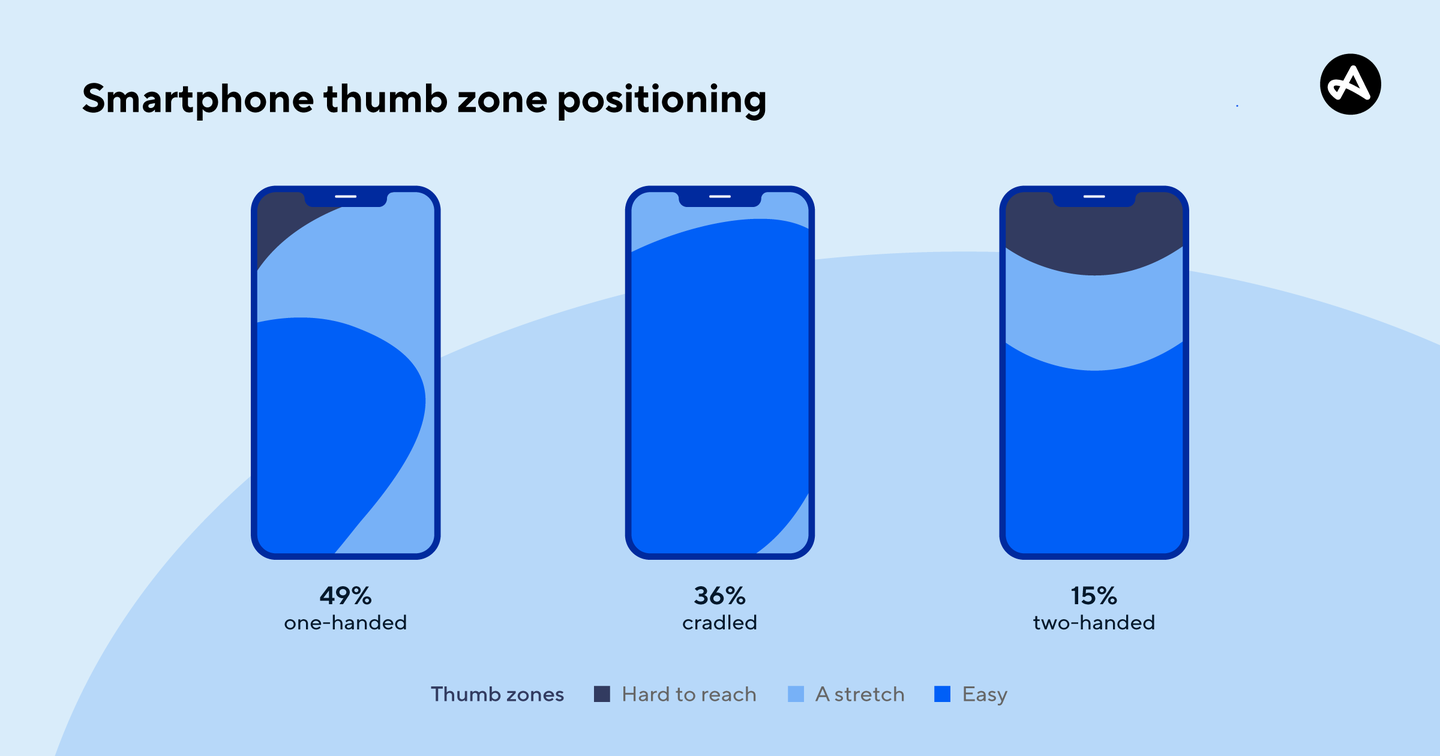
Your key takeaway here is strategic placement. Primary actions and navigation should be placed within the "Natural" zone, typically the bottom two-thirds of the screen. Secondary or destructive actions (like "Delete" or "Sign Out") should be moved to the "Stretch" or "Hard" zones to prevent accidental taps.
Part 2: The "Fat Finger" Problem – Sizing for Touch
Now that we know where to place elements, let's address how big they need to be. A common mistake junior designers make is creating buttons and links that are too small to be tapped reliably. This is often called the "fat finger" problem, but it’s really a design problem.
A finger is not a pixel-perfect cursor. When you tap a screen, your finger makes contact over a surprisingly large surface area. If interactive elements are too small or too close together, users will frequently make errors.
To solve this, major design systems provide clear guidelines for minimum touch target sizes.
Perfect Mobile Button Size: Tips, Guidelines, and Best Practices
This article by DesignMonks provides clear, actionable numbers and best practices for sizing mobile buttons.
Read the following sections: The Importance of The Right Mobile Button Size: Understand the "why" behind proper sizing—usability, accessibility, and user engagement. Touch Target Size for Mobile Design: This is the core of the reading. Pay close attention to the specific recommendations from Apple (HIG) and Google (Material Design). Note the distinction between "Visual Size" and "Touch Target Size." Button Size for Mobile UI: 7 Best Practices: Skim this section, focusing on "Minimum Button Size," "Recommended Button Size," and "Button Spacing."
Let's reinforce those critical numbers. The industry standards are non-negotiable for professional work:
- Apple's Human Interface Guidelines (HIG): Recommends a minimum touch target of 44pt x 44pt.
- Google's Material Design: Recommends a minimum touch target of 48dp x 48dp.
It's important to remember that pt (points) and dp (density-independent pixels) are units that scale with screen resolution. For our purposes in Figma, you can think of them as being equivalent to pixels. Aiming for a target between 44px and 48px is a safe rule of thumb.
The video below discusses this in the practical context of a bottom navigation bar, a component that lives squarely in the thumb zone.
Top UI/UX Design Tips - How to Design a Great Bottom Mobile Navigation Bar
This segment from uxpeak's video on mobile navigation bars directly addresses the importance of creating thumb-friendly tap areas.
Watch the tip on thumb friendly tap areas. The presenter explicitly states the 44x44 pixel guideline and explains why it's based on the average size of a human thumb.
Visual Size vs. Tappable Area
A crucial concept is that the visual icon or text does not have to be 44px wide. The tappable area, often called the "hitbox," must be at least that size. You achieve this in Figma by adding padding inside a component or frame.
For example, a 24px icon can be placed inside a 48px x 48px frame. The frame itself can be transparent, but it defines the tappable region, ensuring the element is easy to interact with.
An icon might be visually small (e.g., 24x24px), but its tappable area should be expanded with padding to meet the minimum 44x44px guideline. This prevents user error without cluttering the visual design.
Finally, remember spacing. Ensure there is at least 8dp (or 8px) of non-interactive space between any two touch targets to prevent accidental taps.
Part 3: A Practical Audit Checklist
Theory is useful, but action is better. Let's translate these principles into a simple checklist you can use to audit your own mobile designs in Figma.
Open one of the mobile app screens you designed in the previous lessons (either the iOS or Android version). Now, review it against these five ergonomic criteria:
-
Thumb Zone Placement:
- Are the most frequently used actions (e.g., primary navigation tabs, main CTA) located in the "Natural" thumb zone at the bottom or middle of the screen?
- Action: If not, consider moving them. For example, if you have a primary action in the top-right corner, could it be a Floating Action Button (Android) or a prominent button at the bottom of the content area?
-
Destructive Action Safety:
- Are dangerous or irreversible actions (e.g., "Delete," "Cancel Subscription," "Sign Out") placed in the "Stretch" or "Hard" zones (e.g., top of the screen, inside a menu)? This makes them harder to tap by accident.
- Action: If a "Delete" button is right next to a "Save" button in the thumb zone, move it or place it behind a confirmation dialog.
-
Touch Target Sizing:
- Select every interactive element on your screen (buttons, icons, form fields, links). In Figma, check its dimensions in the Properties panel. Is its width and height at least 44px?
- Action: If an element is too small, increase its size. For icons, place them inside a larger frame (e.g., 44x44) and use Auto Layout constraints to center the icon. This increases the tappable area without changing the icon's visual size.
-
Element Spacing:
- Measure the distance between adjacent touch targets. Is there at least 8px of space between them?
- Action: If elements are too close, increase the space between them using Auto Layout or by adjusting their positions.
-
System Area Respect:
- On modern phones, the very bottom of the screen is reserved for the home indicator (the little bar you swipe up on). Are your interactive elements, like a bottom navigation bar, sitting clearly above this area with sufficient padding?
- Action: Ensure there's a "safe area" at the bottom of your frame so interactive UI doesn't conflict with system gestures. Most design kits for iOS and Android will have this built in.
Running through this audit will quickly reveal opportunities to dramatically improve the usability and professionalism of your designs.
Conclusion
Today, you've learned to think like an ergonomist, considering the physical reality of how users hold and interact with their devices. By designing for the thumb, you create interfaces that feel natural, reduce errors, and are fundamentally more user-friendly.
Key Takeaways:
- Design for Thumbs, Not Cursors: Place primary actions and navigation in the easily reachable "Thumb Zone" at the bottom and middle of the screen.
- Size Matters: All interactive elements must have a minimum touch target size of 44x44pt (iOS) or 48x48dp (Android) to prevent mis-taps.
- Visual Size ≠ Tappable Area: Use padding to expand the tappable area of smaller icons and text links without compromising your visual design.
- Space is Safety: Maintain at least 8dp of space between touch targets to reduce user error.
- Audit Your Work: Regularly check your designs against ergonomic principles to ensure they are not just visually appealing but also physically usable.
Preview of the Next Lesson:
Now that you understand how to design individual components and screens for optimal platform-nativeness and usability, we will zoom out to look at a critical sequence of screens. In the next lesson, you will learn to define the goals and structure of a mobile app onboarding flow, guiding users through their very first experience with a product.