Introduction
In our last two lessons, you dove deep into the mobile design ecosystems, first analyzing Apple's Human Interface Guidelines (HIG) and then applying Google's Material Design to build a complete Android screen. You now have hands-on experience creating a design that feels at home on each platform individually.
Today, we will connect those two worlds. As a freelance designer, clients will often need an app that works beautifully on both iOS and Android. Simply copying a design from one platform to the other can create a disjointed and frustrating user experience. This lesson focuses on comparing the specific conventions for key UI patterns—navigation, controls, and dialogs—to help you make informed, platform-appropriate decisions. Mastering this will make your designs feel truly native and intuitive, a hallmark of a professional designer.
Part 1: The Strategy: Platform-Native vs. Platform-Agnostic
Before diving into specific components, it's important to understand the strategic choice you're making. Why not just design one interface and use it everywhere? Is it worth the effort to adapt a design for each platform?
The following talk from Figma's Config conference addresses this question directly. It introduces two philosophies: "platform-agnostic," where the UI is the same everywhere, and "platform-native," where the UI adheres to the standards of each system.
Config London 2025: Designing for both iOS and Android—the right way with Christine Røde
Christine Røde's talk, "Designing for both iOS and Android—the right way," offers a clear perspective on this topic.
Watch these two segments to understand the core argument for designing natively. Two Approaches: This section introduces the platform-agnostic vs. platform-native concepts, using Google's apps and WhatsApp as examples. Debunking Myths: The speaker challenges common arguments against native design, such as the ideas that it's less efficient or weakens the brand. Pay attention to the "Familiarity Myth"—users compare your app to other apps on their phone, not to your app on a different phone.
The key takeaway is that designing natively isn't about looking generic; it's about pragmatism, respecting user expectations, and leveraging built-in features like accessibility and future-proofing that come "for free" with the platform's SDK (Software Development Kit).
Part 2: A Systematic Comparison of Key Patterns
Now, let's get into the specifics. We'll systematically break down the differences between iOS and Android for the most common UI patterns you'll encounter. The following article provides an excellent, detailed reference that you can use for this lesson and bookmark for future projects.
iOS vs. Android App UI Design: The Complete Guide
This guide from Learn UI Design offers a clear, side-by-side comparison of iOS and Android conventions, complete with helpful visuals.
Read the article from the beginning down to the start of the "Typography" section. Focus on the following three areas: Overview Table: Start with the summary table at the top. It provides a fantastic at-a-glance reference for the main differences. Navigation: Read the "iOS vs. Android Navigation" section. Pay close attention to the different approaches for primary navigation (bottom tabs vs. side drawers) and the universal "back" pattern on Android. Controls & Undo: Read the "iOS vs. Android Control Design" section. This covers everything from primary action buttons (CTAs) and search bars to selection controls and how each platform handles confirming or undoing actions.
Let's summarize the most critical differences you just read about, using some visual aids to make them concrete.
Navigation Patterns

- Primary Navigation:
- iOS: Almost always uses a bottom Tab Bar for 2-5 top-level destinations.
- Android: Uses a Bottom Navigation Bar (similar to iOS) but also frequently employs a Navigation Drawer (a side menu accessed via a "hamburger" icon) for secondary or less-frequented destinations.
- "Back" Functionality:
- iOS: Navigation is contextual. You go back by tapping a "Back" button in the top-left of the navigation bar or using a swipe-from-left-edge gesture.
- Android: Features a universal, system-level "Back" function (either a dedicated button or a swipe-from-edge gesture) that works consistently across all apps.
Controls and Actions
- Primary Call-to-Action (CTA):
- iOS: The main action for a screen is typically a text or icon button in the top-right of the navigation bar (e.g., "Edit," "Done," "+").
- Android: Famously uses the Floating Action Button (FAB), a circular button that "floats" above the UI in the bottom-right corner, signifying the screen's most common action (e.g., compose an email, create a new contact).
- View Switching:
- iOS: Uses a Segmented Control to switch between different views or filter content within the same screen.
- Android: Uses Tabs, which are visually integrated into the top app bar and allow you to swipe between views.
Dialogs, Alerts, and Feedback
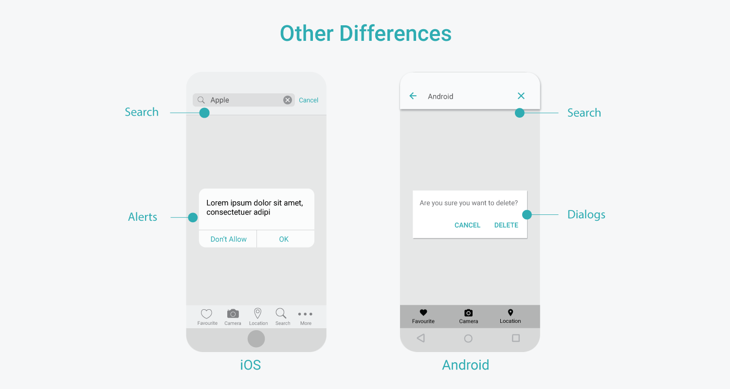
- Blocking Modals (for critical info/confirmation):
- iOS: Calls these Alerts. They are centered, block interaction, and typically present 2-3 actions. Destructive actions are styled in red.
- Android: Calls these Dialogs. Functionally similar to iOS Alerts, they interrupt the user to confirm a choice or present critical information.
- Contextual Choices & Temporary Feedback:
- iOS: Uses an Action Sheet, which slides up from the bottom to present a set of choices related to an action the user just took.
- Android: Has two common patterns. A Bottom Sheet can present choices similarly to an iOS Action Sheet. More uniquely, Android uses a Snackbar, a temporary message at the bottom of the screen that often includes an "Undo" action, providing non-blocking feedback. This "allow undo" pattern is favored over asking for confirmation upfront.
Part 3: A Case Study in Decision-Making
Knowing the different components is the first step. The next is knowing when to use them. The official guidelines from Apple and Google provide definitions for the intended use of each component. Let's walk through a practical example to see how a designer thinks through this process.
Imagine you're designing a feature where a user can cancel a reservation. This requires confirmation. Which component should you use?
Learning from Material Design and Human Interface Guidelines
The video "Learning from Material Design and Human Interface Guidelines" by Design Pilot provides an excellent walkthrough of this exact thought process.
Watch these segments to see how to go from a design problem to a platform-specific solution. Investigating iOS (HIG): The presenter explores the HIG documentation to find the definitions for Action Sheets, Alerts, and Sheets, comparing them to real-world app examples. Comparing Alert vs. Action Sheet: This is a crucial part of the video. The presenter finds the key differentiator in the HIG: an Alert is for unexpected events, while an Action Sheet is for presenting choices related to an intentional action. This is a subtle but critical distinction. Investigating Android (Material): He then shifts to Material Design, looking at Dialogs and Bottom Sheets. Notice that Material Design doesn't have a direct equivalent of an "Action Sheet" or "Alert"; the components are defined differently.
This exercise demonstrates a vital skill: when in doubt, consult the official documentation. The Human Interface Guidelines and Material Design guidelines are your ultimate source of truth. They explain the purpose behind each component, which helps you choose the right one for the job and create an experience that feels intuitive to the user.
Conclusion
Today you've moved beyond designing for a single platform and learned how to think across both. By understanding and respecting the unique conventions of iOS and Android, you can create apps that feel powerful, intuitive, and seamlessly integrated into the user's device. This ability to "translate" a design effectively is a high-value skill for any freelance UI/UX designer.
Key Takeaways:
- Native Design Meets User Expectations: Users are accustomed to the patterns on their device. Adhering to platform conventions reduces cognitive load and makes your app feel familiar.
- Key Patterns Differ Significantly: Remember the core differences in navigation (Tab Bar vs. Drawer), primary actions (Top-Right vs. FAB), and temporary feedback (Action Sheets vs. Snackbars).
- Terminology Matters: iOS uses "Alerts" and "Action Sheets," while Android uses "Dialogs," "Bottom Sheets," and "Snackbars." Using the correct terminology is important, especially when communicating with developers.
- The Guidelines Are Your Guide: The HIG and Material Design docs are not just style guides; they explain the intended use and rationale for each component. Always refer to them to resolve design questions.
Preview of the Next Lesson:
Now that you can select the right component for each platform, the next step is to ensure it's physically easy to use. In our next lesson, we will focus on the ergonomics of mobile design, exploring how to optimize UI elements for touch targets and ergonomic thumb zones, ensuring your designs are not only beautiful but also comfortable and accessible to use.