Hello! Welcome to your third lesson.
In our last session, we outlined the three fundamental characteristics of light: quantity, quality, and direction. We briefly touched on color temperature as a critical aspect of light quality.
Today, we'll focus entirely on that concept. The learning outcome for this lesson is to distinguish between warm, neutral, and cool color temperatures using the Kelvin scale. As a technical architect, you're used to how material choices—like warm woods versus cool concrete—define a space's character. Color temperature is the lighting designer's equivalent tool. Mastering it allows you to intentionally shape the mood and psychological impact of an interior, moving from simply lighting a room to creating an atmosphere.
1. What is Color Temperature?
At its core, color temperature describes the perceived color of a "white" light source. This can range from a warm, yellowish hue reminiscent of a candle to a cool, bluish hue like a clear sky. We need a precise way to measure and specify this color, and for that, we use the Kelvin (K) scale.
To understand the origin of the Kelvin scale and its connection to light, let's start with a short video. While it's from a filmmaking perspective, its explanation of the physics is universal and exceptionally clear.
Color Temperature and the Kelvin Scale Tutorial
The video 'Color Temperature and the Kelvin Scale Tutorial' from the FilmSkills channel provides an excellent foundation for what the Kelvin scale is and how it was developed.
Please watch from the beginning to 07:46. Focus on three key ideas: Why we need a quantifiable scale (like Kelvin) instead of subjective terms like 'warm' or 'cool'. The concept of the 'black-body radiator' and how its temperature in Kelvin relates to the color of light it emits. The different Kelvin values of common light sources like candlelight, tungsten, and daylight.
A crucial, and perhaps counterintuitive, point from the video is the relationship between temperature and color appearance:
- Lower Kelvin temperatures (e.g., 1900K) correspond to what we perceive as warm (reddish/yellowish) light.
- Higher Kelvin temperatures (e.g., 6500K) correspond to what we perceive as cool (bluish) light.
This is because the scale is based on the actual temperature of the theoretical black-body radiator, not our psychological association of blue with "cold" and yellow with "warm."
2. The Kelvin Scale in Interior Design
Now, let's translate this scientific scale into practical categories for interior lighting design. We generally group color temperatures into three main classifications: Warm White, Neutral White, and Cool White (or Daylight).
This guide provides a fantastic visual summary of these categories, the moods they evoke, and typical applications.
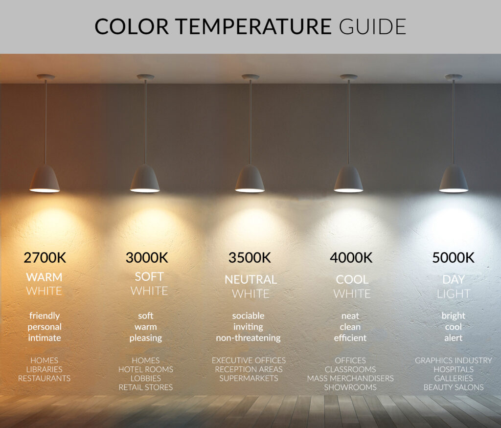
To get into the specifics of each category, please read the following section from the article "What Are the Differences Between 3000K, 4000K, 5000K..."
What Are the Differences Between 3000K, 4000K, 5000K ...
This article from LEOTEK provides a detailed, practical breakdown of the different color temperature ranges used in lighting.
Read Section III, titled 'Differences in LED Color Temperatures'. Pay attention to the typical Kelvin range, appearance, and best use cases for Warm White, Neutral White, and Cool White.
Let's summarize the key points for interior applications:
-
Warm White (2700K – 3000K):
- Appearance: Soft, yellowish-white light, similar to traditional incandescent bulbs.
- Mood: Creates a cozy, relaxing, and intimate atmosphere.
- Best for: Living rooms, bedrooms, dining areas, and restaurants—spaces meant for relaxation and socializing.
-
Neutral White (3500K – 4100K):
- Appearance: A clean, balanced white light that is neither overtly yellow nor blue.
- Mood: Creates a friendly, inviting, and efficient environment.
- Best for: Kitchens, bathrooms, offices, and retail spaces where good visibility is needed without the harshness of cool light.
-
Cool White / Daylight (5000K and above):
- Appearance: Crisp, bluish-white light that mimics natural daylight.
- Mood: Creates an alert, energetic, and focused feeling. Can feel sterile or clinical in the wrong setting.
- Best for: Task-oriented areas like garages, workshops, and commercial/industrial environments. It's also used in healthcare to promote alertness and cleanliness.
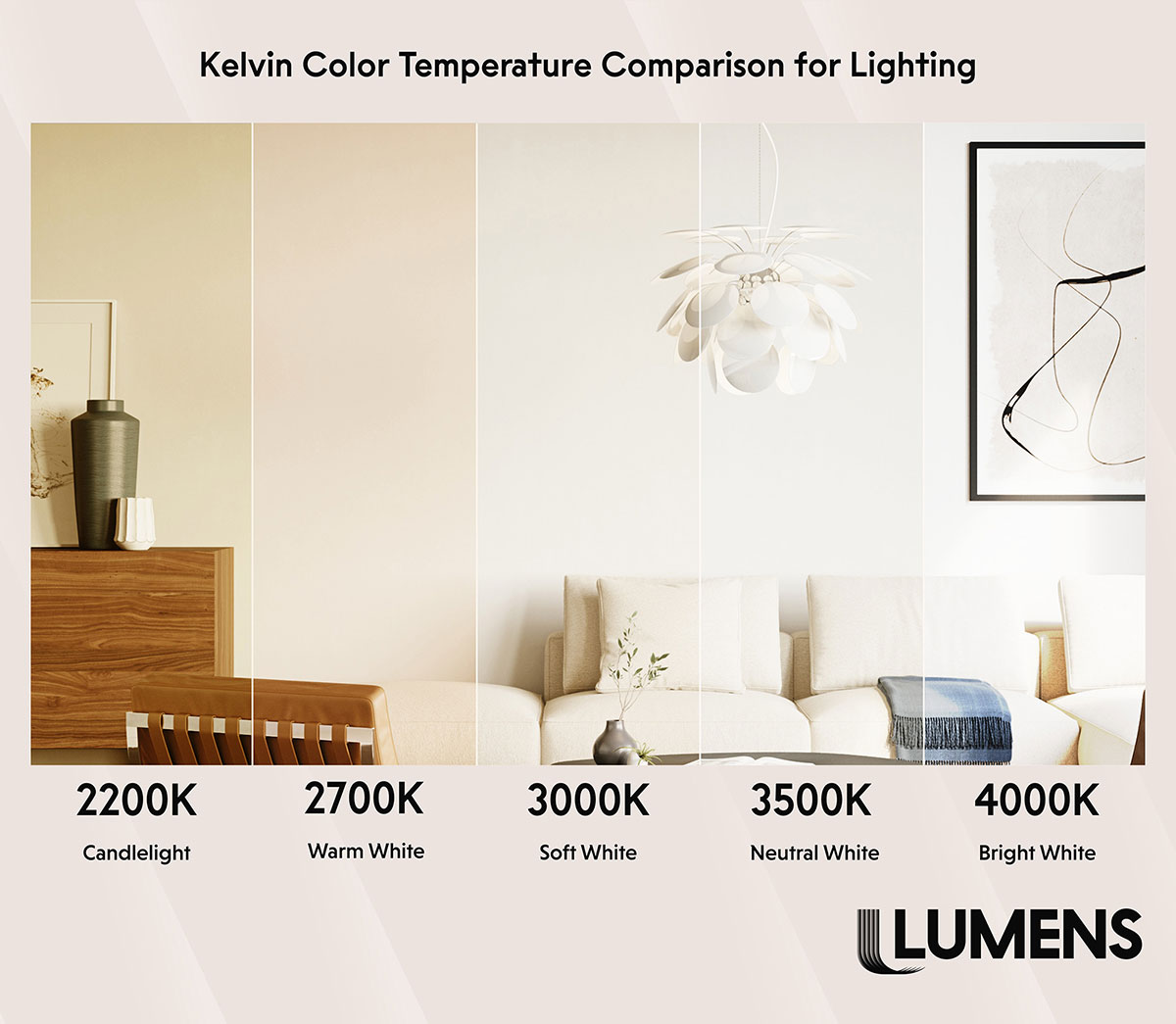
The image below demonstrates powerfully how these different color temperatures can completely change the feeling of the exact same room.
Test your understanding!
You are designing the lighting for a home office. The client wants a space that feels focused and productive during the day but can also serve as a comfortable reading nook in the evening. How might you use your knowledge of color temperature to meet this dual requirement?
Show answer
A great solution would be to use tunable white or layered lighting. For the main work lighting (e.g., recessed downlights or a task lamp over the desk), you could specify a neutral or cool temperature around 4000K to promote focus and alertness during work hours. For the evening, you could add a separate layer of light, such as a floor lamp or wall sconces, with a very warm 2700K bulb. This allows the client to switch off the "work" lights and turn on the "relax" lights, completely changing the room's atmosphere to suit the activity.
Conclusion
You can now distinguish between the primary color temperature categories and understand how to apply them using the Kelvin scale. This is a fundamental skill for controlling the atmosphere of an interior space.
Key Takeaways:
- Color Temperature describes the perceived warmth or coolness of white light and is measured in Kelvin (K).
- Low Kelvin values (2700K-3000K) produce warm light, creating a cozy and relaxing ambiance suitable for residential living areas.
- Mid-range Kelvin values (3500K-4100K) produce neutral light, offering a balanced and efficient atmosphere for kitchens, offices, and retail.
- High Kelvin values (5000K+) produce cool light, promoting alertness and focus in task-heavy commercial or industrial environments.
In the next lesson, we will explore the second crucial component of light quality: the Color Rendering Index (CRI). You'll learn why two light sources with the exact same 3000K color temperature can make the colors in a room look dramatically different, and how to ensure your designs render colors beautifully and accurately.