Hello! Welcome to your fourth lesson in the "Foundations of Light and Perception" module.
In our last lesson, we focused on Color Temperature (CCT), learning how the Kelvin scale helps us define the mood of a space, from a warm and cozy 2700K to a crisp and alert 5000K. However, you might find that two light bulbs, both rated at 3000K, can render the colors in a room very differently. A rich, red oak floor might look vibrant under one but disappointingly dull under the other. Why is that?
This brings us to today's topic. Our learning goal is to explain the Color Rendering Index (CRI) and its importance for rendering colors accurately in interior spaces. CRI is the metric that quantifies this difference, measuring a light source's ability to reveal the true colors of objects. For a technical architect like you, who understands how crucial material and finish selection is, mastering CRI is essential to ensure your design intent is faithfully represented by the lighting.
1. What is the Color Rendering Index (CRI)?
CRI is a quantitative measure of how accurately an artificial light source displays colors compared to a reference light source, which is typically natural daylight or an incandescent bulb (both considered "perfect" with a CRI of 100).
To get a solid grasp of this concept, let's start with a foundational article.
What Is CRI In Lighting And Why Does It Matter?
The article 'What Is CRI In Lighting And Why Does It Matter?' provides an excellent, straightforward explanation of the basics.
Please read the first part of the article, under the heading 'The Basics of CRI'. Focus on the definition, the 0–100 scale, and the fruit bowl example.
As the article explains, the CRI scale works from 0 to 100.
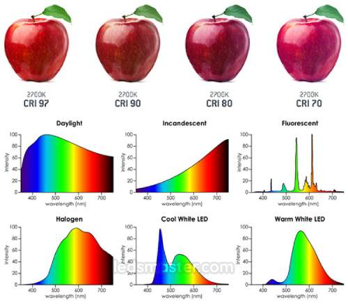
- A light source with a CRI of 100 shows colors perfectly, as they would appear in natural sunlight.
- A light source with a CRI of 80 is generally considered good for most applications.
- A light source with a CRI below 70 can make colors look muted, washed out, or even take on a different hue.
The images below provide a clear visual demonstration of this effect. Notice how the vibrancy and richness of the colors diminish as the CRI value decreases.

2. CRI vs. Color Temperature (Kelvin)
It is crucial not to confuse CRI with Color Temperature (CCT), which we covered in the last lesson. They measure two different, independent qualities of light.
- Color Temperature (Kelvin) describes the color appearance of the light source itself (warm yellow, neutral white, or cool blue).
- Color Rendering Index (CRI) describes how accurately that light reveals the colors of objects it illuminates.
To clarify this distinction, please read the next section of the same article.
What Is CRI In Lighting And Why Does It Matter?
This section directly compares CRI with other key lighting metrics, which will help solidify your understanding.
Read the subsection titled 'CRI vs Kelvin: Color Accuracy vs Color Temperature'. You can skim the other comparisons for now.
So, you can have a warm 2700K light with a low CRI of 70, which would create a cozy but dull-looking space. You can also have a warm 2700K light with a high CRI of 95, which would make the same space feel both cozy and vibrant. They work together to define the overall quality of light.
3. Why CRI Matters in Interior Design
As a design professional, CRI is not just a technical number; it's a tool that directly impacts the success of your projects. Low CRI lighting can undermine carefully selected materials, making expensive finishes look cheap and altering the intended color palette.
Let's explore the practical applications where prioritizing high CRI is essential.
What Is CRI In Lighting And Why Does It Matter?
The following sections of the article detail exactly where and why CRI is so important in both residential and commercial settings.
Please read the sections 'Why CRI Matters For Your Home Or Business' and 'When To Prioritize High CRI Lighting'. Pay close attention to the specific examples for kitchens, bathrooms, and retail.
To summarize the key applications:
- Residential: High CRI is critical in kitchens to make food look fresh and appealing, and in bathrooms and walk-in closets to render skin tones and clothing colors accurately. In living areas, it ensures that furniture, artwork, and wall colors appear as you intended.
- Commercial: In retail, high CRI makes merchandise more attractive and can directly influence purchasing decisions. In galleries and museums, it is non-negotiable for presenting artwork authentically. In restaurants, it affects the appearance of both the decor and the food.
What CRI Value Should You Specify?
Here are some practical guidelines for choosing the right CRI, drawn from industry best practices.
The importance of the Color Rendering Index (CRI) in lighting
This short article provides simple, actionable CRI ranges for different applications.
Read the section titled 'When to apply each CRI?'.
Based on this, here are some rules of thumb for your specifications:
- CRI 80-90: This is a good baseline for general ambient lighting in many residential and commercial spaces like offices and schools.
- CRI 90-100: This is considered high quality and is strongly recommended for task areas and spaces where color accuracy is critical (kitchens, bathrooms, high-end retail, art studios, healthcare).
Test your understanding!
You are specifying the lighting for two different areas:
- A high-end residential kitchen featuring dark walnut cabinetry and a richly veined marble countertop.
- A storage basement in the same residence.
For which space would you prioritize a higher CRI, and why? What would be the risk of using a low CRI light in that critical space?
Show answer
You would prioritize a high CRI (90+) for the kitchen. The rich colors and subtle details in the walnut wood grain and marble veining would be lost under low CRI light, making these expensive finishes appear flat and lifeless. Food would also look less appetizing.
In the storage basement, a lower CRI (e.g., 80) is acceptable as the primary goal is visibility, not accurate color perception. Using a low CRI light in the kitchen risks undermining the entire design intent and material investment.
A Deeper Look: CRI and LED Technology
Modern LEDs can achieve excellent CRI, but not all are created equal. Some struggle to reproduce certain colors, particularly deep reds. This specific part of the color spectrum is measured by a value called R9. A high R9 value is crucial for rendering warm wood tones, red textiles, and natural skin tones accurately.
The following video offers a great real-world example of how different LED bulbs perform in CRI tests, including the challenge of rendering reds.
The best LED light bulb EVER made is $3.50. Excellent CRI, No Flicker, Even Dimming.
This video from 'The Hook Up' channel, while reviewing a specific bulb, has an excellent segment explaining and demonstrating CRI testing in a very practical way.
Watch from 03:25 to 04:56. Notice the visual difference and the discussion about how even high-CRI LEDs can struggle with the R9 (pure red) value compared to an old incandescent bulb.
As you advance, you'll find that for high-end projects, specifying a light source with not only a high overall CRI (90+) but also a high R9 value (often 50+ is considered good, 90+ is excellent) is a mark of a knowledgeable designer.
Conclusion
Today, we've unpacked the concept of the Color Rendering Index, a crucial factor in the quality of light. You now understand not just what it is, but how to use it as a design tool to ensure the spaces you create look exactly as you envision them.
Key Takeaways:
- CRI is a scale from 0 to 100 that measures how accurately a light source renders color compared to natural daylight.
- CRI is different from Color Temperature (Kelvin). CCT is the color of the light itself; CRI is its effect on the color of objects.
- A CRI of 80+ is acceptable for general use, but 90+ is recommended for kitchens, bathrooms, retail, and any space where color appearance is critical.
- Poor CRI can make high-quality finishes look dull and alter the entire color scheme of a room.
- When specifying high-quality LEDs, look for a high R9 value for superior rendering of red tones.
In our next lesson, we will shift our focus from the quality of light to how it is distributed. We will begin Module 3, "Luminaires and Photometrics," by learning how to classify lighting fixtures (luminaires) by their distribution type: direct, indirect, and semi-direct. This will be our first step in understanding how to select the physical hardware that delivers the light we've so carefully defined.