Welcome back! In our last lesson, you learned how to apply CSS for typography, colors, and spacing. You now have the skills to style individual elements, which is the direct code equivalent of setting up a style guide in Figma. You can control the font-size of a heading, the background-color of a button, and the padding inside a card.
Today, we take the next crucial step: arranging those elements on the page. We'll explore CSS Flexbox, a powerful layout model that governs how items are positioned and distributed within a container. For you, this concept should feel remarkably familiar. Flexbox is the underlying engine that powers Figma's Auto Layout feature. Every time you've set a frame to "Auto Layout" and adjusted its direction, distribution, and alignment, you've been working with the principles of Flexbox.
Our goal is to build flexible horizontal and vertical layouts using the core Flexbox properties. By the end of this lesson, you will be able to translate your Auto Layout designs into clean, functional CSS.
The Core Idea: From Auto Layout to display: flex
Flexbox works by establishing a relationship between a parent element (the flex container) and its direct children (the flex items). This is identical to how an Auto Layout frame in Figma controls the elements within it.
To start, let's watch a short video that directly connects the Figma UI you know with the CSS properties we're about to learn. This will help bridge the gap between your design expertise and the code.
CSS for UI Designers: Understanding Flexbox and Applying it to Figma's Auto Layout
This video from the moonlearning channel provides a perfect introduction to Flexbox by explicitly comparing its properties to the settings in Figma's Auto Layout panel.
Watch the first few minutes, from the beginning to this point. Pay close attention to how display: flex turns a container into a flex container and how properties like flex-direction, justify-content, and align-items map directly to the settings you use daily in Figma.
The Two Axes of Flexbox
As you saw in the video, once an element becomes a flex container, it establishes two invisible axes. All Flexbox alignment and distribution rules are based on these axes.
- Main Axis: The primary direction in which flex items are laid out. By default, this is horizontal (left-to-right).
- Cross Axis: The axis that is perpendicular to the main axis. By default, this is vertical (top-to-bottom).
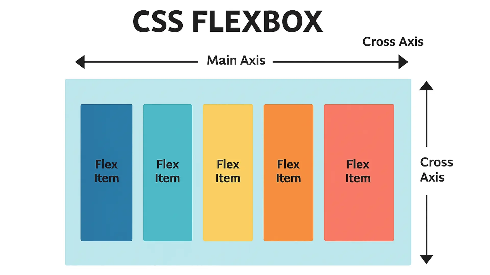
Understanding these axes is the single most important concept in Flexbox, because every alignment property refers to one or the other. If you change the direction of the main axis (e.g., from a row to a column), the cross axis automatically adjusts to remain perpendicular.
Controlling the Layout: The Container's Role
The most common Flexbox properties are set on the parent flex container. These properties define the overall layout rules for all the children within.
display: flex: This is the magic property that turns an element into a flex container.flex-direction: This sets the direction of the main axis.row(default): Items are laid out horizontally.column: Items are laid out vertically. The main axis is now top-to-bottom.
justify-content: This defines how items are distributed along the main axis. It controls the spacing between items. This is equivalent to Figma's "Distribution" setting (e.g., "Pack" vs. "Space between").align-items: This defines how items are aligned along the cross axis. This is equivalent to Figma's alignment settings (e.g., align top, center, bottom).
This cheat sheet provides an excellent visual summary of these properties and their effects.

To gain a deeper intuition for how these properties work in practice, let's turn to an excellent interactive guide.
An Interactive Guide to Flexbox in CSS
Josh Comeau's guide is one of the best resources for learning CSS. Its interactive examples allow you to see the effects of properties in real time.
Start by reading the section on Flex direction. This reinforces the concept of the primary axis. Next, explore the interactive demos in the Alignment section to understand justify-content. Play with the different values like flex-start, center, and space-between. Continue to the part on align-items to see how alignment on the cross axis works.
Why justify-content but align-items?
You might notice the different naming conventions. This isn't arbitrary; it reveals a core truth about Flexbox.
- Along the main axis, items are treated as a single group of "content" that cannot overlap. You can only control how this group is distributed (
justify-content). - Along the cross axis, each item is independent. You can align them individually without affecting their siblings. They are treated as separate "items" (
align-items).
Josh Comeau's guide explains this with a memorable metaphor.
An Interactive Guide to Flexbox in CSS
This section provides a brilliant mental model for understanding the difference between the main and cross axes.
Read the section titled Content vs. items. The analogy of a kebab skewer versus cocktail wieners is a perfect way to build an intuition for why these properties are named the way they are.
Spacing and Wrapping
In modern CSS, the easiest way to add space between flex items is with the gap property. This is the direct code equivalent of the "Space between items" field in Figma's Auto Layout panel.
.flex-container {
  display: flex;
  gap: 16px; /* Adds 16px of space between each flex item */
}
By default, flex items will try to fit on a single line, even if it causes them to overflow their container. To allow them to wrap onto multiple lines, you use the flex-wrap property.
.flex-container {
  display: flex;
  flex-wrap: wrap; /* Allows items to wrap to the next line */
  gap: 16px;
}
The moonlearning video demonstrates this wrapping behavior clearly.
CSS for UI Designers: Understanding Flexbox and Applying it to Figma's Auto Layout
Let's revisit the moonlearning video to see wrapping in action.
Watch the short segment on wrapping. Notice how items move to a new line when the container becomes too narrow. This is a fundamental technique for building responsive layouts.
Controlling Individual Items
Beyond the container-level rules, you can also apply properties to individual flex items to control their sizing and alignment.
flex-grow: A unitless value that determines if an item can grow to fill available space. A value greater than0allows it to grow. This is conceptually similar to setting an element to "Fill container" in Figma.flex-shrink: A unitless value that determines if an item can shrink when there isn't enough space. The default is1, which allows shrinking. Setting it to0prevents an item from shrinking.align-self: Overrides the container'salign-itemsproperty for a single item. This is incredibly useful for creating exceptions in your layout, like having one button aligned to the bottom of a card while others are at the top.
The video from Kevin Powell provides an excellent, practical walkthrough of these properties.
This video by Kevin Powell breaks down the core behaviors of flex items.
First, watch his explanation of flex-grow. This shows how items can consume extra space. Next, watch the segment on align-items and align-self. He clearly demonstrates how to align items on the cross axis and how align-self can be used to override the alignment for a specific child.
Your Turn: Build a Navigation Bar
Let's put this all together. A navigation bar is a perfect use case for Flexbox. The goal is to have a logo on the far left and the navigation links grouped on the far right, with everything vertically centered.
-
Create an
index.htmlfile and astyle.cssfile. -
Paste this HTML into your
index.htmland link the stylesheet.<!DOCTYPE html> <html lang="en"> <head> <meta charset="UTF-8"> <meta name="viewport" content="width=device-width, initial-scale=1.0"> <title>Flexbox Nav</title> <link rel="stylesheet" href="style.css"> </head> <body> <nav class="main-nav"> <a href="#" class="logo">MyBrand</a> <ul class="nav-links"> <li><a href="#">Home</a></li> <li><a href="#">About</a></li> <li><a href="#">Services</a></li> <li><a href="#">Contact</a></li> </ul> </nav> </body> </html> -
Add this starter CSS to your
style.cssfile.body { font-family: system-ui, sans-serif; margin: 0; } .main-nav { background-color: #f8f9fa; padding: 0 40px; /* --- YOUR FLEXBOX CODE GOES HERE --- */ } .nav-links { list-style: none; margin: 0; padding: 0; /* --- YOUR FLEXBOX CODE GOES HERE --- */ } .logo { font-weight: bold; font-size: 1.5rem; text-decoration: none; color: #333; } .nav-links a { display: block; padding: 20px 15px; text-decoration: none; color: #555; } -
Your Task:
- Make the
.main-nava flex container. Use Flexbox properties to push the logo and the.nav-linkslist to opposite ends. Ensure they are vertically centered. - Make the
.nav-linkslist also a flex container to arrange its list items horizontally. Add some space between the links using thegapproperty.
- Make the
Click to see the solution
/* Solution for .main-nav */
.main-nav {
    background-color: #f8f9fa;
    padding: 0 40px;
    /* --- YOUR FLEXBOX CODE GOES HERE --- */
    display: flex;
    justify-content: space-between;
    align-items: center;
}

/* Solution for .nav-links */
.nav-links {
    list-style: none;
    margin: 0;
    padding: 0;
    /* --- YOUR FLEXBOX CODE GOES HERE --- */
    display: flex;
    gap: 10px;
}
This is an example of nesting, a powerful technique you also use in Figma by nesting Auto Layout frames. The outer nav handles the main layout, while the inner ul handles the arrangement of its own items.
Conclusion
You have now learned the fundamentals of CSS Flexbox, one of the most important tools in modern web development. You've seen how its core concepts—containers, items, and axes—are direct parallels to Figma's Auto Layout system, giving you a powerful head start in translating your designs to code.
Key Takeaways:
- Flexbox is a one-dimensional layout model activated with
display: flex. - Layout is controlled by a main axis and a perpendicular cross axis.
flex-directiondetermines the main axis (roworcolumn).justify-contentdistributes items along the main axis.align-itemsaligns items along the cross axis.- The
gapproperty is the modern way to create space between items.
In our next lesson, we will explore Flexbox's powerful counterpart: CSS Grid. While Flexbox excels at arranging items in a single line (a row or a column), Grid is designed for creating complex, two-dimensional layouts, such as the overall structure of an entire page.