Welcome back! In the last lesson, we mastered CSS Flexbox, the one-dimensional layout system that powers components and arranges items in a single row or column. You saw how it directly mirrors Figma's Auto Layout, giving you a powerful tool for creating flexible, content-driven UI elements like navigation bars.
Today, we're moving from one dimension to two. We'll explore CSS Grid, the layout model designed for structuring an entire page. While Flexbox is for arranging items along a line, Grid is for positioning them within a scaffolding of rows and columns. This is the difference between organizing books on a single shelf (Flexbox) and building the entire bookshelf itself (Grid).
Your goal for this lesson is to learn how to build these complex, two-dimensional page layouts using CSS Grid. This skill is the direct counterpart to using Layout Grids in Figma, but with far more power and flexibility, allowing you to create the foundational structure for entire web pages.
From One Dimension to Two: Grid vs. Flexbox
Before we dive into the properties, it's essential to solidify the mental model. You're already comfortable with the distinction in Figma:
- Auto Layout (Flexbox) is for one-dimensional layouts. You decide if items go in a row or a column. It's about flow and distribution.
- Layout Grids (CSS Grid) are for two-dimensional layouts. You define rows and columns simultaneously, creating a coordinate system to place items on. It's about structure and placement.
This article from UX Design CC explains this distinction perfectly and is written specifically for designers like you who are moving into code.
Figma's new grid — you must understand CSS Grid as a ...
This article directly connects the Figma tools you know to the CSS concepts we're learning. It provides the ideal bridge between your design experience and front-end development.
Read the section One-dimensional vs. Two-dimensional Layout. Pay close attention to the visual metaphors: Flexbox as items on a string, and Grid as a bento box. This will be your guiding principle for choosing the right tool for the job.
The power of Grid is that it allows you to define this "bento box" structure invisibly in your CSS, and then place your content precisely within its cells.
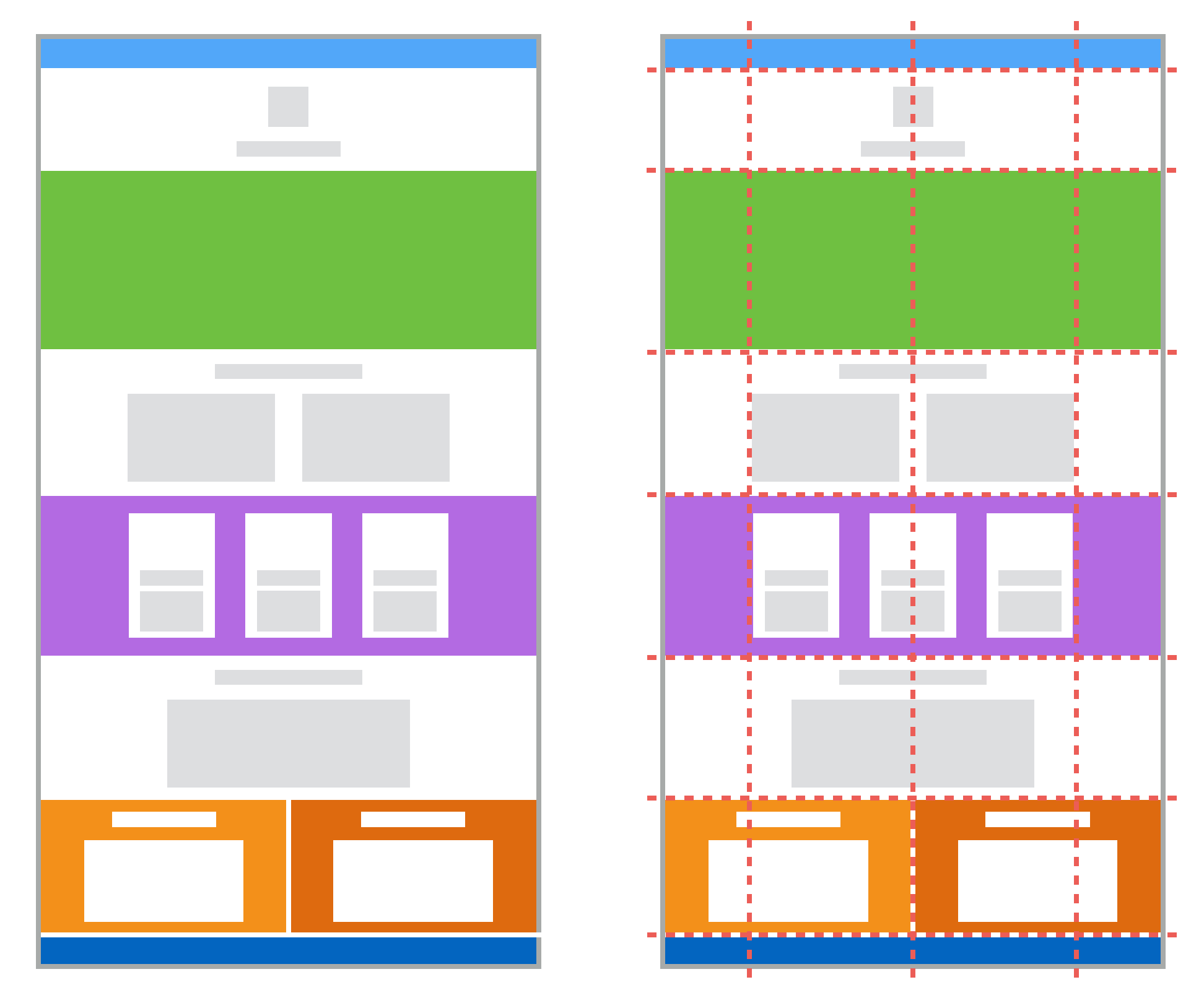
Defining a Grid
To get started with Grid, you first need to declare a grid container. This is done with a single line of CSS, which then allows you to define its structure. Let's watch a short video that introduces the fundamental concepts of grid lines, cells, and tracks, and shows how to define your first grid.
Learn CSS Grid - A 13 Minute Deep Dive
This video from the "Slaying The Dragon" channel is a quick and clear deep dive into CSS Grid. It will give you a solid visual foundation for the properties we're about to cover.
Watch the first segment from the beginning of the video. This will introduce you to the core terminology and show you how to set up a basic grid using grid-template-columns and grid-template-rows.
As you saw, the core of defining a grid lies in two properties:
display: grid;: This turns an element into a grid container.grid-template-columns: Defines the number and size of the columns.grid-template-rows: Defines the number and size of the rows.
For sizing, you can use familiar units like px or %, but Grid introduces a new, incredibly useful unit: the fractional unit (fr). The fr unit represents a fraction of the available space in the grid container. This is what allows for the creation of fluid, responsive layouts that adapt gracefully to different screen sizes.
Josh Comeau's interactive guide provides the best way to develop an intuition for how these properties work.
An Interactive Guide to CSS Grid
This guide lets you play with Grid properties in real-time. Experimenting with the interactive examples is the fastest way to understand their effect.
Read the section on Grid flow to see the effect of display: grid. Next, work through the section on Grid Construction. This is crucial. Pay close attention to the fr unit and play with the interactive demo comparing it to percentages. Read about Implicit and explicit rows to understand how Grid can automatically add rows. Finally, look at The repeat helper to learn the repeat() function, a convenient shorthand for defining many identical tracks.
Placing Items on the Grid
Once you've defined your grid structure, you can place child elements onto it. This is where CSS Grid truly shines and where a critical mental shift is required, especially coming from a design background.
Think in Lines, Not Columns
In Figma, you might think of an element as "spanning 3 columns." In CSS Grid, it's more precise: you place items by referencing the lines that make up the grid. A 3-column grid has 4 vertical lines. To make an item span all three columns, you tell it to start at line 1 and end at line 4.
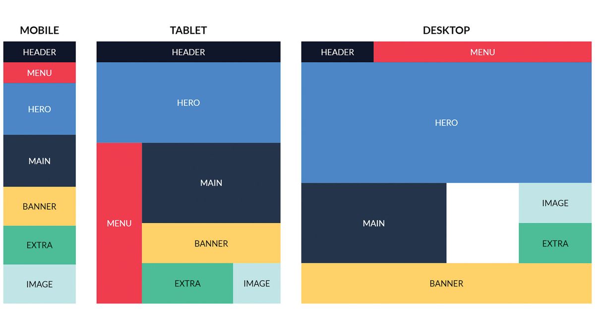
The article from UX Design CC has an excellent explanation for this.
Figma's new grid — you must understand CSS Grid as a ...
This section will help you make the crucial mental shift from thinking in columns to thinking in grid lines, which is key to mastering CSS Grid.
Read the two subsections Think in Grid Lines, Not Columns and A Powerful Coordinate System.
You place items using the grid-column and grid-row properties on the child elements.
.my-item {
  /* This makes the item start at column line 1 and end at column line 4, spanning 3 columns */
  grid-column: 1 / 4;

  /* This makes the item start at row line 2 and end at row line 3, occupying the second row */
  grid-row: 2 / 3;
}
You can also use the span keyword if you want an item to occupy a certain number of tracks without specifying the exact end line.
.my-item {
  /* This makes the item span 2 columns, wherever it happens to be placed */
  grid-column: span 2;
}
Let's see this in action.
Learn CSS Grid - A 13 Minute Deep Dive
Revisiting the "Slaying The Dragon" video, let's see a demonstration of placing and spanning items.
Watch the segment from positioning an item. He demonstrates how to use grid-row-start/end and the span keyword.
The Visual Way: grid-template-areas
While placing items by line number is powerful and precise, it can sometimes be hard to visualize the final layout just by reading the code. CSS Grid offers a wonderfully intuitive alternative: grid-template-areas.
This property allows you to name the different sections of your grid and create a visual representation of your layout directly in your CSS.
.container {
  display: grid;
  grid-template-columns: 1fr 3fr; /* A narrow sidebar and a wide main content area */
  grid-template-rows: auto 1fr auto; /* Header, main, footer */
  grid-template-areas:
    "header header"
    "sidebar main"
    "footer footer";
}
In the code above:
- We've created a 2x3 grid.
- The
grid-template-areasproperty "draws" the layout. Repeating a name (header,footer) makes that area span multiple columns. - Then, you simply assign each child element to its named area using the
grid-areaproperty:
.page-header {
  grid-area: header;
}
.page-sidebar {
  grid-area: sidebar;
}
/* and so on... */
This method is often much easier to understand and maintain for static page layouts.
Learn CSS Grid - A 13 Minute Deep Dive
The "Slaying The Dragon" video has a fantastic walkthrough of this technique.
Watch the segment on grid-template-areas. This will show you exactly how to define areas and assign items to them to build a full page layout.
Your Turn: Build a Classic Page Layout
Let's apply these concepts to build the classic "Holy Grail" layout: a header, a main content area with a sidebar, and a footer. We'll use grid-template-areas to make it easy.
-
Create an
index.htmlfile and astyle.cssfile. -
Paste this HTML into your
index.htmland link the stylesheet.<!DOCTYPE html> <html lang="en"> <head> <meta charset="UTF-8"> <meta name="viewport" content="width=device-width, initial-scale=1.0"> <title>CSS Grid Layout</title> <link rel="stylesheet" href="style.css"> </head> <body> <div class="grid-container"> <header class="header">Header</header> <aside class="sidebar">Sidebar</aside> <main class="main">Main Content</main> <footer class="footer">Footer</footer> </div> </body> </html> -
Add this starter CSS to your
style.cssfile. This adds some basic colors and styles so you can see the layout clearly.body { font-family: system-ui, sans-serif; margin: 0; color: white; text-align: center; } .grid-container { height: 100vh; /* Make the container fill the whole screen height */ /* --- YOUR GRID CODE GOES HERE --- */ } /* Helper styles for visualization */ .header { background-color: #2a9d8f; padding: 20px; } .sidebar { background-color: #e9c46a; padding: 20px; } .main { background-color: #f4a261; padding: 20px; } .footer { background-color: #e76f51; padding: 20px; } -
Your Task:
- In the
.grid-containerrule, add the necessary CSS properties to turn it into a grid. - Define the columns: a sidebar column that is
1frand a main content column that is3fr. - Define the rows: a header that is
60pxtall, a main content area that takes up the remaining space (1fr), and a footer that is60pxtall. - Use
grid-template-areasto define the layout visually. The header and footer should span both columns. - Assign each of the four elements (
.header,.sidebar,.main,.footer) to its correspondinggrid-area.
- In the
Click to see the solution
.grid-container {
    height: 100vh; /* Make the container fill the whole screen height */
    /* --- YOUR GRID CODE GOES HERE --- */
    display: grid;
    grid-template-columns: 1fr 3fr;
    grid-template-rows: 60px 1fr 60px;
    grid-template-areas:
        "header header"
        "sidebar main"
        "footer footer";
    gap: 10px; /* Optional: adds space between grid items */
}

.header { grid-area: header; }
.sidebar { grid-area: sidebar; }
.main { grid-area: main; }
.footer { grid-area: footer; }
With this code, you've created a fully realized page structure in just a few lines of declarative CSS, a task that was once notoriously difficult.
Conclusion
You have now learned the fundamentals of CSS Grid, the most powerful layout system available in CSS. You've seen how it differs from Flexbox and how it empowers you to create robust, two-dimensional page structures with clean and intuitive code.
Key Takeaways:
- CSS Grid is a two-dimensional layout system for creating page structures with rows and columns.
- Flexbox is for 1D, Grid is for 2D. Use Flexbox for components and content flow; use Grid for overall page scaffolding.
- Define your grid structure on a parent container using
display: grid,grid-template-columns, andgrid-template-rows. - The
frunit is essential for creating flexible, proportional tracks. - You can place items by referencing grid lines (
grid-column: 1 / 3;) or by using the highly visualgrid-template-areasmethod.
In our next lesson, we will shift our focus from structure to interactivity. You'll learn how to apply CSS transitions and hover effects to bring your static elements to life, adding a layer of polish and user feedback that is critical for great UX.