Welcome back! In our last lesson, we constructed the static skeleton of a webpage using CSS Grid, learning how to arrange elements in a two-dimensional structure. You now have the skills to build the "bookshelf" for your content. Today, we're going to make that bookshelf interactive.
This lesson is all about bringing your designs to life with CSS transitions and hover effects. From a UI/UX perspective, this is where you translate static mockups into dynamic, responsive interfaces. These small animations, or microinteractions, are crucial for providing user feedback, guiding attention, and creating a polished, professional feel. Your goal is to learn how to animate changes between element states smoothly, making your web pages feel responsive and alive.
From Static to Dynamic: The Role of Transitions
When a user interacts with an element, like hovering over a button, its appearance often changes. Without transitions, this change is instantaneous and can feel jarring. CSS transitions allow us to define how that change occurs over time, creating a smooth animation between the element's initial state and its new state.
Let's watch a quick introduction to see what this means in practice.
Animating with CSS Transitions - A look at the transition properties
Kevin Powell, a well-known CSS educator, provides a crystal-clear explanation of what transitions are and why they are fundamental for a better user experience.
Watch the very beginning of the video, from the start up to this point, to get a conceptual overview of how transitions bridge two states of an element.
The "two states" are key. For our purposes, the most common states are the default state and the :hover state.
- Default State: How the element looks normally.
:hoverState: How the element looks when the user's mouse pointer is over it.
To create a transition, you define the styles for both states and then tell the browser how to animate between them.
The Anatomy of a CSS Transition
The magic happens with the transition property. It's a shorthand that bundles several properties together, but the two most important are transition-property and transition-duration.
Let's explore this with an interactive guide that will form the foundation of our lesson.
An Interactive Guide to CSS Transitions
This guide by Josh W. Comeau is exceptionally well-made for visual learners. You can play with the code and see the results in real-time, which is the best way to build intuition.
Read the introduction and the section on The fundamentals. Pay close attention to the interactive example. Notice the difference between the button with and without the transition property.
As you saw, the basic syntax is transition: <property> <duration>;. For example, transition: background-color 300ms;.
A Critical Detail: Where to Place the transition Property
A common mistake is to place the transition property inside the :hover rule. This causes the animation to play when the user hovers on, but snap back instantly when they hover off. To ensure the animation is smooth in both directions, the transition property must be placed on the element's base style.
This short video clip explains this crucial point perfectly.
Learn CSS Animation In 15 Minutes
The "Web Dev Simplified" channel clearly demonstrates this common pitfall and why the correct placement matters.
Watch the segment from this point, where he moves the transition property from the hover state to the base class and explains the effect.
Performance Matters: Be Specific
You can transition multiple properties at once, like transition: transform 250ms, opacity 400ms;. You might be tempted to use the value all to animate any property that changes. However, this is generally a bad practice for performance.
Animating certain properties is much "cheaper" for the browser than others. The most performant properties to animate are transform and opacity because they can be handled by the computer's graphics processing unit (GPU), leading to buttery-smooth animations. Other properties, like width, height, or margin, require the browser to do more work (recalculating the layout), which can lead to "janky" or stuttering animations, especially on less powerful devices.
As a Design Engineer, optimizing for performance is part of the job. Being explicit about what you're transitioning is a key habit to build.
Animating with CSS Transitions - A look at the transition properties
Let's revisit Kevin Powell's video. He gives excellent advice on why you should avoid all and which properties are best for performance.
First, watch the segment on transition-property. He explains why it's better to be specific and list out the properties you want to animate. Then, jump to the end and watch his summary on performance. This reinforces the importance of using transform and opacity.
Controlling the "Feel": Timing Functions
Simply transitioning a property is only half the story. The feel of an animation is determined by its speed curve, or transition-timing-function. This is where your design sensibilities are essential. Do you want the motion to be constant? Should it start fast and slow down? Or should it have a bouncy, playful feel?
CSS provides several built-in timing functions:
linear: A constant speed. Often feels robotic.ease-in: Starts slow, then speeds up. Good for elements exiting the screen.ease-out: Starts fast, then slows down. Good for elements entering the screen.ease-in-out: Starts slow, speeds up in the middle, then ends slow. A good general-purpose choice.ease: The default. A slight ease-in, but mostly eases out. A very natural-feeling option.
The best way to understand these is to see them.
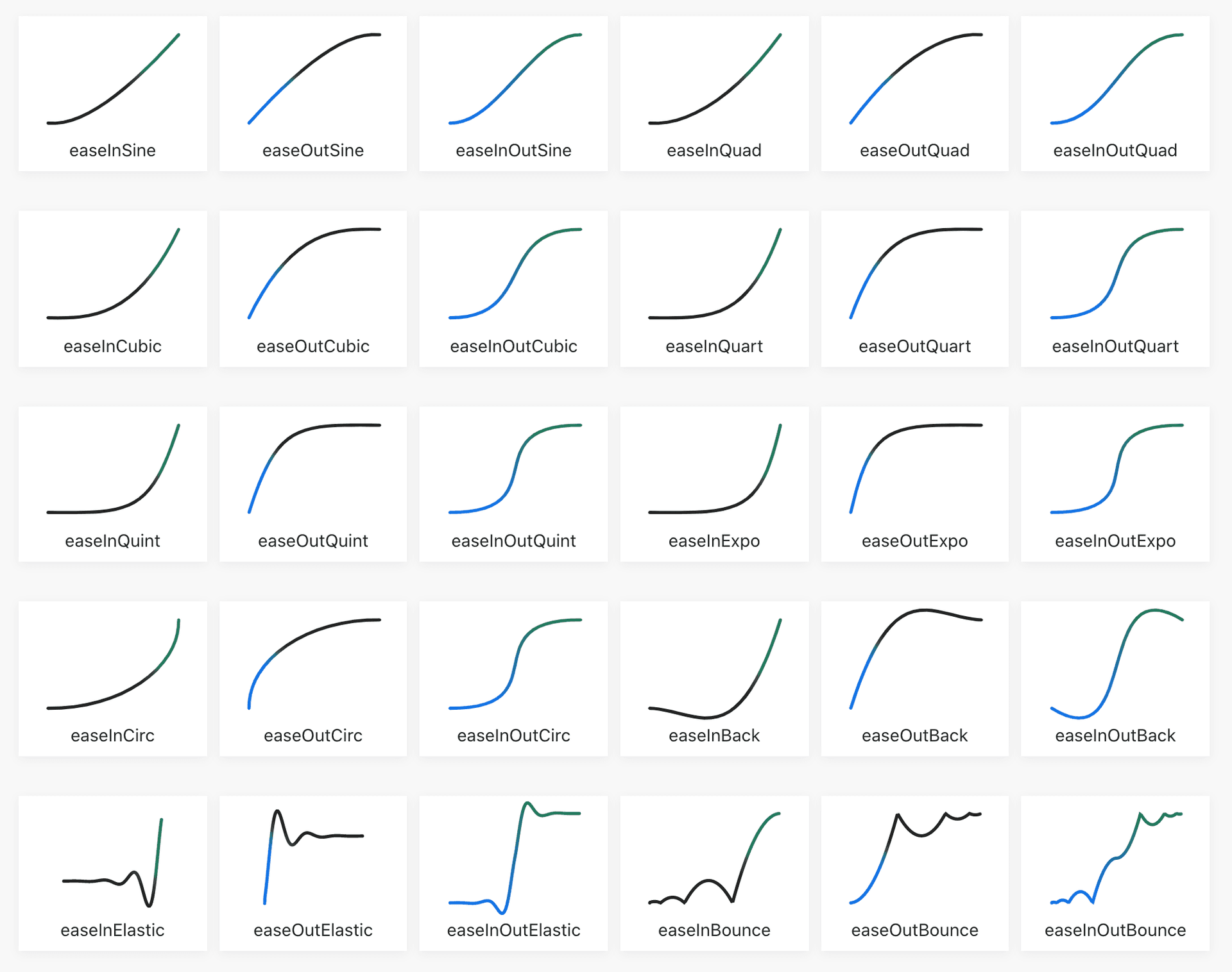
Now, let's play with them.
An Interactive Guide to CSS Transitions
We're back to Josh Comeau's guide. This next section has fantastic interactive visualizations for each timing function.
Read the sections on Timing functions and custom curves. For each timing function (ease-out, ease-in, etc.), make sure to drag the timeline scrubber back and forth to get a tangible sense of its motion curve. Notice the commentary on when to use each one.
For even more control, you can define your own curve using cubic-bezier(). This is analogous to adjusting animation curves in tools like Figma or After Effects. While you rarely write these by hand, browser developer tools have built-in editors that make it easy to create custom timings. This gives you ultimate expressive control over the feel of your animations.
User Experience and Accessibility Touches
Great microinteractions go beyond just :hover. They are thoughtful and inclusive.
Hover vs. Focus
Not all users navigate with a mouse. Keyboard users use the Tab key to move between interactive elements like links and buttons. The state when an element is selected via the keyboard is called :focus. It's crucial to provide a clear visual indicator for the focus state, just as you do for the hover state. Often, the styles can be the same.

You can apply styles to both states by chaining the pseudo-classes:
.my-button:hover,
.my-button:focus {
  background-color: blue;
  transform: translateY(-2px);
}
Advanced UX with Delays and Action-Driven Motion
Let's look at two final techniques that add a layer of sophistication to your interactions.
An Interactive Guide to CSS Transitions
The final section of this guide covers some brilliant, practical UX patterns.
Read the section titled UX touches. Pay close attention to these three ideas: Action-driven motion: Using different transition timings for mouse-enter vs. mouse-leave. Delays: Using transition-delay to solve common UI frustrations, like disappearing dropdown menus. Respecting motion preferences: Using @media (prefers-reduced-motion: reduce) to disable animations for users who find them problematic. This is a critical accessibility practice.
Your Turn: Animate Your Layout
It's time to apply what you've learned. We'll use the "Holy Grail" layout you built in the previous lesson.
-
Open the
index.htmlandstyle.cssfiles from the last exercise. -
If you don't have them, use this starter code. First, the HTML:
<!DOCTYPE html> <html lang="en"> <head> <meta charset="UTF-8"> <meta name="viewport" content="width=device-width, initial-scale=1.0"> <title>CSS Transitions</title> <link rel="stylesheet" href="style.css"> </head> <body> <div class="grid-container"> <header class="header"> <nav> <a href="#">Home</a> <a href="#">About</a> <a href="#">Contact</a> </nav> </header> <aside class="sidebar">Sidebar</aside> <main class="main">Main Content</main> <footer class="footer">Footer</footer> </div> </body> </html> -
And the CSS:
body { font-family: system-ui, sans-serif; margin: 0; color: white; text-align: center; } .grid-container { height: 100vh; display: grid; grid-template-columns: 1fr 3fr; grid-template-rows: 60px 1fr 60px; grid-template-areas: "header header" "sidebar main" "footer footer"; gap: 10px; } .header { grid-area: header; background-color: #2a9d8f; display: flex; align-items: center; justify-content: center; } .sidebar { grid-area: sidebar; background-color: #e9c46a; padding: 20px; } .main { grid-area: main; background-color: #f4a261; padding: 20px; } .footer { grid-area: footer; background-color: #e76f51; padding: 20px; } .header nav a { color: white; text-decoration: none; padding: 10px 15px; margin: 0 10px; border-radius: 4px; /* --- YOUR TRANSITION CODE GOES HERE --- */ } /* --- YOUR HOVER/FOCUS CODE GOES HERE --- */ -
Your Task:
- In the
/* --- YOUR HOVER/FOCUS CODE GOES HERE --- */section, add a rule that targets thenav aelements on both:hoverand:focus. - Inside this new rule, change the
background-colortorgba(0, 0, 0, 0.1)and add atransform: scale(1.1);. - Now, in the
.header nav arule, add thetransitionproperty. Animate bothbackground-colorandtransformover a duration of250ms. Use theeasetiming function. - Experiment! Change the duration and try different timing functions like
ease-in-outor even a customcubic-beziercurve you find online to see how it changes the feel.
- In the
Click to see the solution
/* In the .header nav a rule */
.header nav a {
    color: white;
    text-decoration: none;
    padding: 10px 15px;
    margin: 0 10px;
    border-radius: 4px;
    /* --- YOUR TRANSITION CODE GOES HERE --- */
    transition: transform 250ms ease, background-color 250ms ease;
}

/* --- YOUR HOVER/FOCUS CODE GOES HERE --- */
.header nav a:hover,
.header nav a:focus {
    background-color: rgba(0, 0, 0, 0.1);
    transform: scale(1.1);
}
Notice how a few lines of CSS add a satisfying layer of polish and interactivity to the previously static links.
Conclusion
You've now reached the end of our first module and have a solid foundation in HTML structure and CSS styling. You can build static layouts with Flexbox and Grid, and now you can bring them to life with transitions.
Key Takeaways:
- CSS transitions create smooth animations between an element's different states (e.g., default and
:hover). - The
transitionproperty should be applied to the base element, not the state, for animations to work in both directions. - For best performance, explicitly animate
transformandopacitywhenever possible. transition-timing-functionis a powerful design tool for controlling the feel of an animation.- Always consider accessibility by styling the
:focusstate and respectingprefers-reduced-motion.
This lesson concludes our work with "vanilla" CSS. In the next module, we'll make a significant leap in productivity by learning Tailwind CSS. It's a utility-first framework that allows you to style elements directly in your HTML. You'll find that implementing the hover effects we learned today becomes even faster, like class="... hover:scale-110 transition-transform". This will be our first major step towards the "Vibe Coding" workflow and building UIs at high speed.