Welcome to your fifth lesson! In our previous session, we established the fundamental concept of the CSS box model, understanding that every element on a page is a rectangular box defined by its content, padding, border, and margin. This gave you the vocabulary to control an element's size and its relationship to its neighbors—a direct parallel to the Auto Layout principles you use in Figma.
Now that we understand the "box," we will focus on styling what's inside and around it. Today, you will learn how to apply the core CSS properties for typography, colors, and spacing. These are the essential tools for translating a static design into a living, breathing webpage. As a UI/UX designer, you already think in terms of style guides that define color palettes and typographic scales. This lesson provides the code to implement those very systems.
Our goal is to master the CSS properties that bring a design's visual identity to life, from font choices and text layout to color schemes and the deliberate use of white space.
From Design System to CSS
In your design work, a style guide is the source of truth for a product's visual language. It specifies which fonts to use, at what sizes and weights, and which colors represent the brand.

Let's begin by learning the CSS properties that correspond directly to this typographic scale.
Typography: The Voice of the Interface
Typography is more than just text; it's the visual expression of the content's tone and hierarchy. CSS provides a powerful set of properties to control it. The Mozilla Developer Network (MDN) offers an excellent guide on this topic.
Fundamental text and font styling - Learn web development
This comprehensive guide from MDN covers the essential font and text properties. We'll break it down into specific sections.
First, read about the color property here. We'll cover color in more detail shortly, but it's often introduced alongside font properties. Next, focus on font-family. Read the section on font families. Pay close attention to the concepts of web-safe fonts and font stacks. A font stack (a list of fonts) is your safety net, ensuring the browser has fallback options if your preferred font isn't available. This is a crucial aspect of robust web design. Now, let's look at font-size. Read the section explaining font size units. As we've discussed, using rem units is the best practice for creating scalable and accessible interfaces, as it respects the user's default browser font size. Finally, read about the properties that control emphasis in the section on font style and weight. These properties, like font-weight (e.g., 400 for regular, 700 for bold) and font-style (italic), directly map to the font variations you select in Figma.
Color: Setting the Mood
Color is fundamental to visual identity. In CSS, you can apply color to an element's text and its background.
color: Sets the color of the text (and other foreground elements like underlines).background-color: Sets the background color of the element, which fills the area defined by its content and padding.
As a designer, you're used to working with specific color codes. CSS supports several formats you'll recognize from Figma's Dev Mode.
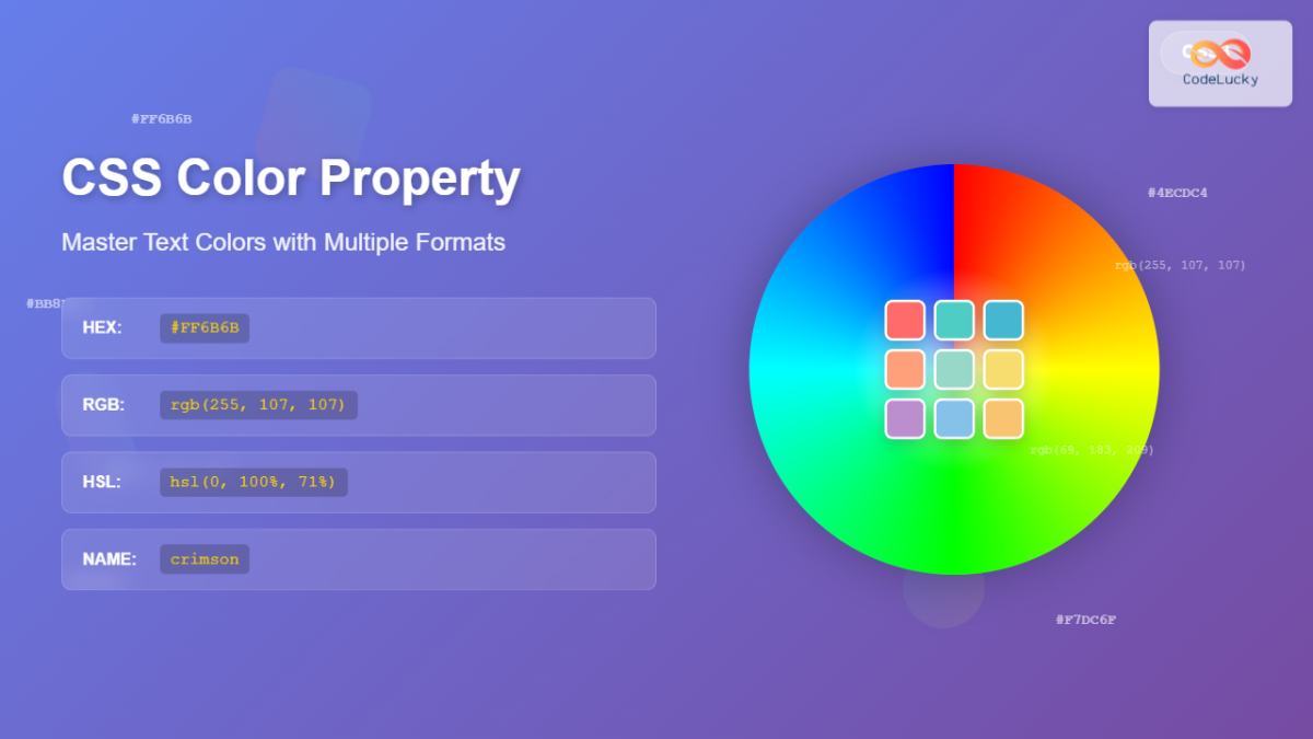
Here’s how you’d use them:
/* Using a named color */
h1 {
  color: crimson;
}

/* Using a HEX code (most common for web) */
p {
  color: #333333;
}

/* Using an RGB value */
.card {
  background-color: rgb(240, 248, 255);
}
The HEX format is the most ubiquitous for defining specific brand colors, as it's concise and universally supported.
Spacing: Creating Rhythm and Clarity
In the last lesson, we introduced the box model, which consists of margin (outside the border) and padding (inside the border). These two properties are your primary tools for implementing spacing.
A helpful way to think about them is:
- Padding is internal spacing. It creates breathing room inside an element, between its content and its border. It's part of the element itself, so it takes on the element's
background-color. - Margin is external spacing. It pushes other elements away, creating space between components. It is always transparent.
This distinction is precisely how Auto Layout works in Figma. The padding you set on a frame is padding, and the "space between" items is margin.
The short video from Web Dev Simplified that we saw in the last lesson gives a quick visual refresher on this.
Learn CSS Box Model In 8 Minutes
Let's quickly review how padding and margin work visually.
Watch this segment on padding to see how it adds space inside the element's background. Then, watch this part on margin to see how it creates space outside the element to push others away.
This concept is so important for translating designs that it's worth reading a quick article that approaches it from a designer's perspective.
How CSS Spacing Works – A Guide for Web Developers
This freeCodeCamp article explains the why behind spacing from a usability and aesthetic viewpoint, which will resonate with your design background.
Read the first three sections of the article: What is CSS Spacing? Importance of CSS Spacing Types of CSS Spacing Focus on the table that contrasts Padding (Internal Spacing) and Margin (External Spacing). This reinforces the core difference between them.
Text Layout: Spacing Within Text
Beyond the space around elements, CSS also lets you control the spacing within blocks of text, which is critical for readability.
Let's return to the MDN article to cover these final properties.
Fundamental text and font styling - Learn web development
This final reading covers properties for text alignment and the vertical and horizontal rhythm of your text.
First, read about text-align, which controls the horizontal alignment of text within its box. Find the section here. Next, read the section on line-height. This is one of the most important properties for readability. As the article notes, using a unitless value (like 1.6) is the recommended best practice. Read about it here. Finally, review letter-spacing and word-spacing. These are the direct code equivalents of the character and word spacing adjustments you make in Figma. Read the short section here.
For a different perspective, the following video tutorial provides a practical demonstration of all these properties.
CSS Text and Fonts Tutorial for Beginners - Typography
This video by Dave Gray walks through applying many of the text and spacing properties we've just discussed.
Watch from this point to see a demonstration of text-transform, text-align, and text-indent. Then, watch the section from this timestamp where he explains line-height, letter-spacing, and word-spacing, emphasizing how line-height improves readability.
Your Turn: Style a Product Card
Let's apply these concepts to a simple component. Here is the HTML for a basic product card.
-
Create an
index.htmlfile and astyle.cssfile in a new folder. -
Paste this HTML into
index.htmland make sure to link your stylesheet.<!DOCTYPE html> <html lang="en"> <head> <meta charset="UTF-8"> <meta name="viewport" content="width=device-width, initial-scale=1.0"> <title>Styled Card</title> <link rel="stylesheet" href="style.css"> </head> <body> <div class="card"> <h2 class="card-title">Ergonomic Keyboard</h2> <p class="card-description">A high-quality mechanical keyboard designed for comfort and productivity. Perfect for developers and writers.</p> <p class="card-price">$129.99</p> <button class="card-button">Add to Cart</button> </div> </body> </html> -
Now, in your
style.cssfile, add the following CSS. Your task is to fill in the missing values to style the card. Try to achieve a clean, modern look. Experiment with different values./* A universal reset for a more predictable box model */ *, *::before, *::after { box-sizing: border-box; margin: 0; padding: 0; } body { font-family: /* Add a font stack, e.g., "Helvetica", sans-serif */ ; background-color: /* A light gray color, e.g., #f4f4f9 */ ; display: grid; place-content: center; min-height: 100vh; } .card { width: 320px; padding: /* Add some internal spacing, e.g., 24px */ ; background-color: /* A white color */ ; border-radius: 8px; /* This property rounds the corners! */ box-shadow: 0 4px 12px rgba(0,0,0,0.1); /* A subtle shadow */ } .card-title { font-size: /* e.g., 1.5rem */ ; font-weight: /* e.g., 700 (bold) */ ; color: /* A dark text color, e.g., #1a1b26 */ ; margin-bottom: /* Space below the title, e.g., 8px */ ; } .card-description { font-size: /* e.g., 1rem */ ; line-height: /* A readable value, e.g., 1.6 */ ; color: /* A medium gray text color, e.g., #4a4b57 */ ; margin-bottom: /* Space below the description, e.g., 16px */ ; } .card-price { font-size: /* e.g., 1.25rem */ ; font-weight: /* e.g., 600 (semi-bold) */ ; color: /* A primary brand color, e.g., #4CAF50 */ ; margin-bottom: /* Space below the price, e.g., 24px */ ; } .card-button { width: 100%; padding: /* Internal spacing for the button, e.g., 12px */ ; font-size: /* e.g., 1rem */ ; font-weight: /* e.g., 700 (bold) */ ; color: /* A white color */ ; background-color: /* The same primary brand color as the price */ ; border: none; border-radius: 4px; cursor: pointer; /* Changes the mouse to a pointer on hover */ } -
Open
index.htmlin your browser to see your styled card. Tweak the values until you are happy with the result.
Conclusion
You have now learned the fundamental CSS properties for implementing the visual layer of a design. You can control not just the shape of the boxes on your page, but also their color, the appearance of the text inside them, and the rhythm of the space between them. This is a massive step towards being able to translate any Figma design into code.
Key Takeaways:
- Typography is controlled with
font-family,font-size,font-weight,font-style,line-height, andletter-spacing. - Color is applied using the
color(for text) andbackground-colorproperties, with HEX codes (#RRGGBB) being the most common format. - Spacing is managed with
marginfor external space (between elements) andpaddingfor internal space (inside an element). - These CSS properties directly map to the specifications found in a design system's style guide.
In our next lesson, we will move from styling individual elements to arranging them in powerful, responsive layouts. We'll start with CSS Flexbox, a layout model designed for building flexible one-dimensional layouts, like navigation bars and rows of cards.