Welcome to our fourth lesson. In the last session, you built the complete HTML structure for a contact form, learning how to capture user input. While that structure is functional, it has no visual design. This is where we begin our journey into CSS (Cascading Style Sheets), the language used to style web pages.
Today, we'll explore the single most important concept in CSS layout: the box model. This principle governs the size and spacing of every element on a page. For you, as a UI/UX designer, this is the bridge between your work in Figma and its implementation in code. In Figma, you intuitively use Auto Layout to control padding, margins (as space between items), and container sizes. The CSS box model is the browser's fundamental version of that same logic. Understanding it is the key to translating your designs into predictable, pixel-perfect code.
Our goal is to identify how the four components of the box model—content, padding, border, and margin—work together to determine an element's final size and position on the page.
Everything is a Box
The most critical mental model to adopt when moving from design to web development is that everything on a web page is a box. Every paragraph, every button, every image exists inside a rectangular container. These boxes can contain other boxes, and they have rules about how they size themselves and interact with their neighbors.
This idea should feel familiar. An article by designer-developer Anirudh on his blog FourZeroThree explains this concept perfectly for designers transitioning to code.
Auto-layout isn't broken. Your mental model is!
This article directly connects the "box" concept to design tool thinking.
Please read the first section, Part 1: Think in terms of “boxes”. Notice how it describes boxes stacking, nesting, and having space between them—exactly what you manage with Auto Layout.
The Four Layers of the Box Model
Every one of these boxes is composed of four distinct areas, layered like an onion, from the inside out.
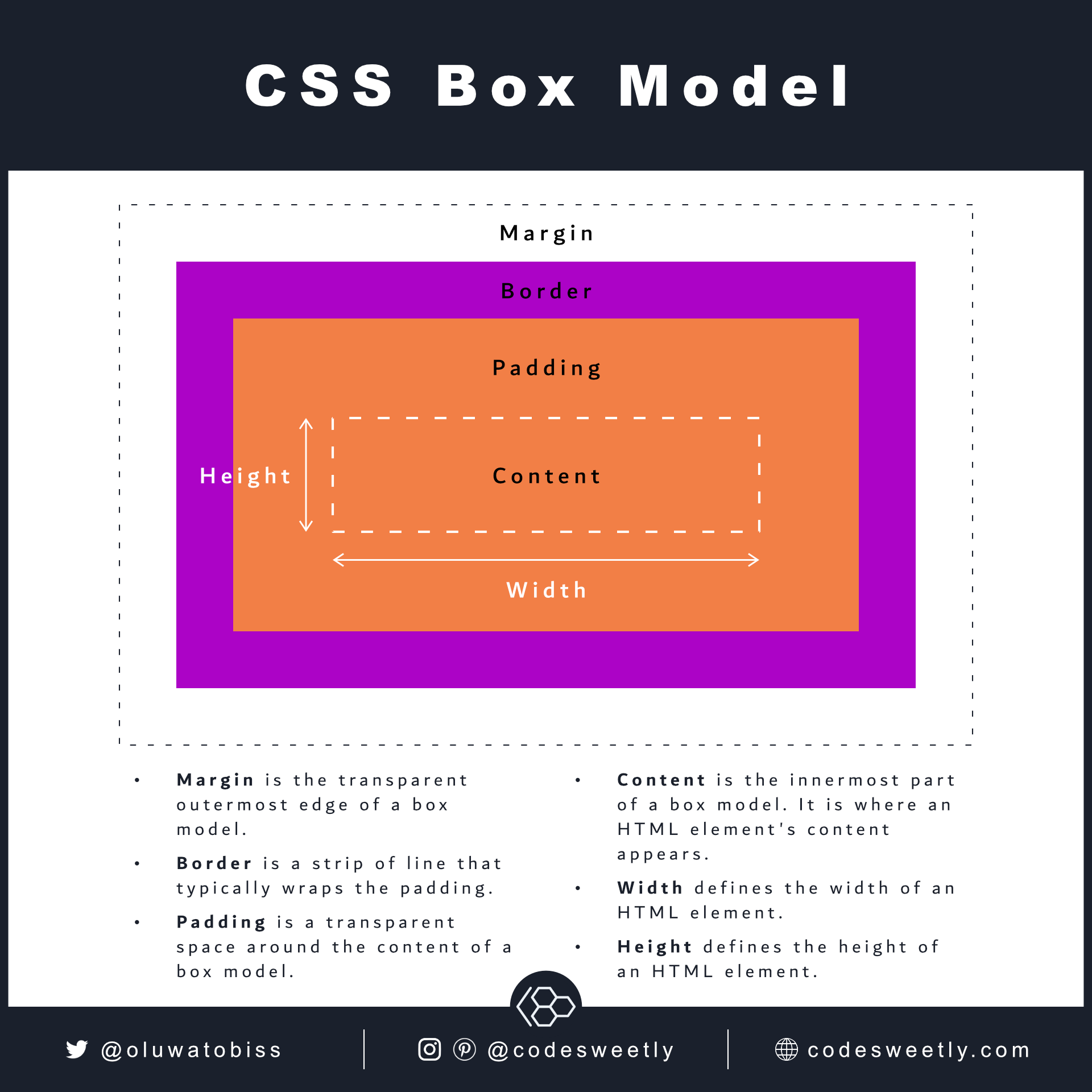
Let's break down each layer:
- Content: This is the innermost area, where your actual content—text, an image, or other HTML elements—resides. The size of this box is either determined by the content itself (intrinsic sizing) or set explicitly with
widthandheightproperties. - Padding: This is a transparent space inside the box, surrounding the content. It pushes the content away from the border. The background color or image of the element will be visible through the padding. Think of it as the matting inside a picture frame.
- Border: A line drawn around the padding and content. The border has a style (like
solidordotted), a width, and a color. It's the picture frame itself. - Margin: This is a transparent space outside the border. Its job is to push other elements away. It creates the "space between" items you're familiar with in Figma.
The following video from Kevin Powell, a well-known CSS educator, provides a clear, practical demonstration of each of these properties.
HTML & CSS for Beginners Part 12: The CSS Box Model - Margin, Borders & Padding explained
This video walks through margin, border, and padding one by one, making their distinct roles very clear.
Watch the explanation of margin from the beginning, where he shows how it creates invisible space to push elements away. Next, watch the segment on the border from the start of the border section. He explains the three properties of a border: width, style, and color. Finally, watch the explanation of padding from the start of the padding section. Pay close attention to how he contrasts it with margin: padding is space with the background color, inside the element.
The Problem: How Total Size is Calculated
This is where things get tricky, and where most beginners get confused. By default, when you set a width and height for an element in CSS, those dimensions apply only to the content box. The padding and border are then added on top of that width.
Let's say you have this CSS:
.my-box {
  width: 200px;
  padding: 20px;
  border: 10px solid black;
}
You might expect the box to be 200px wide. However, the browser calculates the total visible width like this:
Total Width = width (200px) + left padding (20px) + right padding (20px) + left border (10px) + right border (10px) = 260px
This behavior, known as content-box sizing, is often unintuitive, especially for designers who expect an element's width to be the final width they see on the screen.
The "Box Model" lesson on web.dev explains this common pitfall very well.
This resource from Google's web development team clarifies the default sizing behavior and introduces its more intuitive alternative.
First, read the introduction here to see a code example of this exact problem. Then, scroll down to the section "Control the box model" and read the part that explains the default content-box behavior, including the interactive quiz question: default box sizing.
The Solution: box-sizing: border-box
Fortunately, CSS provides a much more intuitive way to handle sizing: box-sizing: border-box.
When you apply this property to an element, the width and height you set now define the total visible width of the box, including the padding and border. The padding and border no longer expand the box; instead, they push the content inward.
With border-box, our previous example now works as you'd expect:
.my-box {
  box-sizing: border-box; /* The magic property! */
  width: 200px;
  padding: 20px;
  border: 10px solid black;
}
The total visible width of this element is now exactly 200px. The content area automatically shrinks to accommodate the 20px of padding and 10px of border on each side.
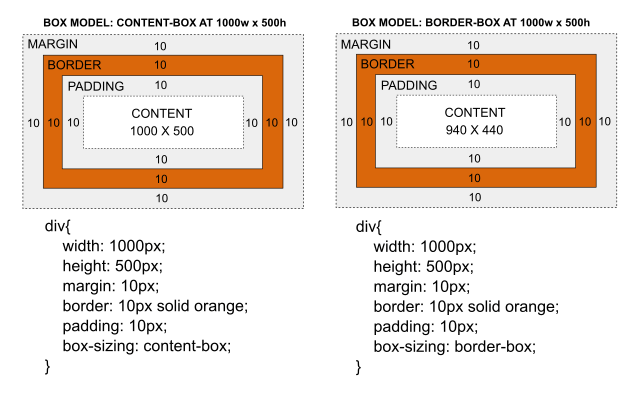
This border-box model is so much more predictable that it has become a web development standard. The following video from Web Dev Simplified explains why it's recommended to apply it to every element on your page.
Learn CSS Box Model In 8 Minutes
This video quickly demonstrates the sizing problem and presents border-box as the modern, standard solution.
Watch the segment from the discussion on total size calculation to see how border-box works. The instructor highlights that this makes the width and height you set become the actual dimensions of the element. He then mentions a common practice at the end of the video of applying this to all elements.
Most modern projects start with this small CSS snippet to ensure all elements use this more logical box model:
*,
*::before,
*::after {
  box-sizing: border-box;
}
The asterisk * is a universal selector that targets every element. This is a crucial piece of setup for any project you build.
Your Turn: Inspect the Box Model
The best way to see the box model in action is with your browser's developer tools. Let's apply what you've learned to the simple form structure from our last lesson.
- Create a simple
index.htmlfile and astyle.cssfile. - In
index.html, add the HTML for a simple text input and label. Don't forget to link your stylesheet in the<head>.<!DOCTYPE html> <html lang="en"> <head> <meta charset="UTF-8"> <meta name="viewport" content="width=device-width, initial-scale=1.0"> <title>Box Model Test</title> <link rel="stylesheet" href="style.css"> </head> <body> <label for="name">Name</label> <input type="text" id="name" class="my-input"> </body> </html> - In
style.css, add theborder-boxreset and some styles to the.my-inputclass.*, *::before, *::after { box-sizing: border-box; } .my-input { width: 300px; padding: 10px; border: 2px solid #666; margin: 20px; background-color: #f0f0f0; } - Open
index.htmlin your browser. Right-click on the input field and choose "Inspect". - In the Developer Tools panel that appears, find the "Computed" tab on the right side. You should see a diagram just like the one we saw earlier.
- Hover over the different parts of the diagram (margin, border, padding, content). Watch how the browser highlights these distinct areas on the page.
- Change the
width,padding,border, andmarginvalues in thestyle.cssfile, save, and refresh the browser. Observe how the diagram and the element's appearance change, but its totalwidthremains300pxbecause ofborder-box.
Conclusion
You have now grasped the foundational principle of CSS layout. This is a huge milestone. By understanding that every element is a box composed of content, padding, border, and margin, you've unlocked the ability to control size and space on a web page. Most importantly, you've learned to use box-sizing: border-box to make this control intuitive and predictable—aligning the way the browser works with the way you think as a designer.
Key Takeaways:
- Everything in CSS is a box with four layers: content, padding (space inside), border (a frame), and margin (space outside).
- The default
box-sizing: content-boxadds padding and border to an element's specified width, which can be confusing. - Using
box-sizing: border-boxis the modern standard. It includes padding and border within the element's specified width, making layouts behave as expected. - This box model directly corresponds to the layout and spacing controls you use in Figma's Auto Layout.
In our next lesson, we'll continue styling our elements. Now that we understand the "box," we will focus on what goes inside it and how it looks, covering fundamental CSS properties for typography (fonts, text sizes) and colors.