Welcome back! In our previous lesson, you mastered the art of manually translating a Figma design into a responsive, mobile-first component with Tailwind CSS. You learned to think like a developer, deconstructing a design into its core layout, spacing, and typography rules.
Today, we transition from being the builder to being the architect. This lesson marks your official entry into "Vibe Coding." You will learn how to take that same design analysis and craft structured, effective prompts for an AI coding assistant like Cursor. Your goal is no longer to write every line of code but to provide such a clear and comprehensive brief that the AI can generate high-quality code for you. This is where your deep expertise in UI/UX becomes your primary tool for front-end development.
By the end of this lesson, you will be able to write and iterate on prompts that combine precise design descriptions with crucial user experience considerations, moving you from simply using AI to actively supervising it.
The Art of the Prompt: From Vague Wish to Specific Command
Imagine asking a junior designer to "create a nice logo." You'd likely get something generic that doesn't align with your vision. You would never do that; instead, you'd provide a detailed creative brief outlining the brand, target audience, desired mood, and technical constraints.
Communicating with an AI is no different. A vague prompt like "create a product card" will yield generic, often unusable code. A great prompt is a great brief.
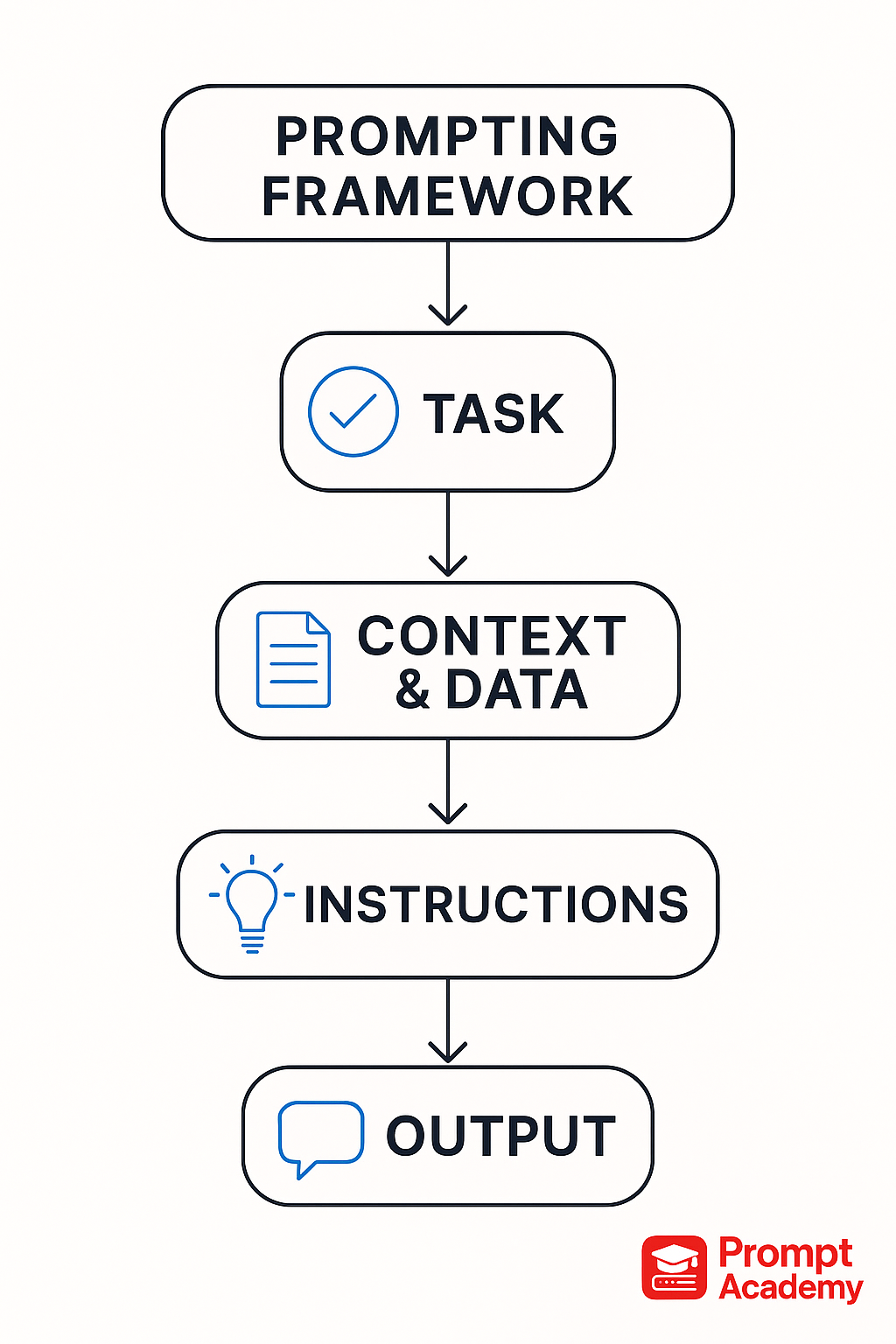
The difference between a frustrating experience and a productive one lies in the quality of your prompt. Let's examine what makes a prompt effective.
AI UI Prompts: 300+ Templates That Actually Work (2026) - 0xminds
This guide from 0xminds breaks down the essential components of a successful UI prompt and highlights common mistakes. It provides an excellent foundation for thinking about how to structure your requests to an AI.
First, read the section The Anatomy of a Good AI Prompt. It introduces a five-element formula that should feel very familiar from your design work. Then, jump to the end and read the section on Common Mistakes to Avoid. This will help you proactively avoid the pitfalls that frustrate many new vibe coders.
The key takeaway is that specificity is king. Vague aesthetic terms like "modern" or "clean" are useless. Instead, you must provide concrete details about layout, color, typography, and states—the very details you meticulously define in your Figma files.
A Structured Framework for Professional Prompts
To ensure you provide all the necessary details, it's best to follow a structured format. Think of this as your template for creating a "design brief" for your AI assistant. While the five elements from the previous article are a great start, we can organize them into a more professional, layered structure.
Vibe Coding: Best Practices for Prompting
This Supabase article introduces a powerful "three-layer" prompt structure that separates technical requirements from functional needs and edge cases. This is a professional-grade approach to AI supervision.
Start by reading about the three-layer structure. Notice how it forces you to think about not just the "what" but also the "how" and "what if." Then, review the UI component template, which provides a fill-in-the-blanks model for this structure. Finally, read the short section Why context matters to understand why this structured approach is non-negotiable for producing production-ready code.
Let's synthesize these ideas into a single, powerful framework you can use for every component you build. A great prompt combines your design specs with your UX thinking.
The Vibe Coding Prompt Framework:
-
Goal: A clear, one-sentence statement of what you want to build.
- Example: "Create a responsive hero section for a SaaS marketing website."
-
Technical Context & Constraints: The "how-to" for the AI.
- Framework/Language: HTML, Tailwind CSS, React, etc.
- Styling: Utility classes, mobile-first approach.
- Libraries: Any specific icon or component libraries to use (e.g., shadcn/ui, Lucide Icons).
-
Functional & Visual Requirements (The Design Spec): This is where you translate your Figma design into words.
- Layout: Describe the structure (e.g., "split-screen," "three-column grid").
- Responsiveness: Explicitly state how the layout changes at different breakpoints (e.g., "stacks to a single column on mobile," "grid changes from 2 to 3 columns at the
lgbreakpoint"). - Visuals: Specify colors (using hex codes), typography (font sizes, weights), spacing (padding, margins, gaps), and other visual elements like border radius and shadows.
- Content: Provide the actual text for headlines, buttons, and labels. Using realistic content leads to a much better final product than "lorem ipsum."
-
UX Requirements & Edge Cases (The User-Centric Layer): This is your superpower as a UI/UX designer.
- Interactions: Describe hover, focus, and active states.
- States: Explicitly request loading states (skeletons), empty states (for lists), success states (toasts), and error states (inline messages).
- Accessibility (A11y): Ask for
aria-labels, keyboard navigability, and proper semantic HTML. - Animations: Request subtle transitions and micro-interactions.
By following this structure, you leave no room for ambiguity. You are guiding the AI with the full force of your design and product thinking.
From Design File to Live Code: A Practical Workflow
Let's watch how this process looks in a real-world scenario. The following video demonstrates a powerful workflow where a developer takes a visual design, uses an AI to analyze it and create a structured "design brief," and then feeds that brief into Cursor to generate the final code.
Vibe coding beautiful UIs in 3 simple steps
In "Vibe coding beautiful UIs in 3 simple steps," you'll see a complete design-to-code workflow driven by structured prompts.
Watch these key segments: First, observe how a design is chosen and prepared for the AI in the section from preparing the design to generating the brief. Notice the specific prompt structure used to create a JSONC design brief. This is one way of creating the "Design Spec" layer of our prompt. Next, see how this brief is fed into Cursor to generate the final UI. The result is remarkably close to the original design because the context provided was so detailed. Finally, pay close attention to the "secret" revealed at the end. The developer wasn't starting from a blank file. He was working within a pre-configured project with Tailwind and other tools already set up. This is a crucial insight for getting high-quality results.
This workflow reinforces our main principle: the quality of your output is directly proportional to the quality of your input context.
Your Turn: Write Your First Vibe Coding Prompt
Now it's time to apply what you've learned. Let's return to the responsive product card component from our last lesson. Your task is to write a complete, structured prompt for Cursor that would generate the HTML and Tailwind CSS for it.
Here are the specs from last time:
- On Mobile (default): Vertical stack, image on top, text content below.
- On Tablet (
mdbreakpoint and up): Horizontal row, image on the left (1/3 width), text on the right (2/3 width). - Visuals: Specific typography, colors, and adaptive rounded corners for the image.
Your Task:
Using the Vibe Coding Prompt Framework, write a detailed prompt in a text editor. Think carefully about each section: the goal, the technical context, the detailed visual requirements, and the crucial UX considerations. Don't forget to ask for a hover effect!
Once you've written your prompt, compare it to the example below.
Click to see an example prompt
**Goal:**
Create a responsive product card component using HTML and Tailwind CSS.

**1. Technical Context & Constraints:**
- The component should be built with semantic HTML5 and styled using Tailwind CSS utility classes.
- Follow a mobile-first responsive methodology.

**2. Functional & Visual Requirements (The Design Spec):**
- The card should have a white background, a light gray border, and a medium shadow (`shadow-md`).
- **Layout (Mobile - default):** The component should be a single vertical column (`flex-col`). The image appears at the top, and the text content appears below it. Maximum width should be `max-w-sm`.
- **Layout (Tablet - `md:` breakpoint and up):** The component should switch to a horizontal row (`md:flex-row`). The image should be on the left, taking up 1/3 of the container width (`md:w-1/3`). The text content should be on the right, taking up 2/3 of the width (`md:w-2/3`). The max-width should increase to `md:max-w-2xl`.
- **Image:** The image `src` is `https://images.unsplash.com/photo-1555982105-d25af4182e4e`.
  - On mobile, the top-left and top-right corners should be rounded (`rounded-t-lg`).
  - At the `md` breakpoint, the rounding should switch to the top-left and bottom-left corners (`md:rounded-l-lg`), and the top rounding should be removed (`md:rounded-t-none`).
- **Text Content:**
  - **Container:** The text content area should have `p-5`.
  - **Title:** The text is "High-Performance Laptop." It should be `text-2xl`, `font-bold`, and tracking-tight. On `md` screens, it should grow to `text-3xl`.
  - **Description:** The text is "Built for designers and developers...". It should be `font-normal` and `text-gray-700`.
  - **Price:** The text is "$1,999." It should be `text-xl`, `font-semibold`, and `text-green-600`. It should be pushed to the bottom of the card content area on mobile.

**3. UX Requirements & Edge Cases:**
- **Interaction:** On hover, the card should have a subtle lift effect (e.g., a slightly larger shadow or a `translate-y` transform) to indicate it is an interactive element. Use a smooth transition for this effect.
- **Accessibility:** Ensure the image has an `alt` attribute: "A laptop on a desk".
Iterate, Don't Dictate
Even with a perfect prompt, the first result from the AI might not be exactly what you want. This is where supervision comes in. The process is a conversation. You provide a prompt, review the output, and then provide follow-up instructions to refine it.
For example, after Cursor generates the card, you could ask:
- "The shadow on hover is too strong. Make it more subtle."
- "Add a 'Add to Cart' button below the price."
- "Refactor this to use a
figuretag for the image and afigcaptionfor the text content for better semantics." - "What edge cases have we missed here? What if the description text is very long?"
This iterative loop of Prompt → Review → Refine is the core skill of Vibe Coding.
Conclusion
You've now taken your first and most important step into supervising AI. You've learned that effective prompting isn't about magic keywords; it's about providing structured, detailed, and context-rich instructions—a skill you've already honed as a UI/UX designer.
Key Takeaways:
- Structure is Key: A well-structured prompt with clear layers for technical, functional, and UX requirements yields the best results.
- Translate Your Expertise: Your ability to deconstruct a design and consider the user experience is your primary asset when prompting an AI.
- Be Explicit: Never assume the AI knows what you mean. Specify everything from hex codes and font weights to responsive behavior and accessibility needs.
- Iterate and Refine: Vibe Coding is a conversation. Use follow-up prompts to review, critique, and improve the AI-generated code.
In our next lesson, we'll dive deeper into the "Review" part of this cycle. You'll learn how to systematically analyze AI-generated code, compare it against a Figma file for visual accuracy, and identify responsiveness issues, preparing you to give even more precise feedback for refinement.