Welcome back! In our last lesson, we explored the mechanics of responsive design in Tailwind CSS, focusing on its mobile-first philosophy and how to use breakpoint prefixes like md: and lg:. You learned how to change styles based on screen size, which is the foundational "how" of building adaptive layouts.
Today, we connect that technical skill directly to your expertise as a UI/UX designer. This lesson is all about the "what" and "why." We will walk through the complete process of translating a UI component from a Figma design into a fully responsive, mobile-first component using Tailwind CSS. This is the core workflow of a Design Engineer.
By the end of this session, you'll be able to deconstruct a design, identify its responsive rules, and implement them systematically in code. This process is not just for manual coding; it's the exact blueprint you'll need to write effective prompts and confidently supervise AI tools like Cursor.
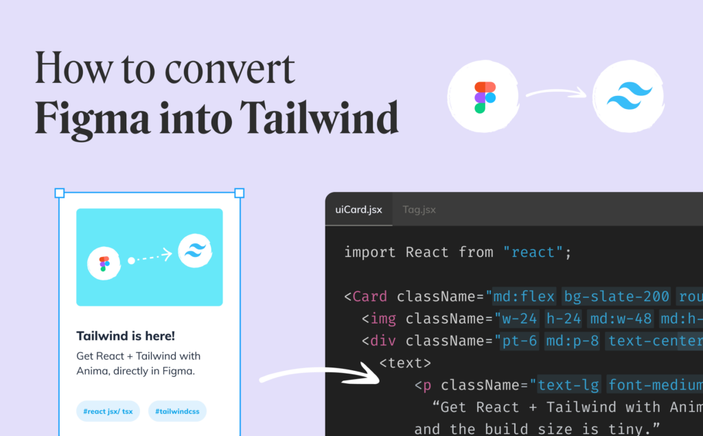
The Design Engineer's First Step: Deconstructing the Design
Before writing a single line of code, a Design Engineer puts on their designer hat. The process starts by analyzing the Figma file to understand its structure, spacing, and, most importantly, its responsive behavior. You're essentially creating a specification sheet that you (or an AI) will follow.
Let's watch a video where a professional developer, Lee Robinson, does exactly this. He starts his project not in a code editor, but in Figma, analyzing an existing design to inform his own.
From Figma to Tailwind CSS (Design Process + Code)
In this video, "From Figma to Tailwind CSS," Lee Robinson demonstrates the full design-to-code process. We'll focus on the initial design analysis phase.
Watch the segment from the beginning until he finishes his analysis. As you watch, notice how he: Identifies what he likes and dislikes in the existing mobile and desktop designs. Pulls out specific UI patterns, like the use of color and visual indicators (W for win). Thinks about information hierarchy—what's most important for the user to see? Uses this analysis to form a clear idea of what he wants to build.
This analytical process is your home turf. When you look at a Figma design, you should be asking:
- Layout & Structure: Is it a vertical stack? A horizontal row? A grid? How does that change at different breakpoints? This is your Figma Auto Layout thinking.
- Spacing: What are the padding values inside the component and the margin values between elements? This relates directly to Tailwind's spacing scale (
p-4,m-6,gap-8). - Typography: What are the font sizes, weights, and colors for headings and body text? (
text-2xl,font-semibold,text-slate-700). - Responsive Rules: At what width does the layout fundamentally change? This is where you map your Figma frames (e.g., a 390px mobile frame and a 768px tablet frame) to Tailwind's breakpoints.

From Analysis to Implementation: Mobile-First in Action
Once you've deconstructed the design, you have a clear plan. The implementation follows the mobile-first principle we discussed:
- Write the base HTML structure.
- Apply the mobile styles first. These are the un-prefixed utility classes that define the look on the smallest screens.
- Add the responsive overrides. Layer on the prefixed classes (
md:,lg:, etc.) to adjust the layout for larger screens, just as you defined in your analysis.
The most common pattern you'll implement is changing a layout from a vertical stack on mobile to a horizontal row on tablets or desktops. Let's see this in action.
How to Create Responsive Websites (TailwindCSS)
This video, "How to Create Responsive Websites," provides concise examples of the most common responsive patterns.
First, watch the demonstration of converting a Flexbox row to a column. The instructor uses flex-col as the default (mobile) and md:flex-row as the override for medium screens and up. Next, see how this applies to a grid layout. He changes the number of columns from grid-cols-2 on mobile to md:grid-cols-3 and lg:grid-cols-4 for larger screens.
This default-class + breakpoint:override-class pattern is the bread and butter of responsive development with Tailwind.
A Complete Walkthrough: Figma to a Coded Component
Now, let's tie it all together by watching the core of Lee Robinson's video, where he translates his Figma design into a real component.
From Figma to Tailwind CSS (Design Process + Code)
We'll now see the "implementation" part of the process. Lee takes a single row from his sports schedule design and builds it from scratch using Tailwind utilities.
Watch this critical section from start to finish. Pay close attention to how his thought process mirrors the design deconstruction: He starts with the overall container and makes it a flex box with justify-between. He builds the left side (logo and team name), applying spacing (ml-4), font weight (font-semibold), and image sizing. He builds the right side (score and win/loss), again using Flexbox and text utilities. He constantly references the mental model from his Figma design, even mentioning how Tailwind's spacing system (ml-2 = 8px) helps maintain the design grid.
Watching this process shows that building with Tailwind isn't about memorizing random class names. It's about systematically applying design decisions—layout, spacing, typography—that you're already intimately familiar with from your work in Figma.
Your Turn: Recreate a Card Component
Let's put this into practice. Imagine you've been given a Figma design for a product card with the following specifications:
- On Mobile (default):
- The card is a vertical stack.
- The image is on top.
- The text content (title, description, price) is below the image.
- The title is large and bold.
- The price is medium-sized and green.
- On Tablet (
mdbreakpoint - 768px and up):- The layout switches to a horizontal row.
- The image is on the left, taking up 1/3 of the width.
- The text content is on the right, taking up 2/3 of the width.
- The title becomes extra-large.
Open Tailwind Play and paste in this unstyled HTML:
<!-- Card Container -->
<div class="m-8 max-w-sm rounded-lg border border-gray-200 bg-white shadow-md md:max-w-2xl">
  <!-- Flex container for image and text -->
  <div class="flex flex-col md:flex-row">
    <!-- Image -->
    <div class="md:w-1/3">
      <img class="rounded-t-lg md:rounded-l-lg md:rounded-t-none" src="https://images.unsplash.com/photo-1555982105-d25af4182e4e?q=80&w=1964" alt="A laptop on a desk" />
    </div>

    <!-- Text Content -->
    <div class="flex flex-col p-5 md:w-2/3">
      <h5 class="mb-2 text-2xl font-bold tracking-tight text-gray-900 md:text-3xl">
        High-Performance Laptop
      </h5>
      <p class="mb-3 font-normal text-gray-700">
        Built for designers and developers. Powerful, portable, and perfect for your creative workflow.
      </p>
      <p class="mt-auto text-xl font-semibold text-green-600">
        $1,999
      </p>
    </div>
  </div>
</div>
Your Task:
Your HTML is already mostly styled. The responsive layout is already implemented with flex-col md:flex-row. However, the image rounding is slightly off.
Notice the img tag has the classes rounded-t-lg md:rounded-l-lg md:rounded-t-none.
rounded-t-lg: On mobile, rounds the top corners.md:rounded-l-lg: At themdbreakpoint, rounds the left corners instead.md:rounded-t-none: At themdbreakpoint, it removes the top rounding.
This combination correctly handles the corners as the layout changes from vertical to horizontal. Play with resizing the window in Tailwind Play to see this effect. This level of detail is what separates a good implementation from a great one. You've already mastered the core concept.
Conclusion
Today you've bridged the gap between design and code. You've learned that building a responsive component is a systematic process of analysis and implementation that begins long before you write any code.
Key Takeaways:
- Start with Analysis: Deconstruct your Figma designs to create a clear specification for layout, spacing, typography, and responsive rules.
- Implement Mobile-First: Build the base mobile layout with un-prefixed utilities, then layer on
breakpoint:prefixes to handle larger screens. - Think in Patterns: The most common responsive changes involve switching
flex-direction(e.g.,flex-coltomd:flex-row) or adjustinggrid-cols. - Translate for AI: The design analysis you perform is the perfect input for an AI Vibe Coding tool. A precise specification leads to precise output.
In our next lesson, we will put this last point into practice. You'll learn how to write structured prompts for Cursor, combining your design specifications with user experience needs to generate and refine Tailwind components, officially starting your journey into AI supervision.