Hello! In our last lesson, you got hands-on with Tailwind's core utility classes, learning the "vocabulary" for styling elements. This was a direct translation of the design tokens for color, spacing, and typography you use daily in Figma.
Today, we'll build on that foundation to tackle one of the most critical aspects of modern web development: responsive design. As a UI/UX designer, you already think about how a layout should adapt from a mobile phone to a desktop monitor. This lesson will show you how to implement that thinking in code. We will focus on translating a design's responsive breakpoints—the points at which a layout changes—into Tailwind's powerful and intuitive responsive prefixes like sm:, md:, and lg:.
By the end of this session, you'll understand Tailwind's mobile-first approach and be able to apply different styles at different screen sizes, a crucial skill for turning your static Figma layouts into fully adaptive, real-world interfaces.
The Mobile-First Philosophy
Before we write any code, it's essential to understand Tailwind's core philosophy for responsiveness: mobile-first.
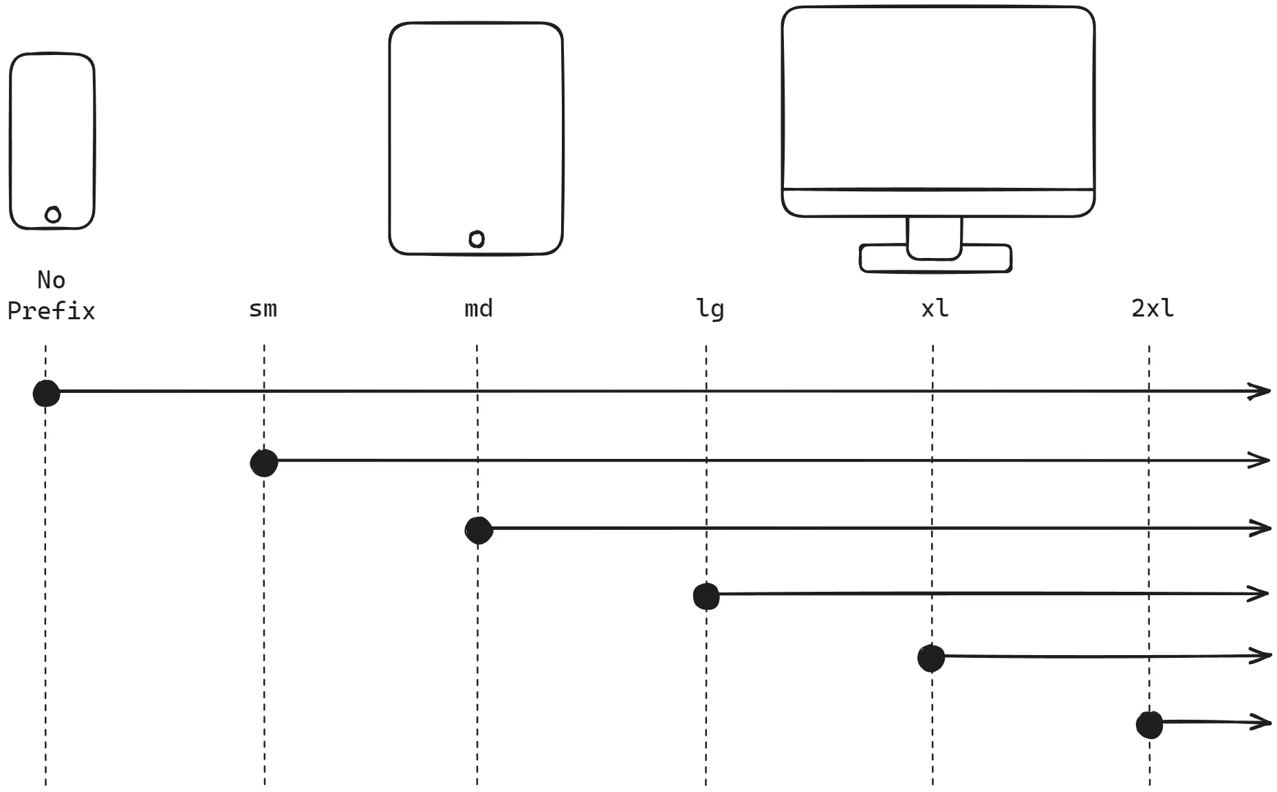
This means that any utility class you write without a prefix (like bg-white, p-4, or text-center) applies to all screen sizes, starting with the smallest mobile screens. You then add prefixed utilities to override or add styles for larger screens.
This approach encourages you to design the base mobile experience first and then progressively enhance the layout for tablets, desktops, and beyond. It’s a clean and organized way to manage complexity.
The image below illustrates this concept perfectly. The "No Prefix" style applies to all screen sizes, while a prefixed style like md: only kicks in at the medium breakpoint and continues for all larger sizes.
Understanding Tailwind's Breakpoints
So, what do sm, md, and lg actually mean? These are Tailwind's default breakpoints, which are predefined minimum screen widths. As a designer, you can think of them as general device categories.
This article is written specifically for designers transitioning to code. It provides an excellent "designer translation" for Tailwind's technical terms.
In the article, find the section titled Responsive system (Mobile first). Pay close attention to the list of default breakpoints and the "Designer translation" that maps prefixes like md and lg to familiar concepts like "Tablet" and "Desktop". Note the key phrase: "These are minimum widths, not device targets."
As you just read, the standard breakpoints are:
sm: 640px and upmd: 768px and uplg: 1024px and upxl: 1280px and up2xl: 1536px and up
An un-prefixed class like flex-col applies to everything. If you then add md:flex-row, the layout will be a single column on screens narrower than 768px and will switch to a row on screens 768px and wider.
Applying Responsive Prefixes
The syntax is simple and powerful: you add the breakpoint prefix, followed by a colon, directly before the utility class you want to apply. For example: md:p-8.
Let's watch a video that demonstrates this in practice.
The BEST Way to Create Responsive Design with Tailwind CSS (2025)
This video by Lukas provides a clear, practical demonstration of applying responsive prefixes to change a layout from a stacked mobile view to a side-by-side desktop view.
First, watch the segment from this timestamp. Here, the instructor applies the md: prefix to change a grid layout and adjust text alignment for medium screens. Notice how he only adds the classes needed for the change. Next, watch the explanation from this timestamp. The instructor clarifies how prefixed utilities override un-prefixed ones. This concept of precedence is fundamental to Tailwind's responsive system.
This combination of a base style (for mobile) and prefixed override styles (for larger screens) is the most common pattern you'll use.
A very frequent use case is changing a layout from vertical to horizontal.
- HTML:
<div class="flex flex-col md:flex-row">...</div> - Translation: This
divwill stack its children vertically on mobile screens. On screens 768px and wider, it will arrange them horizontally in a row.
Another common pattern is hiding elements on certain screen sizes.
- HTML:
<div class="hidden md:block">...</div> - Translation: This
divwill be completely hidden by default (on mobile). On screens 768px and wider, it will become visible as ablockelement. This is perfect for things like a desktop sidebar that should be hidden or replaced by a menu icon on mobile.
Master Responsive Design with Tailwind CSS Utility Classes
This article from TailGrids provides more code examples for common responsive patterns, including layout, text, and visibility.
Skim the section Using breakpoints utility classes to see examples of making text, layout, and images responsive. Then, carefully read the section Understanding visibility, which explains the powerful hidden and md:block pattern.
From Figma to Tailwind: A Design Engineer's Workflow
This is where your design background gives you a significant advantage. The responsive layouts you create in Figma are the blueprint for your Tailwind code.

When you design frames in Figma for different screen sizes (e.g., 390px for mobile, 768px for tablet, 1440px for desktop), you are defining your breakpoints.
A key part of the Design Engineer role, especially when supervising AI tools like Cursor, is to translate these visual breakpoints into code. You might tell your AI assistant: "Use this Figma design. The layout should change at the md breakpoint (768px), where the card grid switches from a single column to two columns." The AI needs this context, which comes directly from your design intent.
What if your Figma design system uses breakpoints that don't match Tailwind's defaults? For a true Design Engineer, this is not a problem. You can customize them.
The BEST Way to Create Responsive Design with Tailwind CSS (2025)
Let's return to the video from Lukas to see how you can align your code's breakpoints with your design's specifications. This is a key skill for ensuring high-fidelity implementation.
Watch the segment on customizing breakpoints. You'll see how the tailwind.config.js file can be modified to change existing breakpoints or add new ones entirely. You don't need to memorize this code, but you should understand that it's possible—and where to do it.
Knowing that you can customize breakpoints to perfectly match your Figma file is a powerful concept. It ensures that the design system and the code are perfectly in sync, which is a hallmark of high-quality frontend development.
Your Turn: Build a Responsive Component
Let's put this into practice. Open Tailwind Play and paste the following unstyled HTML.
<div class="m-4 p-6 bg-slate-100 rounded-xl">
  <!-- Image container -->
  <div>
    <img class="rounded-lg shadow-lg" src="https://images.unsplash.com/photo-1542362567-b07e54358753?auto=format&fit=crop&w=1200" alt="A red sports car">
  </div>

  <!-- Text content -->
  <div>
    <h2>Supercar GT</h2>
    <p>Experience the thrill of pure performance. This is not just a car; it's a statement.</p>
    <button>Learn More</button>
  </div>
</div>
Your task is to style this component using a mobile-first approach. Follow these responsive specifications:
-
Main Container (
divwithbg-slate-100):- Mobile (Base styles): Make it a
flexcontainer that stacks its children vertically (flex-col). Add a gap of 6 units between the children (gap-6). - Desktop (
lg:prefix): Change the layout to a horizontal row (lg:flex-row). Center the items vertically (lg:items-center). Increase the gap to 8 units (lg:gap-8).
- Mobile (Base styles): Make it a
-
Image and Text Containers:
- To make the layout work on desktop, both the image container and the text container need to be flexible. Add the class
lg:flex-1to both thedivwrapping theimgand thedivwrapping the text content. This will make them share the available space equally on large screens.
- To make the layout work on desktop, both the image container and the text container need to be flexible. Add the class
-
Heading (
h2):- Mobile (Base styles): Make the font bold (
font-bold) and the text size2xl(text-2xl). - Desktop (
lg:prefix): Increase the text size to4xl(lg:text-4xl).
- Mobile (Base styles): Make the font bold (
-
Paragraph (
p):- Mobile (Base styles): Set the text color to a medium gray (
text-gray-600) and add a top margin of 2 units (mt-2). - Desktop (
lg:prefix): Increase the top margin to 4 units (lg:mt-4).
- Mobile (Base styles): Set the text color to a medium gray (
-
Button:
- Style it with a blue background, white text, padding, and rounded corners. Add a top margin (
mt-6). These styles should apply to all screen sizes. (e.g.,bg-blue-600 text-white px-5 py-2 rounded-lg mt-6).
- Style it with a blue background, white text, padding, and rounded corners. Add a top margin (
Resize the preview pane in Tailwind Play to see your layout adapt!
Click here for the solution
<div class="m-4 p-6 bg-slate-100 rounded-xl flex flex-col gap-6 lg:flex-row lg:items-center lg:gap-8">
  <!-- Image container -->
  <div class="lg:flex-1">
    <img class="rounded-lg shadow-lg" src="https://images.unsplash.com/photo-1542362567-b07e54358753?auto=format&fit=crop&w=1200" alt="A red sports car">
  </div>

  <!-- Text content -->
  <div class="lg:flex-1">
    <h2 class="font-bold text-2xl lg:text-4xl">Supercar GT</h2>
    <p class="text-gray-600 mt-2 lg:mt-4">Experience the thrill of pure performance. This is not just a car; it's a statement.</p>
    <button class="bg-blue-600 hover:bg-blue-700 text-white px-5 py-2 rounded-lg mt-6">Learn More</button>
  </div>
</div>
Conclusion
You have now learned the fundamental principle of responsive design in Tailwind CSS. By combining a mobile-first approach with responsive prefixes, you can create fluid layouts that look great on any device.
Key Takeaways:
- Mobile-First: Un-prefixed utilities apply to all screen sizes. You start with the mobile layout.
- Responsive Prefixes: Use prefixes like
md:andlg:to add or override styles for larger screens. The syntax isbreakpoint:utility-class. - Breakpoint Mapping: Tailwind's breakpoints (
sm,md,lg, etc.) aremin-widthvalues that you can conceptually map to the device frames you design in Figma. - Customization is Key: As a Design Engineer, knowing you can customize breakpoints in
tailwind.config.jsallows you to ensure perfect fidelity between your design system and the final code.
In our next lesson, we will combine everything you've learned so far. You'll take a component from a Figma design and implement it from scratch, applying core utilities and responsive prefixes to create a pixel-perfect, mobile-first UI element.