Hello! Welcome back to your React course.
In our last lesson, we mastered JSX, learning how to write HTML-like markup directly in our JavaScript files. You learned the essential rules and how to embed dynamic JavaScript expressions to bring your UI to life. So far, all our work has been inside a single App.jsx file.
Today, we'll learn one of React's most powerful features: component-based architecture. Instead of one massive file, we'll break our UI into small, reusable, and independent pieces. This lesson directly addresses the learning outcome: Create and export functional components. We'll learn how to define these components in their own files, export them, and then assemble them to build a user interface.
What is a Functional Component?
At its core, a React component is a JavaScript function that returns JSX, describing a piece of the user interface. Think of them as custom, reusable HTML tags that you create. This modular approach makes your code cleaner, easier to manage, and much more scalable.
To start, let's get a solid conceptual understanding from the official React documentation. This article explains what components are and why they are the building blocks of a React app.
Read the introductory section 'Components: UI building blocks' and the 'Recap' at the end. Focus on the core idea of components as reusable UI elements and their relationship to JavaScript functions.
As the article mentions, a React component is a JavaScript function with two key rules:
- Its name must start with a capital letter. This is how React distinguishes your custom components from standard HTML tags (like
<div>or<h1>). - It must return a single JSX element. As you learned in the last lesson, you can use a Fragment (
<>...</>) to group multiple elements.
This diagram provides a simple mental model: a component is a machine that can receive inputs (which we'll call props in the next lesson) and produces UI as output.
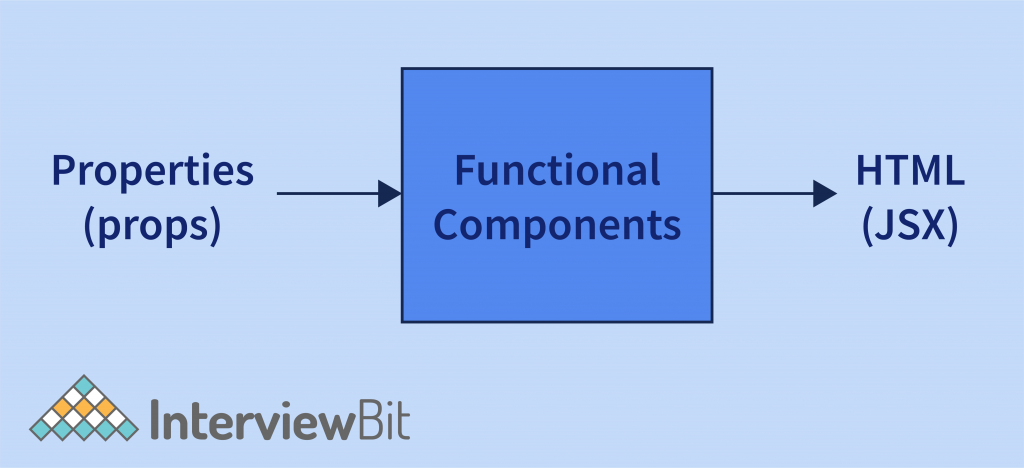
Creating and Exporting Your First Component
Let's put this theory into practice. We will create a simple Header component, place it in its own file, and then use it in our main App.jsx.
The process involves three main steps:
- Create a new file for the component.
- Define the component as a JavaScript function that returns JSX.
- Export the component so other files can use it.
This video from Codevolution provides an excellent walkthrough of this entire process.
ReactJS Tutorial - 5 - Functional Components
Watch this video to see a step-by-step demonstration of how to create, export, and then import a functional component.
Watch from 00:37 to 04:22. The video demonstrates creating a component file, defining the component with both traditional function syntax and modern ES6 arrow function syntax, exporting it, and finally importing and rendering it in the main App component.
Let's follow those steps in our own project.
Hands-On Practice
-
Create a
componentsfolder: In your project'ssrcdirectory, create a new folder namedcomponents. This is a standard convention for organizing your component files. -
Create the component file: Inside
src/components, create a new file namedHeader.jsx. -
Define and export the component: Open
Header.jsxand add the following code. We'll use the ES6 arrow function syntax, which is the modern standard you'll see in most React projects.// src/components/Header.jsx const Header = () => { return ( <header style={{ backgroundColor: '#f8f9fa', padding: '1rem', textAlign: 'center' }}> <h1>My React App</h1> <p>Learning about components!</p> </header> ); }; export default Header;Notice the
export default Header;line. This makes theHeadercomponent available for other files to import. -
Import and use the component: Now, let's use our new
HeaderinApp.jsx. Replace the contents ofsrc/App.jsxwith the following:// src/App.jsx import Header from './components/Header'; // Import the component import './App.css'; function App() { return ( <> <Header /> {/* Use the component like an HTML tag */} <main> <p>This is the main content of my application.</p> </main> </> ); } export default App;
Save your files and look at your browser. You should see the content from your Header component displayed at the top of the page! You've successfully created and composed your first component.
Default vs. Named Exports
In the example above, we used export default. This is one of two ways to export things from a JavaScript file. The other is a named export. Understanding the difference is crucial for managing your components.
-
Default Export:
export default MyComponent;- A file can only have one default export.
- You can import it with any name:
import MyCustomName from './MyComponent.js'; - This is typically used for the primary component in a file.
-
Named Export:
export const MyComponent = () => { ... };- A file can have many named exports.
- You must import it using its exact name inside curly braces:
import { MyComponent } from './MyComponent.js'; - This is often used for helper functions or smaller, secondary components exported from the same file.
This image clearly visualizes how a named export works:

For a definitive guide on this topic, the official React documentation is the best place to look.
Importing and Exporting Components
This article from react.dev provides a detailed explanation of default and named exports, including a handy comparison table.
Read the 'Deep Dive' section titled 'Default vs named exports'. Pay close attention to the table comparing the syntax for both types. This is a concept that often trips up beginners, so understanding it now will save you a lot of trouble later.
Challenge: Combine Export Types
Let's test your understanding. You will create a Footer component and a helper utility, using both default and named exports.
-
Create
Footer.jsx: In yoursrc/componentsfolder, create a new file namedFooter.jsx. -
Add the following code to
Footer.jsx:// src/components/Footer.jsx // A helper function - ideal for a named export export const getCurrentYear = () => { return new Date().getFullYear(); }; // The main component - ideal for a default export const Footer = () => { return ( <footer style={{ marginTop: '2rem', paddingTop: '1rem', borderTop: '1px solid #ccc', textAlign: 'center' }}> <p>Copyright © {getCurrentYear()}</p> </footer> ); }; export default Footer; -
Your Task: Modify
src/App.jsxto import both theFootercomponent (default export) and thegetCurrentYearfunction (named export) from./components/Footer.jsx. Then, render theFootercomponent below the<main>section.
Click here to see the solution
// src/App.jsx

import Header from './components/Header';
// Correctly import both default and named exports from Footer.jsx
import Footer, { getCurrentYear } from './components/Footer';
import './App.css';

function App() {
  // You could even use the imported function here if you wanted!
  const year = getCurrentYear();

  return (
    <>
      <Header />
      <main>
        <p>This is the main content of my application, created in {year}.</p>
      </main>
      <Footer /> {/* Render the Footer component */}
    </>
  );
}

export default App;
Conclusion
Great work! You've taken a significant step from writing UI in a single file to building with a scalable, component-based architecture.
Key Takeaways:
- Components are Reusable: They are JavaScript functions that return JSX, acting as self-contained, reusable UI blocks.
- PascalCase Naming: Component files and the functions themselves should be named using
PascalCase(e.g.,MyComponent). - File Organization: It's a best practice to keep components in a dedicated
src/componentsfolder. - Exports are Key: You must export components to use them elsewhere.
- Use
export defaultfor the primary component in a file. - Use
export const ...(named export) for secondary components or helper functions. - The import syntax (
import Name from ...vs.import { Name } from ...) must match the export type.
- Use
Next Up:
Our components are currently static. They render the same content every time. To make them truly powerful and dynamic, we need a way to pass data into them. In the next lesson, we will explore props, which allow you to pass data from a parent component to a child component, making your components configurable and even more reusable.