Hello! Welcome back.
In our last lesson, we explored component composition using the children prop, which allows us to create flexible container components. You learned how React prefers this "building block" approach over traditional inheritance.
Today, we'll put all the pieces from this module together. We're going to tackle the process of translating a UI design into a functioning, albeit static, React application. This is a fundamental skill in front-end development.
This lesson's goal is to build a static UI section by composing multiple components. You'll learn the "Thinking in React" methodology: how to look at a design, break it down into a logical component hierarchy, and then assemble those components using props to create a complete UI structure.
The "Thinking in React" Workflow
Building a React UI isn't just about writing code; it's a systematic process of deconstruction and assembly. The official React documentation outlines a clear, two-step process for building a static UI, which we will follow.
Step 1: Break the UI into a Component Hierarchy
First, you look at a design mockup and decide which parts should be components. A good rule of thumb is the "single responsibility principle": if a part of the UI does one thing (like a search bar) or is repeated (like a list item), it's probably a component.
Let's read the official guide on this process.
The 'Thinking in React' article from the official documentation is the definitive guide to this process. Let's start with the first step: identifying and organizing components.
Please read 'Step 1: Break the UI into a component hierarchy'. Pay attention to how they draw boxes around UI elements and arrange them into a tree structure.
This process of drawing boxes and naming components helps you create a blueprint for your application.
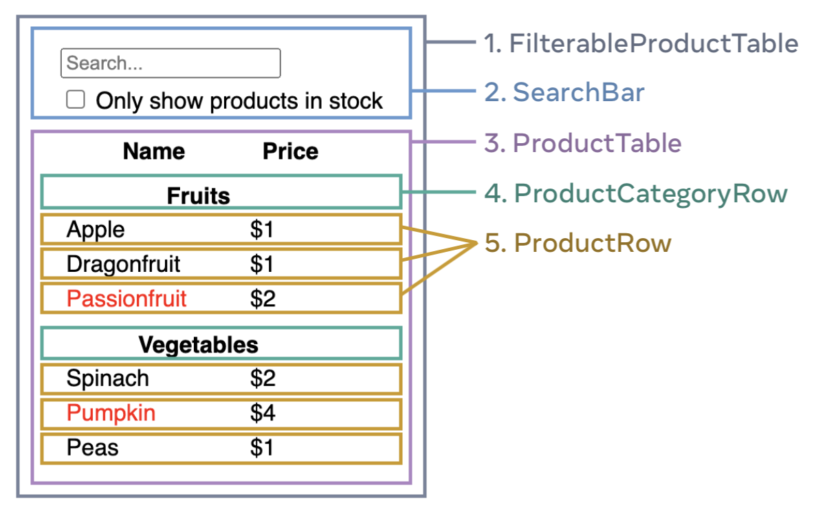
This idea of building UIs from smaller, self-contained pieces is a core concept in modern web development. It's often compared to the Atomic Design methodology, where you start with the smallest elements ("atoms" like buttons and inputs) and compose them into progressively larger structures ("molecules" and "organisms").

Step 2: Build a Static Version in React
Once you have your component hierarchy, you build them out one by one. At this stage, you focus only on rendering the UI with the data you have. There's no interactivity yet—no button clicks, no typing in forms. You'll build your components and pass data down from parent to child using props.
Let's continue with the "Thinking in React" guide to understand this step.
Now, let's read about the implementation phase. This section explains the importance of building the static version first, using props for data flow and deliberately avoiding state.
Read 'Step 2: Build a static version in React' and the 'Pitfall' note right after it. Focus on the concept of 'one-way data flow' and the instruction to not use state at this stage.
The key here is that you're creating a "dumb" but visually complete version of your app. This makes it much easier to reason about your component structure before adding the complexity of state and user interactions.
From Theory to Practice: Composing a UI
Let's see how this works in a real project. We'll start with a simple example and then look at a more complex one.
A Simple Example: App Layout
A common pattern is having a main App component that lays out the core structure of your page, like a header, main content area, and footer.
React JS Functional Components | Learn ReactJS
Dave Gray provides a great, straightforward demonstration of creating separate Header, Content, and Footer components and then composing them within the main App component.
Watch from 01:43 to 08:35. Observe how he: Creates a Header.jsx file and component. Imports and renders it in App.jsx. Repeats the process for Content.jsx and Footer.jsx. Ends up with an App.jsx that clearly describes the page structure by composing these three components.
As you saw, the App.jsx file becomes a clean, readable representation of the page's structure:
// App.jsx
import Header from './Header';
import Content from './Content';
import Footer from './Footer';

function App() {
  return (
    <div className="App">
      <Header />
      <Content />
      <Footer />
    </div>
  );
}
A Complex Example: Building a Landing Page
Now, let's look at a more realistic landing page. It's built from multiple, visually distinct sections: a navbar, a hero section, a features section, a pricing table, and more. Each of these sections is a perfect candidate for its own component.
We'll watch a segment of a tutorial where a developer builds the "Hero Section" of a landing page. Notice how it's created in its own file (HeroSection.jsx) and combines several elements (headings, paragraphs, buttons, videos) into a single, cohesive unit.
Build and Deploy Fully Responsive Landing Page: React + Tailwind CSS
In this video from compiletab, we'll see the 'Thinking in React' process applied to build a feature-rich 'Hero Section'.
Watch the segment from 16:32 to 23:31. Focus on how this entire section is built within a single HeroSection component. Notice the use of props (implicitly, from data files) and composition of standard HTML tags to create the desired layout.
After creating components for each section (Navbar, HeroSection, FeatureSection, etc.), the main App.jsx file would then compose them all to build the final page, just like in our simpler Header/Content/Footer example.
// A simplified App.jsx for the landing page
import Navbar from './components/Navbar';
import HeroSection from './components/HeroSection';
import FeatureSection from './components/FeatureSection';
import Pricing from './components/Pricing';
import Footer from './components/Footer';

function App() {
  return (
    <>
      <Navbar />
      <main>
        <HeroSection />
        <FeatureSection />
        <Pricing />
      </main>
      <Footer />
    </>
  );
}
This is the power of component-based architecture. Your main application file becomes a high-level overview of the UI, and each complex piece of that UI is neatly encapsulated in its own component file.
Practice: Build a Static Profile Card
Now it's your turn to apply this process. Your task is to build a ProfileCard component that is itself composed of several smaller components.
Your goal: Create a static user profile card.
-
Deconstruct the UI: The
ProfileCardwill consist of three parts:- An avatar image.
- User information (name and username).
- A list of user statistics (e.g., Followers, Following, Posts).
-
Create the Child Components:
src/components/Avatar.jsx: A component that takes animageUrlprop and analtTextprop, and renders an<img>tag.src/components/UserInfo.jsx: A component that takesnameandusernameprops and displays them.src/components/Stats.jsx: A component that takes astatsprop (an array of objects, e.g.,[{label: 'Followers', value: 123}]). It should map over this array to display each statistic.
-
Create the Parent Composer Component:
src/components/ProfileCard.jsx: This component will importAvatar,UserInfo, andStats. It will define the hardcoded data for a user and pass it down to the child components as props. It should also provide the main container and styling for the card.
-
Assemble in
App.jsx:- Finally, import
ProfileCardinto yourApp.jsxand render it to see the final result.
- Finally, import
This exercise will solidify your understanding of breaking down a UI, creating child components, and composing them in a parent to build a complete UI section.
Click to see the solution for the child components
// src/components/Avatar.jsx
const Avatar = ({ imageUrl, altText }) => {
  return <img src={imageUrl} alt={altText} style={{ width: '100px', height: '100px', borderRadius: '50%' }} />;
};
export default Avatar;

// src/components/UserInfo.jsx
const UserInfo = ({ name, username }) => {
  return (
    <div>
      <h2 style={{ margin: '10px 0 0' }}>{name}</h2>
      <p style={{ color: 'gray', margin: '0' }}>@{username}</p>
    </div>
  );
};
export default UserInfo;

// src/components/Stats.jsx
const Stats = ({ stats }) => {
  return (
    <div style={{ display: 'flex', justifyContent: 'space-around', width: '100%', marginTop: '20px' }}>
      {stats.map((stat, index) => (
        <div key={index} style={{ textAlign: 'center' }}>
          <h3 style={{ margin: '0' }}>{stat.value}</h3>
          <p style={{ color: 'gray', margin: '0' }}>{stat.label}</p>
        </div>
      ))}
    </div>
  );
};
export default Stats;
Click to see the solution for the parent component (ProfileCard.jsx)
// src/components/ProfileCard.jsx
import Avatar from './Avatar';
import UserInfo from './UserInfo';
import Stats from './Stats';

const ProfileCard = () => {
  const userData = {
    name: 'React Learner',
    username: 'react_dev',
    imageUrl: 'https://via.placeholder.com/150',
    stats: [
      { label: 'Followers', value: '1.2k' },
      { label: 'Following', value: 350 },
      { label: 'Posts', value: 98 },
    ],
  };

  const cardStyle = {
    fontFamily: 'sans-serif',
    border: '1px solid #ddd',
    borderRadius: '15px',
    padding: '20px',
    maxWidth: '300px',
    margin: '20px auto',
    boxShadow: '0 4px 8px rgba(0,0,0,0.1)',
    display: 'flex',
    flexDirection: 'column',
    alignItems: 'center'
  };

  return (
    <div style={cardStyle}>
      <Avatar imageUrl={userData.imageUrl} altText={`Avatar of ${userData.name}`} />
      <UserInfo name={userData.name} username={userData.username} />
      <Stats stats={userData.stats} />
    </div>
  );
};

export default ProfileCard;
Click to see the solution for App.jsx
// src/App.jsx
import ProfileCard from './components/ProfileCard';
import './App.css';

function App() {
  return (
    <div className="App">
      <h1>My Profile</h1>
      <ProfileCard />
    </div>
  );
}

export default App;
Conclusion
Congratulations! You have now mastered the fundamental workflow for building UIs in React. By combining the concepts of components, props, and composition, you can create complex and well-structured static interfaces.
Key Takeaways:
- Think Before You Code: Always start by breaking down your UI design into a component hierarchy.
- Build Static First: Implement the visual structure of your app using components and props before adding any interactivity. This separates concerns and reduces complexity.
- Composition is Key: The main
Appcomponent (or any page-level component) acts as an orchestrator, composing various child components to form the complete UI. - One-Way Data Flow: In a static UI, data flows strictly from parent to child via props.
Next Up:
Our UIs look great, but they don't do anything yet. The next module, "State and Interactivity with useState," is where the magic happens. We will introduce state, the internal memory of a component, and learn how to make our applications respond to user actions. Get ready to bring your UIs to life