Hello! In our last lesson, we made our components more robust by providing them with default props. This ensures they have the data they need to render correctly, even when a parent component doesn't pass a specific prop.
So far, we've focused on passing individual pieces of data like strings or numbers. Now, we'll explore a more powerful concept that is central to how React applications are built: component composition.
This lesson will teach you how to compose components by nesting them and using the special children prop. This is the key to creating flexible, reusable UI containers like cards, modals, and page layouts. Instead of just passing data into a component, you'll learn how to pass entire chunks of JSX through it.
Composition: React's Building Philosophy
In many programming paradigms, particularly object-oriented ones, code reuse is often achieved through inheritance. You might have a base Vehicle class, and a Car class that inherits from it.
React takes a different approach, preferring composition over inheritance. Because React is all about components, the philosophy is to build complex components by combining simpler ones, much like assembling building blocks. A HomePage component isn't a special kind of "page"; it's a component that contains a Navbar, a Header, a PostList, and a Footer.
To get a clear idea of why this is React's recommended pattern, let's start with a short video.
Composition and Inheritance in React #11 React Course
This video from Code with Sloba quickly explains the difference between inheritance and composition and why React's component-based nature makes composition the ideal choice.
Watch the first 45 seconds of the video, up to the point where the coding example begins. Focus on the core distinction between the two design patterns.
The key takeaway is that nesting components is a more natural and flexible way to structure a React application than trying to force an inheritance model. The primary mechanism that makes this possible is a special prop: children.
The children Prop: A Component's "Slot"
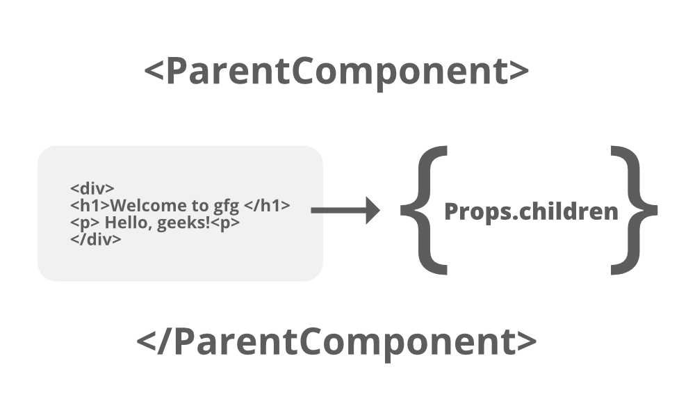
When you build a React component, you can leave a "slot" open for a parent component to fill with any content it wants. This content is passed through a special, automatically available prop called children.
Here’s how it works: any JSX you place between a component's opening and closing tags is passed to that component as its children prop.
<Card>
  {/* Everything in here is the 'children' prop for the Card component */}
  <h1>This is a title</h1>
  <p>This is a paragraph inside the card.</p>
</Card>
The Card component can then render this content wherever it needs to.
// A simple Card component
function Card({ children }) {
  // 'children' contains the h1 and p tags from above
  return (
    <div className="card-container">
      {children}
    </div>
  );
}
This simple but powerful pattern allows you to create generic "wrapper" or "container" components. The Card component provides the box, the border, and the shadow, but it doesn't need to know or care about what content is being placed inside it.
The following illustration from GeeksforGeeks and the official React documentation offer excellent explanations of this concept.
Now, let's read the definitive guide from the official React docs.
The article 'Passing Props to a Component' from the official React documentation contains a crucial section that explains exactly how JSX children work.
Please read the section titled 'Passing JSX as children'. It's a short but fundamental explanation of how nested content becomes the children prop.
A Practical Demonstration: Dynamic vs. Hardcoded Children
Let's see this in action. Imagine you're building a section of a webpage that displays multiple Card components. You could hardcode the cards inside a CardSection component. But what if one section needs two cards and another needs five? Using props.children makes your CardSection flexible and dynamic.
The following video provides a clear, step-by-step tutorial on this exact scenario.
React - Nested Components Tutorial (Childen props)
Austin Davis provides an excellent walkthrough of creating nested components using the children prop. This video will solidify your understanding of how to build flexible container components.
Watch the entire video (it's short!). Pay close attention to: The Problem (0:00 - 0:46): Understand the limitation of hardcoding child components. Using children in the Parent (0:46 - 1:54): See how to accept and render the children prop inside the wrapper component (CardSection). Passing Children from the Consumer (1:54 - 4:08): Learn the syntax for passing children by nesting components and see how this makes the wrapper dynamic. Flexibility (4:08 - 5:09): Notice that you can pass different types of components or even plain JSX as children.
As the video demonstrates, the children prop isn't limited to just one type of component. You can pass a mix of different components, text, or standard HTML tags, making it incredibly versatile. For a more detailed look at what's possible, the following reading is a great reference.
A Complete Guide To props.children In React
This article from DEV Community dives deeper into the children prop. We'll focus on the part that details the different types of content you can pass.
Read the sections 'props.children in Actions' and 'What Types of Content Are Allowed for props.children?'. This will give you a comprehensive list of what React considers valid children.
Advanced Composition: Specialization
Composition can also be used to create more specialized versions of a generic component. For example, you could have a generic Dialog component. Then, you could create a ConfirmDialog and a WarningDialog. These specialized components would render the generic Dialog but configure it with specific props (like a title and colors) while still using props.children to accept the main content.
Let's return to the "Code with Sloba" video to see an example of this.
Composition and Inheritance in React #11 React Course
This segment demonstrates how to create a specialized BlackCard component that uses composition to render and configure a more generic Card component.
Watch the section from 02:09 to 03:18. Observe how BlackCard renders the base Card component, passes a new prop (type='black') to modify its style, and still passes through its own children.
This pattern of creating specialized components through composition is extremely common and helps keep your codebase clean and reusable (Don't Repeat Yourself - DRY).
Practice Time: Create a Panel Component
Now it's your turn to build a reusable wrapper component. Your task is to create a Panel that can display a title and any content you want inside it.
-
Create
src/components/Panel.jsx:- This component should accept two props:
titleandchildren. - It should render a
<section>with some basic styling (e.g., a border, padding, and margin). - Inside the
<section>, it should render an<h2>that displays thetitleprop. - Below the
<h2>, it should render thechildrenprop.
- This component should accept two props:
-
Update
src/App.jsx:- Import your new
Panelcomponent. - Use it twice with different content:
- The first
Panelshould have thetitle"About Me". Inside, place a<p>tag with a short bio. - The second
Panelshould have thetitle"My Hobbies". Inside, place an unordered list (<ul>) with a few<li>items listing your hobbies (e.g., Coding, Music, Gaming).
- The first
- Import your new
This exercise will test your ability to combine standard props with the children prop to build a flexible UI component.
Click to see the solution for Panel.jsx
// src/components/Panel.jsx

const Panel = ({ title, children }) => {
  const panelStyles = {
    border: '1px solid #ddd',
    borderRadius: '8px',
    padding: '16px',
    margin: '16px 0',
    boxShadow: '0 2px 4px rgba(0,0,0,0.1)'
  };

  return (
    <section style={panelStyles}>
      <h2>{title}</h2>
      {children}
    </section>
  );
};

export default Panel;
Click to see the solution for App.jsx
// src/App.jsx

import Header from './components/Header';
import Footer from './components/Footer';
import Panel from './components/Panel'; // Import the new component
import './App.css';

function App() {
  return (
    <>
      <Header title="Component Composition" />
      <main>
        <Panel title="About Me">
          <p>
            I'm a student learning React to build cool web applications.
            I'm interested in coding, AI, and audio technology.
          </p>
        </Panel>

        <Panel title="My Hobbies">
          <ul>
            <li>Coding and building projects</li>
            <li>Playing video games</li>
            <li>Listening to and creating music</li>
          </ul>
        </Panel>
      </main>
      <Footer />
    </>
  );
}

export default App;
Conclusion
Mastering composition and the children prop is a huge step in "thinking in React." You've learned how to create components that are not only reusable but also highly flexible, serving as generic containers for any content you need to display.
Key Takeaways:
- Composition over Inheritance: React favors building complex UIs by combining and nesting components, not by inheriting from them.
- The
childrenProp: This special prop contains whatever content is nested between a component's opening (<Component>) and closing (</Component>) tags. - Generic Wrappers: The
childrenprop is ideal for creating reusable "wrapper" components likeCard,Panel,Modal, orLayout, which provide structure and styling without being tied to specific content. - Flexibility: The content passed as
childrencan be a mix of text, HTML elements, and other React components.
Next Up:
You now understand the fundamental building blocks of React: creating components, passing data with props, and nesting them using composition. In the next lesson, we'll put all of this together to build a static UI section by composing multiple components, solidifying your ability to translate a design into a component-based structure.