Hello! Welcome to the next lesson in our journey through Power Apps Component Framework (PCF) Development.
In our previous session, we enabled your components to interact directly with Dataverse using the ComponentFramework.WebApi. You learned how to perform CRUD operations, effectively turning your components from simple displays into powerful, interactive tools.
Today, we're shifting our focus from functionality to form. A great component is not just powerful; it's also visually appealing, consistent with its host application, and adaptable to any screen size. This lesson is dedicated to achieving that professional polish. Our goal is to learn how to style PCF components using CSS and responsive design principles.
Your background in web development with HTML and CSS will be a great asset here. We will build upon those fundamentals and apply them within the specific context of the Power Platform, focusing on modern techniques that are essential for the PL-400 exam and for building enterprise-grade components.
1. Linking Styles to Your Component
Every PCF component can have one or more associated CSS files. The standard practice is to create a css folder within your component's directory and place your stylesheet there (e.g., style.css).
To make the framework aware of your stylesheet, you must declare it in the ControlManifest.Input.xml file. This is done within the <resources> node.
<resources>
  <code path="index.ts" order="1"/>
  <css path="css/style.css" order="1" />
  <!-- Other resources like resx files for localization can also be added here -->
</resources>
Once linked, the styles in this file will be loaded along with your component. A crucial best practice is to scope your CSS to prevent it from accidentally affecting the host Model-driven or Canvas App. The easiest way to do this is to add a unique class to your component's root container in index.ts and prefix all your CSS rules with it.
// In index.ts, within your component class
private mainContainer: HTMLDivElement;

public init(context: ComponentFramework.Context<IInputs>, ...): void {
    this.mainContainer = document.createElement("div");
    this.mainContainer.classList.add("my-unique-component-class"); // Scoping class
    // ... rest of your init logic
}
/* In css/style.css */
.my-unique-component-class .my-button {
    background-color: blue;
    color: white;
}

.my-unique-component-class h1 {
    font-size: 24px;
}
2. Achieving Visual Consistency with Modern Theming
A key characteristic of a professional component is its ability to blend seamlessly with the host application's user interface. This means adopting the app's colors, fonts, and control styles. In the Power Platform, this is achieved by aligning with Fluent UI, Microsoft's design system.
The "modern theming" feature allows your PCF components to automatically inherit styling from the host app, ensuring a consistent look and feel, including support for dark mode.
Style components with modern theming (preview)
First, let's understand the official Microsoft guidance on modern theming. This document outlines the different strategies you can use depending on the controls you're using in your component.
Read through the introduction and the four main sections: 'Fluent UI v9 controls', 'Fluent UI v8 controls', 'Non-Fluent UI controls', and 'Custom theme providers'. Focus on understanding the core concept of each approach.
Key Takeaways from Modern Theming:
- Easiest Path (Fluent UI v9): If you build your component using React and Fluent UI v9 controls (the latest version), and declare a dependency on the platform's React libraries, your component will automatically inherit the modern theme. This is the most recommended and future-proof approach.
- Non-Fluent UI: If your component uses plain HTML and CSS, you can still participate in theming. The framework provides access to theme tokens (like colors, fonts, spacing) through
context.fluentDesignLanguage. You can then use these tokens as variables in your CSS to style your custom elements. - Customization: You can also create your own
FluentProviderto deliberately override the app's theme for your component, giving you complete control over its appearance.
Let's see a practical example. This short video demonstrates the goal: modifying a custom PCF control to match the look of the out-of-the-box controls.
You asked, I built - Showing lookup field as an Optionset using PCF
In this clip, watch how the developer applies styles from an existing control to make his custom dropdown look like a standard Dynamics 365 control.
Watch from 00:30:56 to 00:33:43. Notice the objective is to achieve visual consistency. The developer copies pre-defined styles to make the component look native.
While copying styles manually works, modern theming and using Fluent UI controls make this process much easier and more robust. Let's look at a more detailed, practical guide.
Style Your Fluent UI 9 PCFs for Power Apps
This blog post from Diana Birkelbach provides excellent, hands-on examples of how to style Fluent UI 9 components to match the modern look of both Canvas and Model-driven apps.
Read the sections 'Fluent UI 9', 'PCFs for Canvas Apps & Custom Pages', and 'PCFs for Model-Driven Apps (Forms)'. Pay close attention to the use of properties like appearance and size, and the specific styling differences for disabled controls between app types.
This article highlights professional-level nuances, such as:
- Using built-in properties like
appearance="filled-darker"is a quick way to align with the modern look. - Disabled controls are styled differently in Model-driven vs. Canvas apps. A truly robust component accounts for this, perhaps with a configuration property as the author suggests.
- Avoid hardcoding colors like
#000000. Instead, use theme tokens (e.g.,theme.colorNeutralBackground1) so your component adapts correctly to different themes, including dark mode.
3. Mastering Responsive Design
A responsive component looks and works great on any device, from a wide desktop monitor to a narrow phone screen. This is achieved by using flexible layouts that adapt to the available space. Your CSS skills are key here.
This video provides an excellent, concise overview of the core principles of modern responsive web design.
The Easy Way to Build Responsive Websites
This is a general web development video, but its concepts are directly applicable to building responsive PCF components. It's a fast and effective way to get up to speed on modern CSS layout techniques.
Watch from 00:53 to 06:42. The video covers the most important tools for responsive layout: CSS Display Properties: (Starts at 00:53) Understand the basics of block, inline, flex, and grid. Flexbox: (Starts at 02:35) This is your primary tool for creating flexible, one-dimensional layouts (rows or columns). Pay attention to flex-wrap, flex-grow, and gap. CSS Grid: (Starts at 04:36) Ideal for more complex, two-dimensional layouts where you need precise control over rows and columns. Media Queries: (Introduced around 07:04, but covered throughout) The traditional method for applying different styles based on the viewport (browser window) width.
Media Queries vs. Container Queries
For PCF components, there's a concept even more powerful than media queries: Container Queries.
- Media Queries respond to the size of the entire browser window (the viewport).
- Container Queries respond to the size of the component's immediate parent container.
Since you don't know where your PCF component will be placed—it could be in a wide main section or a narrow sidebar—reacting to its own container size is far more reliable and makes the component truly modular.
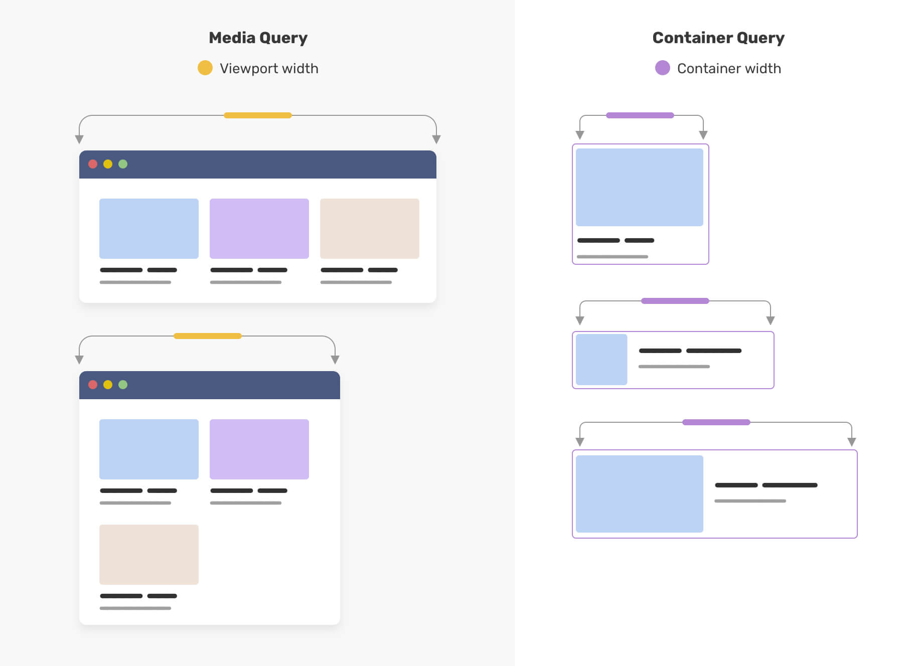
To use a container query, you first need to designate an element as a "query container." Then, you can write @container rules that apply styles when that container meets certain size criteria.
/* Designate the component's main div as a container */
.my-unique-component-class {
  container-type: inline-size;
  container-name: my-component;
}

/* Default styles (for wider containers) */
.my-unique-component-class .card-layout {
  display: flex;
  flex-direction: row; /* Side-by-side */
  gap: 16px;
}

/* Styles for when the container is narrow */
@container my-component (max-width: 400px) {
  .my-unique-component-class .card-layout {
    flex-direction: column; /* Stack vertically */
  }
}
Test your understanding!
You are building a PCF component that will be used in both the main form of a Model-driven app and in the side pane. You want the component to display its content in a three-column grid when it's wide and a single-column list when it's narrow. Which CSS feature is better suited for this task and why?
Show answer
A Container Query is better suited for this task. A Media Query would only react to the total width of the browser window. If the app is full-screen, the Media Query might incorrectly assume the component is wide, even if it's placed in a narrow side pane. A Container Query, however, will correctly detect the narrow width of its immediate container (the side pane) and apply the single-column layout, making the component truly adaptable and reusable.
4. Testing Your Responsive Component
The PCF local test harness is designed for testing responsiveness. It allows you to manually set the width and height of the component's container and see how it reacts in real-time.
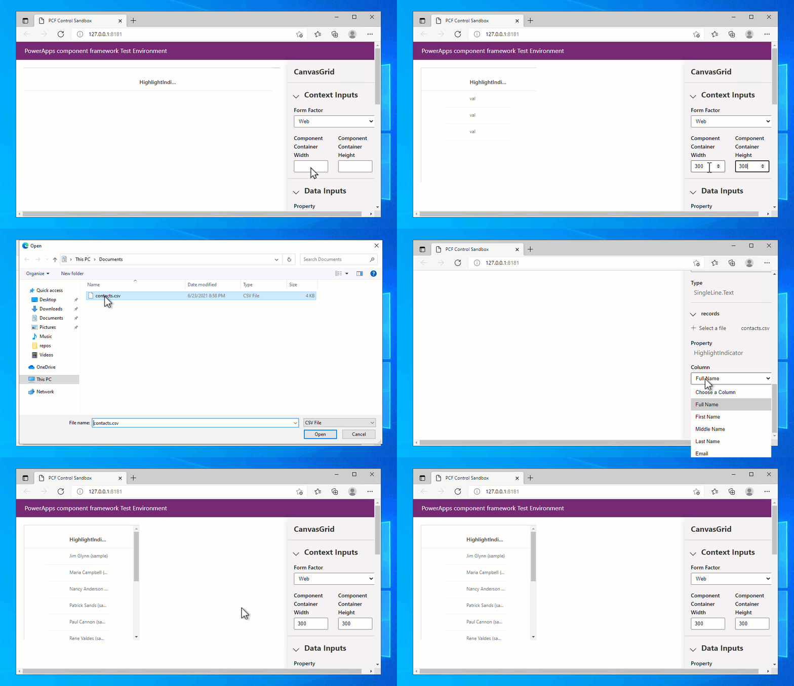
Your updateView method also receives the available space via the context.mode.allocatedWidth and context.mode.allocatedHeight properties. While you can use these to make programmatic changes in TypeScript, it is generally considered a best practice to handle responsive layouts with CSS (using Flexbox, Grid, and Container Queries) whenever possible, as it is more performant and declarative.
Conclusion
You've now covered the essential skills to make your PCF components not just functional, but also visually integrated and professionally polished.
Key Takeaways:
- Link your CSS in the
ControlManifest.Input.xmland use scoping to avoid style conflicts. - Leverage Fluent UI and modern theming to create components that automatically match the look and feel of Power Apps.
- Use properties like
appearanceand theme tokens instead of hardcoded values for robust styling. - Master responsive layouts with Flexbox for one-dimensional flow and CSS Grid for two-dimensional structures.
- Prefer Container Queries over Media Queries for building truly modular, reusable components.
- Test your responsive designs effectively using the local test harness.
What's Next?
We've now touched on building the component's structure, interacting with data, and styling the UI. In the next lesson, we will focus on the development workflow itself. We'll take a deep dive into how to build, test, and debug PCF components locally using the local test harness, ensuring you have an efficient and productive development cycle.