Hello! Welcome to the fifth module of our course.
In the previous module, we delved deep into advanced Canvas App techniques, culminating in our last lesson where we mastered complex Power Fx formulas. You learned how to use LookUp, Filter, and With to write performant and readable code, skills that are foundational for any Power Platform developer.
Now, we pivot from the pixel-perfect control of Canvas Apps to the data-first, component-driven world of Model-driven Apps. As someone with a rich background in Dynamics 365 CRM, you'll find the concepts here familiar, but our focus will be on the modern tools and design philosophies that are crucial for the PL-400 exam and for building contemporary enterprise applications.
Today's learning outcome is to design Model-driven Apps applying modern best practices for app modules, site maps, and user experience. We will explore how to structure your app, create intuitive navigation, and apply UX principles to deliver a polished, professional product that users will find both effective and engaging.
1. The Modern App Module: Your Application's Blueprint
A Model-driven App is fundamentally an "app module"—a curated collection of components like tables, forms, views, charts, and dashboards, packaged to serve a specific business function or user role. The modern app designer is the canvas where you assemble this package.
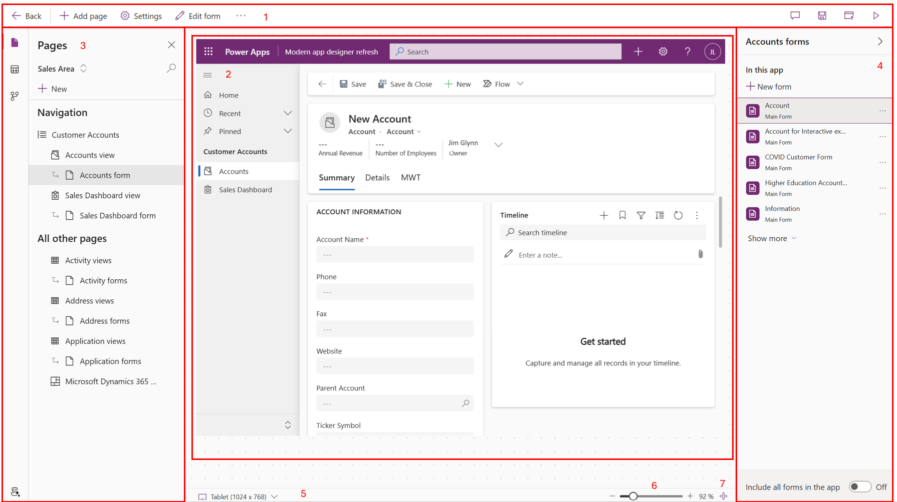
A key initial step in building a clean app is to separate the act of including components from the act of displaying them in the navigation. A common mistake is to add every table to the navigation menu, creating immediate clutter. A better approach is to add all necessary tables to the app first, and then thoughtfully construct the navigation menu afterwards.
Let's see this best practice in action.
How to build a Navigation Menu: Power Apps Model-Driven Apps Tutorial
This clip from Lisa Crosbie's tutorial demonstrates the correct way to start building a new Model-driven App. Pay close attention to her advice about the 'Show in navigation' checkbox.
Please watch from the beginning to 3:07. Focus on: How to create a new Model-driven App within a solution. The technique of adding all necessary tables to the app. The crucial step of unchecking 'Show in navigation' to create a clean slate for building a purposeful sitemap.
By following this method, you gain full control over the user's navigational experience from the outset, which is the first step toward a well-designed app.
2. Designing an Effective Sitemap: Less is More
The sitemap is the primary navigation for your app. A poorly designed sitemap can make an app feel confusing and overwhelming. The core principle for modern sitemap design is simplicity. This isn't just a matter of taste; it's grounded in established UX principles.
Hick's Law states that the time it takes to make a decision increases with the number of choices available. By limiting the options in your sitemap, you reduce the user's cognitive load and help them find what they need faster.
My recipe for applying UX laws in the model-driven apps
The article 'My recipe for applying UX laws in the model-driven apps' provides a great overview of these principles. Let's look at how Hick's Law applies directly to sitemap design.
Read the short section on 'Hick's Law'. Note the advice to simplify the navigation menu and place less-frequently used items in separate areas.
Now, let's translate this principle into practice. The modern sitemap designer makes it easy to create a structured, intuitive navigation experience.
How to build a Navigation Menu: Power Apps Model-Driven Apps Tutorial
Continuing with Lisa Crosbie's video, these sections demonstrate how to build a clean navigation menu from scratch, including creating groups, adding items, and configuring separate areas for different user roles.
Please watch the following segments: (3:07 - 5:15): Learn how to add groups (like 'Innovation') and sub-areas (like 'Challenges' and 'Ideas') to structure your menu. (5:52 - 7:38): See how to enable and use areas to create distinct navigation experiences, such as a main area for users and an 'Admin' area. (7:38 - 8:48): Pay attention to how you should edit the sitemap via the app object, not the legacy sitemap object. This is a key difference from the classic Dynamics 365 experience.
Sitemap Best Practices Summary:
The article "Extreme Makeover: Model Driven App edition" provides an excellent summary of modern sitemap best practices.
- Avoid Clutter: Only include links that are essential for the app's primary purpose.
- Role-Specific Apps > Areas: Instead of creating many areas within one app, prefer building separate, focused apps for different user roles (e.g., Sales Hub vs. a separate Configuration app).
- Use Icons: Set meaningful, colorful icons for your custom tables. This drastically improves scannability. Given your interest in developer tooling, you'll appreciate that this can be automated with tools like the Power Platform CLI (
pacx) or XrmToolbox's Iconator. - Use Collapsible Groups: If you have many items, organize them into logical groups that users can expand and collapse.
3. Enhancing User Experience (UX) on Forms and Views
A great user experience goes beyond the sitemap. It involves the visual presentation of your app and the layout of its forms and views. The goal is to create an interface that is not only functional but also visually appealing and easy to use. This aligns with the Aesthetic-Usability Effect, which suggests that users perceive attractive designs as more usable.
Modern Theming and App Header
First impressions matter. You can significantly improve the look and feel of your app with modern theming options. One of the most impactful settings is the Header and Navigation Refresh.

This single toggle gives your app a more contemporary feel by flattening the navigation bar and collapsing the command bar.
Extreme Makeover: Model Driven App edition
The 'Extreme Makeover' article details several practical ways to improve your app's aesthetics. Let's focus on theming and the header refresh.
Read the section 'Theme Customization: First Impressions Matter'. Pay special attention to the description and screenshots of the 'Header and Navigation Refresh' feature.
Form and View Design Best Practices
How data is presented on forms and in views is critical for usability. Here, the Law of Proximity—grouping related items together—is your guide.
- Form Layout:
- Use tabs and sections to group related fields (e.g., 'Contact Information', 'Address Details').
- Move technical/audit fields ('Created On', 'Owner', etc.) to a separate 'Administration' or 'Audit' tab that is collapsed by default.
- For crowded forms, consider a 3-column layout and place labels above fields for better readability.
- View Modernization with the Power Apps Grid Control:
- Replace classic grids with the Power Apps Grid Control. This modern control enables features like infinite scrolling, inline editing, and visual styling based on cell data (e.g., using colors for an OptionSet).
This combination of thoughtful form layout and modern grid controls transforms a standard data entry screen into an interactive and efficient workspace.
Test your understanding!
A user complains that a form in your Model-driven App is "too busy" and that they have to scroll endlessly to find the information they need. Based on the UX principles discussed, what are three distinct, actionable steps you could take in the form designer to address this feedback?
Show answer
- Apply the Law of Proximity: Reorganize fields into logical tabs and sections. For example, group all address-related fields into an 'Address' section on a 'Details' tab. This breaks the form into manageable chunks.
- Reduce Clutter: Identify fields that are rarely used or are for administrative purposes (like 'Created By', 'Modified On'). Move these to a separate, dedicated 'Admin' tab to get them off the main screen.
- Optimize Layout: Change the section format from a single column to two or three columns. This makes better use of horizontal space and reduces the need for vertical scrolling, allowing users to see more information at a glance.
4. The Next Level: AI-Driven and Custom User Experiences
While the standard components of Model-driven Apps are powerful, the platform is evolving to allow for more tailored user experiences. A cutting-edge feature in this space is generative pages. This allows you to describe a desired UI to Copilot, which then generates the underlying React-based custom page for you.
This bridges the gap between standard, out-of-the-box forms and needing to build a fully custom PCF control or web resource from scratch. It represents a significant step forward in rapidly creating rich, interactive experiences within a Model-driven App.
Building Model-Driven Power Apps the Modern Way (2025 Tutorial)
To see what's possible with modern design, let's watch this segment from Reza Dorrani on 'generative pages'. This showcases the future of building highly customized UIs in Model-driven Apps.
Please watch from 8:15 to 13:20. (8:15 - 10:47): Observe the examples of custom experiences that go beyond standard forms and views, such as a Kanban board and interactive dashboards. (10:47 - 13:20): See how these 'gen pages' are created by describing the need to an app agent, which then generates the code. This is a powerful modern technique to be aware of.
Conclusion
In this lesson, we've explored the core tenets of modern Model-driven App design. You've learned that building a great app isn't just about connecting to data; it's about thoughtfully curating components and presenting them in an intuitive, efficient, and visually appealing way.
Key Takeaways:
- App Modules are Curated Experiences: A Model-driven App is a targeted package of components. Add tables to the app first, then design the navigation.
- Sitemaps Should Be Simple: Apply Hick's Law by creating a minimalist, role-focused navigation menu. Use groups and areas to create structure.
- UX is King: Use modern theming, the 'Header and Navigation Refresh', and thoughtful form design (tabs, sections) to create a professional and usable interface.
- Modernize Your Grids: The Power Apps Grid Control is the standard for modern views, offering inline editing and better performance.
- The Future is Tailored: Be aware of emerging features like generative pages that allow for rapid development of rich, custom user experiences.
Up Next:
Now that you know how to design the structure and user interface of a modern app, our next lesson will focus on adding client-side logic. We will evaluate the trade-offs between business rules and JavaScript for implementing client-side logic, helping you choose the right tool for the right job.