Introduction
Hello! In our previous lessons, we built a foundation for trust by designing UI patterns that answer two critical user questions: "How sure are you?" (communicating confidence) and "Why are you sure?" (providing traceability). We established that simply displaying a confidence score and a reason isn't enough. A truly robust system must use its own self-awareness to adapt its behavior, especially when it's uncertain.
This lesson tackles that next crucial step. Our learning outcome is to define behavioral shifts in a UI when AI confidence is low, using patterns like hedging language and escalation prompts.
Instead of leaving the user to interpret a low confidence score and decide what to do, we, as designers and architects, will build safety and guidance directly into the interface. We'll explore how an AI-powered UI can change its language, its interactive elements, and its entire workflow to protect the user from risk and prevent dead ends. This is a core skill in moving from designing static interfaces to architecting dynamic, responsive decision systems.
1. From Failure to Feature: The Predictable Error
As a UI/UX designer, you're familiar with designing for error states—a 404 page, a failed form submission. With AI, errors become more nuanced. Some are "silent failures" where the AI is confidently wrong. But a more manageable and designable category is the predictable error, where the system knows it has low confidence. This is where our design work begins.
This article provides an excellent framework for thinking about different types of AI failures.
Designing for AI Failures: Error States and Recovery Patterns ...
The article 'Designing for AI Failures' from clearly.design helps categorize different types of AI errors. It provides a solid foundation for understanding why we need to design different responses for different situations.
Please read the introduction and the section 'The AI Failure Spectrum,' focusing on the first category, '1. Predictable Errors (System Knows It's Wrong).' Notice how it frames this type of failure as an opportunity for clear communication.
When the AI recognizes its own uncertainty, it's not a bug; it's a signal. This signal gives us the opportunity to proactively change the UI's behavior to guide the user toward a safer and more productive outcome. Let's explore the key patterns for doing this.
2. The Confidence Cascade: Matching Behavior to Certainty
The most fundamental behavioral shift is to change how the UI presents information and actions based on the AI's confidence level. This is sometimes called a "Confidence Cascade." Instead of a single, uniform interface, you design a spectrum of interactions.
The Designing for AI Failures article you just reviewed outlines this pattern beautifully.
Designing for AI Failures: Error States and Recovery Patterns ...
Let's return to the same article to explore a powerful pattern for implementing behavioral shifts.
Now, please read the section 'Recovery Patterns That Build Trust,' focusing specifically on the subsection titled 'The Confidence Cascade.' Pay close attention to the different interaction patterns recommended for High, Medium, and Low confidence levels.
Here is a summary of that cascade, which you can use as a mental model:
| Confidence Level | System Behavior | User Interaction Goal | Example Action |
|---|---|---|---|
| High (90%+) | Assert & Automate | Proceed with easy override | Auto-fill a form, with a subtle indicator and an 'edit' button. |
| Medium (60-89%) | Suggest & Confirm | Require user confirmation for important actions | "I suggest this action. [Confirm] or [See alternatives]." |
| Low (<60%) | Clarify, Hedge & Escalate | Guide the user to provide more input or use a fallback | "I'm not sure. Can you specify...?" or "Talk to an expert." |
As a designer, your task is to define what each of these states looks like in your product. Today, we're focusing on the patterns used in that crucial low-confidence state.
3. Low-Confidence Patterns: Clarify, Hedge, and Escalate
When confidence is low, the system must shift from being an answer-provider to being a helpful guide. This involves three primary strategies.
A. Hedging Language and Honest Tone
The simplest shift is in the language itself. Instead of asserting a fact, the AI hedges. This manages user expectations and encourages critical thinking.
How to design AI UIs that show confidence, uncertainty, trust?
This article provides a concise overview of designing for trust, with excellent points on using language effectively.
Please read the short sections titled '3. Preserving trust with honesty' and '5. Tone and personality.' Note the examples of hedging language.
Examples of hedging include:
- "This is my best guess based on the available data..."
- "I'm not certain, but this seems relevant..."
- "One possible interpretation is..."
This shift in tone from a confident expert to a helpful but cautious assistant is a powerful, low-effort way to build trust.
B. Clarification Loops
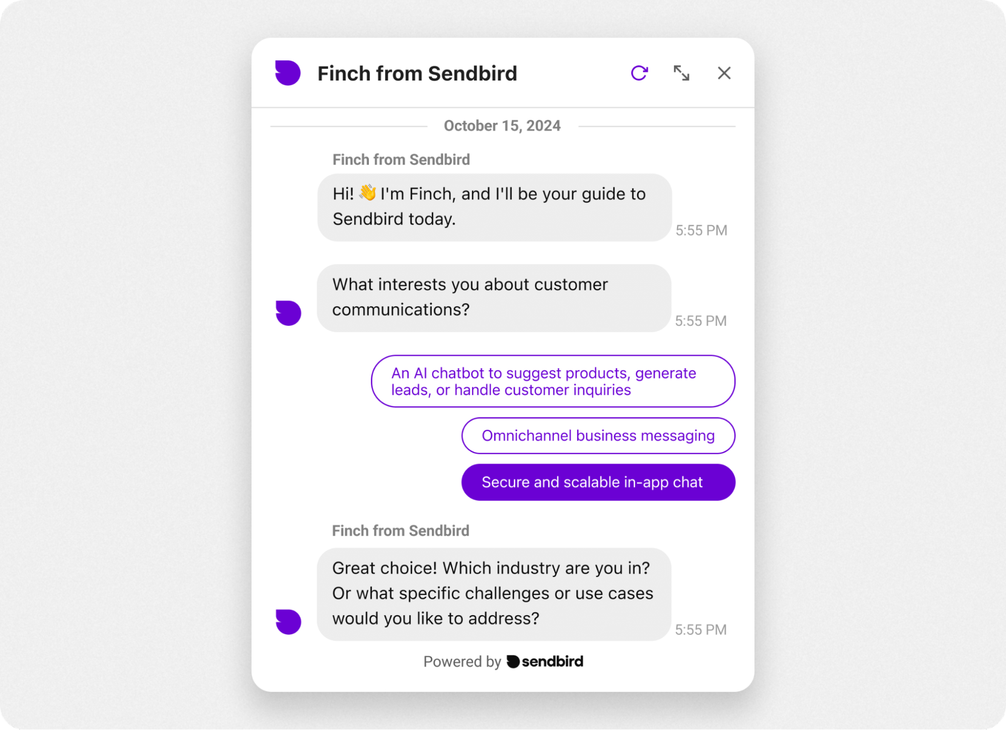
If the AI is uncertain because the user's input was ambiguous, the best response is to ask for more information. This creates a "clarification loop," where the AI and user collaborate to refine the prompt before a final answer is generated.
This is not about the AI failing; it's about the AI being smart enough to ask for help.
Vitaly Friedman - Beyond Chat: What's Next for AI Design Patterns
In this segment, UX expert Vitaly Friedman discusses the importance of slowing down the prompting process to get better results. He shows examples of UIs that guide the user to provide better input.
Please watch from 18:23 to 22:44. Notice how he advocates for using structured UI controls (buttons, forms) to guide the user, rather than relying solely on an open text box. This is a behavioral shift on the input side.
As Vitaly Friedman points out, this can be done by:
- Asking clarifying questions: "When you say 'annual report,' do you mean for executives or for the design team?"
- Providing structured inputs: Instead of a blank text field, offer buttons, sliders, or forms to guide the user toward providing the necessary context.
C. Graceful Degradation and Escalation
What if clarification isn't enough or the AI simply can't handle the request? In this case, the system must gracefully degrade, offering a less complex but still useful alternative, with the ultimate fallback being an escalation path to a human.
Emily Campbell - AI UX Deep Dive
In this clip, AI UX expert Emily Campbell discusses 'governors'—patterns that help build trust by showing the AI's work and giving the user control.
Please watch from 24:51 to 28:33. Pay close attention to the concept of 'planning mode' in Replit, where the AI presents its plan before executing. This gives the user a chance to intervene—a key part of a safe escalation workflow.
A well-designed escalation path might look like this:
- AI is low-confidence: It states its uncertainty.
- It offers a simplified response: "I can't generate the full custom report, but I can show you the standard monthly summary."
- It provides an explicit fallback: It presents a button or link:
[Talk to a human advisor]or[Browse help articles].
This ensures the user is never left at a dead end. The system acknowledges its limits and provides a safe, reliable path forward. This is a cornerstone of responsible AI design.
4. Your Turn: Designing a Low-Confidence Workflow
Let's revisit our AI-powered "Portfolio Rebalancer" from the previous lessons.
Scenario: The market has become highly volatile. The AI analyzes your portfolio and identifies a potential rebalancing trade, but its confidence is low (45%) because the supporting data is conflicting and news sentiment is ambiguous.
Your Task:
Using the patterns we've discussed, design the behavioral shift for this low-confidence scenario. In the previous exercise, you designed the UI for a high-confidence suggestion. Now, how does it change?
-
Redesign the UI Component:
- Language: How does the text change? Write out the new "hedging" copy.
- Visuals: How do the visuals change from the high-confidence version? Do colors shift? Do icons appear?
- Call to Action (CTA): What does the primary button say now? Is it still "Execute Rebalance," or something else?
-
Define the Behavioral Shift:
- What happens when the user clicks the new primary CTA? Describe the workflow that is triggered. Does it execute a trade? Or does it start a clarification or escalation process?
-
Design the Escalation Path:
- Sketch out the user flow (you can describe it textually, as if you were explaining a Figma prototype).
- What options are presented to the user? Do you offer to show them the conflicting data? Do you suggest a simpler, lower-risk trade? Do you provide a "Schedule a call with an advisor" button?
Take about 15 minutes to outline your design for this low-confidence workflow. Think about creating a "no dead ends" experience that prioritizes user safety and trust.
Conclusion
Today we've made a critical shift from designing static displays to architecting dynamic behaviors. When an AI knows it's uncertain, it has a responsibility to act differently, and it's our job as designers to define what that looks like.
Key Takeaways:
- Act on uncertainty: Trustworthy AI doesn't just show its confidence level; it changes its behavior based on it.
- The Confidence Cascade is your guide: Use a spectrum of interactions for high, medium, and low confidence, moving from assertion to suggestion to clarification.
- Low-confidence patterns build safety:
- Hedging language manages expectations.
- Clarification loops improve input quality.
- Graceful degradation and escalation provide safe fallbacks and ensure there are no dead ends.
- This is a core design responsibility: Defining these behavioral shifts is central to creating safe, effective, and trustworthy AI-powered products.
Next Steps
We have now established a solid foundation for designing trustworthy interactions at the component and workflow level by focusing on confidence, traceability, and behavior. However, a robust decision system must also be resilient to unintended long-term consequences.
In our next module, we will zoom out from the immediate user interface to the broader system. We will begin our journey into Strategic Foresight & Failure Analysis, starting with how to distinguish between the immediate, first-order effects of a feature and its long-term, second-order consequences.