Introduction
Hello! In our last lesson, we focused on answering the user's first crucial question about an AI recommendation: "How sure are you?" We explored various UI patterns for communicating an AI's confidence level, all with the goal of fostering calibrated trust and prompting the user to engage their analytical System 2 thinking when necessary.
Showing a low or medium confidence score is a powerful first step, but it immediately invites the user's next, more pointed question: "Why?" Why is the confidence low? Why was this specific recommendation made over others? Why should I trust this at all?
This lesson directly addresses that question. Our learning outcome is to design a UI pattern that provides traceability for an AI's reasoning or data sources. This is where we move from simply stating confidence to providing the evidence behind it. For you as a UI/UX designer and aspiring Decision Systems Architect, this is about designing transparency and giving users the tools they need to conduct their own analysis, moving from being passive recipients to active participants in the decision-making process.
1. The Pillars of Transparency in AI
Before diving into specific UI patterns, it's essential to understand the foundational principles that make an AI system "transparent." These principles go beyond just the interface and touch on the very architecture of the system.
A great way to frame this is through three pillars: Explainability, Accountability, and Data Transparency.
Decode Black Boxes with Explainable AI: Building Transparent AI Agents
This short video from IBM Technology, 'Decode Black Boxes with Explainable AI,' provides a concise introduction to the core concepts of building transparent AI agents.
Please watch from the beginning to 02:37. Pay close attention to the definitions of the three pillars and the key pieces of information a good explanation should provide: the decision, the 'why,' the confidence, and the recourse.
As the video illustrates, a good explanation isn't just a data dump. It's a user-centric communication that answers key questions. The loan declination example is particularly telling:
- Decision: The loan was declined.
- Why: Your debt-to-income ratio is 2% too high.
- Confidence: I'm 85% confident.
- Recourse: Reduce monthly debt by $120 and reapply.
This structure provides a complete, actionable explanation. Our focus today is on designing the "Why" part of this structure. This "Why" can generally be broken down into two categories:
- Reasoning Traceability: Explaining the logic, rules, or steps the AI followed. (e.g., "We recommended this stock because it matches your risk profile and has shown consistent growth in a volatile sector.")
- Data Traceability: Citing the specific data or sources used to arrive at the conclusion. (e.g., "This summary is based on articles from Source A, Source B, and Source C.")
In practice, the best explanations often combine both.
2. UI Patterns for Traceability
Now, let's explore how to translate these principles into concrete UI patterns. Your goal as a designer is not to overwhelm the user with technical details, but to provide clarity at the right moment.
A fundamental pattern is simply annotating the sources an AI uses. This is a direct form of data traceability.
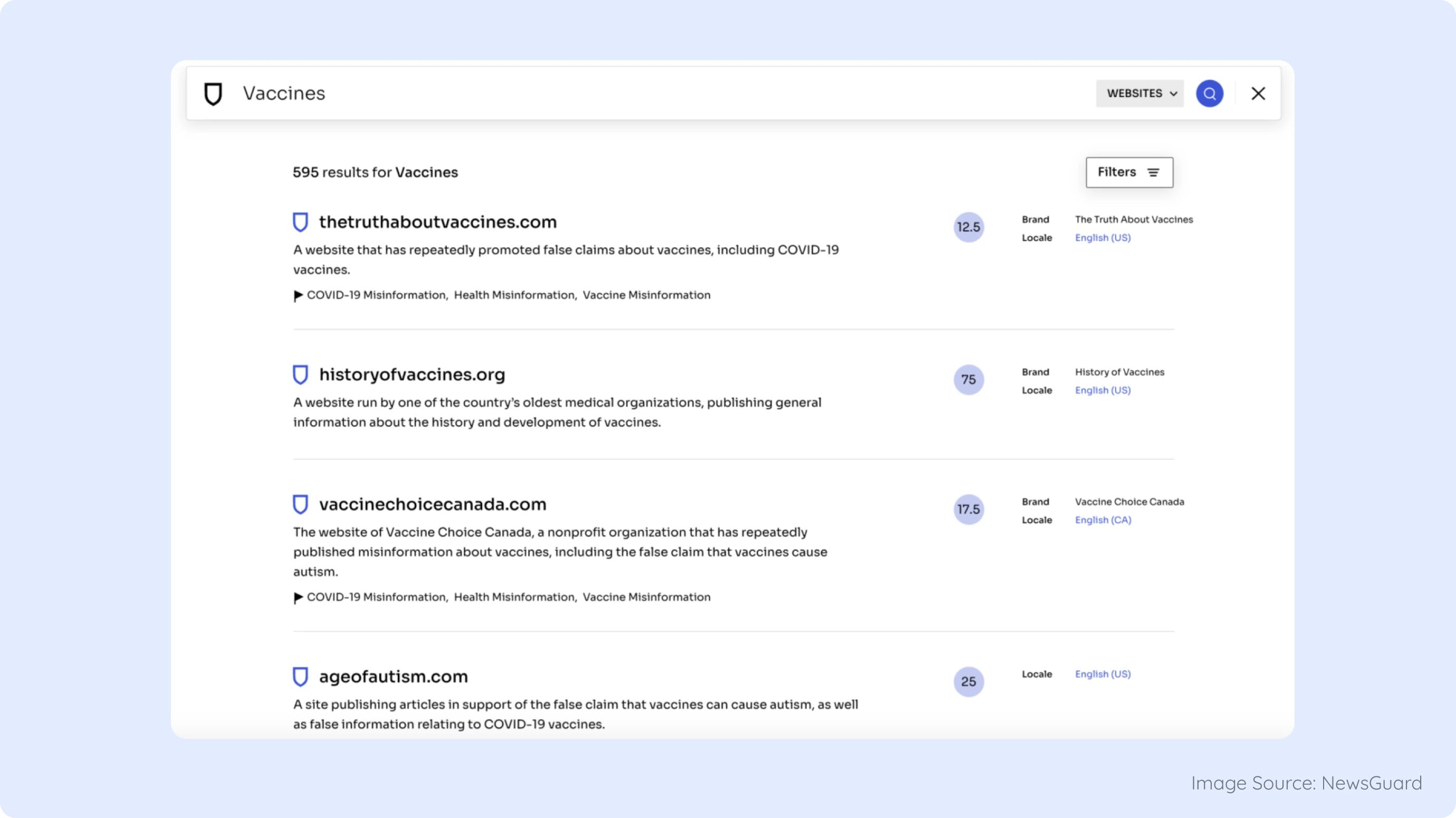
While simple annotation is powerful, many scenarios require more nuanced explanations. Let's look at a collection of established and emerging patterns.
Explainable AI UI Design (XAI): Make Interfaces Users Trust - Eleken
The article 'Explainable AI UI Design (XAI)' from Eleken provides a great overview of the principles and patterns for making AI interfaces trustworthy. It translates complex ML concepts into practical UX terms.
Please read the sections 'Principles of explainable UI design with real examples' and 'Patterns emerging from the field'. Focus on the principles of 'Show the AI’s thinking path' and the patterns of 'In-chat elements' and 'Feedbackable reasoning'.
Progressive Disclosure: The "Why This?" Pattern
One of the most effective strategies, mentioned in the Eleken article, is what SAP's Fiori design system calls Progressive Disclosure. This is a concept you're likely familiar with in UX design: show the essential information first, and let the user drill down for more detail if they choose.
This avoids cluttering the interface for users who don't need a deep explanation, while empowering those who do. It often takes the form of a simple "Why?" or "How was this calculated?" link.
Top 6 Examples of AI Guidelines in Design Systems | by Supernova
This article, 'Top 6 Examples of AI Guidelines in Design Systems,' shows how major companies are standardizing explainability. It provides real-world context for these patterns.
Read the sections on the 'Carbon Design System' (IBM) and 'SAP Fiori Design System'. Notice how both emphasize providing explanations in layers.
IBM Carbon's "progressive layers" and SAP Fiori's "What/Why/How" framework are excellent examples of this principle in action. You start with the what (the recommendation), provide an easy path to the why (a brief explanation), and a further path to the how (detailed data sources or logic).
Hyper-Granular Traceability
For research-heavy or high-stakes applications, simply linking to a source document isn't enough. The user shouldn't have to hunt through a 20-page PDF to verify a single claim. The future of traceability lies in pointing to the exact sentence or data point that supports the AI's statement.
Let's see two brilliant examples of this in practice.
Vitaly Friedman - Beyond Chat: What's Next for AI Design Patterns
In this segment from his talk 'Beyond Chat: What's Next for AI Design Patterns,' Vitaly Friedman showcases two AI tools, Consensus and Elicit, that have exceptional traceability features.
Watch from 09:49 to 16:19. In the 'Consensus' example, pay attention to the 'consensus meter' and color-coded sources. For 'Elicit', focus on the 'magical asterisks' that provide highly granular links to specific segments within research papers.
The patterns in Consensus and Elicit are superb models for data traceability:
- Consensus: The color-coding of sources (green for confirmed, yellow for mixed opinions) and the "consensus meter" provide a visual summary of the data landscape. This is a form of reasoning traceability—showing how the AI synthesized a conclusion from conflicting data.
- Elicit: The asterisks that link directly to a specific segment within a source document represent a gold standard for traceability. They drastically reduce the user's effort in verifying information, thereby building trust and utility.
3. From Explanation to Exploration: Counterfactuals
The most advanced form of explainability goes beyond just showing what the AI did; it allows the user to explore what it could have done. This is known as a counterfactual explanation.
The Eleken article you read earlier describes this as letting users explore "what if." Instead of just saying "Your loan was denied," the system says, "If your income were $500 higher, this loan would be approved."
This turns the AI from a black-box judge into a collaborative tool for learning and exploration. It gives the user agency and a clear path forward. This is a powerful concept for a Decision Systems Architect because it directly connects the system's logic to actionable user outcomes.
4. Your Turn: Designing for Traceability
Let's return to our AI-powered "Portfolio Rebalancer". In the last lesson, you added a UI component to show the AI's confidence in its rebalancing suggestion. Now, let's add the "Why?".
Your task is to design an interaction that provides traceability for the AI's rebalancing recommendation. Assume the AI has medium-to-high confidence (e.g., 85%) and has just suggested selling 10 shares of Stock X and buying 15 shares of Stock Y.
- Choose a Pattern: Select a traceability pattern we've discussed. Will you use a simple "Why?" link with progressive disclosure? Granular source linking like Elicit? A counterfactual explanation?
- Design the Interaction: Describe the user flow. What does the user click? What information is revealed? Think in terms of your Figma design skills.
- For example: "The user clicks a small 'i' icon next to the confidence score. A popover appears with two tabs: 'Reasoning' and 'Data Sources'..."
- Define the Content: What would the explanation say?
- Reasoning: Briefly explain the logic. (e.g., "This trade increases your exposure to the tech sector while maintaining your desired risk level.")
- Data Sources: What data would you cite? (e.g., "Based on Q3 earnings reports for Stock Y and recent market volatility index.")
- Counterfactual (Optional but powerful): What might a counterfactual look like here? (e.g., "To achieve a 'high confidence' recommendation, an additional investment of $500 in bonds would be needed to offset risk.")
Take about 15 minutes to outline your design. This exercise will help you solidify how to apply these abstract principles to a real, high-stakes financial product.
Conclusion
Today we've added a critical layer to our trust-building toolkit. Answering "Why?" is fundamental to moving AI from a mysterious oracle to a transparent, accountable partner.
Key Takeaways:
- Traceability builds on confidence: Once a user knows the AI's confidence, they need to know the reasoning behind it.
- Explainability has two sides: Reasoning traceability (the logic) and data traceability (the sources).
- Progressive disclosure is key: Don't overwhelm users. Provide explanations in layers, allowing users to drill down as needed. This is a core UX pattern applied to AI.
- Granular linking is the gold standard: Citing specific sentences or data points, like in the Elicit app, dramatically improves user trust and efficiency.
- Counterfactuals empower users: Allowing users to ask "what if" transforms a static explanation into an interactive exploration, giving them agency.
Next Steps
We've now equipped our user to understand both the AI's confidence and its reasoning. But what should the UI itself do with that information? A simple label is good, but a truly intelligent system should adapt its own behavior based on its uncertainty.
In our next lesson, we will explore how to define behavioral shifts in a UI when AI confidence is low. We'll look at patterns like using hedging language, changing call-to-action buttons, and designing clear escalation paths to a human expert, further embedding safety and trust directly into the system's architecture.