Hello and welcome back!
In our last few lessons, we've been building up the core components of strong composition. First, we learned how to create a focal point using value and contrast. Then, we explored how to guide the viewer's eye through the scene using leading lines and visual flow.
Today, we're going to put all of those pieces together to tackle a crucial concept: visual hierarchy. This is the art of intentionally arranging elements to show their order of importance, telling the viewer precisely what to look at first, second, and so on. Mastering this separates a mere collection of objects from a clear, impactful story.
Our learning outcome for this lesson is to create two versions of the same scene, one with clear visual hierarchy and one without, to analyze the difference. This hands-on comparison will make the power of deliberate composition incredibly clear.
1. What is Visual Hierarchy?
Visual hierarchy is the principle of arranging elements to show their order of importance. A scene with strong visual hierarchy has a clear primary focal point, one or more secondary points of interest, and tertiary details that add richness without competing for attention. A scene without it feels chaotic, and the viewer's eye wanders aimlessly, unsure of where to land. This is often called "visual confusion."
Let's look at two very simple examples.
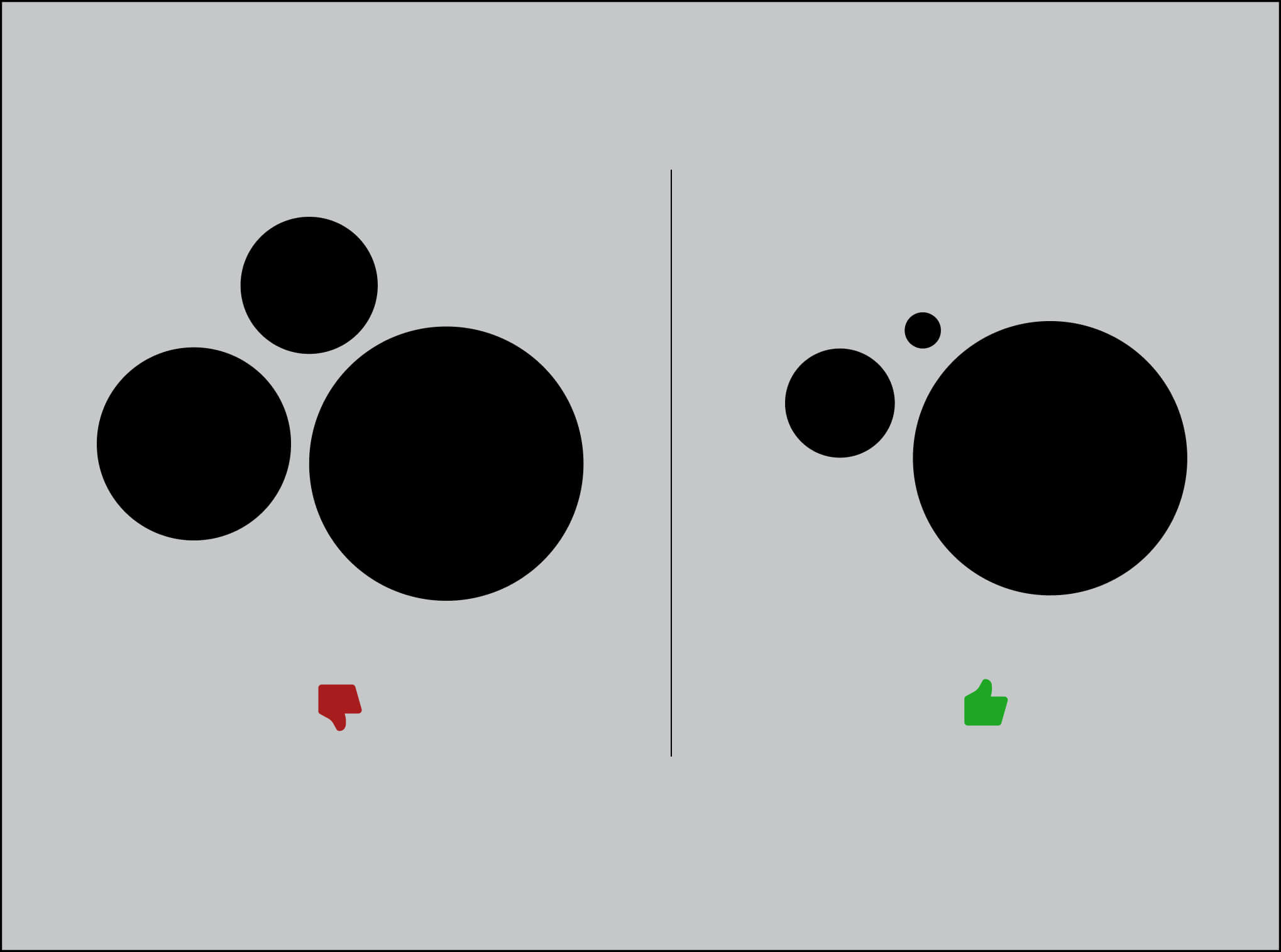
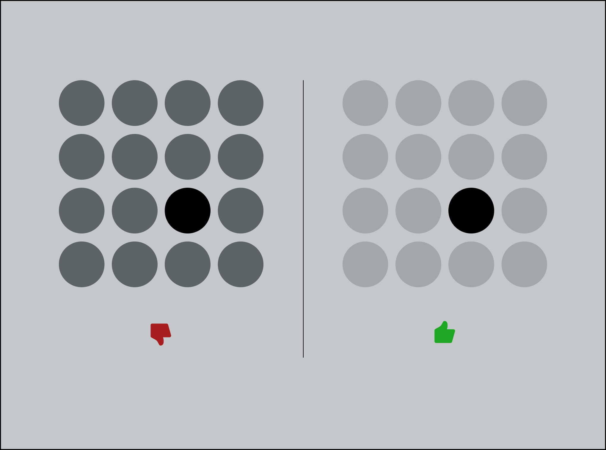
The main tools you'll use to establish hierarchy are:
- Contrast: The most powerful tool. This can be contrast in value (light vs. dark), color (saturated vs. muted), or shape.
- Scale: Larger objects naturally command more attention.
- Detail: The eye is drawn to areas with higher detail and texture.
- Isolation: An object placed with significant negative space around it will stand out.
To see how this applies to more complex environment art, let's hear from artist Tyler Edlin as he critiques a few pieces.
TOP 10 TIPS FOR ENVIRONMENT ART (FEATURING YOUR ART!)
In this video, Tyler Edlin discusses key tips for environment art. He provides a perfect demonstration of a scene with clear hierarchy and another that suffers from 'visual confusion.'
Watch these three short clips: First, from 03:07 to 04:06, notice how he praises a piece for its clear visual hierarchy, pointing out how framing and value emphasize the main character. Next, from 08:19 to 09:18, he analyzes a piece that lacks hierarchy. Pay attention to how he describes multiple elements competing for attention. Finally, from 09:18 to 09:48, he explains the solution: decide what to emphasize and use your tools to express that choice, reserving highlights for specific elements.
2. The Mechanics of Controlling Attention
Now that you understand the what and why, let's focus on the how. How do you ensure one focal point dominates another? How do you use light and composition to build this order of importance?
Artist Neil Blevins provides an excellent technical breakdown of creating and managing focal points, which is the foundation of hierarchy.
Creating Focal Points And Visual Paths
In his video 'Creating Focal Points And Visual Paths,' Neil Blevins details the practical techniques for drawing the viewer's eye. We'll focus on the sections about using contrast and managing multiple points of interest.
Please watch the following sections: Using Contrast (01:21 - 04:15): Pay close attention to his explanation of using value contrast (light against dark) and detail contrast (high detail vs. low detail) to create a focal point. This is your primary tool for establishing the top of your hierarchy. Multiple Focal Points (22:40 - 24:10): This is the core of visual hierarchy. He explains that if you have multiple focal points, you must ensure one dominates. Notice his example of having one area of very high contrast and a secondary area of slightly less contrast.
In a 3D application, your lighting toolkit is one of the most direct ways to control visual hierarchy. You're not just illuminating a scene; you're sculpting with light and shadow to direct the narrative.
8 Types of Accent Lights in D5 Render: The Ultimate Guide
This guide from D5 Render, while specific to their software, outlines universal principles for using accent lights to create hierarchy. These concepts apply to any render engine, including Blender's Cycles or Eevee, or Houdini's Karma.
Read these key sections: Start with the Key Takeaways at the top. The very first point is about defining visual hierarchy with accent lights. Read the section on the Spotlight. It's described as your 'primary tool for establishing visual hierarchy.' Notice the advice on using it to emphasize elements through shadow and contrast. Finally, look at the FAQ at the end. Read Q1, which directly addresses how to use accent lights to avoid 'flat' renders and create depth by sculpting with light.
Test your understanding!
You are building a scene of a lone adventurer discovering a treasure chest inside a dark, cluttered cave. To establish a clear visual hierarchy, what are three specific things you could do using light, contrast, and/or detail?
Show answer
Here are a few possible answers:
- Primary Focal Point (Chest): Use a spotlight aimed at the treasure chest, making it the brightest object in the scene. You could also have light rays coming from within the chest itself, creating very high value contrast against the dark cave.
- Secondary Focal Point (Adventurer): Light the adventurer with a softer rim light that separates their silhouette from the background, but ensure the overall brightness on them is less than the light on the chest. This makes them important, but clearly secondary.
- Tertiary Elements (Cave clutter): Keep the surrounding rocks, barrels, and cave walls in shadow or low, ambient light. Reduce the detail on their textures or use atmospheric fog to push them back, ensuring they don't compete for attention.
3. Your Turn: Hierarchy vs. Chaos (Approx. 35 minutes)
It's time to apply these concepts. Your task is to build a simple scene and render it twice: once with no clear hierarchy, and once with a very deliberate hierarchy.
The Prompt:
Choose a simple narrative concept for your scene. It should have a clear subject and a setting.
- Idea 1: A robot repairing a complex engine in a messy workshop.
- Idea 2: A person reading a glowing book in a vast, ancient library.
- Idea 3: A single, unique flower growing in a dense, overgrown garden.
The Steps:
-
Blockout the Scene (5 mins):
Using simple primitives in Blender or Houdini, block out your chosen scene. Include your main subject, secondary elements, and background/environmental details. Position your camera. This single blockout will be the base for both versions. -
Version A: Create Visual Chaos (10 mins):
- Duplicate your scene or create a new lighting collection.
- Your goal is to make everything equally important.
- Light the scene evenly with a large, soft area light or an ambient world light. Avoid strong shadows and contrast.
- Ensure multiple objects have similar value (brightness). You can check this by viewing your render in grayscale.
- Keep everything in sharp focus.
- Render this version and save it as
version_A.png.
-
Version B: Create Clear Hierarchy (15 mins):
- Go back to your base scene or duplicate it again.
- First, decide your hierarchy:
- 1st (Primary): The glowing book / the robot's focus point / the unique flower.
- 2nd (Secondary): The person reading / the robot's body / the immediate surrounding leaves.
- 3rd (Tertiary): The library shelves / the workshop clutter / the rest of the garden.
- Execute the hierarchy:
- Use a Spotlight to create a focused, bright pool of light on your primary element. This should be the area of highest contrast.
- Use a softer, dimmer fill light or rim light to illuminate your secondary element, separating it from the background but keeping it darker than the primary focus.
- Let the tertiary elements fall into shadow. Use atmospheric fog or camera Depth of Field to blur the background and reduce its detail.
- Render this version and save it as
version_B.png.
-
Analyze the Difference (5 mins):
- Look at
version_A.pngandversion_B.pngside-by-side. - In a simple text file, briefly describe the difference. Ask yourself:
- In Version A, where does my eye go first? Is it a clear choice?
- In Version B, what is the path my eye follows?
- What were the top 2-3 specific changes (e.g., adding a spotlight, blurring the background) that made the biggest difference in creating the hierarchy in Version B?
- Look at
This exercise is not about creating a polished masterpiece, but about demonstrating a conscious control over the viewer's attention.
Conclusion
Today you've moved from simply placing elements in a frame to orchestrating a complete visual experience. By establishing a clear visual hierarchy, you are telling the viewer a story in the most efficient and impactful way possible.
Key Takeaways:
- Visual Hierarchy is the intentional ordering of elements by importance to guide the viewer's eye.
- A lack of hierarchy creates visual confusion, where elements compete for attention.
- Hierarchy is primarily established using contrast (value, color, detail), scale, and isolation.
- In 3D, lighting (especially spotlights and accent lights) and camera effects (like depth of field) are your most powerful and direct tools for sculpting this hierarchy.
In our next lesson, we will sharpen our analytical skills further. You'll be asked to analyze and diagram the composition of 3 master paintings or film stills, identifying key principles. This will train your eye to see the invisible structures that make great images work, making it easier to apply them to your own 3D art.