Welcome back! In our last lesson, we covered the essentials of CSS, learning how to style individual elements and manage their spacing with the box model. You now have the tools to change the appearance of elements, but arranging them into a cohesive page layout requires a more powerful system.
This lesson introduces CSS Flexbox, a modern and essential layout module. You will learn to use its core properties to create flexible, responsive, and robust layouts. We'll explore the fundamental concepts of flex containers and items, understand the critical role of the main and cross axes, and use properties like display, flex-direction, justify-content, and align-items to distribute and align elements. Mastering Flexbox is a significant step toward building the complex user interfaces you'll create with Leptos.
The Core Idea: Containers and Items
Flexbox works by defining a relationship between a parent element (the flex container) and its direct children (the flex items). You "activate" Flexbox on a container, and this gives you a whole new set of properties to control the position, alignment, and size of the items within it.
This model is built around two fundamental axes: the main axis and the cross axis.
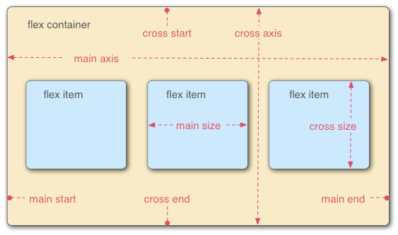
The key insight is that almost all Flexbox properties operate relative to these axes.
- The main axis is the primary direction along which flex items are laid out.
- The cross axis is the axis perpendicular to the main axis.
Crucially, you can decide whether the main axis runs horizontally or vertically. This makes Flexbox an incredibly versatile, one-dimensional layout system.
Let's begin with an introductory video that walks through these foundational concepts.
This clip from the "Flexbox Crash Course" by Traversy Media provides a concise overview of what Flexbox is, the container/item relationship, and the concept of the main and cross axes.
Watch the first section of the video from the introduction. Focus on understanding the distinction between a flex container and a flex item, and how the main and cross axes are defined for rows and columns.
Activating Flexbox and Setting Direction
To turn an element into a flex container, you simply set its display property to flex.
.container {
  display: flex;
}
The moment you do this, the direct children of .container become flex items and will, by default, arrange themselves in a horizontal row, regardless of their original display value (e.g., block or inline).
The direction of the main axis is controlled by the flex-direction property. It has four possible values:
row(default): Main axis is horizontal, left-to-right.row-reverse: Main axis is horizontal, right-to-left.column: Main axis is vertical, top-to-bottom.column-reverse: Main axis is vertical, bottom-to-top.
Changing flex-direction from row to column swaps the main and cross axes. This is a powerful feature, as all other alignment properties will adapt automatically.
The following interactive guide provides an excellent hands-on feel for these initial properties.
An Interactive Guide to Flexbox in CSS
This guide by Josh W. Comeau is one of the best resources for building a strong mental model of Flexbox. Its interactive examples let you see the effects of properties in real time.
First, read the introduction to understand the problem Flexbox solves and how to enable it with display: flex. Next, work through the section on flex direction. Pay close attention to the interactive demo and the explanation of how the primary (main) and cross axes change based on this property.
Distributing Items: justify-content and align-items
Once you have your flex container and direction, the next step is to control how the items are positioned and spaced. This is done with two primary properties: justify-content for the main axis and align-items for the cross axis.
Main Axis Alignment: justify-content
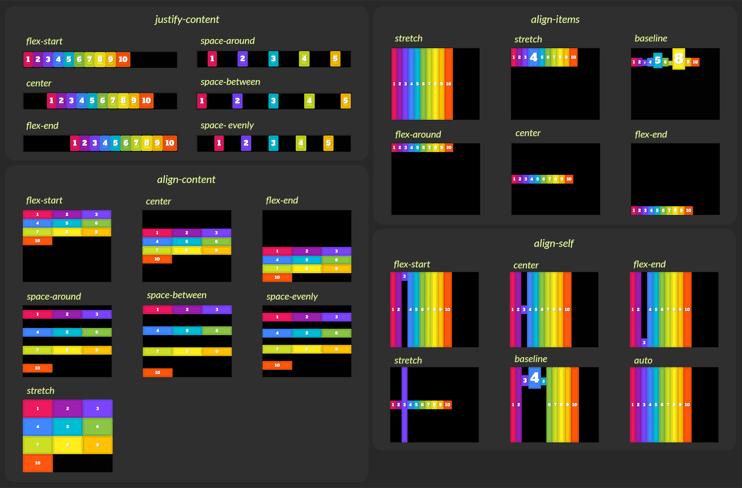
The justify-content property defines how flex items are distributed along the main axis. It is particularly useful for managing the extra space in the container.
Common values include:
flex-start: Items are packed at the start of the main axis.flex-end: Items are packed at the end of the main axis.center: Items are centered along the main axis.space-between: Items are evenly distributed; the first item is at the start, the last is at the end.space-around: Items are evenly distributed with equal space around them.space-evenly: Items are distributed so that the space between any two items and the space to the edges are equal.
Cross Axis Alignment: align-items
The align-items property defines how flex items are aligned along the cross axis.
Common values include:
stretch(default): Items stretch to fill the container's height (or width, ifflex-directioniscolumn).flex-start: Items are aligned to the start of the cross axis.flex-end: Items are aligned to the end of the cross axis.center: Items are centered on the cross axis.baseline: Items are aligned so their text baselines line up.
The image below gives a fantastic visual summary of these alignment properties.
Now, let's dive into an excellent video explanation that demonstrates these properties in a practical context.
Kevin Powell's tutorial excels at explaining the "why" behind Flexbox behaviors in a clear, beginner-friendly manner.
Watch the segment on justify-content. Notice how it only works when there is leftover space along the main axis. Next, watch the segment on align-items. This part clearly shows how to align items vertically (in a row layout) and explains why properties like space-between don't apply here.
Overriding Alignment with align-self
While align-items sets the default alignment for all children, you can override this for a specific child using the align-self property. This is applied directly to a flex item, not the container. It accepts the same values as align-items (e.g., flex-start, center, stretch).
This leads to an important question: why is there an align-self but not a justify-self? This gets to the heart of how Flexbox treats the two axes differently. The following reading uses a clever metaphor to explain this.
An Interactive Guide to Flexbox in CSS
We're returning to Josh Comeau's guide to clarify the distinction between the two axes.
Read the sections on Alignment and Content vs. items. The kebab vs. cocktail wiener analogy is a memorable way to understand why we can align items individually on the cross axis (align-items, align-self) but must distribute them as a group on the main axis (justify-content).
Controlling Flexibility and Size
So far, we've focused on alignment. But the "flex" in Flexbox comes from its ability to flexibly control the size of items—letting them grow to fill available space or shrink to fit smaller spaces. This is primarily controlled by three properties on the flex items themselves: flex-grow, flex-shrink, and flex-basis.
flex-basis: Defines the ideal or initial size of an item along the main axis before any growing or shrinking occurs. You can think of it as a more flexible version ofwidth(in a row) orheight(in a column).flex-grow: A unitless number that dictates how much an item will grow relative to its siblings if there is extra space in the container. The default is0(don't grow).flex-shrink: A unitless number that dictates how much an item will shrink relative to its siblings if there isn't enough space. The default is1(allowed to shrink).
These are often used via the shorthand property flex. For example, flex: 1; is a common pattern that is shorthand for flex-grow: 1; flex-shrink: 1; flex-basis: 0%;. This tells all items to start at a base size of 0 and then share the available space equally, resulting in equal-width columns.
Let's watch a clear explanation of how this works.
This part of the video breaks down the concepts of growing and shrinking, which are key to creating truly flexible layouts.
First, watch the segment covering flex-grow and flex-shrink. This explains the default behavior and what happens when you enable growing. Next, see how these properties combine in practice by watching the section on creating equal columns. This demystifies the common flex: 1 declaration by explaining flex-basis.
Conclusion
In this lesson, we moved from styling individual elements to arranging them in powerful, one-dimensional layouts with CSS Flexbox. You've learned that Flexbox is not just a collection of properties, but a layout algorithm governed by a clear mental model: the container, its items, and the main and cross axes.
Key Takeaways:
- Flexbox is enabled by setting
display: flexon a container, which makes its direct children items. - Layout is determined by the main axis and cross axis. The
flex-directionproperty (roworcolumn) sets the orientation of the main axis. justify-contentdistributes items along the main axis, controlling how extra space is used.align-itemsaligns items along the cross axis.align-selfcan be used to override this on individual items.- The
flexproperty (shorthand forflex-grow,flex-shrink, andflex-basis) controls the flexibility of items, allowing them to grow or shrink to fit the available space.
Next Up:
Theory is great, but practice is better. In the next lesson, we will apply everything you've just learned to a practical and common web development task: constructing a simple webpage with a distinct header, main content area, and footer, all arranged using Flexbox.