In the previous lesson, we explored the fundamental properties of CSS Flexbox, understanding how to control the alignment, direction, and flexibility of items within a container. Now, it's time to apply that knowledge to a tangible and essential task: building the foundational structure of a modern webpage.
This lesson will guide you through constructing a simple yet robust page layout consisting of a header, a main content area, and a footer. You will learn how to use a column-based Flexbox layout for the overall page structure and how to nest a row-based layout for the content area. A key technique we'll cover is the "sticky footer," ensuring your footer stays at the bottom of the screen even on pages with little content. This is a cornerstone pattern in web development and a perfect practical application of your new Flexbox skills.
The Overall Structure: A Vertical Stack
The most common high-level structure for a webpage is a vertical arrangement of a header, a main content block, and a footer. With Flexbox, creating this is straightforward. We'll treat the <body> element of our page as a flex container and configure it to stack its children—the <header>, <main>, and <footer> elements—vertically.
The key CSS properties for this are display: flex and flex-direction: column.
There's one more crucial piece. If the content on the page is short, the footer will appear directly after it, leaving a large empty space at the bottom of the viewport. To solve this, we want the layout to always fill the full height of the browser window. We achieve this by setting min-height: 100vh on our flex container (<body>). The vh unit stands for "viewport height," so 100vh means 100% of the available height of the browser window.
The "Sticky Footer" Technique with flex-grow
With our container filling the viewport, we now have extra vertical space. How do we want to distribute it? Ideally, the header and footer remain at their natural height, and the main content area expands to fill all the remaining space.
This is a perfect use case for the flex-grow property you learned about in the last lesson. By applying flex-grow: 1 to the <main> element, we tell it to "soak up" any extra space along the main axis (which, in our vertical layout, is the vertical axis). Since <header> and <footer> have the default flex-grow: 0, they won't expand. This elegantly pushes the footer to the bottom of the viewport, regardless of the content's height.
The following video provides a concise demonstration of building this vertical, flexible structure.
Create Responsive Flexbox Layout in 8 Minutes
This video from the How to Web Dev channel demonstrates how to quickly assemble a full-page layout. We'll focus on the initial vertical stacking.
Watch the segment from the beginning of the styling. Pay attention to how display: flex and flex-direction: column are applied to the main container. The narrator uses flex: 1 for the header and flex: 4 for the content section, which is another way of using flex-grow. It gives the content section four times more "weight" to grow into the available space compared to the header. This achieves the same goal of making the content area expand.
Nesting Flexbox for Internal Layouts
Now that our main vertical structure is in place, we can focus on the layout inside the <main> element. A common pattern is to have a central article flanked by one or two sidebars. This requires a horizontal layout.
We can achieve this by turning the <main> element into a flex container itself. This is a key concept: you can nest flex containers. The <main> element is a flex item within the <body> container, but it can also be a flex container for its own children.
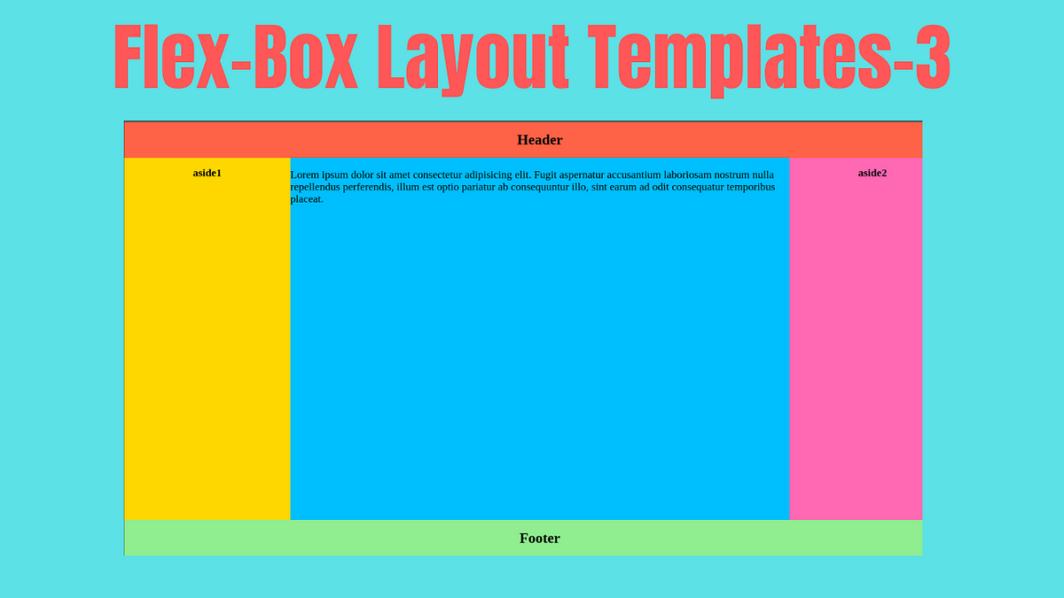
By setting display: flex on <main>, its children will default to flex-direction: row, arranging themselves horizontally. We can then use the flex shorthand property on the children to control their widths. For example, we could make the central article flexible while keeping the sidebars at a fixed width or a smaller proportion.
Let's return to the video to see this principle in action.
Create Responsive Flexbox Layout in 8 Minutes
This next segment shows how to create the horizontal two-column layout within the main content area.
Watch the section from creating columns. Notice that the section element (which is inside the main container) is now made a flex container. Its children, the two columns, arrange themselves side-by-side. The flex property is again used to give the left column (flex: 2) twice as much space as the right column (flex: 1).
A Practical Walkthrough
Let's solidify this with a step-by-step guide. The following resource explains how to create a layout with a flexible central column and static side columns, a pattern directly applicable to what we've been discussing.
Flexbox Tutorial | HTML & CSS Is Hard
The "Interneting Is Hard" tutorial provides excellent, in-depth explanations. We'll focus on a section that builds a three-column footer, as the technique is identical for creating a main content area with sidebars.
Please read the section titled Flexible Items. As you read, focus on these key steps: Equal distribution: Initially, flex: 1 is applied to all three items, causing them to share the available space equally. Unequal distribution: The middle item's flex value is changed, showing how you can create proportionally sized columns. Mixing flexible and static items: This is the most important part. The guide applies flex: initial and a fixed width to the outer items, while the central item retains flex: 1. This combination creates a layout where the sidebars have a fixed size and the main content area fluidly expands or shrinks to fill the remaining space. This is an incredibly common and powerful pattern.
Putting It All Together
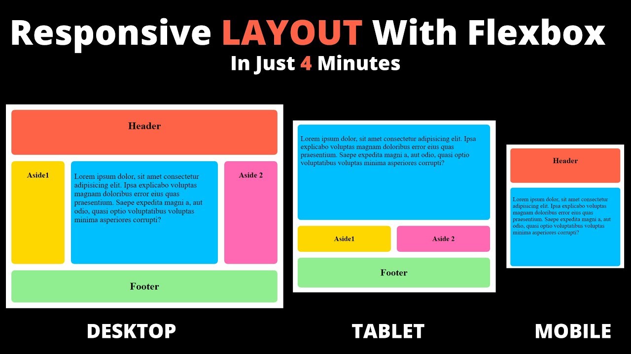
Let's consolidate everything into a complete, working example. Here is the HTML and CSS for a classic Header-Content-Footer layout, where the content area is further divided into a flexible article and two sidebars.
HTML (index.html)
<!DOCTYPE html>
<html lang="en">
<head>
<meta charset="UTF-8">
<meta name="viewport" content="width=device-width, initial-scale=1.0">
<title>Flexbox Page Layout</title>
<link rel="stylesheet" href="style.css">
</head>
<body>
<header>
<h1>My Website</h1>
</header>
<main>
<aside class="sidebar-left">Sidebar Left</aside>
<article>
<h2>Main Content</h2>
<p>This content area grows and shrinks to fill available space, while the sidebars and header/footer have fixed proportions.</p>
</article>
<aside class="sidebar-right">Sidebar Right</aside>
</main>
<footer>
<p>© 2024 My Website</p>
</footer>
</body>
</html>
CSS (style.css)
/* A simple reset for consistency */
* {
  margin: 0;
  padding: 0;
  box-sizing: border-box;
}

/* 1. Set up the main vertical layout container */
body {
  display: flex;
  flex-direction: column;
  min-height: 100vh; /* Ensures the body fills the viewport height */
  font-family: sans-serif;
}

header, footer {
  background-color: #e3e3e3;
  padding: 1rem;
  text-align: center;
  /* Default flex-grow is 0, so they don't expand */
}

/* 2. The main content area */
main {
  display: flex; /* It's a nested flex container! */
  flex-grow: 1;  /* This makes it fill the vertical space */
}

/* 3. The items inside the main content area */
article {
  flex: 3; /* This will take 3 "shares" of the available width */
  padding: 1rem;
  background-color: #f7f7f7;
}

aside {
  flex: 1; /* Each sidebar will take 1 "share" of the width */
  padding: 1rem;
  background-color: #f0f0f0;
}
This simple set of rules creates a fully functional and common webpage layout. Because we used Flexbox, it also has some inherent responsiveness. If you were to view this on a smaller screen, the columns would shrink proportionally.
Conclusion
In this lesson, you put Flexbox theory into practice to build one of the most fundamental structures in web design. You now have a reusable pattern for creating robust page layouts.
Key Takeaways:
- A full-page layout can be created by making the
<body>a flex container withflex-direction: column. - The "sticky footer" pattern is achieved by setting
min-height: 100vhon the container andflex-grow: 1on the main content element. - Flexbox layouts can be nested to create more complex designs, like a horizontal column layout inside a vertical page structure.
- The
flexproperty is a powerful shorthand for controlling the relative sizes of elements, enabling you to create fluid and fixed columns within the same container.
Next Up:
With the overall page structure in place, the next step is to add elements for user interaction. In our next lesson, we will dive into HTML forms, learning how to create inputs, buttons, and other controls that allow users to submit data. This is a crucial step on our path to building interactive Leptos applications.