In our last session, we explored how a browser transforms an HTML text file into a live, structured representation called the Document Object Model (DOM). We established that this DOM is a tree of nodes that frameworks like Leptos are built to manipulate. Today, we'll learn how to give that structure visual form and style using Cascading Style Sheets (CSS).
This lesson will equip you to apply styles to your HTML documents. We will cover the fundamental syntax of CSS, how to target specific DOM elements using selectors, how to group reusable styles using classes, and how to control appearance and spacing with common properties like color, font, margin, and padding. This is a foundational web skill that you'll use constantly when building user interfaces in Leptos.
What is CSS and How Does it Work?
CSS is a style sheet language. It's not a programming language like Rust or Python; it doesn't have logic, loops, or control flow in the same way. Its purpose is to describe the presentation of a document written in a markup language like HTML. It allows you to separate the content and structure (HTML) from the presentation (CSS), which is a core principle of modern web development.
A CSS file is composed of rulesets. A ruleset has two main parts: a selector and a declaration block.
- The selector "selects" the HTML element(s) you want to style. It's a pattern that matches nodes in the DOM tree we discussed previously.
- The declaration block, enclosed in curly braces
{}, contains one or more declarations. Each declaration consists of a property (likecolororfont-size) and a value, separated by a colon.
/* This is a CSS ruleset */
p {
  color: blue;
  font-size: 16px;
}
In this example, the selector is p, which targets all <p> (paragraph) elements. The declaration block contains two declarations: one sets the text color to blue, and the other sets the font size to 16 pixels.
There are three main ways to apply these CSS rules to an HTML document. The following article from the Mozilla Developer Network (MDN) explains them clearly. While it's important to know all three, we'll be focusing on the best practice: external stylesheets.
Getting started with CSS - Learn web development | MDN
This section from MDN's "Getting started with CSS" guide introduces the three methods for incorporating CSS: external stylesheets, internal stylesheets, and inline styles.
Please read the section Adding CSS to our document. Pay close attention to the descriptions of external, internal, and inline methods. Note why external stylesheets are considered the most common and useful approach.
As you read, the key takeaway is that using an external stylesheet (<link rel="stylesheet" href="styles.css">) is the preferred method. It keeps your styling separate from your structure, making your code much cleaner and easier to maintain—a principle that is just as important in web development as it is in systems programming.
Selectors: Targeting Elements in the DOM
Selectors are the heart of CSS. They are the bridge between your stylesheet and your HTML document's DOM tree. By writing precise selectors, you can target anything from a single element to complex groups of elements.
Element Selectors
The most basic type of selector is the element selector (or type selector). It targets all instances of a specific HTML tag. For example, h1 selects all <h1> elements, and p selects all <p> elements.
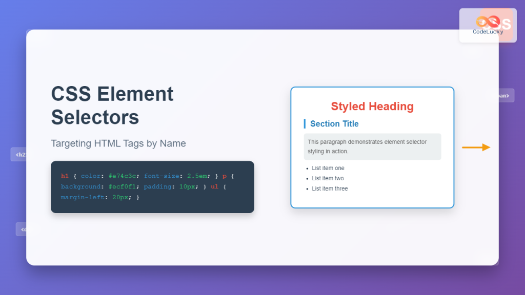
Let's watch a short clip that demonstrates this in action.
CSS Selectors Tutorial for Beginners
In this video, Dave Gray provides a clear, practical demonstration of basic CSS selectors.
Watch the segment from the beginning, where the instructor explains and demonstrates how to use an element selector to style the <body> and <p> tags.
Class Selectors
Styling all elements of a certain type is often too broad. What if you want some paragraphs to be highlighted, but not others? For this, we use class selectors.
A class is an attribute you can add to any HTML element, like this: <p class="highlight">This is a special paragraph.</p>. You can then target this specific element in your CSS using a period (.) followed by the class name.
.highlight {
  background-color: yellow;
  font-weight: bold;
}
The power of classes is that they are reusable. You can apply the same class to multiple elements (<p>, <li>, <span>, etc.), and they will all receive the same styles.
Let's see how this works in the next segment of the video.
CSS Selectors Tutorial for Beginners
This clip continues the tutorial on selectors, focusing on the highly versatile class selector.
Now, watch from this section on classes. Notice how a class selector is more specific and can override a general element selector.
While the video also mentions ID selectors (e.g., #my-id), it's good practice to primarily use classes for styling. IDs must be unique on a page and have very high "specificity," which can make stylesheets difficult to manage. We'll stick with element and class selectors for now as they cover the vast majority of use cases.
Combining Selectors
You can also create more complex rules by combining selectors.
- Grouping: To apply the same rule to multiple selectors, you can group them with a comma:
h1, h2, h3 { color: navy; }. - Descendant: To select an element that is inside another element, you list them with a space in between:
ul li { border: 1px solid gray; }selects only<li>elements that are inside a<ul>.
Let's see a quick demonstration of these combinations.
CSS Selectors Tutorial for Beginners
This part of the video shows how to group selectors and how to target nested elements.
Watch from this segment on grouping and nesting selectors. This demonstrates the power of combining simple selectors to create more specific targets.
The CSS Box Model: Margin & Padding
One of the most fundamental concepts in CSS is the box model. Every element on a page is treated as a rectangular box. This box is composed of four parts, from the inside out:
- Content: The text, image, or other media in the element.
- Padding: The transparent space between the content and the border.
- Border: A line that goes around the padding and content.
- Margin: The transparent space outside the border, separating the element from other elements.
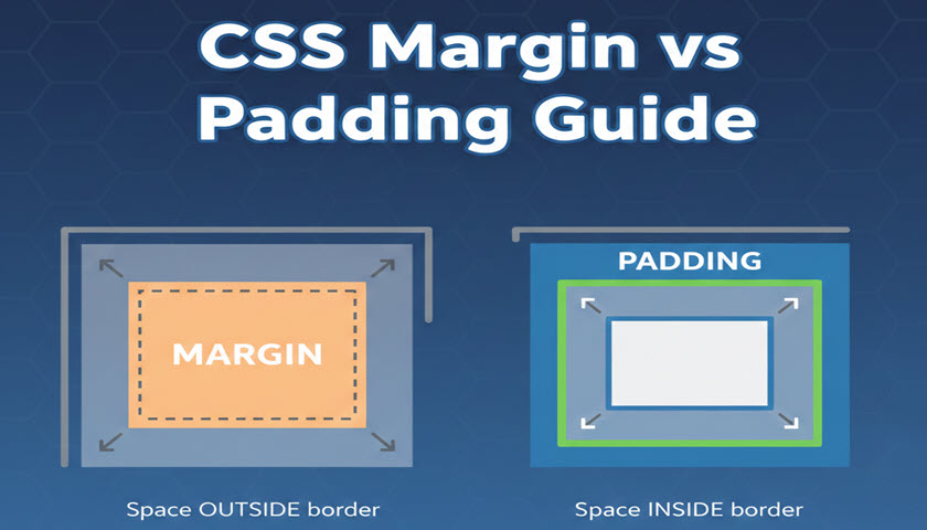
Understanding the distinction between padding and margin is crucial for layout and spacing.
- Use padding to create space within an element, for example, to stop text from touching the edges of a button.
- Use margin to create space between elements, for example, to push two paragraphs apart from each other.
The following video provides an excellent, concise explanation of the entire box model.
Learn CSS Box Model In 8 Minutes
This video from Web Dev Simplified breaks down the CSS box model into its essential components.
First, watch the introduction from the beginning to understand that every element is a box. Next, see how padding adds space inside the element. Then, watch how the border is added around the padding. Finally, understand how margin creates space outside the element. The segment on using DevTools is also very helpful, as it reinforces the skill you learned in the last lesson for inspecting the DOM and now applying it to CSS.
Common Properties: Color and Font
Besides spacing, the most common styles you'll apply relate to color and typography. Here are a few key properties:
color: Sets the color of the text content.background-color: Sets the background color of the element's box (content + padding).font-family: Specifies the font for the text (e.g.,Arial,Verdana,"Times New Roman"). It's common to provide a "fallback" list, likefont-family: Helvetica, Arial, sans-serif;.font-size: Sets the size of the text, often usingpx(pixels) orremunits.font-weight: Sets the thickness of the font (e.g.,normal,bold).
Let's read a brief section from MDN that puts these properties into practice.
CSS: Styling the content - Learn web development | MDN
This article provides a hands-on example of styling a basic webpage.
Skim through the section Improving the text to see how font-family and font-size are applied. Next, review the sections on changing the page color and styling the body/title. This demonstrates the use of background-color, width, margin, padding, and border together to create a centered layout with styled elements.
Conclusion
In this lesson, we made the jump from pure structure (HTML) to presentation (CSS). You've learned the essential mechanics of how to apply styles to a webpage, a skill that directly translates to making your Leptos applications look polished and professional.
Key Takeaways:
- CSS (Cascading Style Sheets) is a language for styling HTML elements.
- CSS rules consist of a selector (to target elements) and declarations (
property: value) within a block{}. - The best practice is to use an external stylesheet linked via the
<link>tag in your HTML's<head>. - Element selectors (
p) target all elements of a type, while class selectors (.my-class) target elements with a specificclassattribute, allowing for reusable styles. - Every element is treated as a box defined by the CSS Box Model, which includes content, padding (internal space), border, and margin (external space).
- Common properties like
color,background-color,font-family, andfont-sizecontrol the fundamental look and feel of your elements.
Next Up:
Now that you can style individual elements and control their spacing, the next logical step is to arrange them into a coherent layout. In the following lesson, we will dive into CSS Flexbox, a powerful and modern layout module that allows you to design flexible and responsive page structures with ease. This will be your primary tool for arranging components on the page.