Introduction
Welcome back! In our last lesson, you established the strategic zones for your beauty mini-market and created a rough sketch based on the psychology of customer flow. You defined what goes where—placing new arrivals at the front, destination products at the back, and organizing categories like skincare and makeup in the central areas.
Today, we will build directly on that foundation. The learning outcome for this lesson is to design a functional floor plan for a beauty mini-market. We'll move from your conceptual sketch to a more detailed, practical blueprint. Think of the previous lesson as creating a sitemap for a website; today, we are creating the wireframe. We'll choose a formal layout structure, arrange fixtures to scale, and ensure the plan works not just for customers, but for you and your staff as well.
1. Choosing Your Store's Layout Style
Just as different website layouts serve different purposes (e.g., a blog vs. an e-commerce site), different retail layouts are designed to elicit specific customer behaviors. Your goal is to create an experience of discovery and elegance, which differs greatly from the efficiency-focused layout of a grocery store.
We'll explore the most relevant layout types for a specialty store like yours.
Planning Your Retail Store Layout
The video 'Planning Your Retail Store Layout' by FitSmallBusiness provides an excellent overview of the standard options. As you watch, think about which style best fits the 'beauty mini-market' concept.
Please watch the sections describing these three layouts: Loop Layout (02:51 - 04:42) Free Flow / Mixed Layout (04:42 - 06:30) Diagonal Layout (06:39 - 08:02) Pay attention to the type of store each layout is best for and the kind of shopping experience it creates.
Let's break down these options for your beauty store:
- Loop Layout: This design creates a clear, defined path that guides customers around the perimeter of the store. It's excellent for maximizing exposure to all your products and works well in smaller, rectangular spaces. The central area can be used for promotional displays or a consultation station.
- Free-Flow Layout: As the name suggests, this layout is more open and organic. It uses a variety of fixture placements (tables, curved shelving) to create a relaxed, meandering path. This is often considered more upscale and is perfect for encouraging browsing and discovery—ideal for customers exploring new beauty products.
- Diagonal Layout: This is a variation of the grid layout but with angled aisles. Its primary benefit is the excellent visibility it provides from the checkout area to the entire store. This is a strong consideration for a beauty store where staff need to offer assistance and also maintain security over many small, high-value items and testers.
Which to choose? You don't have to pick just one. The most effective small retail stores often use a hybrid approach. For example, you could use a Free-Flow layout for the main product area to encourage exploration, but place the checkout in a position that gives you the clear sightlines of a Diagonal layout.
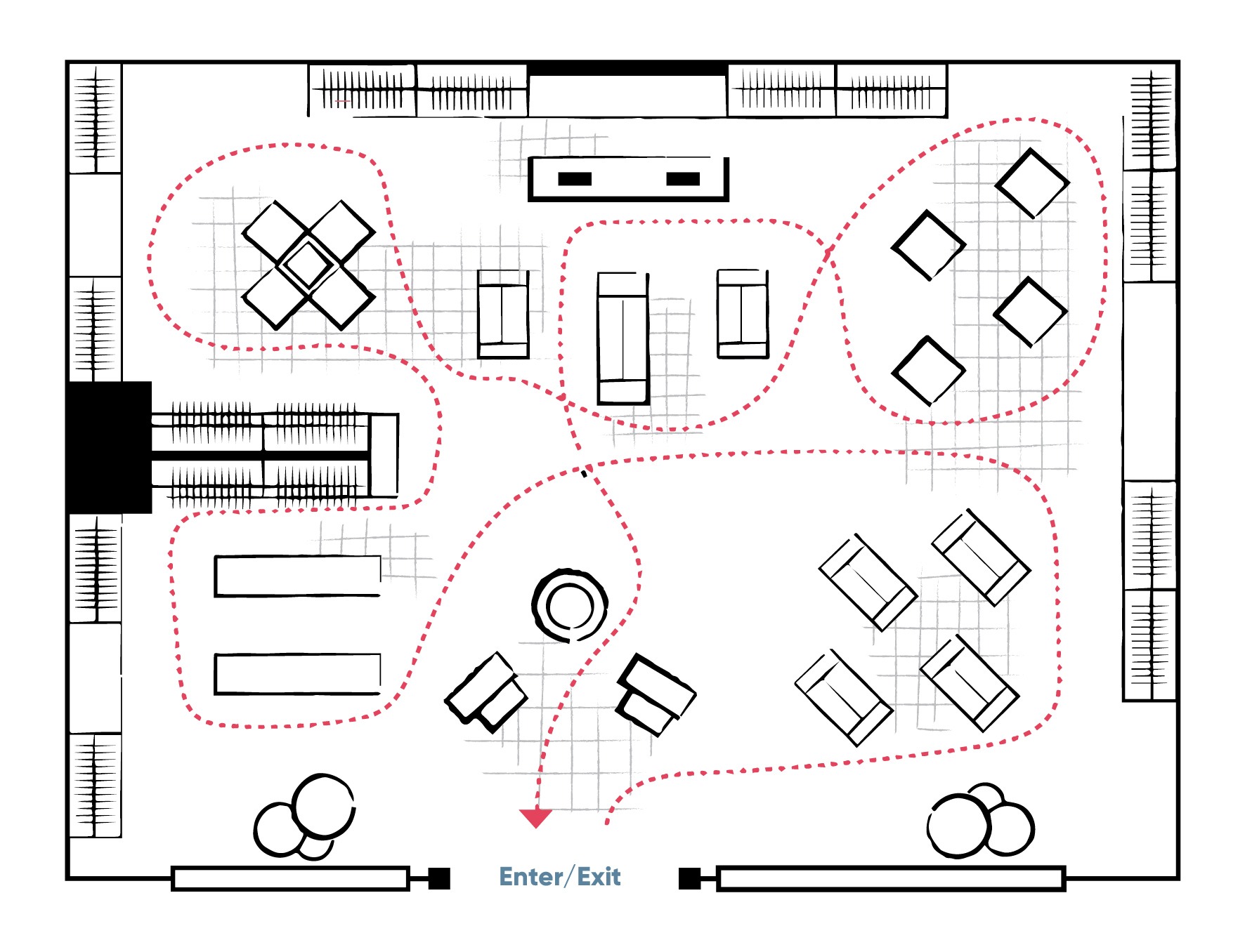
2. Core Principles of a Functional Floor Plan
Once you have a layout style in mind, there are some non-negotiable rules to ensure the space is functional and comfortable. A beautiful store that is difficult to navigate will frustrate customers.
How To Design A Great Retail Experience For Your Customers
The video 'How To Design A Great Retail Experience For Your Customers' by FittDesign Studio offers key architectural insights into creating a space that feels right.
Please watch from 04:50 to 05:42, 07:06 to 08:00, and 09:52 to 10:41. Focus on these practical principles: The minimum width for main walking paths. The importance of a clear, singular path without dead ends. Designing for your staff's efficiency.
Here are the key takeaways to apply to your plan:
- Provide Adequate Navigation Space: The video recommends main aisles be at least 4 feet (or 120 cm) wide. This is a critical standard. It allows two people to pass each other comfortably, accommodates customers with strollers or walkers, and ensures compliance with accessibility standards.
- Create a Clear Customer Path: Even in a free-flow layout, there should be an intuitive path that guides customers through the store. Use your fixture placement to subtly direct them, ideally in that counter-clockwise loop we discussed in the last lesson. Avoid dead ends where customers feel trapped and have to turn back.
- Design for Staff Efficiency: A great layout isn't just for customers. Your staff need to move quickly between the checkout counter, the sales floor to help customers, the demo station, and the stockroom. A well-placed door or a short path from the checkout to the stockroom can make daily operations much smoother.
3. Planning Your Essential Zones
Your floor plan must account for more than just product shelves. It needs to integrate all the functional areas required to run the business. Let's map these out.
The Checkout Counter
The checkout is the final touchpoint of the customer's journey and a key operational hub. Its placement and design are critical.
Beauty Store Layout Secrets That Boost Sales and Customer ...
The article 'Beauty Store Layout Secrets' provides excellent advice on positioning your checkout area for a smooth exit and maximizing last-minute sales.
Please read section 4, 'Optimize Checkout Placement to Reduce Congestion.' Focus on the advice regarding strategic positioning and managing queues.
Key considerations for your checkout area include:
- Placement: Usually near the exit (front-left in a counter-clockwise flow), but with enough space around it to prevent queues from blocking the entrance or main aisles.
- Function: It needs space for your POS system, cash drawer, receipt printer, and bagging.
- Impulse Buys: The queueing area is the perfect spot for small, tempting items like lip balms, travel-size products, or hand sanitizers.
Experiential Zones: Where the Magic Happens
For a beauty store, allowing customers to try products is essential. Your floor plan must include dedicated spaces for this.
The ultimate guide to organising your cosmetics and beauty store
Let's revisit the Ankorstore article from our previous lesson, as it has great ideas for creating these dedicated spaces. Then, we'll supplement it with insights from 'Beauty Store Layout Secrets'.
First, please re-read section 4, 'Creating dedicated spaces for an optimal beauty store layout' in the Ankorstore article.
Beauty Store Layout Secrets That Boost Sales and Customer ...
Now, let's get more detail on designing these interactive areas.
Read section 3, 'Create Inviting Demo Stations and Consultation Areas.' Pay close attention to the details about lighting and seating.
A Makeup Corner or Demo Station is a major draw. Your floor plan should allocate space for:
- A counter or vanity table.
- Well-lit mirrors (natural or daylight-mimicking light is crucial).
- Comfortable seating.
- Hygienic storage for testers and disposable applicators.
The Back of House (BOH)
This is the operational engine of your store. It's not visible to customers but is vital for a functional floor plan. Neglecting it leads to a cluttered sales floor and inefficient operations. Your BOH should include space for:
- Stockroom: For holding inventory.
- Receiving Area: A small space to unbox supplier shipments.
- Employee Area: A small break area and a place for personal belongings.
- Office: A small desk for administrative work.
For a mini-market, this might be a single room partitioned for different uses. The key is to ensure it has a door connecting it efficiently to the sales floor.
4. Activity: Drawing Your Functional Floor Plan
It's time to put all this together and refine the sketch you made in the last lesson into a functional floor plan.
Your Task:
Grab graph paper and a pencil, or use a free online floor plan tool. Create a to-scale drawing of your store. If you don't have a specific location yet, assume a simple rectangular space, for example, 20 feet wide by 50 feet deep.
Follow these steps:
- Outline the Space: Draw the exterior walls, marking the location of the entrance and any windows. Use a scale (e.g., 1 square on the graph paper = 1 foot).
- Block out the BOH: Section off the back area for your stockroom and office. A common practice is to allocate about 15-25% of your total space to BOH.
- Position the Checkout: Place your checkout counter near the entrance, ensuring there's ample space for a queue.
- Arrange Fixtures: Based on your chosen layout style (e.g., Free Flow), draw your fixtures—wall shelves, gondolas, and display tables.
- Standard Dimensions: Wall shelving is typically 1.5-2 feet deep. A central gondola might be 3-4 feet wide. A small display table could be 3x3 feet.
- Verify Pathways: Use your ruler or count squares to ensure your main aisles are at least 4 feet wide. Check that there are no dead ends.
- Place Experiential Zones: Mark out the location for your makeup demo station. Does it have good lighting (e.g., near a window or dedicated electrical)? Is it out of the main traffic flow?
- Label Everything: Clearly label all areas: Skincare Zone, Makeup Zone, Checkout, Demo Station, Stockroom, etc. Draw a dotted line to show the intended customer path.

Conclusion
In this lesson, you have transformed a conceptual idea into a practical, functional blueprint. By choosing a layout style, adhering to core design principles, and allocating space for all essential functions, you have created a floor plan that serves as the backbone of your store.
Key Takeaways:
- Choose a Layout with Intent: A Free-Flow or hybrid layout is often ideal for a beauty mini-market to encourage discovery and convey a premium feel.
- Functionality is Paramount: A successful floor plan prioritizes clear, accessible pathways (at least 4 ft wide), an intuitive customer flow, and staff efficiency.
- Plan for All Functions: Your floor plan must integrate not only product displays but also a well-placed checkout, experiential demo stations, and a sufficient Back of House area.
Preview of the Next Lesson:
With your architectural plan now complete, we can focus on making it beautiful. In the next lesson, "Describe key visual merchandising techniques for displaying beauty products effectively," we will zoom in on the displays themselves. You'll learn how to use color, lighting, and composition to make your products look irresistible and tell a compelling story on every shelf.