Introduction
Welcome back! In our last lesson, we chose the foundational aesthetic elements for your beauty mini-market: the color palette, lighting design, and fixture styles. These are the "what" of your store's design. Now, we'll focus on the "where"—arranging these elements to create a space that’s not just beautiful, but also smart.
Today's lesson addresses the learning outcome: to organize product categories and zones within the store for intuitive customer navigation. Just as a well-designed website guides a user seamlessly from the homepage to checkout, a well-planned store layout guides a customer on a journey of discovery that is both pleasant and profitable. We'll explore the psychology behind how people shop in physical spaces and apply it to create a layout that encourages browsing, highlights key products, and makes finding items effortless.
1. The Psychology of Customer Flow
Before we start placing shelves, it's crucial to understand how customers naturally move through and perceive a retail space. Shopper behavior isn't random; it follows predictable patterns that we can use to our advantage. Your background in digital user experience (UX) will be helpful here; think of this as mapping the physical user journey.
Retail Store Layout - 8 Easy Steps to Optimize Your Business's Space
To start, let's watch a video called 'Retail Store Layout' from the KORONA POS channel. It introduces some fundamental principles of how customers interact with a new space. This will form the psychological bedrock of our layout strategy.
Please watch from 02:18 to 05:29. Pay close attention to these four key concepts: Decompression Zone: The purpose of the first few feet of the store. The Right Turn: The common tendency of shoppers upon entry. Personal Space: The importance of aisle width. Checkout Placement: The most common and logical location for the checkout counter.
These principles are powerful because they are subtle. Customers don't consciously think, "I will now turn right," but by anticipating these behaviors, you can create a more effective and comfortable experience.
- The Decompression Zone: This initial 5-15 feet is where the customer transitions from the outside world. Keep it open and uncluttered. A simple, elegant welcome mat or a single, striking decorative element works better here than a dense product display.
- The "Power Wall": Because most people turn right, the first wall they see—your right-hand wall—is your most valuable piece of real estate. This is the ideal spot for new arrivals, high-margin products, or a display that tells a compelling brand story.
- Checkout: Placing the checkout at the front-left puts it on the customer's natural exit path after they've looped through the store in a counter-clockwise direction, making for a smooth end to their journey.
2. Strategic Zoning for a Beauty Store
Now that we understand the basic path a customer might take, we need to decide what they will see along that path. This is where we organize your products into logical zones and categories. The goal is to make it easy for a customer looking for a specific item (e.g., "Where is the vitamin C serum?") while also encouraging them to discover products they weren't looking for.
This is analogous to designing the main navigation and sub-categories of an e-commerce website. The categories need to be intuitive to your target customer.
The ultimate guide to organising your cosmetics and beauty store
The article 'The ultimate guide to organising your cosmetics and beauty store' from the Ankorstore blog provides a fantastic, beauty-specific framework for this. It breaks down the store into logical areas.
Please read section 2, 'Optimising the layout of your beauty store,' focusing on the subsections 'Strategic zones' and 'A smooth flow of traffic.' Then, jump to section 4, 'Creating dedicated spaces.'
Let's synthesize this information into a clear zoning strategy for your beauty mini-market:
-
The Entrance Zone (Hot Spot): As mentioned, this area follows the decompression zone. Use it for your most eye-catching products: new arrivals, seasonal collections (e.g., summer suncare), or limited-edition items. This creates excitement and a sense of newness.
-
The Central Zone (The Core): This is the main body of your store. Here, you should group your staple products into clear, thematic categories. For a beauty store, this would look like:
- Skincare (further broken down by concern: anti-aging, acne, hydration)
- Makeup (broken down by type: face, eyes, lips)
- Haircare
- Body Care
- Fragrance
-
The Back of the Store (The Destination): This is where you place your "destination" products—the everyday essentials or best-sellers that customers will come in specifically to buy. This could be a popular brand of cleanser, a cult-favorite moisturizer, or your main fragrance line. This tactic, often seen in grocery stores, draws customers all the way through your store, forcing them to pass by—and potentially purchase—other items along the way.
-
Experiential Zones: As the article suggests, creating dedicated spaces like a Make-up Corner with a well-lit mirror and testers, or a small Consultation Area, elevates the shopping experience. These are not just places to hold products; they are interactive zones that build customer loyalty.
3. Product Placement: The Art of the Shelf
Once you have your zones mapped out, the final step is to decide where products go on the shelves within each zone. This is where visual merchandising gets very specific.
The ultimate guide to organising your cosmetics and beauty store
Let's return to the Ankorstore article, which has excellent, practical advice on arranging products on the shelf.
Now read section 3, 'Showcasing products in your beauty store.' Focus on 'Product presentation techniques' and 'Display units.'
The key principle is arranging products by visibility and profitability. Here’s a summary of the most important concepts, reinforced by decades of retail practice:
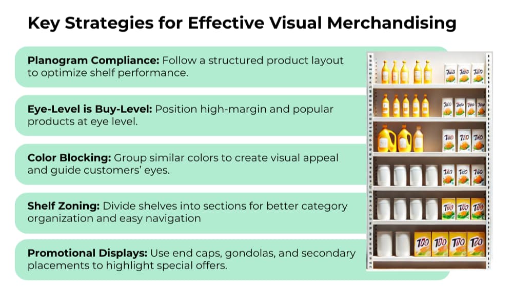
- Eye Zone (The "Golden Zone"): Products placed at eye level (roughly 4-5 feet) sell the best. This is where you put your high-margin products, bestsellers, and items you want to promote most heavily.
- Hand Zone: Just below eye level, this space is for products that invite touch and interaction. In your store, this is the perfect place for product testers, creams, and serums.
- Bottom Zone: The lower shelves are for larger, bulkier items (like large shampoo bottles) or budget-friendly options. Customers who are price-shopping are more willing to bend down to find a deal.
- Top Zone: The highest shelves are typically for overstock or visual branding elements, as they are the hardest for customers to reach.
- Endcaps: The displays at the end of an aisle are prime real estate. They have high visibility and are perfect for promotions, seasonal items, or cross-merchandising (e.g., placing sunscreen and after-sun lotion together).
Putting It All Together: The Flow
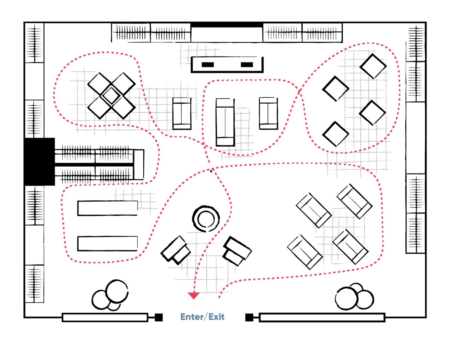
So, how do these zones and principles combine into a cohesive floor plan? For a specialty store like a beauty mini-market, where discovery and browsing are important, a Free-Flow Layout is often most effective. This contrasts with the rigid Grid Layout of a supermarket.
A free-flow layout uses curved fixtures and creative placements to guide customers along a winding path, encouraging them to explore.
Your Turn: Start Sketching
Take a piece of paper and begin a rough sketch of your potential store.
- Draw the entrance. Mark off the first 5-10 feet as your "Decompression Zone."
- Identify your "Power Wall" to the right of the entrance. What will you put there?
- Place your checkout counter in the front-left corner.
- What is a "destination" product category you can place at the very back to draw customers through the entire space?
- Start blocking out your central zones. Where will skincare go? Where will makeup go?
This is just a first draft, but it's the first step in translating these principles into a physical reality.
Conclusion
In this lesson, we've moved from abstract design elements to the concrete organization of your store's space. You've learned how to create an intuitive and profitable customer journey by understanding shopper psychology and applying strategic zoning.
Key Takeaways:
- Anticipate Customer Flow: Leverage natural tendencies like the "right turn" and the need for a "decompression zone" to create a welcoming environment.
- Zone Your Store Strategically: Use the Entrance/Hot Spot, Central/Core, and Back/Destination framework to guide customers and expose them to your full product range.
- Group Products Intuitively: Organize products into logical categories (skincare, makeup, etc.) to prevent frustration and make shopping easy.
- Place Products with Purpose: Use the "Eye-Level is Buy-Level" rule to maximize sales of your most important products and place testers within easy reach.
Preview of the Next Lesson:
We have now selected our design elements and planned our store's zones. In the next lesson, "Design a functional floor plan for a beauty mini-market," we will combine these concepts. You'll learn how to take your rough sketch and turn it into a more detailed and practical floor plan, considering dimensions, accessibility, and the specific fixtures you'll be using.