Introduction
Welcome back! In the last lesson, you did an excellent job assembling a full, polished desktop landing page. By creating a library of reusable components and structuring your content with a 12-column grid, you've built a solid foundation.
Today, we'll address a critical aspect of modern web design. The learning outcome for this lesson is to adapt the desktop design to a mobile-first layout using breakpoints and responsive techniques. While the term "mobile-first" often refers to designing for mobile first and then scaling up, our practical goal is to ensure your design works flawlessly on smaller screens. We will adapt your existing desktop layout for tablet and mobile devices, a process sometimes called "graceful degradation" or simply responsive adaptation.
This step is essential because a significant portion of web traffic comes from mobile devices. A design that looks great on a desktop but is unusable on a phone can turn away a huge part of your potential audience. You're absolutely right that poor performance—and a poor layout is a form of poor performance—can drive users away.
By the end of this lesson, you'll have a single, cohesive design in Figma that looks intentional and professional across different screen sizes, preparing you perfectly for the next module where we'll bring it to life in Framer.
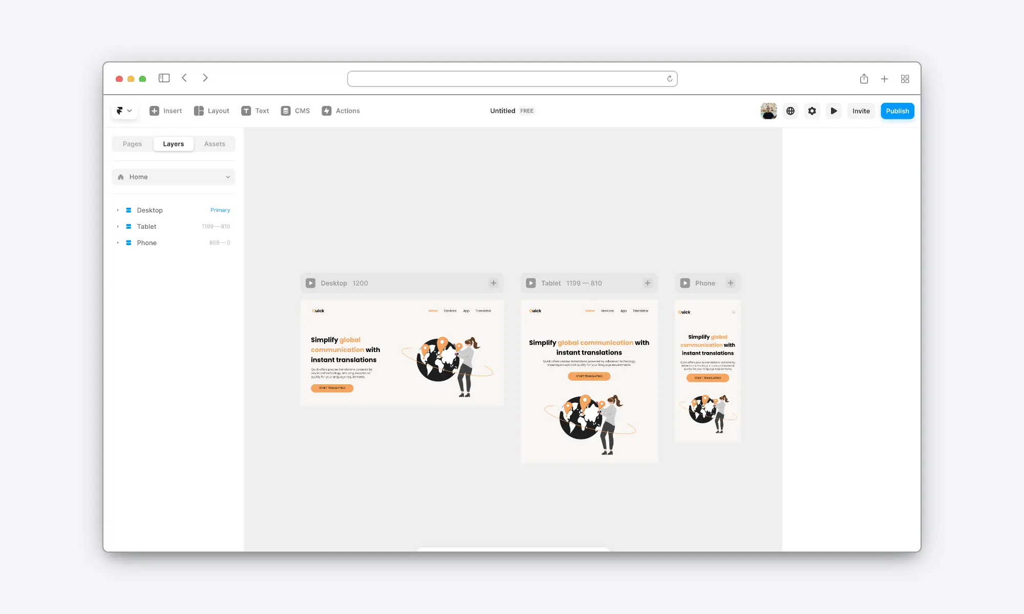
1. The Principles of a Responsive Structure
Before we start resizing frames, it's important to understand why some designs are easier to make responsive than others. A well-structured file is predictable and efficient to adapt. The work you've already done—organizing your page into logical sections and using Auto Layout—is the key.
Let's review the core principles that make a Figma design truly responsive, which will be invaluable when you hand off designs or import them into tools like Framer.
3 Core Guidelines for Converting Figma Designs into Responsive Layouts
This article, '3 Core Guidelines for Converting Figma Designs into Responsive Layouts,' provides a fantastic, high-level overview of how to structure your files for responsiveness. It directly addresses the benefits for tools like Framer.
Read the article from the section 'How to create truly responsive Figma files' through 'Core 3 — Favor Auto Layout.' Focus on these three core ideas: Clear Sectioning: How dividing a page into logical blocks makes it easier to manage. Effective Grouping: Why the way you group layers inside a section matters for responsive adjustments. Favoring Auto Layout: How using Auto Layout properties like Fill and Hug is fundamental to responsive behavior.
As the article highlights, a design with responsive "DNA" has huge benefits. Since you've already built your page using separate sections for the Hero, Features, and Social Proof, and you've used Auto Layout extensively, you're already on the right track. This systematic approach isn't just a preference; it's a professional best practice that directly translates to how websites are built with code (e.g., HTML sections and CSS Flexbox/Grid).
2. Adapting Your Design Across Breakpoints
Now for the practical part. We'll create two new versions of your landing page—one for tablet and one for mobile—by adjusting the layout at specific breakpoints. A breakpoint is simply a screen width at which the design's layout changes to better suit the available space.
Common breakpoints are:
- Desktop: 1200px or 1440px+
- Tablet: ~768px - 1199px
- Mobile: ~320px - 480px
We'll use a straightforward, hands-on method to adapt your design.
Make Your Web Design Responsive in 10 Minutes | Figma Tutorial
The video 'Make Your Web Design Responsive in 10 Minutes' by DesignWithArash offers a clear, practical walkthrough of the process we're about to undertake. It shows how to duplicate a desktop frame and adjust elements for smaller screens.
Watch the following two segments to see the process in action: Tablet Breakpoint (07:16 - 09:31): See how the desktop frame is duplicated and resized. Pay close attention to how the navigation bar is changed to use a hamburger menu icon and how the main content frames are resized. Mobile Breakpoint (09:31 - 11:05): Observe the same process for an even smaller screen. Notice the adjustments to margins and how content is expanded to use the space efficiently.
Activity: Adapt Your Landing Page (~30 minutes)
Open your Figma file containing the desktop landing page you completed in the last lesson. We'll apply the techniques from the video to your design.
Part A: The Tablet Layout (~768px)
- Duplicate Your Frame: Select your 1440px desktop frame and duplicate it (
Cmd/Ctrl + D). Rename the new frame to "Tablet". - Set the Breakpoint Width: Change the width of the "Tablet" frame to 768px.
- Adjust the Navigation:
- On your Tablet frame, hide the text-based navigation links.
- Find a "hamburger" menu icon using a plugin like Iconify and place it on the right side of your header. Ensure it's vertically aligned with your logo.
- Adjust the constraints on your logo to
Left and Topand the hamburger icon toRight and Top.
- Reflow Your Sections:
- Go through your sections (Hero, Social Proof, Features) one by one. Because you used Auto Layout and
Fill containerproperties, much of the content should have already adapted reasonably well. - If you have multi-column layouts (like a 3-card feature section), they will likely look cramped. Select the Auto Layout frame containing the columns and change its direction from Horizontal (→) to Vertical (↓). Adjust the spacing as needed. You may also want to center the items.
- For elements arranged side-by-side, consider stacking them vertically to give them more room to breathe.
- Go through your sections (Hero, Social Proof, Features) one by one. Because you used Auto Layout and
Part B: The Mobile Layout (~390px)
- Duplicate Again: Now, duplicate your "Tablet" frame. Rename the new copy to "Mobile".
- Set the Breakpoint Width: Change the width of the "Mobile" frame to 390px.
- Optimize for a Small Screen:
- The navigation should already have the hamburger icon, which works perfectly for mobile.
- Reduce the horizontal padding/margins within your sections to maximize content space (e.g., from 80px on desktop to 24px or 16px on mobile).
- Check your font sizes. While they might scale down, ensure your body text is still easily readable. You may need to slightly increase the size of headlines or body copy relative to the smaller screen.
- Ensure your buttons are large enough to be easily tapped. A minimum height of around 44px is a good rule of thumb for touch targets.
- For layouts with cards, they should now be stacked vertically. Ensure the images and text within them are set to
Fill containerso they use the full width of the card.
An Advanced Technique: Auto Layout Wrap
For future projects, you can make your card layouts even more dynamic using Auto Layout's Wrap property. Instead of manually changing the direction from horizontal to vertical, Wrap does it automatically when the container runs out of horizontal space. This is a very powerful, rule-based approach that you might find interesting.
Figma RESPONSIVE DESIGN using Variables, Layout grids and Auto Layout | Figma 2024
For a deeper dive into this automated method, this video from TD Sunshine explains how to use Auto Layout Wrap to make card components stack automatically.
Watch the segment on responsive cards (08:26 - 13:11). You don't need to implement this now, but pay attention to the concepts of setting a minimum width on the cards and applying Wrap to the container. This is a glimpse into more advanced responsive workflows.
3. Preparing for Framer
You've now created a design that is visually ready for any device. The final step in this lesson is to ensure your Figma file is technically ready for a smooth import into Framer. A well-organized file is the key to a fast-loading, performant website.
How To Import From Figma To Framer
This article provides best practices for the Figma-to-Framer workflow. Following these tips will save you a lot of time and frustration in the next module.
Read the sections 'Preparing Your Figma Design For Import' and '5 Best Practices For Using Figma To HTML With Framer Plugin.' Take note of the advice on: Layer Naming: Why 'Hero Section' is better than 'Group 5'. Auto Layout & Components: How they map to Framer's structure. Importing in Batches: Why it's better to copy/paste one section at a time.
Take a moment to review your Figma file. Are your layers named logically? Is everything that should be a component (like buttons and cards) a component? Tidying this up now will make the next phase much more efficient.
Conclusion
Excellent work! You have successfully adapted your desktop design to create a fully responsive landing page that looks great on tablet and mobile screens. This is a crucial skill for any digital creator, ensuring your work is accessible and effective for the widest possible audience.
Key Takeaways:
- Responsive design is not an afterthought; it's a core requirement for modern websites.
- Breakpoints (e.g., 1440px, 768px, 390px) are the points at which a layout restructures to fit different screen sizes.
- The primary techniques for responsive adaptation in Figma are changing an Auto Layout's direction (horizontal to vertical), adjusting padding and margins, and ensuring child elements use
Fill container. - A clean, well-structured Figma file with logical layer names and components is essential for a smooth transition to development tools like Framer.
Preview of the Next Lesson:
Our design work in Figma is now complete. We have a beautiful, systematic, and responsive landing page ready to be brought to life. In the next lesson, we will begin Module 5: Launching Your Website with Framer. You will learn how to import your Figma design into Framer and map your design elements to Framer's page structure, taking the first step in turning your static design into a live, interactive website.