Introduction
Welcome back! In our last lesson, you designed a powerful social proof section, building credibility by showcasing what others think about your product. You also got hands-on experience creating a Quote Card component, complete with variants for avatars and properties for the text content.
Today, we're going to expand on that foundation. The learning outcome for this lesson is to build a library of reusable components (buttons, cards) and assemble a full-page desktop layout. We'll move from creating a single, specific component to establishing a small, systematic library of core elements that you can reuse across your entire website. This practice is the backbone of efficient and consistent web design.
First, we'll build two of the most essential components for any website: a versatile button and a flexible content card. Then, we'll organize all the sections you've designed so far—Hero, Features, and Social Proof—into a complete, polished desktop landing page, using a layout grid for structure and alignment.
1. A Systematic Approach: Component-Based Design
Before we start building, let's touch on the "why." You've mentioned you prefer systematic, rule-based frameworks. The approach we're taking is often called Component-Based Design or Atomic Design.
The core idea is simple: you build small, independent "atoms" (like buttons and icons), combine them into more complex "molecules" (like a search bar or a card), and then arrange those into "organisms" (like a page header or a full section).
Lesson 3: Build your design system - Figma Learn
To understand this concept better, let's review a brief section from Figma's official guide on design systems.
Read the subsections 'Component architecture' and 'Atomic design'. Focus on how this modular approach helps you build complex interfaces from simple, reusable building blocks.
By creating components for elements like buttons and cards, you establish a single source of truth. If you decide to change your brand's button style later, you only need to edit one main component, and every instance of that button across your entire design will update automatically. This is incredibly efficient.
2. Building the "Atom": A Versatile Button Component
Nearly every website needs buttons. Let's create a robust button component that can handle different states and styles, building on the Auto Layout principles you've been using.
We'll follow a systematic process to build a button with variants for different types (primary/secondary) and states (default/hover).
Figma Button Components (Variables, Tokens, Variants & Component Properties ) | Design System Part 5
The video 'Figma Button Components' by TD Sunshine provides a very detailed, step-by-step process. We will follow the core principles from this video to create our own button component set.
Watch the following segments to guide your process: Planning (00:23 - 01:45): Understand the properties we'll build (type, state, etc.). Initial Build (01:45 - 03:02): See how to combine text and an icon with Auto Layout. Creating States (03:02 - 07:39): Observe how to style primary and secondary buttons for default, hover, and other states. Focus on the distinction between the filled primary button and the outlined secondary button. Componentizing (17:55 - 19:09): This shows how to combine all your variations into a single Component Set. Adding Properties (19:01 - 21:38): Learn how to add the final touches: a text property for the label and an instance swap for the icon.
Activity: Build Your Button Component (~15 minutes)
Open your Figma file and follow these steps. Don't worry about creating all 240 variations from the video; we'll focus on the most important ones.
-
Create the Base:
- Create a text layer and type "Button". Apply your body text style.
- Add an icon (e.g., a simple arrow from a plugin like Iconify) next to the text.
- Select both and press
Shift + Ato apply Auto Layout. Adjust the spacing and padding to your liking (e.g., 16px horizontal padding, 8px vertical padding, 8px gap).
-
Build the Variants:
- Primary/Default: Style your first button. Give it a fill color from your brand palette and use a light text color for contrast.
- Primary/Hover: Duplicate the first button. Change the fill to a slightly lighter or darker shade to indicate a hover state.
- Secondary/Default: Duplicate the primary button. Remove the fill, add a stroke using your primary brand color, and change the text color to match the stroke.
- Secondary/Hover: Duplicate the secondary button. Add a light fill color (e.g., a 10% opacity of your primary color) to indicate a hover state.
-
Create the Component Set:
- Turn each of your four button styles into a component (
Option + Command + K). - Select all four components. In the right sidebar, click Combine as variants.
- Figma will create a component set. Rename the properties to
Type(with valuesPrimary,Secondary) andState(with valuesDefault,Hover).
- Turn each of your four button styles into a component (
-
Add Component Properties:
- Select the text layer inside all variants. In the Content section of the right sidebar, click the "Create text property" icon and name it
Label. - Select the icon layer inside all variants. Next to the instance name in the sidebar, click the "Create instance swap property" icon and name it
Icon.
- Select the text layer inside all variants. In the Content section of the right sidebar, click the "Create text property" icon and name it
You now have a flexible button component! You can drag an instance onto your canvas and easily change its type, state, label, and icon directly from the design panel.
3. Building the "Molecule": A Flexible Card Component
Cards are containers used to group related information, like a blog post preview, a product feature, or a user profile. You already made a Quote Card; now we'll make a more generic Content Card.
Build a Professional Card Component in Figma from SCRATCH!
We'll follow the structure from 'Build a Professional Card Component in Figma from SCRATCH!' by UX with Luke. This video clearly explains how to build a card that's both flexible and easy for others (or your future self) to use.
Watch these key parts to understand the workflow: Basic Setup (00:11 - 01:38): See how to assemble the initial text and icon elements using Auto Layout. Flexible Media Slot (01:38 - 04:08): Pay close attention to how a frame with 'Fill Container' is used to create a responsive image area. Creating Properties (04:08 - 10:23): This is the most important part. See how to create text properties, a boolean toggle to show/hide a button, and how to 'nest' the button component so you can access its properties from the card itself.
Activity: Build Your Content Card Component (~10 minutes)
-
Assemble the Structure:
- Create a frame for an image placeholder (a grey rectangle is fine for now).
- Add a title (
H3style) and a short description (body text style). - Drag an instance of the Button component you just created.
- Select the title, description, and button. Apply vertical Auto Layout (
Shift + A). - Select this text-and-button group and the image placeholder. Apply vertical Auto Layout again to create the full card structure.
-
Add Styling and Responsiveness:
- Apply a
Fill(white or a light grey),Padding, andCorner Radiusto the main card frame. - Set the image placeholder's horizontal resizing to Fill container.
- Set the title and description layers' horizontal resizing to Fill container.
- Apply a
-
Turn into a Component with Properties:
- Turn the entire card into a main component and name it
Content Card. - Create text properties for the
TitleandDescription. - Select the Button instance inside the card. In the Layer section of the right sidebar, click the "Create boolean property" icon and name it
Show Button, with a default value ofTrue. - Now, expose the button's own properties. Select the main
Content Cardcomponent. In the Properties section, click+and select Nested instances. Check your button component to expose its properties.
- Turn the entire card into a main component and name it
Now you have a powerful Content Card component where you can change the text, toggle the button on or off, and even change the button's style, all from the top level.
4. Assembling the "Organism": Your Full-Page Layout
You've created the building blocks. Now it's time to assemble them into a cohesive desktop landing page. The key to a professional, organized layout is using a grid.
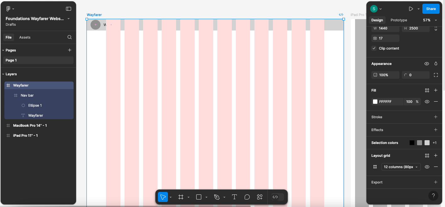
Activity: Assemble Your Desktop Page (~15 minutes)
-
Create Your Desktop Frame and Grid:
- Create a new frame. A standard desktop width is 1440px. Give it a height of around 3000px to start; you can adjust it later.
- Select the frame and, in the right sidebar, click the
+next to Layout grid. - Change the grid from
GridtoColumns. Set theCountto12,Marginto around80, andGutterto24. These are common starting values.
-
Add a Header and Footer:
- At the top of your frame, create a simple header. Drag in your wordmark logo from Module 3 and add a few text links ("Features", "Pricing", "Blog"). Place an instance of your new Button component for a "Sign Up" or "Get Started" call-to-action.
- At the very bottom, create a simple footer. Include your wordmark again and some placeholder copyright text.
-
Stack and Align Your Sections:
- Copy and paste the sections you've already designed (Hero, Features, Social Proof) into your new 1440px frame.
- Arrange them vertically in a logical order: Header -> Hero -> Social Proof -> Features -> Footer.
- Adjust the content within each section to align with your 12-column grid. For example, a centered headline should span the inner columns, and a two-column feature layout might have each column spanning 5-6 grid columns.
-
Integrate Your New Components:
- Go through your sections and replace any static, non-component buttons with instances of your new Button component.
- Optional: If you have time, create a new section called "From the Blog" or "Related Products." Use your 12-column grid to lay out three instances of your new Content Card component side-by-side. This is excellent practice.

Conclusion
Fantastic work today! You've taken a massive step from designing individual sections to building a systematic and scalable design for an entire page. By creating a library of reusable components, you're not just designing faster; you're designing smarter and more consistently.
Key Takeaways:
- Component-Based Design (or Atomic Design) provides a systematic framework for building complex UIs from simple, reusable parts.
- Variants and Component Properties in Figma are the tools that make your components powerful and flexible, allowing for different states, styles, and content.
- A 12-column layout grid is the essential skeleton for a desktop page, ensuring everything is aligned and visually organized.
- Assembling a full-page layout involves stacking your sections and aligning them to the grid, creating a cohesive user experience from top to bottom.
Preview of the Next Lesson:
We've successfully designed a beautiful desktop landing page. However, over half of all web traffic comes from mobile devices. In the next lesson, we will adapt the desktop design to a mobile-first layout using breakpoints and responsive techniques. This is the final and most critical design step before we prepare to bring your site to life with Framer.