Introduction
Welcome to the next lesson in building your web hub. In our last session, you designed the hero section for your landing page—the critical first impression that makes a promise to your visitors.
Today, we'll design the section that proves that promise. The learning outcome for this lesson is to design a feature section to highlight a product's primary benefits and use cases. This section typically sits right below the hero and is your first opportunity to go into detail, answer the user's question "How does this help me?", and persuade them that your product is the right solution for them.
We'll start by understanding the crucial difference between a product's features and its benefits. Then, we'll translate that understanding into a practical design in Figma, creating a clean, modular, and visually compelling layout.
1. From Features to Benefits: Crafting Your Message
Before designing the layout, you need to be crystal clear on what you're communicating. A common mistake is to list technical specifications (features) without explaining why a user should care (benefits). Your goal is to sell an outcome, not just a product.
Let's watch a short video that brilliantly explains this distinction.
Perfect Landing Page Design Explained (in 5 minutes)
The video 'Perfect Landing Page Design Explained' by Flux Academy offers a quick and memorable analogy to differentiate features from benefits.
Watch the clip from 04:24 to 05:23. Pay close attention to the Tesla and Super Mario examples. A feature is the 'flower,' while the benefit is the ability to 'throw fireballs'.
To summarize:
- Features are what your product is or has (e.g., "20 high-resolution wallpapers").
- Benefits are the positive outcomes the user experiences because of those features (e.g., "Instantly create a professional and focused workspace").

The "So What?" Technique
You've expressed a preference for systematic, rule-based frameworks. The "So what?" technique is a perfect tool for this. It's a simple, repeatable method to transform a dry feature into a compelling benefit.
For each feature you list, ask "So what?". Keep asking it until you arrive at a core human desire—like saving time, reducing stress, or feeling more creative.
A Simple Trick to Turn Features Into Benefits
The article 'A Simple Trick to Turn Features Into Benefits' by Enchanting Marketing provides a fantastic, in-depth guide to this technique.
Read the sections 'Summary: The difference between features vs benefits,' 'Example: To define a benefit you ask yourself So what?,' and 'More examples of the So what? trick.' Internalize this question-and-answer process. This is the core of effective product messaging.
By mastering this, you ensure your website copy connects with your audience on an emotional level, making your product far more desirable.
2. Designing the Feature Section in Figma
Now that you know what to say, let's build the structure to present it effectively. A common and effective pattern is a grid of "feature cards," where each card highlights a single benefit. This approach is modular, scannable, and works well on both desktop and mobile.
The following video is a detailed, step-by-step guide to building a complete feature section in Figma. We'll break it down into key stages.
Design a WEBSITE IN FIGMA ep.03: The FEATURES SECTION
The video 'Design a WEBSITE IN FIGMA ep.03: The FEATURES SECTION' from Mavi Design is a practical masterclass in building this section. We will walk through the key parts of this process together.
You don't need to watch the whole video at once. Follow the steps below, watching each segment as directed. The goal is to understand the workflow: defining styles, building a reusable component, and then assembling the full section.
Step 2.1: Establish Typographic Hierarchy
Just as with the hero section, we need to define text styles to create a clear visual hierarchy. Your feature section will need a main headline (H2) and headlines for each individual feature card (H3).
- Watch: The Mavi Design video from 00:44 to 04:33.
- Focus on: How he creates H2 and H3 styles that are visually distinct from the H1 used in the hero section. This reinforces the page's structure.
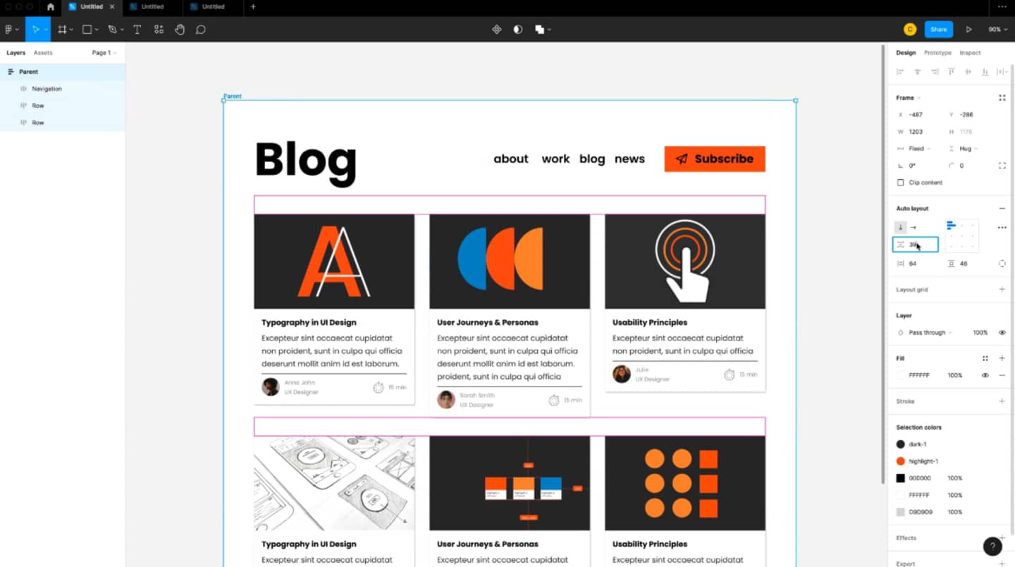
Step 2.2: Build a Reusable Feature Card Component
This is the core of your design. You'll create a single, flexible card that can be reused for each benefit. Your experience with Auto Layout is essential here.
- Watch: The video from 04:33 to 08:22.
- Focus on:
- How he combines an icon placeholder, a headline (your H3), a paragraph, and a button into a single frame.
- The heavy use of Auto Layout (
Shift + A) to manage spacing and ensure the card is responsive. - Setting the horizontal resizing of text layers to "Fill container" so they adapt when the card's width changes.
Step 2.3: Assemble the Section
With your reusable card component ready, you can now build out the entire section.
- Watch: The video from 10:57 to 19:52.
- Focus on:
- Turning the feature card into a Component and using Component Properties to make text edits easy and efficient.
- Duplicating the card component to create a row of features.
- Wrapping the cards in another Auto Layout frame to manage the grid and spacing between them.
- Combining the section headline (H2), the grid of cards, and a final CTA button into a complete, responsive section.
This systematic process—building a reusable part and then assembling the whole—is a cornerstone of efficient UI design.
Activity: Design Your Feature Section (~25 minutes)
Time to apply these concepts in your own Figma file.
Part 1: Content First - Brainstorm Your Benefits (5 mins)
Let's continue with the idea of a minimalist wallpaper pack from the last lesson.
- Open a text editor or a new text block in Figma.
- List 3-4 features of your wallpaper pack.
- Example Feature 1: 4K Resolution
- Example Feature 2: Includes versions for Desktop, Tablet, and Mobile
- Example Feature 3: Abstract Geometric Designs
- For each feature, use the "So What?" technique to find the core benefit.
- Feature 1 -> Benefit: "4K Resolution" -> So what? -> "Your display looks incredibly sharp and crisp." -> So what? -> "Experience stunning clarity that makes your setup look premium and professional."
- Feature 2 -> Benefit: "Multi-device versions" -> So what? -> "You can have the same look on all your screens." -> So what? -> "Create a cohesive and beautiful aesthetic across all your Apple devices."
- Feature 3 -> Benefit: "Abstract Geometric Designs" -> So what? -> "They are visually interesting but not distracting." -> So what? -> "Stay focused and inspired with clutter-free designs that complement your work."
Part 2: Figma Implementation (20 mins)
Now, build the section using the workflow from the Mavi Design video.
- Create Your Frame: Below your hero section, add a new frame for the feature section. Give it a white or light gray background to visually separate it from the hero.
- Add Section Headline: Add a text layer for your section headline (e.g., "Designed for Focus & Aesthetics"). Apply your
H2text style. - Build Your Feature Card Component:
- Create a new frame for a single card.
- Add a placeholder for an icon (a 48x48px Frame or Circle).
- Add a text layer for the Benefit Headline and apply your
H3style. - Add a text layer for the description. Use your
Body/Defaultstyle. - Use Auto Layout to organize these elements vertically. Set appropriate spacing (e.g., 16px or 24px).
- Add padding to the card frame (e.g., 24px all around).
- Add a
FillandCorner Radiusto style the card. - Turn this card into a Component.
- Assemble the Grid:
- Drag an instance of your feature card component into your section.
- Duplicate it 2-3 more times to create a row of 3 or 4 cards.
- Select all the cards and apply Auto Layout to the group to create your grid. Set the spacing between cards (e.g., 24px or 32px).
- Populate and Finalize:
- Select each card instance and populate it with the benefit-focused content you wrote in Part 1.
- Center the section headline and the grid of cards within your main page frame.
- (Optional) Add a primary CTA button below the grid (e.g., "Explore the Full Collection").
Conclusion
Fantastic work. You have now designed the second major section of your landing page, moving your visitor down the path from interest to conviction. You've not only learned a standard layout pattern for feature sections but also a critical copywriting skill that separates effective marketing from simple product descriptions.
Key Takeaways:
- The feature section's job is to prove the promise made in the hero section by detailing the product's value.
- Always translate features (what it is) into benefits (what's in it for the user) using the "So what?" technique.
- A grid of modular "feature cards" is a clean, scannable, and responsive way to present multiple benefits.
- Using components and Auto Layout in Figma is crucial for building these sections efficiently and ensuring consistency.
Preview of the Next Lesson:
You've made a promise (hero section) and provided the evidence (feature section). The next logical step is to show that other people trust your solution. In the next lesson, we will design a social proof section to build credibility using testimonials or trust signals. This is how you'll leverage third-party validation to make your offer even more compelling.