Introduction
Welcome back! In our last lesson, you successfully bridged the gap between design and development by importing your Figma layout into Framer. Your website now exists as a structured collection of frames and stacks on the Framer canvas, but it's still a static page.
Today, we'll bring your site to life by making it navigable. This lesson focuses on configuring site navigation, page routing, and internal links. You will learn how to make your navigation bar functional, allowing users to move between different pages and jump to specific sections within a page. This is a fundamental step in transforming a single-page design into a cohesive, multi-page website.
By the end of this lesson, you'll be able to:
- Create new pages and understand how Framer handles routing.
- Link navigation items to different pages.
- Create "anchor links" that smoothly scroll to specific sections on a page.
- Turn your navigation bar into a reusable component for site-wide consistency.
1. Setting Up Your Site's Structure: Pages and Routing
Before we can link to other pages, we need to create them. In Framer, your site's structure is managed in the Pages panel, located on the left sidebar. This is where you'll add, rename, and organize all the pages of your website. Each page you create here automatically gets its own URL path (e.g., your-site.framer.ai/about).
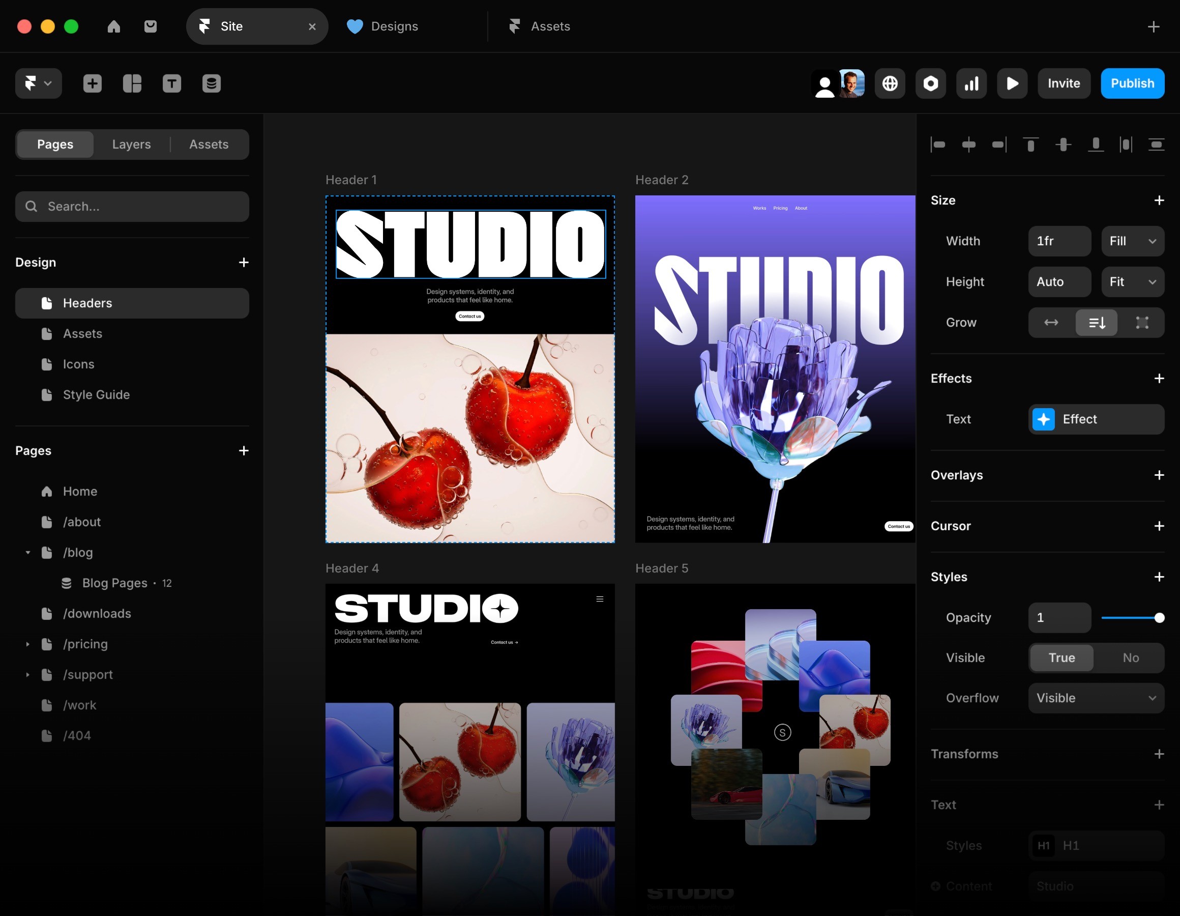
Activity: Create a Placeholder Page
Let's create a new page to use for our navigation links.
- In your Framer project, find the Pages panel on the left.
- Click the
+icon next to the "Pages" title. - A new page will be created. Rename it to
About. You can do this by double-clicking its name. - You now have your main
Homepage and a new, blankAboutpage. This is the foundation of your site's routing.
2. The Three Core Types of Links
With our page structure initiated, let's make your navigation bar functional. In Framer, you can add a link to almost any element (text, a button, an image) by selecting it and using the Link property in the right-hand properties panel or by pressing the L key.
We'll cover three main types of links:
- Page Links: Go to another page within your site.
- Scroll Links: Go to a specific section on a page (often called anchor links).
- External Links: Go to a completely different website.
The following video from Framer's official channel provides an excellent overview of creating these links. We will watch it in segments to focus on each type.
Adding Links in Framer (Fundamentals Lesson 15)
This video, 'Adding Links in Framer,' is a concise and clear guide to the fundamentals. We'll start by focusing on how to create a basic link to another page.
Watch the segment from 00:22 to 01:57. Pay attention to how a text layer is selected and then linked to another page from the dropdown menu. This is the most common linking action you'll perform.
Activity: Link Your Navigation Items
- Go to your
Homepage in Framer. - Select the text element for "About" in your navigation bar.
- In the properties panel on the right, click the
+icon next to Link. - In the Link To field, a dropdown will appear. Select your
Aboutpage. - Your "About" text is now a functioning link! Preview your site by clicking the play button in the top right, and test it.
3. Styling Links for Visual Feedback
A key part of aesthetic and user-friendly design is providing clear visual cues for interactive elements. For links, this means styling their different states:
- Default: How the link looks normally.
- Hover: How the link looks when a user's cursor is over it.
- Current: How the link looks when it points to the page the user is currently on.
This systematic approach to styling ensures consistency and predictability, which aligns with your preference for rule-based design.
Adding Links in Framer (Fundamentals Lesson 15)
Let's continue with the same video to see how to create and apply link styles. This is crucial for maintaining a cohesive look and feel.
Watch the portion from 02:07 to 04:51. The video explains how to create a new, reusable link style. Notice the options for styling the Default, Hover, and Current states, as well as adding a smooth transition.
Activity: Create a Navigation Link Style
- With your "About" link still selected, find the Style property within the Link settings.
- Click it to open the Link Styles editor.
- Create a New Style and name it
nav-link. - Configure the states. For a minimalist aesthetic, you might try:
- Default: Keep the text color the same as your other nav items. Set Decoration to
None. - Hover: Change the text color to a slightly lighter or brighter shade from your palette. You could also add an
Underlinedecoration. - Current: Make the color distinct to show the active page. This could be a bolder color or your primary brand accent color.
- Default: Keep the text color the same as your other nav items. Set Decoration to
- Apply this
nav-linkstyle to your "About" link and any other page links in your navigation.
4. Creating Scroll-to-Section (Anchor) Links
For one-page sites or long landing pages, it's common for navigation items to scroll the user to a specific section on the same page. Framer handles this with a system called Scroll Targets.
The process involves two simple steps:
- Set the Target: Select the section (Frame or Stack) you want to scroll to and enable the Scroll Target property.
- Create the Link: Select your button or text link and point it to the target you just created.

Let's see this in action.
Adding Links in Framer (Fundamentals Lesson 15)
The next segment of the Framer video demonstrates exactly how to set up a scroll target and link to it.
Watch from 04:51 to 07:11. Observe how a 'Scroll Section' is first defined on the features section, and then the 'Features' navigation item is linked to it. Note the 'Smooth' scroll option.
Activity: Create a Scroll Link
- On your
Homepage, select the main container (the Stack or Frame) for one of your sections, like "Features" or "Testimonials". - In the properties panel on the right, scroll down and enable Scroll Target. Give it a descriptive name like
features-section. - Now, select the "Features" text element in your navigation bar.
- Add a Link.
- In the Link To dropdown, select your
Homepage. - A new Section dropdown will appear. Select the
features-sectiontarget you just created. - Ensure the Scroll property is set to
Smooth. - Preview your site. Clicking "Features" should now smoothly scroll you down the page.
For a more detailed written guide on Scroll Targets, including troubleshooting and best practices, the following article is an excellent resource to bookmark.
How to create anchor links between pages in Framer
This article from BRIX Templates, 'How to create anchor links between pages in Framer,' provides a thorough explanation of the Scroll Targets system. It's a great reference for more complex scenarios, like linking to a specific section on a different page.
Quickly read the sections 'Understanding the Scroll Targets system in Framer' and 'How to configure Scroll Targets in Framer'. This will reinforce what you saw in the video and clarify the process with step-by-step text instructions.
5. Finalizing Your Navigation
You've now linked text to other pages and to sections on the same page. The same principles apply to other elements. For example, your main "Call to Action" button can be linked to your Pricing page, and social media icons in your footer can be linked to external URLs. To link externally, simply paste the full URL (e.g., https://twitter.com/your-profile) into the Link To field.
A final, crucial step is to turn your navigation bar into a Component. This makes it a reusable element that you can place on every page. If you need to update a link or change a style, you only have to edit the main component, and the changes will automatically apply everywhere.
To create a navigation component:
- Select the top-level Frame or Stack that contains all the elements of your navigation bar.
- Right-click on it and choose Create Component.
- Give it a name, like "Navbar".
- You can now drag this component from the Assets panel onto any other page (like your
Aboutpage) to have a consistent, fully functional navigation bar across your entire site. All the links you configured will work automatically.
Conclusion
Excellent work! You've transformed your static header into a fully interactive navigation system. This is a massive step towards creating a professional and usable website. You've not only connected your pages but also implemented smooth scrolling and consistent styling, which are key to the polished, high-performance aesthetic you're aiming for.
Key Takeaways:
- Site structure is managed in the Pages panel, which defines your page routes.
- Links can be added to any element to navigate to other Pages, external URLs, or specific Scroll Targets.
- Link Styles (Default, Hover, Current) are essential for providing visual feedback and maintaining brand consistency.
- Scroll Targets allow you to create smooth anchor links for single-page navigation.
- Turning your navigation into a Component ensures it is consistent and easy to manage across your entire website.
Preview of the Next Lesson:
Now that your site is navigable, the next step is to add more subtle layers of interactivity and polish. In our next lesson, we will explore how to add micro-interactions and animations to interactive elements using hover and pressed states. This will add a dynamic, premium feel to your buttons, cards, and other components.