Introduction
Welcome back! In our last lesson, you brought your website's structure to life by configuring page routing and making your navigation bar fully functional. Your site is now navigable, but the interactive elements are still static. Today, we'll add a layer of polish and professionalism by focusing on the small details that make a big difference.
This lesson is about adding micro-interactions and animations to interactive elements using hover and pressed states. These subtle animations provide essential feedback to the user, making your website feel more responsive, intuitive, and high-quality. You will learn how to make buttons, cards, and other elements react to user input, fulfilling a key aspect of the minimalist, high-performance aesthetic you're aiming for.
By the end of this lesson, you will be able to:
- Understand the purpose and structure of micro-interactions.
- Apply simple hover and press effects using Framer's Effects panel.
- Build more robust interactions using component variants and triggers.
1. The "Why" Behind Micro-interactions
Before we jump into Framer, it's crucial to understand why we add these small animations. They aren't just for decoration; they are a fundamental part of good User Experience (UX) design. Micro-interactions communicate status, provide feedback, and guide the user.
A great way to think about this systematically is through the four-part structure defined by designer Dan Saffer:
- Trigger: What initiates the interaction (e.g., the user hovering over a button).
- Rules: What happens during the interaction (e.g., the button's color changes and it scales up).
- Feedback: How the rules are communicated to the user (e.g., the user sees the color change and growth).
- Loops & Modes: What happens if the interaction is repeated or changes over time.
Let's start by reading a brief article that explains these concepts.
Better UX Through Microinteractions
The article 'Better UX Through Microinteractions' from Toptal provides an excellent overview of what micro-interactions are and why they are so important for creating an enjoyable user experience.
Please read the introduction, the 'Benefits of Microinteractions' section, and pay close attention to the 'Follow the Structure of Microinteractions' section, which details Dan Saffer's four-part model. This will give you a solid theoretical framework before we start building.
Think about a simple button. When you hover your mouse over it, it might subtly change color or grow in size. When you click it, it might press down. These are the visual states we're going to build.
2. Method 1: Quick and Simple Effects
Framer provides a fast and easy way to add hover and press states to any layer using the Effects panel. This method is great for simple, one-off interactions or for quickly prototyping an idea.
The video below, from the official Framer team, demonstrates this feature clearly. We'll watch it to see how to apply both hover and pressed effects.
Using Hover and Press Effects in Framer (Animation Lesson 2)
This video, 'Using Hover and Press Effects in Framer,' will walk you through adding these interactions directly to a layer. It's the most straightforward way to get started.
Watch from the beginning until 05:06. The first part covers the 'Hover' effect, and the second part covers the 'Press' effect. Notice how properties like scale, rotation, and opacity can be changed for each state.

Activity: Apply a Hover and Press Effect
Now, let's apply this to one of the buttons or interactive cards in your project.
- Select a button on your canvas.
- In the Properties Panel on the right, find the Effects section and click the
+to add a Hover effect. - In the modal that appears, make a subtle change. For a minimalist aesthetic, try:
- Increasing the Scale to
1.05. - Or, slightly decreasing the Opacity to
0.8.
- Increasing the Scale to
- Close the modal. Now add a Press effect to the same button.
- For the press state, it's common to make the element feel like it's being pushed in. Try:
- Setting the Scale to
0.95.
- Setting the Scale to
- Open the preview (Cmd+P or Ctrl+P) and test your button. You should see it scale up on hover and shrink down when you click and hold.
3. Method 2: Robust Interactions with Component Variants
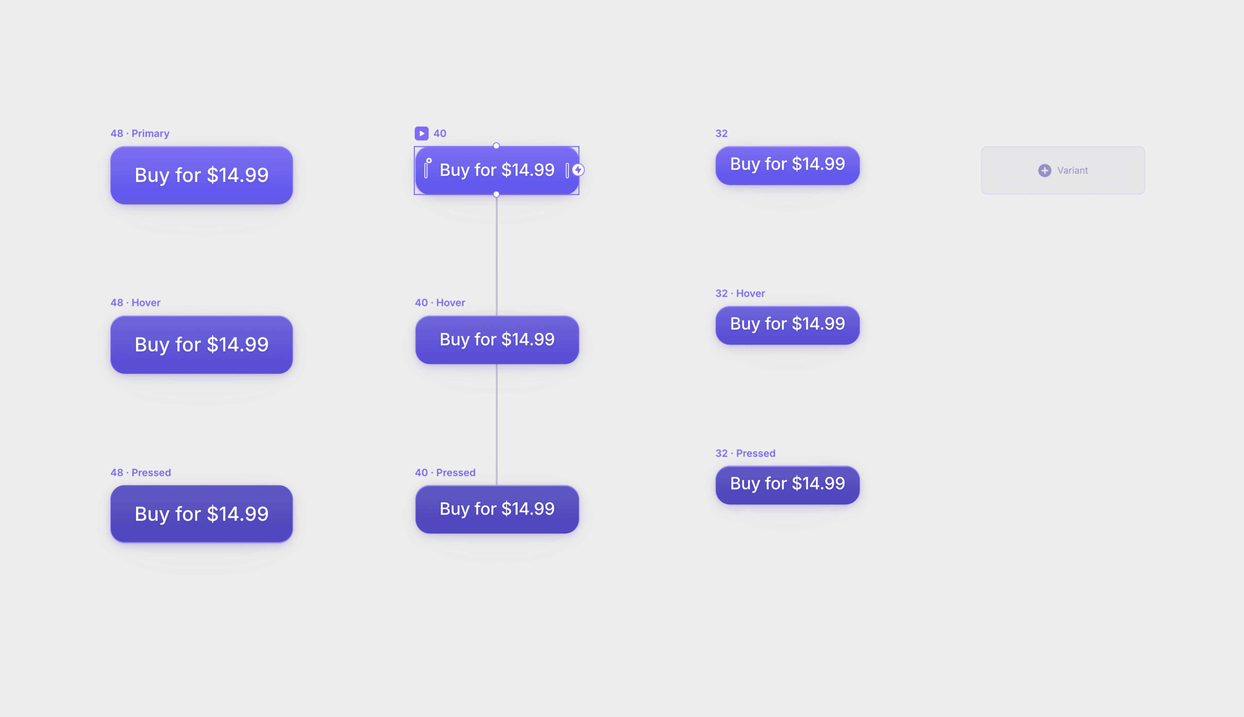
While the Effects panel is quick, the more powerful and systematic approach is to use Component Variants. This is closer to how you might work in Figma, but with Framer's built-in interactivity. You create different versions (variants) of a component for each state (e.g., default, hover, pressed) and then tell Framer how to transition between them.
This method is superior for elements you reuse, like your main call-to-action button, because it ensures consistency and allows for more complex, fine-tuned animations.
First, let's read a quick guide that explains how Framer handles these interactive states within components, drawing a useful comparison to Figma.
The Ultimate Guide for Mastering Framer Components
This guide from SegmentUI, 'The Ultimate Guide for Mastering Framer Components,' clearly explains how to set up interactive states. It also covers the concept of 'Inheritance,' which is key to working efficiently.
Read the sections 'Hover & Pressed States,' 'Inheritance,' and 'Interactivity Between Variants.' This will clarify how Framer's component system differs from Figma's and how to link variants together.
Now that you have the concept down, let's see it in practice. The next video will show you how to build these interactions using variants and triggers.
Learn Framer Interactions (19 Minute Crash Course)
The video 'Learn Framer Interactions' provides a great walkthrough of the component-based interaction workflow. We'll focus on the core concepts of creating variants and setting up triggers.
Watch from 00:23 to 06:05. This segment covers creating a component with variants and then using triggers like 'Mouse Enter' (for hover-on), 'Mouse Leave' (for hover-off), and 'Click' to animate between them.
Activity: Build an Interactive Button Component
Let's rebuild your button interaction using this more robust method. If your button isn't a component yet, right-click it and select "Create Component".
-
Create Variants:
- Double-click your component to enter the component editor.
- You'll see your primary variant. In the Properties Panel, you can add states. Click the
+next to Hover. A new "Hover" state will appear below the primary one. - Select the Hover state and change its appearance. For example, change the fill color or scale it up slightly.
- Now, click the
+next to Pressed. Select this new state and change its properties (e.g., set the scale to0.95).
-
Framer's Magic:
- Unlike the manual variant method shown in the video for a toggle, Framer has built-in triggers for Hover and Pressed states on a single variant. By creating these states directly on the component, Framer automatically handles the "Mouse Enter," "Mouse Leave," and "Click" triggers for you. This is a very efficient workflow.
-
Adjust the Transition:
- Select the primary variant of your component.
- In the Properties Panel, find the Transition section. The default is an "Instant" transition.
- Change the Type to
Easeand set the time to around0.2seconds. This will create a smooth animation between the states instead of an abrupt snap. This transition setting will be inherited by the Hover and Pressed states.
-
Preview: Go back to your main canvas and preview the site. Your component-based button should now have smooth transitions between its default, hover, and pressed states.
Conclusion
Fantastic work. You've now equipped your website with the micro-interactions that separate an amateur site from a professional one. You've learned not just how to create them, but why they matter for the user experience.
Key Takeaways:
- Micro-interactions provide crucial feedback and make a website feel more alive and intuitive.
- Framer offers two primary methods for creating them:
- Effects Panel: Quick and easy for simple, one-off animations on any layer.
- Component States (Hover/Pressed): A more robust, systematic method for creating consistent, reusable interactive elements with fine-tuned transitions. This is the preferred method for design systems.
- The key to a good micro-interaction is subtlety. The goal is to enhance, not distract.
Preview of the Next Lesson:
We've animated elements based on direct user interaction (hover and click). In the next lesson, we'll explore another type of animation: implementing performant scroll-triggered effects for key page sections. This will allow you to reveal or animate content as the user scrolls down the page, creating a dynamic and engaging narrative flow.