Introduction
Welcome back! In our last lesson, we focused on bringing your site to life with performant scroll-triggered animations. You learned how to use scroll animations, transforms, and variants to create engaging user experiences, and we touched on a crucial performance win: lazy-loading videos.
Today, we'll continue our deep dive into website performance by focusing on another critical asset: images. Your goal is to build sites that are both highly aesthetic and exceptionally fast, and nothing slows down a site more than large, unoptimized images. This lesson directly addresses the learning outcome: Optimize images for web delivery by selecting appropriate formats (WebP, AVIF) and compression settings.
We'll break down image optimization into three core pillars:
- Format: Choosing the right file type for the job (e.g., JPEG, PNG, SVG, WebP, AVIF).
- Size: Ensuring the image dimensions are appropriate for where it will be displayed.
- Compression: Reducing the file size without a noticeable loss in quality.
By the end of this lesson, you'll have a systematic process to ensure your visuals are crisp, professional, and load almost instantly.
1. Why Every Kilobyte Counts
Before we get into the technical details, let's establish why this is so important. A slow website leads to a poor user experience, higher bounce rates, and can even negatively impact your site's ranking on Google. As you're building a brand, a fast, snappy website signals professionalism and respect for your visitor's time.
To see how performance is measured and why it matters, let's watch the beginning of this video from Design Champs.
How to Optimize Your Framer Website
This video, 'How to Optimize Your Framer Website,' starts by explaining why website speed is so critical and introduces Google's PageSpeed Insights—a tool you'll use later to audit your own site.
Watch the first 1 minute and 49 seconds. Pay attention to how performance is measured for both mobile and desktop and the presenter's point that you're aiming for 'progression, not perfection.'
The key takeaway is that images are often the single biggest contributor to a slow website. By mastering their optimization, you're tackling the most significant factor in page load speed.
2. Pillar 1: Choosing the Right Image Format
Not all image formats are created equal. The format you choose depends on the type of image (a photo, a logo, an illustration) and the features you need (like transparency).
Traditional vs. Modern Formats
- JPEG (.jpg): The long-standing choice for photographs. It uses lossy compression, which is great for complex images, but doesn't support transparency.
- PNG (.png): Best known for its support of transparency (an "alpha channel"). It uses lossless compression, which means file sizes can be very large, making it a poor choice for photos.
- SVG (.svg): A vector format, not pixel-based. It's defined by mathematical paths, making it infinitely scalable without losing quality. Perfect for logos, icons, and simple illustrations. File sizes are typically tiny.
- WebP: A modern format developed by Google. It offers significantly better compression than JPEG and PNG and supports both transparency and animation. It has become the new web standard.
- AVIF: The newest format. It provides even better compression than WebP, resulting in the smallest file sizes at a comparable quality, especially for high-detail photography. Browser support is now excellent in all modern browsers.
To get a quick overview of these modern formats, please read the following article.
Image Optimization 2025: WebP, AVIF & Best Practices Guide
The article 'Image Optimization 2025' provides a concise summary of today's most important image formats and their ideal use cases.
Please read the sections '1. Use Modern Image Formats (WebP, AVIF, JPEG XL)' and the FAQs 'What is the best image format in 2025?' and 'Should I convert all images to WebP?'. This will give you a clear framework for when to use each format.
Visualizing the Difference
Text is one thing, but seeing the difference is another. These two images provide a clear visual comparison of format performance.

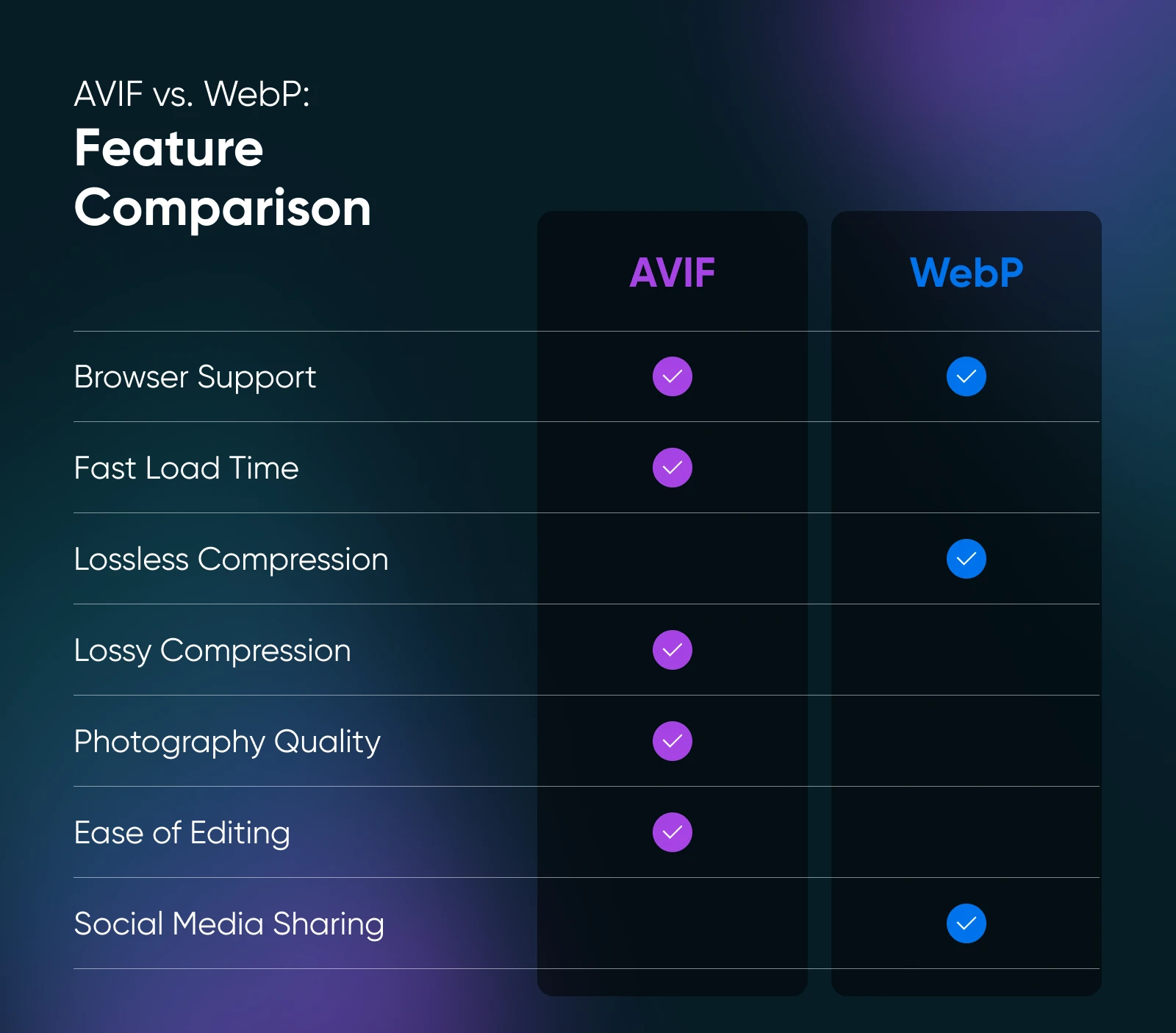
For a deeper dive into how these formats handle compression at a technical level, the following video offers an excellent analysis. Given your background in computer science, you may find this comparison of compression artifacts particularly interesting.
JPEG VS AVIF - The Battle of Compression
The video 'JPEG VS AVIF - The Battle of Compression' offers a pixel-level look at how AVIF retains detail far better than JPEG at very low file sizes.
Watch from 01:12 to 03:44 to see a side-by-side comparison at very aggressive compression levels. Then, watch the summary from 06:05 to 07:45, which concludes that AVIF is excellent for low file sizes, while JPEG XL (a format we won't focus on due to browser support) excels at near-lossless quality.
Your Rule of Thumb:
- For logos and icons: SVG
- For photos and complex images: AVIF or WebP
- For screenshots with text needing perfect clarity: PNG (or lossless WebP)
3. Pillar 2 & 3: Sizing and Compression
Knowing the right format is only part of the story. You also need to serve an image at the correct size (dimensions) and with the right compression (file size).
- Sizing: Don't use a 4000px wide image for a 500px wide container on your site. You should resize your image to be close to its maximum display size before uploading it.
- Compression: This is the process of reducing the file size.
- Lossy: Intelligently removes some image data. Ideal for photos, where minor data loss is imperceptible to the human eye. You can often achieve 70-80% quality settings with no visible difference.
- Lossless: Rewrites the image data more efficiently without discarding any information. Use this for UI graphics or logos where every pixel must be perfect.
The Complete Optimization Workflow
The following video demonstrates the ideal workflow for optimizing an image before ever uploading it to Framer. This process ensures you get the absolute best performance.
How to Optimize Your Framer Website
Let's return to 'How to Optimize Your Framer Website.' This section walks through the three-step process: checking the format, setting the right size in Figma, and applying compression with an external tool.
Watch from 01:49 to 05:46. This is the core of today's lesson. Pay close attention to the dramatic file size reduction achieved by pre-optimizing the image before uploading it to Framer, even though Framer has its own automatic optimization.
As the video shows, you can use design tools like Figma to resize your images and free, budget-friendly tools for compression.
- Online Compressors: TinyPNG/JPG (works for WebP too) or Squoosh
- Desktop App (Mac): ImageOptim (as shown in the video)
4. How Framer Helps Automatically
You might be wondering: if I have to do all this manually, what is Framer doing? The good news is that Framer has a powerful, automatic optimization pipeline that does a lot of heavy lifting. However, as you saw in the video, feeding it an already-optimized image gives you supercharged results.
Here's what Framer does for you, according to its official documentation.
How images are optimized in Framer
This help article, 'How images are optimized in Framer,' explains the automatic processes that run every time you upload an image. It's important to understand this so you know how your manual efforts and Framer's system work together.
Read the sections 'TL;DR: Best practices,' 'We resize JPEG, PNG, WebP, AVIF and GIF images to pick the best size,' and 'We convert JPEG, PNG, WebP and GIF to AVIF.' This will clarify how Framer handles srcset for different screen sizes and its conversion to modern formats.
In summary, Framer automatically:
- Converts Images to AVIF: It takes your uploaded JPEG or PNG and converts it to a super-efficient AVIF file (with WebP as a fallback for older browsers).
- Creates Multiple Sizes (
srcset): It generates several smaller versions of your image and lets the browser choose the most efficient one to download based on the user's screen size. This prevents a mobile phone from downloading a huge desktop-sized image.
The key is that Framer's process is applied to the image you give it. If you give it a 5MB image, it will optimize that. If you give it a pre-optimized 300KB image, it will optimize that, resulting in a final file that is far smaller and faster.
Conclusion
You now have a complete, systematic framework for image optimization that aligns perfectly with your goal of building fast, aesthetic websites. By following this process, you are adopting a professional workflow that sets your sites apart.
Key Takeaways:
- Image optimization rests on three pillars: Format, Size, and Compression.
- For web use, prioritize modern formats: SVG for vectors, and AVIF/WebP for raster images (photos).
- The best workflow is to manually optimize first: resize in a tool like Figma, then compress with a tool like TinyPNG before uploading.
- Framer's automatic optimization is powerful, but it works best when you give it an already-optimized image, leading to maximum performance.
Activity (10 minutes)
- Find a high-resolution image you might use on your site (you can get one from Unsplash). Try to find one that is several megabytes (MB) in size.
- Upload the original, unedited image to a page in your Framer project. Publish the site and, using your browser's developer tools (right-click > Inspect > Network tab), find the image and note its final file size after Framer's optimization.
- Now, take that same original image and run it through the optimization workflow:
- Open it in Figma and resize it to a more reasonable web dimension (e.g., 1600px wide).
- Export it as a JPEG at 80-90% quality.
- Run that exported file through TinyPNG.
- Upload this new, super-optimized version to Framer. Publish and check its final file size.
- Compare the two results. You should see a significant difference, proving the value of the manual optimization step.
Preview of the Next Lesson:
With your site's assets (animations, videos, and images) now fully optimized for performance, you're ready for the final steps before a real launch. In the next lesson, we will cover how to publish your site using a Framer subdomain and prepare for connecting a custom domain. We will then bring everything together by learning to audit site performance using Google Lighthouse, where you'll see the direct impact of all your optimization work.