Introduction
Welcome back! In our last lesson, we completed a deep dive into asset optimization by mastering how to prepare images for the web. You learned a professional workflow for choosing the right format, size, and compression to make your site's visuals load instantly, a crucial step toward your goal of building fast, aesthetic websites.
This lesson tackles the other major contributor to page performance and visual stability: fonts. A poor font loading strategy can lead to jarring shifts in your layout and a perception of slowness, undermining the professional look you're aiming for.
Our learning outcome today is to configure font loading strategies to minimize Cumulative Layout Shift (CLS) and improve performance. We'll explore:
- Why fonts can cause layout shifts (CLS).
- The powerful, automatic optimizations Framer performs for you.
- Actionable strategies you can use to make smart font choices that enhance performance.
- How to leverage modern variable fonts to eliminate layout shifts entirely in certain cases.
1. Understanding the Problem: FOUT, FOIT, and CLS
When a browser loads your webpage, it needs to download the custom font files you've chosen. While it's fetching these files, it has to decide what to show the user. This leads to two common phenomena:
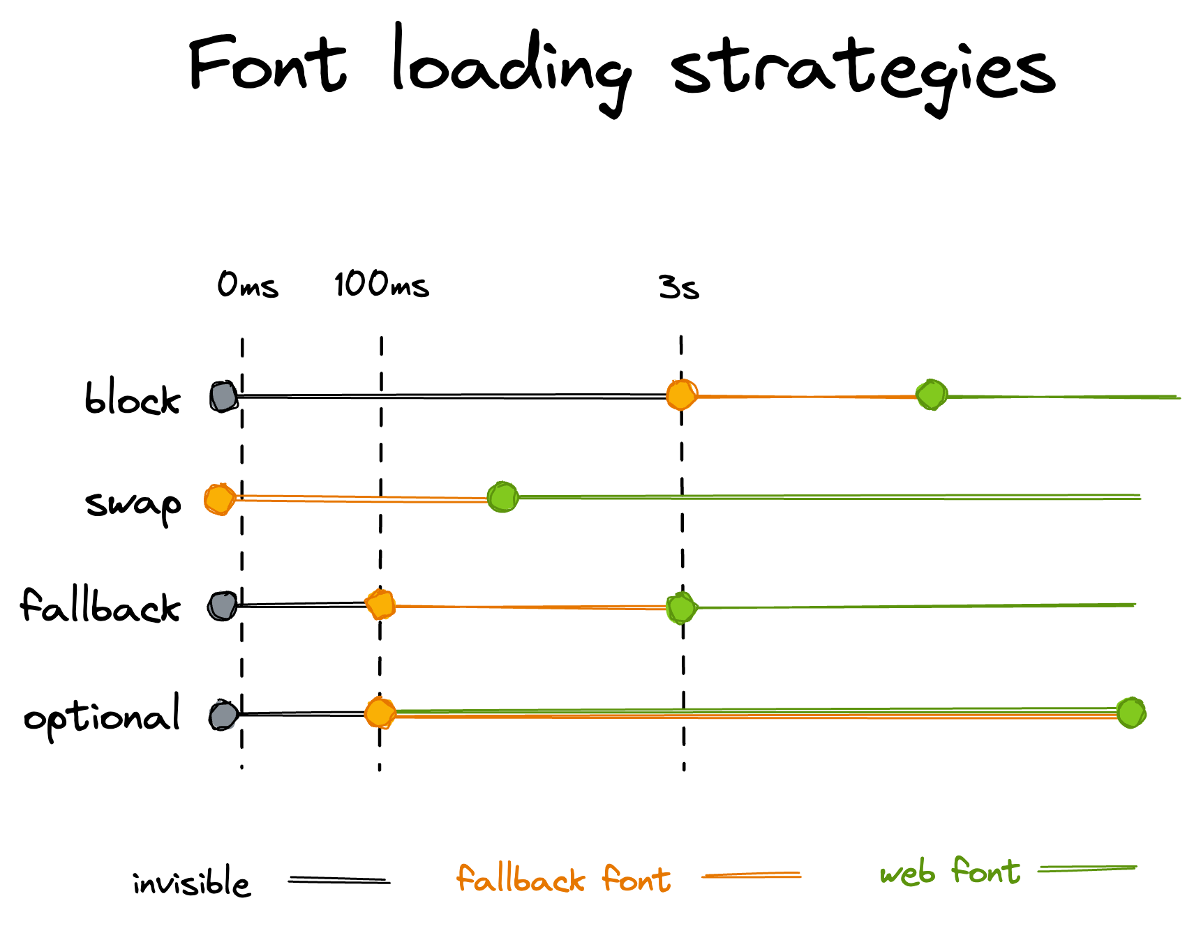
- FOIT (Flash of Invisible Text): The browser waits to render text until the custom font is fully loaded, leaving blank spaces on the page. This feels slow and broken.
- FOUT (Flash of Unstyled Text): The browser immediately displays the text using a readily available system font (like Arial or Times New Roman). Once your custom font loads, the browser swaps the system font for the custom one.
FOUT is generally preferred because the user can start reading immediately. However, the "swap" can cause a problem. If the system font and your custom font have different shapes and sizes, the swap will cause text to reflow and other page elements to jump around. This jarring movement is measured as Cumulative Layout Shift (CLS), a key metric Google uses to evaluate user experience. A high CLS score makes a site feel unstable and unprofessional.
This diagram illustrates the most common strategies, including the one Framer uses by default.
2. Framer's Built-in Font Optimizations
Fortunately, Framer has a sophisticated, automatic optimization pipeline that handles most of the heavy lifting to prevent CLS. Understanding what Framer does for you is key to working with the system effectively.
Let's review the official documentation to see how it works.
How fonts are optimized in Framer
This article from Framer's official help center, 'How fonts are optimized in Framer,' details the automatic processes that run behind the scenes. It's crucial for understanding how Framer already works to solve the CLS problem.
Please read the entire article. Pay close attention to these key optimizations: font-display: swap: This is Framer's chosen strategy to avoid invisible text. Layout shift optimization (size-adjust): This is the magic. Framer automatically calculates the size difference between the fallback font and your web font and applies CSS to make them match, drastically reducing or eliminating CLS. Font subsetting: This reduces file size by only including the characters your site actually uses. WOFF2 font compression: This ensures the font files themselves are as small as possible.
The most important takeaway is that Framer automatically implements the size-adjust CSS property. This is a modern technique designed specifically to combat CLS from font swapping. By pre-calculating the metrics of your chosen web font, Framer tells the browser to adjust the fallback system font so that it takes up the exact same space. When the final font loads and swaps in, there's little to no layout shift.
3. Your Role: Strategic Font Selection
Since Framer automates the complex technical side, your primary responsibility is to make smart, strategic decisions about which fonts to use and how many.
Strategy 1: Prefer Web Fonts and Be a Minimalist
Framer gives you access to a vast library of Google Fonts and Fontshare fonts under the "Web" tab. These are your best option for performance.
- Optimized Delivery: As the documentation mentions, these fonts benefit from automatic subsetting. If your site only uses Latin characters, you won't be forced to download Cyrillic, Greek, and other character sets, keeping file sizes small. Custom-uploaded fonts do not get this benefit.
- Limit Families and Weights: Every font family (e.g., Inter, Poppins) and every weight/style (e.g., Regular 400, Bold 700, Italic) is an additional file the browser must download. To maximize performance, be disciplined. Stick to one or two font families and only load the weights you absolutely need for your design. This aligns perfectly with the minimalist design principles we covered earlier in the course.
Strategy 2: Leverage Variable Fonts
Variable fonts are a modern font technology that is perfect for performance-conscious creators. Instead of needing separate files for each weight and style, a single variable font file contains all of that information.
This offers two huge benefits:
- Fewer HTTP Requests: The browser only needs to download one file for an entire font family, which is much faster.
- Smooth, CLS-Free Animations: This is where variable fonts truly shine.
Watch this short video from Framer to see how they work and, most importantly, how they can be used to prevent layout shift during interactions like hover effects.
This video, 'Framer Update: Variable Fonts,' demonstrates how to use variable fonts within Framer and highlights their key performance benefit.
Watch the entire video. Pay special attention to the end (starting around 03:39) where it discusses 'uni-width fonts' and creating hover effects without any layout jumps. This directly addresses our goal of minimizing CLS.
As the video explains, a common design pattern is to make navigation links bolder on hover. With traditional fonts, the bold version is physically wider, causing the whole navigation bar to shift when you hover—a classic example of CLS. With a uni-width variable font, you can animate the weight axis without affecting the width of the text, creating a smooth, professional effect with zero layout shift.
4. Under the Hood: The @font-face Rule
For those with a computer science interest, it can be helpful to see the code that Framer is generating for you. When you add a font, Framer writes a CSS @font-face rule in your site's code. This rule tells the browser where to find the font file and how to handle it.
A simplified version of what Framer generates might look like this:
@font-face {
  font-family: "My Awesome Font";
  src: url("/fonts/my-awesome-font.woff2") format("woff2"); /* The font file */
  font-display: swap; /* The strategy: show fallback first */
  size-adjust: 105%;  /* Framer's calculation to match the fallback */
}
You don't need to write this code yourself, but seeing it clarifies what's happening. Framer is simply using its interface to build these highly optimized CSS rules on your behalf. If you're curious to learn more about all the possible descriptors and advanced techniques, the article "The Ultimate Guide to Font Performance Optimization" from DebugBear is an excellent (and very comprehensive) resource that explores topics like self-hosting and preload hints, which are typically handled by platforms like Framer automatically.
Conclusion
You now have a clear set of strategies for managing fonts that align with your goal of building high-performance, aesthetically pleasing websites. By combining smart font selection with Framer's powerful automatic optimizations, you can ensure your typography loads quickly and smoothly.
Key Takeaways:
- Font loading can cause Cumulative Layout Shift (CLS) when a fallback font is swapped for a web font of a different size.
- Framer automatically fights CLS by using the
font-display: swapstrategy combined with thesize-adjustproperty to make the fallback and web fonts match. - Your job is to make smart choices upfront: prefer optimized Google Fonts, limit yourself to 1-2 font families, and only load the weights you need.
- Variable fonts are a powerful tool for performance, reducing file requests and enabling CLS-free animations for things like hover states.
Activity (10 minutes)
Let's put the theory of variable fonts into practice to see the CLS benefit firsthand.
- In your Framer project, create a new page.
- Add a horizontal Stack and place three Text layers inside it to create a simple navigation bar (e.g., "Home", "About", "Contact").
- Choose a standard, non-variable Google Font (like "Poppins") for the text.
- Create a Hover effect for the text layers that changes the
Font WeightfromRegular (400)toBold (700). - Preview your site. Hover over the links. Notice the slight but noticeable jump or shift in the layout as the bold text takes up more space.
- Now, duplicate this navigation bar.
- For the new bar, change the font to a variable Google Font. A good one to test with is "Inter" or "Roboto Flex". In the font properties, you should see sliders for variable axes like 'Weight'.
- Edit the Hover state for this new bar. Instead of picking a new font weight from a dropdown, use the Weight slider in the
Variablesection to increase the weight. - Preview the site again and hover over the links in the second navigation bar. You should see the text become bolder with zero layout shift. This is the power of uni-width variable fonts in action!
Preview of the Next Lesson:
With your site's images and fonts fully optimized, your project is nearly ready for the world to see. In our next lesson, we will publish your site using a Framer subdomain and prepare for connecting a custom domain. We will then tie all of our performance work together by learning how to audit site performance using Google Lighthouse, giving you the tools to measure your success and identify any remaining areas for improvement.