Introduction
Welcome back. In our previous lesson, you developed a keen eye for typographic detail by analyzing minimalist wordmarks through the framework of font choice, weight, and spacing. This analytical foundation is crucial because, as you've noted, you prefer systematic, rule-based approaches to design. Today, we put that analysis into practice.
This lesson is a hands-on workshop where you will design and refine a minimalist wordmark logo in Adobe Illustrator, focusing on font selection, kerning, and balance. We will transition from being a critic to being a creator. By the end of this session, you will have the first and most important visual asset for your brand: a polished, professional-looking wordmark ready to be deployed across your future digital products and website.
Let's open Illustrator and begin building.
1. From Brand Story to Font Choice
The first step is to choose a starting typeface. This choice should not be random; it must be a direct reflection of the brand story, values, and target audience you defined two lessons ago.
In the previous lesson, you analyzed how different font categories (serif, sans-serif) convey distinct personalities. For a minimalist, modern brand like the ones you admire (Oliur, Bog), a sans-serif typeface is often the strongest starting point. They feel clean, technical, and contemporary.
Your Task (Part 1):
- Open Adobe Illustrator and create a new document.
- Use the Type Tool (T) to write out your brand name.
- Choose a starting font. Browse a resource like Google Fonts for a high-quality, free sans-serif. Look for a typeface with multiple weights (e.g., Light, Regular, Bold) as this provides flexibility. For this exercise, a simple, geometric sans-serif like Poppins, Inter, or Montserrat is a great choice.
- Select a weight. As discussed in the
Smashing Magazinearticle from our last lesson, weight communicates tone. Start with a Regular or Semi-Bold weight.
Mastering Typography In Logo Design - Smashing Magazine
To reinforce the process of aligning font choice with brand identity, let's revisit a section of the 'Mastering Typography In Logo Design' article. It provides a practical workflow for this exact task.
Review the section titled 'Let’s Build a Brand Logo,' focusing on the five steps used for the 'EcoWave' example. Pay attention to how they go from keywords (Sustainable, Innovative) to a typeface category (Sans-Serif) and then a specific font choice (IBM Plex Sans). Apply this same thought process to your own brand.
2. Refining Spacing: Tracking and Kerning
A default font is just a starting block. Professional wordmarks are distinguished by their meticulous spacing. This is where you will spend most of your refinement time.
First, duplicate your live text object in Illustrator (drag it while holding Option/Alt) so you always have an editable version to go back to.
Step 1: Adjusting Tracking (Overall Spacing)
Tracking adjusts the space uniformly across all characters. For minimalist design, slightly increasing the tracking can create an airy, premium feel.
- Select your text object.
- Open the Character panel (
Window > Type > Character). - Adjust the Tracking value (the
VAicon). Try values like25,50, or75to see the effect. Settle on a value that feels balanced—not too tight, not too spread out.
Step 2: Perfecting Kerning (Individual Spacing)
Kerning is the art of adjusting the space between specific pairs of letters to create optical balance. Default font kerning (Metrics) is often good, but rarely perfect.
Illustrator offers a setting called Optical Kerning, which automatically adjusts spacing based on letter shapes. It's often a significant improvement.
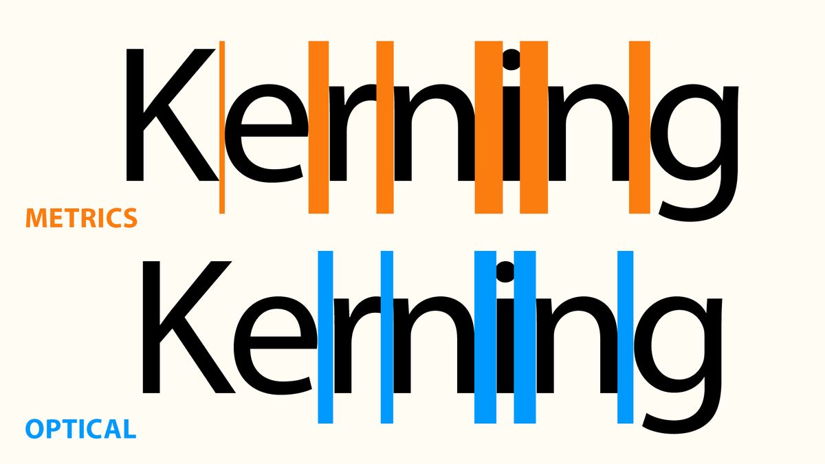
Try switching your kerning from Metrics to Optical in the Character panel.
For ultimate control, however, you must kern manually. This is a non-negotiable skill for high-quality type work.
- Place your cursor between two letters.
- Use the keyboard shortcuts:
Option + Right/Left Arrow(Mac) orAlt + Right/Left Arrow(PC) to nudge the letters. - The goal is optical balance, not mathematical equality. The volume of negative space between each letter should feel the same.

Focus on problematic pairs. For example, the space between A and V needs to be reduced, while the space between two round letters like o and o might need to be increased.
How To Manipulate & Customise Typography For A Logo
Let's watch a designer perform these initial adjustments. Abi Connick provides a clear, practical demonstration of moving from a default font to a more refined starting point.
Watch from the beginning to 02:47. Pay close attention to her workflow: she chooses a font, immediately adjusts the tracking to bring the letters closer, and then discusses exploring glyphs before outlining.
3. Customizing Letterforms for a Unique Identity
Once your spacing is balanced, the final step is to subtly modify the letterforms themselves. This makes the wordmark truly unique and proprietary.
Warning: This next step is destructive. Duplicate your kerned text object one more time. Select the new object and convert it to vector shapes by going to Type > Create Outlines (Shortcut: Cmd/Ctrl + Shift + O). Your text is no longer editable as type, but you can now manipulate each letter as a shape.
Subtle Tweaks with the Direct Selection Tool
For a minimalist logo, subtlety is key. You can use the Direct Selection Tool (A) to select and move individual anchor points.
- You might extend the crossbar of a 't' slightly.
- You could sharpen or round a corner to match other letters.
- The goal is to enhance consistency and rhythm across the wordmark.
How To Manipulate & Customise Typography For A Logo
Here, Abi Connick demonstrates how to use the Direct Selection Tool for these subtle but impactful modifications on a sans-serif typeface.
Watch from 07:21 to 08:46. Notice how she selects the anchor points of the outlined letters and moves them to change the letter's shape. Her key advice is to ensure any changes are applied consistently across all letters to maintain the typeface's characteristics.
Advanced Refinement: A Masterclass
To see what is possible with extreme attention to detail, we will look at a clip from The Futur. Chris Do deconstructs and rebuilds letterforms from scratch to achieve perfect optical harmony. While you are not expected to perform this level of reconstruction today, watching a master at work will train your eye to see the imperfections in default letterforms.
Logo Design – How to Improve Your Letterforms
In this video, Chris Do shows the meticulous process of refining letterforms to create a world-class logo. This is the level of detail that separates good from great.
Watch the following segments: 00:06 - 02:15: See how he identifies issues with overshoot and contrast and begins adjusting the 'o' for better optical balance. 02:15 - 02:56: Notice his decision to remove decorative elements from the 't' to maintain a clean, consistent aesthetic. 08:17 - 11:00: This is the masterclass. Observe his systematic process for rebuilding the letter 'e' using basic shapes and the scissor/join tools. Focus on the principle—ensuring every curve and stroke is intentional—rather than memorizing the exact steps.
Take some time now to experiment with your outlined wordmark. Use the Direct Selection Tool (A), the Pen Tool (P) to add or remove anchor points, and the Shape Builder Tool (Shift + M) to combine or subtract parts. Make small, intentional changes that enhance the personality you defined in your brand story.
Conclusion
Congratulations, you have now moved from analysis to creation. You've taken a brand name and transformed it from plain text into a refined, custom wordmark. This is a foundational skill for any brand designer.
Key Takeaways:
- Wordmark design is a systematic process: Font Selection -> Spacing Refinement (Tracking & Kerning) -> Letterform Customization.
- Always work on duplicates. Keep a live text version of your work before you
Create Outlines. - Optical balance is the ultimate goal. Trust your eye over mathematical measurements.
- Subtle, consistent adjustments to letterforms can elevate a good logo to a great one.
Save your Illustrator file. You should have three versions of your wordmark on your artboard: the original text, the kerned text, and the final outlined vector logo.
Preview of the Next Lesson:
A logo doesn't live in a vacuum. To ensure it's used correctly, you need a brand guide. In our next lesson, we will compile your brand colors, fonts, and the wordmark you just created into a simple, one-page brand guide in Figma. This will become the central document for keeping your visual identity consistent.