Introduction
Welcome back. In our last lesson, you crafted your brand story, establishing the narrative that defines who your customer is, what they want, and how your brand will guide them. This story is now your strategic brief, the document that will inform every creative decision you make, ensuring your brand's visuals and voice are always aligned with its core purpose.
Today, we will begin translating that story into a visual identity. Our focus is on the cornerstone of most minimalist brands: the wordmark. This lesson will equip you to analyze the typography of minimalist wordmarks, focusing on font choice, letter-spacing (tracking), and weight.
You've expressed a preference for systematic, rule-based frameworks, and typography is a perfect domain for this. While it may seem like an art, it is governed by a clear set of principles. By the end of this lesson, you'll be able to deconstruct why a wordmark for a brand like Apple or Oliur feels the way it does, preparing you to make your own intentional design choices.
1. Why Typography is More Than Just Text
In minimalist design, typography does the heavy lifting. With fewer elements on the page, the choice of font, its size, and spacing carry immense weight in communicating your brand's personality. It can signal sophistication, approachability, strength, or elegance before the viewer has even read the words.
Let's start by understanding the power and discipline of typography from a master, Chris Do.
How Typography Elevates Design from Good to Great (Masterclass Part 2/3)
In this clip from The Futur, Chris Do explains the critical role of typography in design and distinguishes it from simply designing a logo. This will set the stage for why a deep understanding of type is non-negotiable for a great designer.
Watch from 00:42 to 03:50. Pay attention to his argument that mastering typography unlocks the ability to master all other facets of design, and how it's used to communicate ideas effectively, not just to look pretty.
As the video highlights, typography is about the intentional arrangement of type to convey a message. To analyze a wordmark, we need a framework. We'll focus on three fundamental pillars:
- Font Choice: The personality of the typeface.
- Font Weight: The thickness of the strokes.
- Letter-Spacing: The space within and between letters.
2. The Three Pillars of Wordmark Analysis
A fantastic article from Smashing Magazine breaks down these pillars. We'll use it as our guide for this section.
Mastering Typography In Logo Design - Smashing Magazine
This article, 'Mastering Typography In Logo Design,' provides a clear, structured approach to understanding the key elements of typographic design. We'll read the first part to establish our analytical framework.
Read from the beginning of the article down to the end of the 'Brand Identity and Consistency' section. Focus on how the author categorizes fonts (Serif, Sans Serif, etc.) and links them to specific brand characteristics (e.g., trustworthy, modern). The ING logo example is particularly insightful.
Let's break down the key ideas from that reading.
Pillar 1: Font Choice (The Persona)
Your font choice is the most significant decision. It sets the entire mood. As the article explains, typefaces can be grouped into categories, each with its own personality:
- Serif: Has small decorative strokes (serifs) at the end of letterforms.
- Conveys: Tradition, authority, reliability, elegance. (Think of a university or a law firm).
- Sans-Serif: Lacks serifs, resulting in clean, simple lines.
- Conveys: Modernity, minimalism, approachability, tech-focus. (Think of most tech startups and modern lifestyle brands like Oliur's).
- Script: Mimics handwriting or calligraphy.
- Conveys: Elegance, personality, creativity, formality or informality depending on the style.
- Display: Bold, expressive, and unconventional. Designed for headlines.
- Conveys: High impact, artistic, unique, stylized.
When analyzing a wordmark, the first question is: How does the font's persona align with the brand's story and values? The Smashing Magazine article's deconstruction of the ING logo is a perfect example of this analysis in practice.
Pillar 2: Font Weight (The Voice)
Font weight refers to the thickness of the characters' strokes. It's like the volume and tone of a voice.
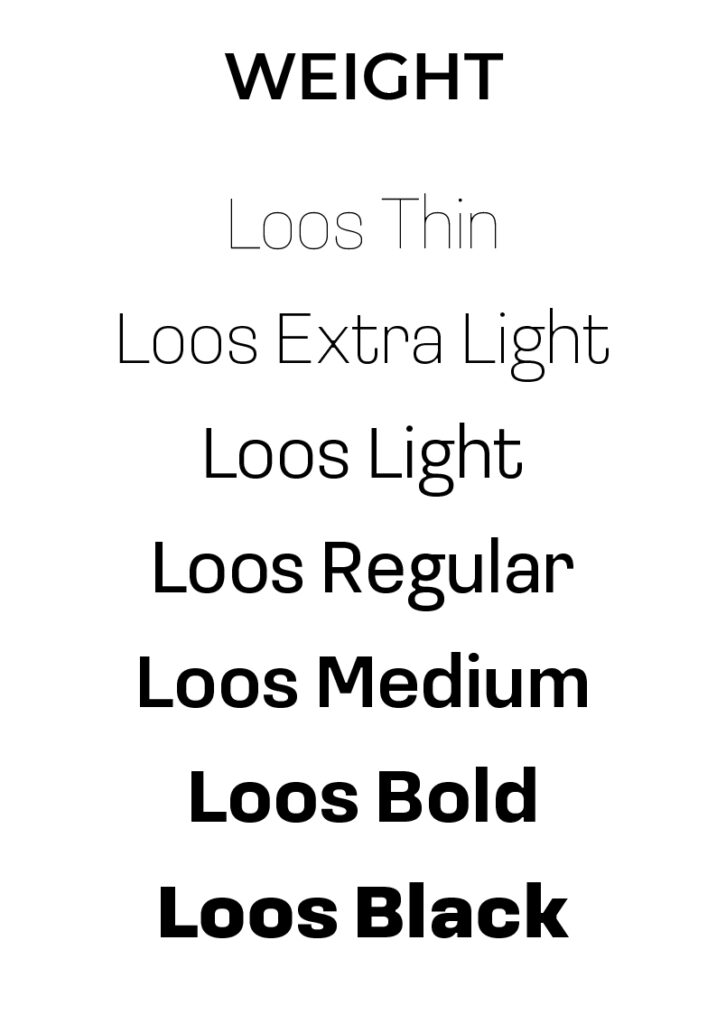
Consider the effect of different weights:
- Light/Thin: Feels delicate, airy, sophisticated, and upscale.
- Regular/Book: A neutral, balanced, and highly readable baseline.
- Bold/Black: Feels strong, confident, and demands attention. It conveys importance and stability.
When analyzing a wordmark, ask: What is the font weight communicating? A minimalist tech brand might use a regular or light weight to feel clean and unobtrusive, while a brand focused on strength and security might use a bold weight.
Pillar 3: Letter-Spacing (The Rhythm)
This is the fine-tuning that separates amateur from professional design. It involves two concepts:
- Tracking: The consistent spacing added or removed between all letters in a word or block of text.
- Kerning: The adjustment of space between specific pairs of letters to create a visually even appearance.

Here's how to analyze spacing:
- Loose Tracking: Creates an airy, spacious, and often luxurious feel.
- Tight Tracking: Creates a compact, solid, and impactful block. It can feel urgent or very deliberate.
- Custom Kerning: Look for letters that typically create awkward gaps (like 'A' and 'V', or 'T' and 'o'). Well-crafted wordmarks will have manually adjusted these spaces to look optically balanced.
When analyzing a wordmark, ask: How does the spacing affect the overall visual texture and rhythm? Is it open and breathable, or dense and solid?
3. Activity: Deconstruct Minimalist Wordmarks
Now it's your turn to be the analyst. Your task is to apply this three-pillar framework to existing wordmarks. This exercise will train your eye to see the deliberate choices behind effective design.
Open your project management tool and create a new page called "Wordmark Analysis."
-
Select 3 wordmarks from brands you admire. Good examples would be
Oliur,Apple,Google,The Futur, or any from the mood board you created in Module 1. -
For each wordmark, create a new heading and paste in an image of the logo.
-
Beneath each image, answer the following questions based on the three-pillar framework:
Analysis Framework for [Brand Name]
-
Font Choice:
- What category does the typeface likely fall into (Serif, Sans-Serif, etc.)?
- What personality or characteristics does this choice convey (e.g., modern, traditional, friendly, serious)?
- Based on what you know of the brand, why do you think this was an effective (or ineffective) choice?
-
Font Weight:
- How would you describe the weight (light, regular, bold)?
- What feeling or tone does this weight create (e.g., delicate, strong, neutral)?
- How does this contribute to the brand's overall message?
-
Letter-Spacing:
- Does the tracking feel loose, tight, or standard? What effect does this have?
- Look closely at letter pairs like 'AV', 'To', 'Ly'. Can you spot any evidence of custom kerning to fix awkward gaps? Describe what you see.
- How does the spacing contribute to the wordmark's final look and feel?
-
To see how a designer thinks through these modifications in real-time, you can watch how they are applied in Illustrator.
How To Manipulate & Customise Typography For A Logo
This video by Abi Connick is about customizing typography. While our goal today is analysis, not creation, watching parts of her process can help you spot the kinds of modifications designers make.
Watch the segment from 01:29 to 08:46. You don't need to follow every step, but observe how she adjusts tracking (01:40), uses the direct selection tool to tweak anchor points (07:30), and focuses on keeping the characteristics consistent across all letters. This will help you identify these subtle adjustments in the logos you analyze.
Conclusion
You now have a systematic framework for analyzing the typography of a wordmark. You can look at a logo and understand why it works, articulating your observations using the language of design. This analytical skill is the foundation for creating your own successful brand visuals.
Key Takeaways:
- Typography in branding is a system of deliberate choices, not arbitrary font-picking.
- The three pillars of analysis are Font Choice (persona), Font Weight (voice), and Letter-Spacing (rhythm).
- Font Choice aligns the typeface's personality with the brand's story.
- Font Weight controls the visual impact and tone.
- Letter-Spacing (Tracking & Kerning) refines the wordmark for a professional, optically balanced finish.
Preview of the Next Lesson:
In the next lesson, we will move from analysis to creation. You will take your brand story, your analysis of successful wordmarks, and design and refine a minimalist wordmark logo in Illustrator, focusing on font selection, kerning, and balance. Today's homework will serve as your direct inspiration and quality benchmark.