Introduction
In the last lesson, we focused on the technical process of exporting your finished vector designs into web-ready (PNG, SVG) and print-ready (PDF) formats. This is a crucial final step in the production pipeline.
Now, we shift our focus from creating individual assets to designing marketable products. Before we build our own templates, it's essential to understand what makes existing ones successful. A great template isn't just about beautiful design; it's about structure, clarity, and ease of use for the end-user.
This lesson is about reverse-engineering. We will deconstruct successful social media templates to identify their common editable elements and underlying structure. Think of this as a programmer studying well-written, open-source code before starting a new project. By the end of this lesson, you'll have a framework for analyzing any design and the vocabulary to describe why it works (or doesn't).
1. The Anatomy of a Template: Structure and Editable Elements
Most effective social media posts, especially those designed as templates, follow a simple but powerful narrative structure. This structure ensures the message is delivered clearly and encourages a specific action from the viewer.
The 12 Best Free Ad Template Resources for High-Converting Campaigns
This article, while about ad production, provides a key insight into a foundational creative framework. It will give you a simple, powerful structure to look for in any template.
Please read the section titled 'Beyond the Template: How to Supercharge Your Ad Production Workflow'. Focus on the paragraph that introduces the Hook-Body-CTA framework. This is the fundamental structure we'll be using for our analysis.
This Hook-Body-CTA structure is the skeleton of your template. Let's break down what goes into each part:
- Hook: The most prominent element, designed to grab attention immediately. This is often a bold headline, a striking image, or a provocative question.
- Body: The core content that provides value. This could be a list of tips, an explanation, a quote, or product features.
- CTA (Call to Action): The element that tells the user what to do next. Examples include "Comment below," "Link in bio," "Save for later," or your website/handle.
Now, let's identify the common editable components that make up this structure. A social media post is essentially a mini-landing page, and its components serve similar functions.

Based on this, we can identify the core editable elements you will find in almost any social media template:
- Primary Media: A placeholder for an image, video, or illustration.
- Headline: The main text element (the hook).
- Body Text: Paragraphs, bullet points, or lists that deliver the main message.
- Logo/Branding: A spot for the user's logo or username.
- Call to Action (CTA): Text prompting a specific action.
- Supporting Details: Smaller text for URLs, dates, or other secondary info.
2. Visual Hierarchy: The Unspoken Rules of Attention
Knowing the components is the first step. Arranging them effectively is the next. This is governed by visual hierarchy, which is the art of arranging elements to guide the viewer's eye in a specific order. Since you prefer systematic, rule-based frameworks, this concept should be particularly useful.
🔸 Master ADVANCED Hierarchy In Under 7 Minutes! (Important)
The video 'Master ADVANCED Hierarchy In Under 7 Minutes!' by Satori Graphics is a concise, rule-based guide to visual hierarchy. It provides the analytical tools you'll need to deconstruct how a template's layout works.
Watch the video in its entirety (it's short!). Pay close attention to these key concepts: The Three-Flow Rule: Where the eye starts, moves, and finishes. F and Z Patterns: The natural scanning paths viewers follow. The Three Levels of Size: The Hook, Secondary Detail, and Finisher. The Role of Whitespace: How empty space creates clarity and enables hierarchy.
These principles—especially the three levels of size (Hook, Secondary, Finisher)—give you a precise way to analyze the structure of any design. The largest element is typically the hook, followed by the body content, and finishing with the smaller CTA or branding elements.
3. Deconstruction in Action: Analyzing Instagram Carousels
Now, let's apply these frameworks to real-world examples. We'll watch selections from a design critique by Chris Do of The Futur, where he deconstructs several Instagram carousels. This is a masterclass in applying the principles we've just discussed.
Improve Your Instagram Design: Critiques, Tips & Advice PT 1
In 'Improve Your Instagram Design', Chris Do provides live critiques that are perfect for learning deconstruction. He starts by outlining his evaluation criteria, which provide a great framework for analysis.
First, watch from 00:37 to 01:42 to understand Chris Do's five criteria for evaluation: clarity, value, typography, design supporting concept, and the 'X factor'. Then, we'll look at two case studies. As you watch each critique, try to identify: The Hook, Body, and CTA structure. The editable elements (images, headlines, lists, etc.). How visual hierarchy (size, spacing, color) is used. Case Study 1 (Clear and Effective): Watch the critique of the 'Overcoming Anxiety' carousel from 01:42 to 08:56. Case Study 2 (Aesthetically Strong, but Structurally Flawed): Watch the critique of the 'Brand Loyalty' carousel from 14:03 to 21:43.
Let's analyze what we saw:
Case Study 1: 'Overcoming Anxiety'
- Structure (Hook-Body-CTA):
- Hook: "How to overcome anxiety in just 20 seconds" - a clear, benefit-driven headline. The accompanying image of breaking chains is a strong visual hook.
- Body: A step-by-step breathing exercise, explained across several slides.
- CTA: A final slide with the creator's photo, asking the user to share the content.
- Editable Elements: The template structure here would have slots for a main headline, a supporting visual, a series of text slides for the "body" content, and a final CTA slide with space for a profile picture and call to action.
- Critique Insights: Chris praises the clarity of the promise but critiques the copy flow and typographic consistency (indentation, proximity). This highlights that even in a well-structured template, the details of execution matter.
Case Study 2: 'Brand Loyalty'
- Structure: This carousel struggles with clarity. The hook is intriguing ("You buy a cup of coffee from the same place..."), but the body's message about brand values and mission statements is disconnected from the viewer's likely experience. The CTA is a vague question.
- Editable Elements: The design uses a mix of photography, abstract shapes, and clip-art style icons. This inconsistency makes it a poor template. A good template uses a consistent visual language.
- Critique Insights: Chris's key critique is the disconnect between the design and the concept. The visual language is inconsistent (rich photography vs. flat icons), and the color palette changes abruptly. This is a crucial lesson: a successful template system must be visually cohesive.
4. From Single Post to Template System
A truly valuable digital product isn't just one template; it's a system. The goal is to create a set of templates that share a consistent visual identity but can be adapted for different platforms and content types.
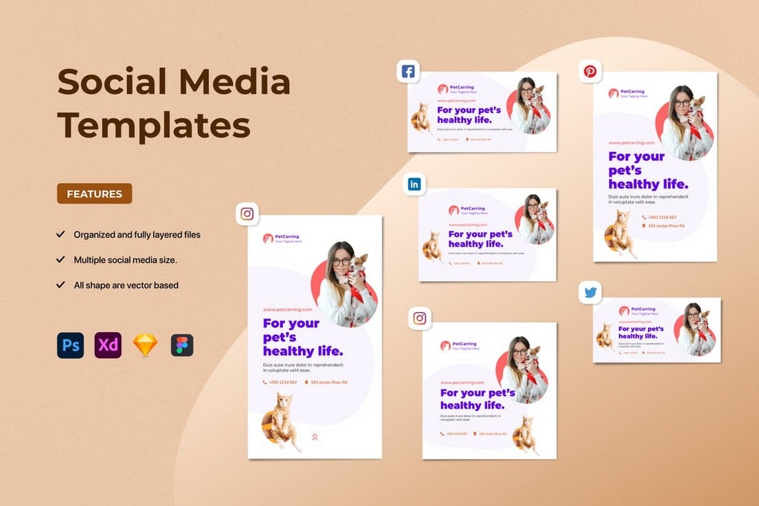
This concept of a modular system is what we'll be aiming for. When deconstructing templates, look for these system-level properties:
- Consistency: Are fonts, colors, and spacing rules applied uniformly?
- Modularity: Are there reusable components like headers, footers, or content blocks?
- Adaptability: How easily does the design adapt to different sizes (e.g., a 1:1 post vs. a 9:16 story)?
Tools like Figma, with its support for components, variants, and auto-layout, are specifically designed to build these kinds of powerful, modular systems.
User profile design masterclass. From Figma templates to live implementation
To see how these components come together in a professional context, let's look at an article that deconstructs the anatomy of a user profile—a common element on social media.
Read the section 'Anatomy of a user profile'. It breaks down a profile into its core layers (header, bio, activity feeds, etc.). This reinforces the idea of identifying common, reusable components that form the structure of a template.
Conclusion
You now have a structured approach to analyzing any social media design. Instead of just seeing a "nice post," you can now deconstruct it into its fundamental parts and understand the principles that make it effective.
Key Takeaways:
- The Hook-Body-CTA Framework: This simple narrative structure is the backbone of most successful social media content.
- Common Editable Elements: Templates are built around key placeholders for media, headlines, body text, branding, and calls to action.
- Visual Hierarchy Governs Attention: The deliberate use of size, color, and whitespace guides the viewer's eye and ensures the message is understood in the intended order.
- Consistency is Key: A successful template is part of a larger, cohesive visual system, not just a one-off design. It should be modular and adaptable.
Preview of the Next Lesson
In our next lesson, we will take everything we've learned from this deconstruction exercise and put it into practice. You will design your first reusable social media template in Figma, applying your brand guidelines and focusing on the principles of modular design. We'll begin translating this analytical knowledge into a practical, marketable skill.