Introduction
Hello! In our last lesson, we focused on deconstruction—analyzing successful social media templates to understand their underlying structure, like the Hook-Body-CTA framework, and identifying their core editable elements. This analytical skill is the foundation for creating effective designs.
Today, we transition from analysis to creation. This lesson's goal is to design a reusable social media template in Figma, applying your brand guidelines and modular design principles. We'll take the theoretical principles from our deconstruction and put them into practice. You'll learn to use Figma's powerful features to build templates that are not only visually appealing but also systematic, consistent, and easy for an end-user to customize—a key quality for any digital product you intend to sell.
1. The Philosophy of a Reusable Template: Modular Design
You've mentioned that you prefer systematic, rule-based frameworks over relying on raw creativity. That's the perfect mindset for template design. Professional designers don't create templates from a blank slate every time; they build them from a design system. A design system is a collection of reusable components, guided by clear standards, that can be assembled to build any number of applications.
For our purposes, we'll focus on three core pillars of a design system in Figma:
- Styles: Pre-defined sets of properties for colors, text, and effects. They are the most basic "rules" of your brand.
- Components: Reusable design elements, from simple buttons to complex cards.
- Libraries: How styles and components are shared and distributed.
A popular framework for thinking about this is Atomic Design. It provides a clear, hierarchical structure that should resonate with your interest in systematic approaches.
Lesson 3: Build your design system
To understand the systematic foundation of template design, please read this official Figma documentation. It explains the core concepts we'll be building on.
Please read Chapter 1: Set up your library. Focus specifically on these three subsections: 'Back to basics': This defines Styles, Components, and Libraries. 'Component architecture': This introduces the concept of Atomic Design (atoms, molecules, organisms). 'Naming conventions': This reinforces the importance of organization, which is crucial for scalable projects.
To summarize Atomic Design in our context:
- Atoms: These are your fundamental building blocks that can't be broken down further. Think of your brand's color styles, text styles, and individual icons.
- Molecules: Simple groups of atoms that function together as a unit. A "CTA button" molecule might be made of a shape (atom), text (atom), and icon (atom).
- Organisms: Complex UI components assembled from molecules and/or atoms. Our entire social media template will be an organism, composed of a headline molecule, an image placeholder atom, and a CTA molecule.
By building with this modular approach, you ensure that if you update a foundational "atom" (like your primary brand color), that change propagates everywhere it's used. This creates a powerful and efficient workflow.
2. Practical Application: Defining Your Brand's "Atoms" in Figma
Before we build the template "organism," we need to codify your brand guidelines (from Module 3) into Figma Styles. These will be the "atoms" of your design system.
Your Task (5-10 minutes):
Open Figma and the brand guide you created in Module 3. We'll translate your brand's foundations into reusable Figma Styles.
-
Create Color Styles:
- Draw a few squares on your canvas.
- For each of your primary, secondary, and neutral brand colors, apply the color to a square.
- Click the four-dot "Style" icon in the Fill section of the right sidebar.
- Click the
+icon to create a new color style. - Name them using a slash
/for organization (e.g.,primary/blue,neutrals/dark-gray,accent/orange).
-
Create Text Styles:
- Write out a few lines of text for a headline, body copy, and a smaller caption/CTA.
- Apply the correct font, size, weight, and line height for each, according to your brand guide.
- Select a text layer, click the "Style" icon in the Text section, and create a new text style.
- Name them semantically (e.g.,
heading/h1,body/paragraph,ui/caption).
You have now created the foundational atoms of your template. Any design you build using these styles can now be updated globally in seconds.
3. Assembling the "Organism": A Guided Template Build
Now, let's put theory into practice. We will watch a professional designer build a social media template from scratch. This will show you how to combine your newly created styles (atoms) with layout principles to form a complete template (organism).
First, let's quickly review the core design principles that make a template effective.
How to Design Social Media Templates in Figma
This short clip from the 'How to Design Social Media Templates in Figma' video by Envato Tuts+ provides a concise overview of the key design principles that guide template creation.
Watch the section from 04:08 to 05:54. Focus on the four principles discussed: consistency, white space, hierarchy, and accessibility. Notice how these align with the visual hierarchy rules we discussed in the last lesson.
With those principles in mind, let's watch the main construction process. Pay close attention to how the designer uses Figma's tools to create a template that is both well-structured and easy to edit.
How to Design Social Media Templates in Figma
Now for the main event. This segment from the same video provides a complete walkthrough of building a Facebook post template. It's a perfect case study for our learning outcome.
Watch the segment from 08:23 to 33:39. Don't worry about following every single click. Instead, focus on the strategy and techniques: Image Placeholders (14:15): How does he use a vector shape as a mask? This is a core technique for creating editable image areas. Applying Styles (18:10): Notice how he applies pre-defined colors and fonts, rather than picking them manually. This is where your work from the previous step pays off. Auto Layout (22:50): Observe how he uses Shift+A to group icons and text. This creates flexible 'molecules' that automatically adjust when content changes. He uses it for the property features and later for the CTA. Reusability (32:20): Pay attention to how he tests the template by changing the text to see if the layout breaks. He then uses constraints to fix it. This is the essence of designing for reusability.
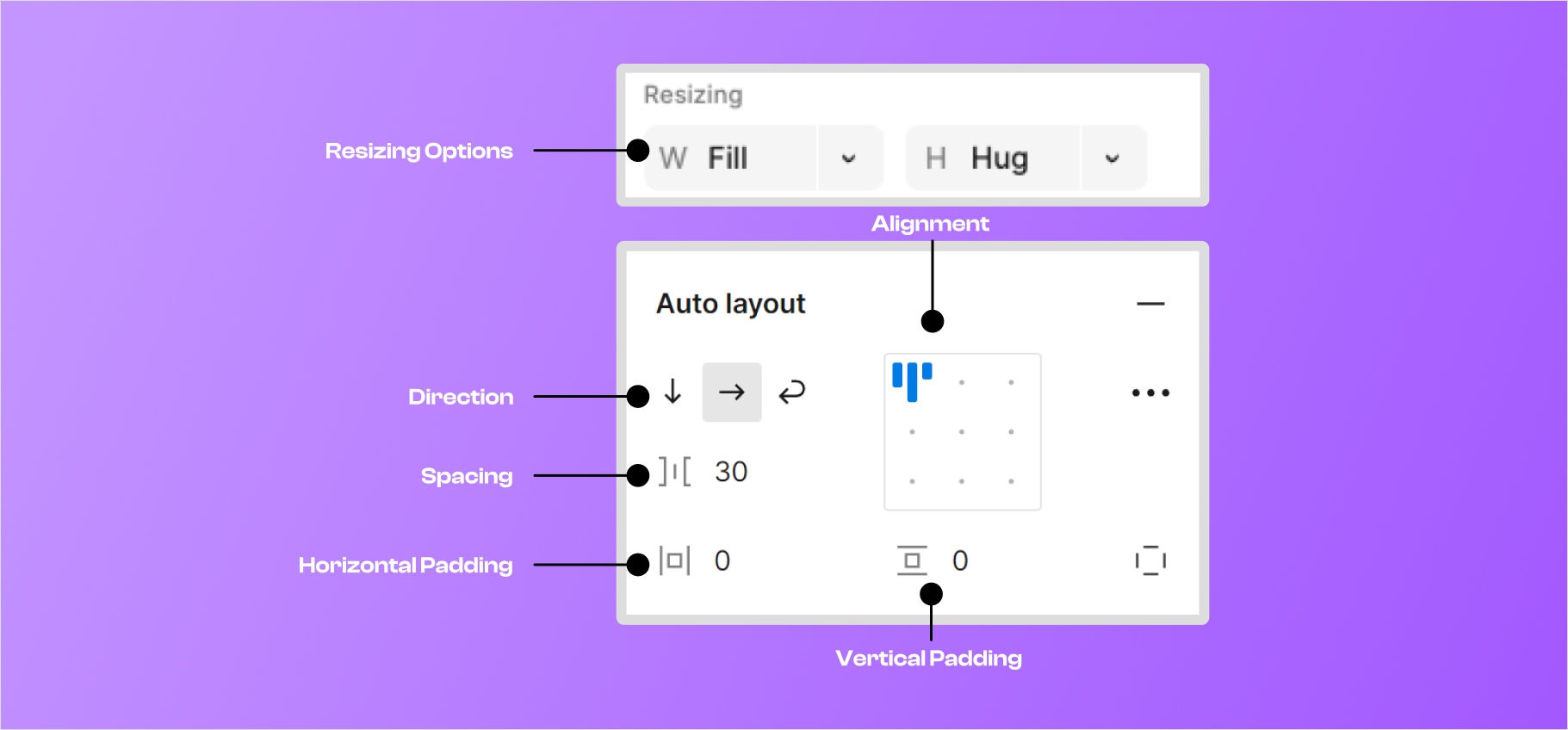
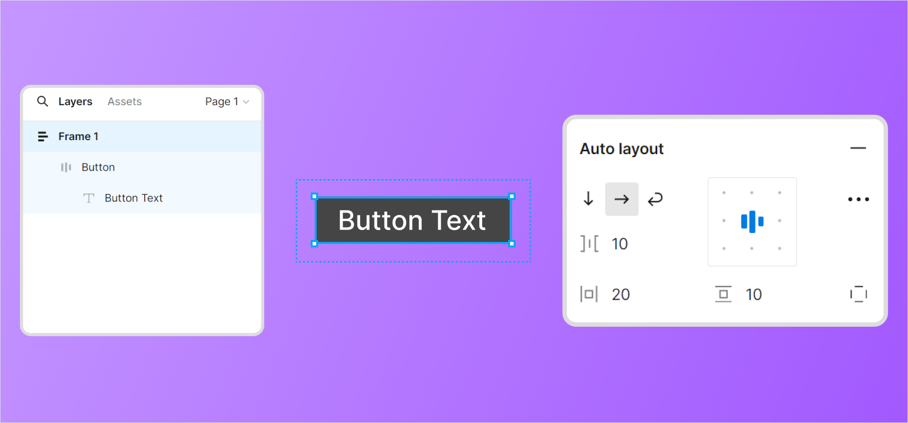
The key to creating reusable components in that video was Auto Layout. It allows you to define spacing, padding, and alignment rules that persist even when the content inside changes.
4. Your Turn: Design Your First Modular Template
Now it's time to apply what you've learned. Using the atoms (your Styles) and techniques you've just seen, you will design your own social media template organism.
Assignment:
- In Figma, create a new Frame with dimensions 1080 x 1080 pixels.
- Using your brand's Color Styles and Text Styles, design a social media post template.
- The template must include the following modular elements:
- An Image Placeholder: Use a shape (like a rectangle or a custom vector shape) as a mask for a placeholder image.
- A Headline: Use your
heading/h1text style. - Body Text: A small block of text using your
body/paragraphstyle. - A Branding Area: A place for your brand's wordmark (which you created in Module 3) or handle.
- Apply Auto Layout to at least one 'molecule' in your design (e.g., grouping your wordmark with your handle, or an icon with a text label).
Don't strive for perfection. The goal is to practice the workflow: using styles for consistency and Auto Layout for modularity.
Conclusion
In this lesson, you moved from being an analyst to an architect. You learned how to structure designs systematically using the principles of Atomic Design and how to implement that structure in Figma.
Key Takeaways:
- Systematic Design: Great templates are built from a design system composed of styles (atoms), components (molecules), and patterns (organisms).
- Brand Guidelines as Code: Figma Styles allow you to codify your brand's color and typography rules, ensuring consistency and enabling rapid updates.
- Modularity via Auto Layout: Auto Layout is the engine for reusability. It lets you create flexible components that adapt to their content, which is essential for a good template.
- The Workflow: The process is to first define your atoms (Styles), then use them to build molecules and organisms (your template) with rules for spacing and alignment (Auto Layout).
Preview of the Next Lesson
You've now created a great template foundation in Figma. However, to make it compatible with users who might not use Figma, or to add more advanced features like editable image placeholders, we often turn to other tools. In the next lesson, "Build the template in Photoshop/Photopea using Smart Objects and editable text layers for easy customization," we will recreate our template design in a raster environment, focusing on features that make templates incredibly user-friendly for a broad audience.