Introduction
Welcome to the final lesson of this foundational module! In our last session, you selected a compelling serif and sans-serif font pairing that reflects your brand's aesthetic, which you had previously defined with a mood board. You now have the typographic voice for your brand.
Today, we'll build on that foundation to address this lesson's learning outcome: to build a cohesive color palette based on your mood board and color theory principles. Color is one of the most powerful tools in design for evoking emotion and establishing brand recognition. Just like with typography, we'll use a systematic, rule-based approach to translate the inspiration from your mood board into a functional and harmonious color system.
By the end of this lesson, you will have a complete core visual identity—fonts and colors—ready to be applied to your future products and website.
1. Understanding the Rules of the Game: Color Theory
Before mixing colors, it's essential to understand the principles that govern how they interact. Color theory provides a framework for making intentional choices that create harmony and visual appeal.
Let's start by reviewing the core concepts.
Color Theory And Color Palettes — A Complete Guide
The article 'Color Theory And Color Palettes — A Complete Guide' from CareerFoundry offers a great introduction to the essential concepts. We'll focus on the terminology and the different types of color relationships.
Please read the following sections to get a solid grasp of the fundamentals: Section 2: Introduction to the color wheel: Focus on the definitions of Hue, Shade, Tint, and Tone. Understanding these four terms is crucial for manipulating any color precisely. Section 3: The importance of color harmony: This short section explains why we aim for harmony and what happens when it's missing. Section 6: What are the different types of color palettes?: Pay attention to the definitions of Monochromatic, Analogous, Complementary, and Triadic schemes. These are classic formulas for creating harmonious palettes.
To help you visualize and remember these concepts, here is a helpful infographic that summarizes much of color theory at a glance.
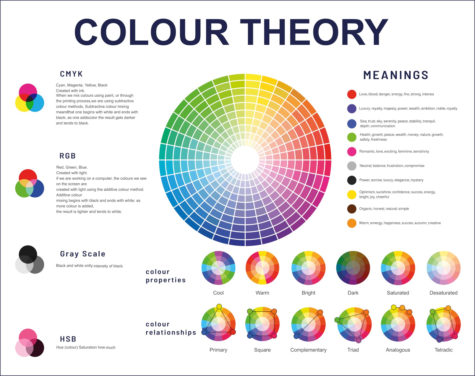
With this theoretical foundation, you now have a set of "recipes" (monochromatic, analogous, etc.) and the basic vocabulary (hue, shade, tint) to start building your palette.
2. A Systematic Approach to Building a UI Color Palette
Now, let's translate theory into a practical, step-by-step process specifically for digital interfaces. You'll find this method is less about random guessing and more about building a logical system.
This video from UX Tools outlines a professional workflow for creating UI color palettes. It introduces a key technique for generating a balanced range of shades from a single color.
The video 'How I make UI color palettes' presents a clear, systematic method for building color systems, which aligns perfectly with your preference for rule-based design.
Watch the video from the start up to 08:02. Pay close attention to these key steps: Color Categories (0:16 - 1:30): Understand the roles of Brand Colors, Supporting Colors, and Neutrals. Finding a Starting Point (1:30 - 2:40): Your brand color is the anchor of the entire system. Using HSB (2:40 - 3:16): The video explains why using the HSB (Hue, Saturation, Brightness) model gives you more precise control than HEX or RGB. This is a technical detail that makes the process much more systematic. The 'Arc' Method for Shades (4:16 - 6:09): This is the core technique. Observe how you can create a full 9-step shade scale by picking colors along a predictable curve in the color picker. Creating Neutrals (6:09 - 6:34): See how the same 'arc' method applies to creating your grayscale. Testing and Refining (6:34 - 8:02): Learn how to check your palette for cohesion and make final adjustments.
The 60-30-10 Rule
Another powerful, rule-based concept for applying color is the 60-30-10 rule. It helps you create balance and visual hierarchy in your designs.
- 60% Dominant Color: This is your primary neutral (like a light gray or off-white) that will make up most of the background space. It sets the overall tone.
- 30% Secondary Color: This is typically your main brand color. It's used for highlighting important elements like subheadings or feature sections.
- 10% Accent Color: This is your most vibrant color, used sparingly for elements that need to grab attention, like call-to-action buttons or notifications.
This rule gives each color in your palette a specific job, preventing visual chaos and guiding the user's eye.
3. Practical Exercise: Build Your Palette in Figma
It's time to apply these systems to create your own brand color palette.
Step 1: Extract Base Colors from Your Mood Board (5 mins)
The colors in your mood board already contain the DNA of your brand's aesthetic. Let's extract them.
- Open your
My Brand - Mood Boardfile in Figma. - Look at your collected images. Using the Eyedropper Tool (I), pick 3-5 colors that best represent the mood you want to create. Create small squares or circles on your canvas and fill them with these colors.
- This is your starting point—a raw, unrefined palette.
This image demonstrates the process of translating inspiration into a concrete palette.

Step 2: Refine and Expand Your Palette (20 mins)
Now, we'll use the systematic method from the UX Tools video to turn your raw colors into a full, functional palette.
- Select Your Primary Color: Choose one of the colors you just extracted to be your main brand color. This should be the color that best represents your brand's core identity.
- Generate a Shade Scale:
- Create a row of 9 squares in Figma.
- Place your primary color in the 5th square (the "500" value).
- Switch its color value from HEX to HSB.
- Following the 'arc method' from the video, select your darkest shade (for the "900" square) and your lightest shade (for the "100" square). A good starting point is:
- Darkest (900): Brightness ~20-30%
- Lightest (100): Brightness ~95-100%, Saturation ~5-10%
- Fill in the intermediate shades (300, 700, etc.) by picking colors along that same arc.
- Create a Neutral Scale: Repeat the process to create a 9-step grayscale. A common practice for minimalist aesthetics is to give your grays a very slight tint of your primary brand color. You can do this by setting the Hue of your neutral gray to match your brand color's hue, but keeping the Saturation very low (e.g., 5-15%).
- Define Accent & Supporting Colors: Select one or two other colors from your initial extraction. These will serve as your accent (for buttons) and supporting colors (for notifications like success, warning, or error states). You can create smaller shade scales for these if needed.
Step 3: Test for Accessibility and Context (10 mins)
A palette is useless if it's not functional.
- Check Contrast: Accessibility is not optional. Your text must be readable. Use a Figma plugin like "Contrast" or an online tool like the WebAIM Contrast Checker.
- Test your darkest neutral (for text) against your lightest neutral (for background).
- The contrast ratio should be at least 4.5:1 for normal text to meet WCAG AA standards.
- Apply to Your Typography:
- Go to the "Typography" frame you created in the last lesson.
- Apply your new colors. Use a light neutral for the background, a dark neutral for the body text, and your primary brand color for the headline.
- Does it feel right? Does it match the aesthetic from your mood board? Make adjustments as needed.
Pro-Tip: Automate with Figma Plugins
Once you understand the principles, you can use plugins to speed up your workflow. This is a great way to leverage technology, which aligns with your interests.
Creating a Color System in Figma | 3 Easy Methods
The video 'Creating a Color System in Figma' by UI Adrian demonstrates how to use plugins to generate entire color systems automatically.
Watch the section on the 'Foundation Color Generator' plugin (10:16 - 12:36). This shows you how you can take a single color and have Figma generate a full, accessible, pre-named color scale for you. This is a huge time-saver for future projects.
Conclusion
Congratulations on completing the first module! You've successfully translated the abstract ideas from your mood board into a concrete and systematic visual identity.
Key Takeaways:
- Theory Provides the Rules: Color theory concepts like hue/shade/tint and harmony models (analogous, complementary) give you a framework for your choices.
- Systems Create Cohesion: Using a methodical process, like defining color roles (Brand, Neutral) and using the 'arc method' or the 60-30-10 rule, ensures a balanced and professional result.
- Your Mood Board is Your Anchor: Your palette should always be derived from and tested against the visual direction you established in your mood board.
- Accessibility is a Core Requirement: Always test your color combinations for sufficient contrast to ensure your designs are usable by everyone.
You now have a solid typographic scale and a cohesive color palette. These are the fundamental building blocks you'll use to design everything that follows, from your website to your first digital product.
Preview of the Next Lesson:
With your core visual identity taking shape, we'll shift gears in the next module, "Building Your Brand Identity." The very first lesson will be "Check brand name availability across relevant social platforms, domains, and marketplaces." This is a critical first step in making your brand official and securing your unique space on the internet.