Introduction
Welcome back! In the last lesson, you did the foundational work of creating a mood board, translating abstract feelings about your brand into a concrete visual direction. You've gathered images, textures, and UI examples, and even identified the general style of typography that fits your aesthetic.
Today, we'll transform that stylistic inspiration into a functional part of your brand identity. The learning outcome for this lesson is to select complementary serif and sans-serif font pairings using free resources like Google Fonts.
Think of font pairing as a systematic process, not a mystical art. By understanding a few core principles, you can make deliberate choices that create visual hierarchy, establish a clear mood, and enhance readability—all crucial for building a professional brand. We will focus on using free, high-quality tools that you can continue to use long after graduation.
1. The Foundation: Contrast and Hierarchy
Before you start browsing for fonts, it's essential to understand why we pair them. The primary goals are to create contrast and establish hierarchy.
- Hierarchy tells the viewer what to read first (a headline), second (a sub-headline), and third (the body text).
- Contrast is how we achieve that hierarchy. By pairing fonts that are different in a pleasing way, we make the design more dynamic and easier to navigate.
The most common and effective way to create contrast is by pairing a serif font with a sans-serif font.

A common mistake is to pair two fonts that are too similar. This creates a subtle conflict and makes the design look unintentional. By pairing a serif with a sans-serif, you guarantee a baseline level of effective contrast.
2. Systematic Strategies for Pairing Fonts
You've mentioned you prefer rule-based frameworks, and font pairing has several that you can rely on. Let's watch a video that breaks down a few effective strategies, from easy wins to more advanced techniques.
Pairing Fonts – 3 effective ways to combine typefaces, from easy to advanced
This video from the Pimp my Type channel provides an excellent, analytical approach to font pairing. It will give you a clear set of methods for choosing fonts that work well together.
Watch the video from the beginning until the end (around 11:27). Pay close attention to the following strategies: When to Use Another Font (1:19 - 3:29): The video starts by asking if you even need a second font. This is a good design principle—always have a reason for your choices. The Quick Win: Superfamilies (3:29 - 4:45): This is your most straightforward option. These are font families like 'PT Serif' and 'PT Sans' that were designed to work together from the start. The High-Contrast Method (4:45 - 5:55): This is the serif/sans-serif pairing we've been discussing. It's about choosing fonts that are intentionally different. The Advanced Method: Finding Similarities (5:55 - 9:15): This is a more nuanced technique where you look for subtle similarities in the letter shapes (like a two-story 'g' or open 'e') between two otherwise different fonts. This is how you can develop a more refined 'typographer's eye.' A Warning about Google's Suggestions (9:15 - 10:39): This part is crucial. The video explains why the 'Popular Pairings' section on Google Fonts is often misleading. This will empower you to make your own informed choices rather than relying on flawed defaults.
To summarize the key takeaway: your goal is to find fonts that are different enough to create clear contrast and hierarchy, but share some underlying harmony in their construction or mood.
3. Your Toolkit: Finding Fonts with Google Fonts
Now that you have the strategies, it's time to find the actual fonts. As you're focused on free and accessible tools, our primary resource will be Google Fonts. It's a massive library of open-source fonts that are free for commercial use.
You already have full Adobe Creative Cloud access, which includes Adobe Fonts. While you can certainly use it for inspiration, we'll build your brand system using Google Fonts to ensure you won't face any subscription issues after graduation.
How to Pair Fonts Like a Pro: The 3-Font Formula
This article from Davey & Krista provides a simple formula for font pairing and lists some excellent, free Google Fonts to get you started.
First, read the section 'Why Use Three Fonts?' and 'Here’s How the “Rule of Three” Breaks Down'. While they suggest three fonts, we'll start with a solid pair: a serif for headings and a sans-serif for body text (or vice versa). Note their recommendations for free Google Fonts. Then, skim the 'Our Favorite Font Pairing Resources' section at the end, which reinforces Google Fonts as a go-to spot.
4. Practical Exercise: Select and Test Your Font Pairing
It's time to make a decision. For this exercise, you'll select your brand's initial headline and body fonts and test them in Figma.
Step 1: Browse Google Fonts (15 mins)
Go to fonts.google.com.
- Use the filter on the right to browse Serif and Sans Serif categories separately.
- Type your brand name or a sample headline like "Minimalist Design System" into the preview text box to see how it looks.
- Refer back to your mood board. Are you looking for something elegant and classic, or modern and geometric? Let that guide your choices.
Here are a few classic, no-fail pairings using Google Fonts to get you started. Many of these are recommended in the resources you've reviewed.
- Playfair Display (Serif) & Raleway (Sans Serif)
- Libre Baskerville (Serif) & Source Sans Pro (Sans Serif)
- Oswald (Sans Serif) & EB Garamond (Serif)
- Poppins (Sans Serif) & PT Serif (Serif)
Step 2: Test Your Pairing in Figma (10 mins)
Once you've identified a promising pair, you need to see them in a layout.
- Open Figma and create a new frame in your
My Brand - Mood Boardfile. Title it "Typography." - Create a large text box for your Headline. Use the font you chose for headings. A good starting size is 48-72px.
- Create a smaller text box below it for your Body Text. Use your chosen body font. Start with a size of 16-18px. Paste in a few paragraphs of placeholder text (you can type
=lorem()in many apps or find it online). - Look at them together. Do they feel cohesive? Is the hierarchy clear?
Here is an example of what this test can look like:
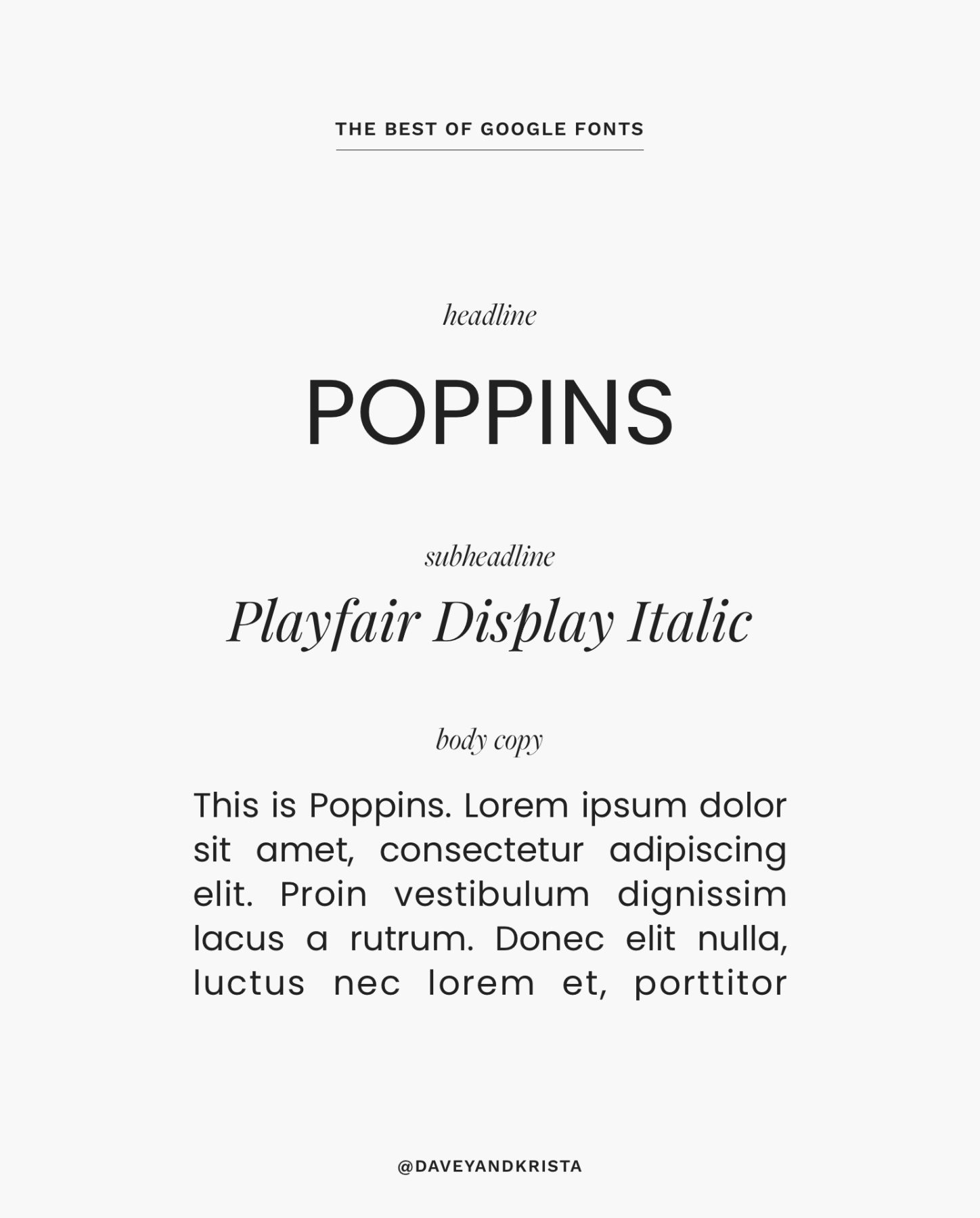
Choose the pairing that best reflects the keywords and visuals from your mood board. This choice isn't permanent, but it will be the foundation for the next steps.
Conclusion
Excellent work. You've now moved from abstract inspiration to a concrete design decision. By applying a systematic approach, you've selected a professional font pairing that will become a cornerstone of your brand's visual identity.
Key Takeaways:
- Contrast is Key: The most reliable way to pair fonts is to create clear contrast, and combining a serif with a sans-serif is a time-tested strategy.
- Hierarchy is the Goal: Your font choices should guide the user's eye, making it immediately clear what is most important on the page.
- Use Free, Professional Tools: Google Fonts provides a vast library of high-quality, commercially-free fonts, making it the perfect tool for a budget-conscious creator.
- Always Test in Context: A font pairing only works if it looks good in a real layout. Testing in Figma is a crucial final step.
Preview of the Next Lesson:
Now that you have your foundational typography, the next logical step is to formalize your color palette. In the next lesson, "Build a cohesive color palette based on your mood board and color theory principles," we will analyze the colors from your mood board, learn the basics of color theory, and build a practical 5-color palette that you can use across your website and products.