Introduction
Welcome back! In the previous lesson, you learned how to efficiently generate color variations for your wallpaper designs using both Photoshop and Figma. This skill is crucial for creating valuable and versatile digital products.
This lesson builds on your design foundation by tackling the learning outcome: design a minimalist poster for personal use, applying typography hierarchy and layout principles. While our previous projects were for digital screens, this one is a stepping stone to the physical world—a poster you could print for your future dorm or home office, a goal you mentioned earlier.
Mastering minimalist poster design isn't about having fewer elements; it's about making every element count. To achieve this, we will focus on two systematic concepts that govern all great design:
- Typographic Hierarchy: The set of rules for making text readable and guiding the viewer's attention by signaling importance.
- Layout & Composition: The principles for arranging elements on the page to create balance, flow, and visual interest.
By the end of this lesson, you'll have designed a clean, professional-looking poster and gained a deep understanding of the "why" behind your design choices.
1. Typographic Hierarchy: The Rules of the Road
You've expressed a preference for systematic, rule-based frameworks, and typography is the perfect domain for that. Typographic hierarchy is the visual structuring of information to tell the reader what to look at first, what's of secondary importance, and what the fine details are.
To begin, let's explore the fundamental variables that designers use to control this hierarchy.
The article 'Typographic Hierarchies' from Smashing Magazine provides an excellent, in-depth breakdown of the core principles. It dissects hierarchy into a set of controllable variables, which will give you a solid theoretical foundation.
Please read the introduction and the sections titled 'Proximity Or Space', 'Weight', 'Size', and 'Size And Weight'. Focus on how each variable can be used independently and then in combination to create clear levels of importance.
The article you just read breaks hierarchy down into distinct variables. Let's summarize and add a few more practical rules.
- Size: The most direct way to signal importance. Larger text commands more attention.
- Weight: Using bold, regular, and light weights creates contrast without changing size.
- Proximity (Space): Grouping related items together creates logical units. The space between elements is as important as the elements themselves. This is often called "negative space."
- Color: Can be used to highlight information, but your hierarchy should work in black and white first.
- Case: Using ALL CAPS can create emphasis but reduces readability for long sentences.
Here is a quick, practical guide that reinforces these ideas with specific advice for print.
How to create a typographic hierarchy
This article from Pangram Pangram, 'How to create a typographic hierarchy,' offers a more concise, action-oriented checklist that complements the deeper theory from Smashing Magazine.
Read the sections 'Start with the text,' 'Use size intentionally,' 'Contrast weights and styles,' and 'Play with spacing.' Pay attention to the suggested point sizes for print and the advice on leading (line spacing).
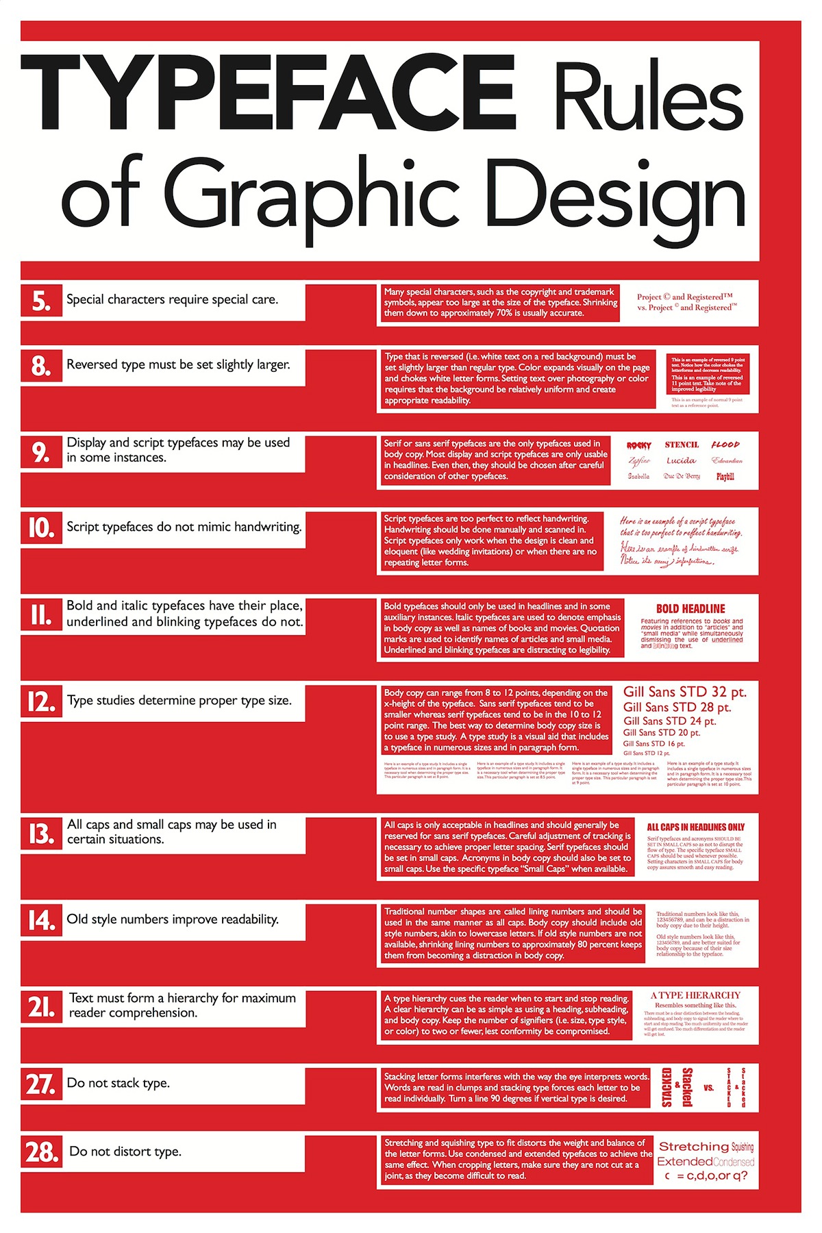
This image serves as a fantastic "cheat sheet" for many of the principles we've just discussed.
2. Layout & Composition: Arranging the Elements
Once you know how to style your text (hierarchy), you need to decide where to put it (layout). A good layout feels balanced, intentional, and guides the viewer's eye through the design effortlessly.
The Power of a Grid
A grid is the designer's most fundamental tool for creating order. It's an invisible structure of columns and guides that helps you align elements consistently.
Pro Tips for Perfect Composition | Make Every Design Stand Out
This video, 'Pro Tips for Perfect Composition,' gives a great practical walkthrough of how a designer uses a grid from the very start of a poster project.
Watch from the beginning to 04:14. Pay close attention to the process: defining the purpose, sketching ideas, and then setting up and using a column grid in Illustrator to organize the layout.
Compositional Flow
Beyond the grid, we need to think about composition—the overall arrangement of elements. In minimalism, where you have few elements, their placement is critical. The goal is to create a dynamic balance, not a static or boring one.
Improve Your Typography: Poster Design Critique
In this video from The Futur, a channel you're interested in, design expert Chris Do critiques a minimalist poster. His method for analyzing composition by abstracting text into simple blocks is a powerful technique.
Watch from 25:38 to 30:05. The key part is when he hides the text and replaces it with simple gray boxes. Focus on how he arranges these boxes to create an asymmetrical balance and a visual flow, which he describes as a 'lazy S-curve.' This is a core concept in dynamic composition.
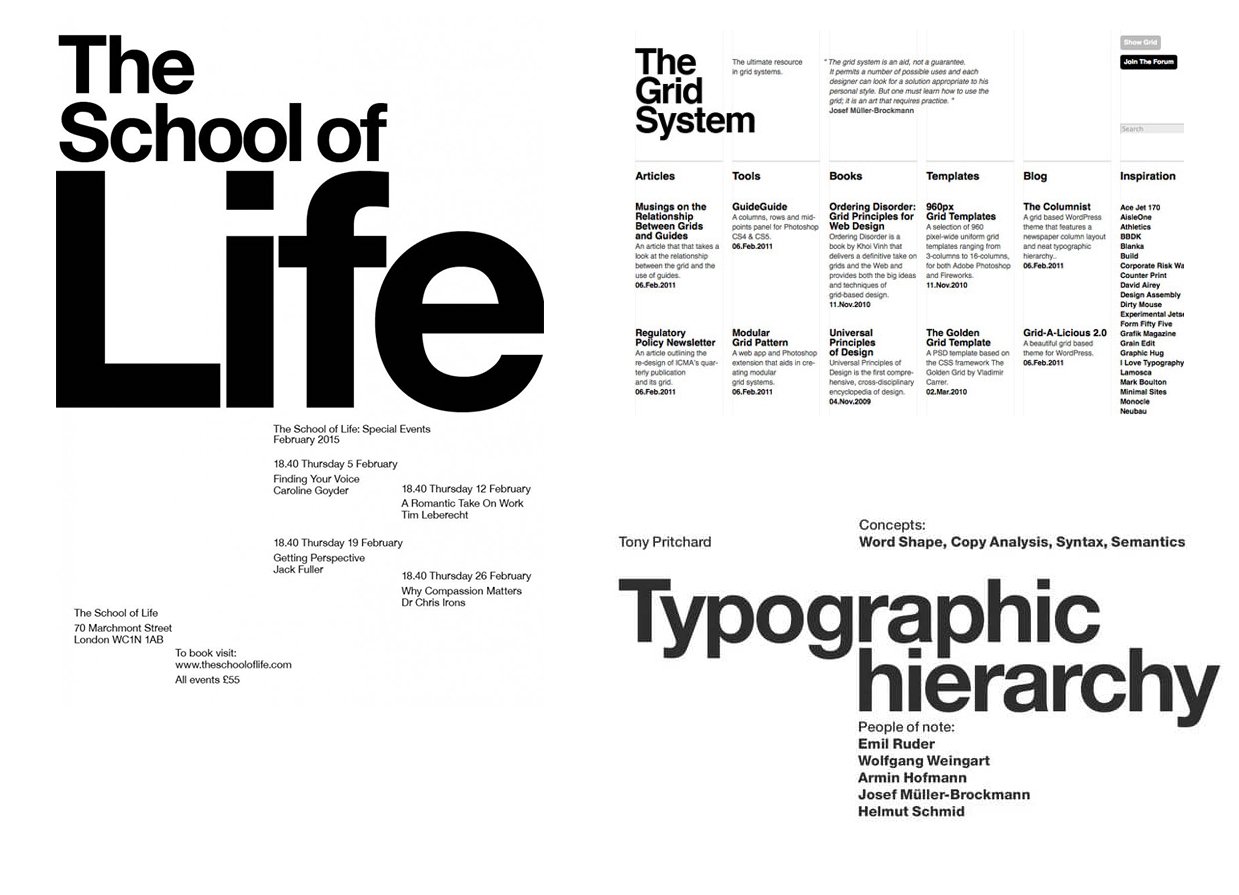
This abstract way of thinking about layout—seeing text blocks as shapes and arranging them to create a visual path—is a systematic approach that separates amateur from professional design.
3. Activity: Design Your Minimalist Poster (30 mins)
Now it's time to put these principles into practice. You have access to Adobe Illustrator and Figma through your school's Creative Cloud account, and both are excellent for this task.
Your Brief: Design an 18x24 inch minimalist typographic poster. Choose one of the following for your content:
- A short, favorite quote from a book, movie, or anime.
- The name of a concept you find interesting (e.g., from computer science, like "Recursion," or from design, like "Whitespace").
- The title of your favorite film, album, or game.
Follow these steps:
-
Content & Hierarchy (5 mins):
- Choose your text.
- On paper or in a text editor, explicitly define its hierarchy. What is the single most important word or phrase (Level 1)? What is the secondary information (Level 2)? What are the minor details, like an author or date (Level 3)?
-
Setup (5 mins):
- Create a new 18x24 inch artboard in Illustrator or a frame in Figma.
- Using the methods from the GraphiqVibe video, set up a simple grid (a 3 or 4-column grid is a great start). Add guides for margins around the edges (e.g., 1 inch).
-
Design & Refine (20 mins):
- Font Selection: Choose a clean font family with multiple weights (like Inter, Poppins, or PT Sans from Google Fonts). If you pair fonts, stick to a simple serif/sans-serif combination.
- Place Level 1 Text: Place your most important text on the artboard. Make it large and bold. This will be your composition's anchor.
- Add Other Levels: Add your Level 2 and Level 3 text. Use smaller sizes and lighter weights to create clear contrast.
- Compose: Now, think like Chris Do. Move your text blocks around the grid.
- Are they aligned to the grid lines?
- Is the spacing (negative space) between them intentional?
- Do they create a visual flow (that "lazy S-curve")? Avoid centering everything, which is often static and less interesting.
- Test: Zoom out or step back. Use the "squint test" from the Pangram Pangram article. Does the hierarchy hold up? Is it immediately clear what the poster is about? Make adjustments to size, weight, and position until it feels right.
Conclusion
Great job. You've now gone through the entire process of designing a poster, from understanding the foundational rules of typography to applying them in a practical layout.
Key Takeaways:
- Hierarchy is Systematic: You can control the viewer's attention by methodically adjusting variables like size, weight, and proximity.
- Grids Create Order: A grid is your essential tool for creating clean, professional layouts where every element feels like it belongs.
- Composition Creates Flow: The arrangement of elements on the page should create a visual path for the eye, achieving an asymmetrical balance that is more dynamic and engaging than simple centered layouts.
Preview of the Next Lesson:
You now have a digital file for your poster. But how do you turn it into a physical object you can hang on your wall? In our next lesson, we will focus on preparing a design file for large-format printing. We'll cover the technical but crucial concepts you requested: CMYK vs. RGB color spaces, setting the correct resolution (DPI), and adding a bleed for professional printing.