Introduction
In our last lesson, you applied principles of typography and layout to design a minimalist poster. You now have a great-looking digital file. But how do you translate that design from your screen to a physical print you can hang on your wall without any nasty surprises like weird colors, blurry images, or white borders?
This lesson directly addresses that challenge and fulfills the learning outcome: prepare a poster design file for large-format printing (CMYK color mode, resolution, bleed).
We'll systematically cover the three non-negotiable technical requirements for professional printing. Think of these not as creative constraints, but as the technical grammar of print design. Mastering them is a key step in turning your digital skills into tangible, high-quality products.
1. The First Rule of Print: Check the Specs
Before you do anything else, the single most important step is to check the specific requirements of your chosen printing company. Every print shop has its own preferred settings for file types, color profiles, and bleed sizes. You can almost always find a "File Setup" or "Print Specifications" page on their website.
This initial check saves immense time and prevents costly errors. To see this in a real-world context, watch the first part of the following video.
How to Make Photoshop Files Print Ready for a Printing Company!
In this video, 'How to Make Photoshop Files Print Ready,' from the channel Zenzdesign, the presenter starts with the most crucial advice for any print project.
Watch from 00:18 to 01:10. Notice how the first thing he does is go to the printer's website to find their exact specifications for PDF format, color, and bleed.
While we will cover the most common standards, always let the printer's own guidelines be your final source of truth.
2. Color Mode: From Screen (RGB) to Ink (CMYK)
The colors you see on your MacBook screen are created differently than colors printed on paper.
- RGB (Red, Green, Blue): This is an additive color model used by digital screens. Light is added together to create colors, with all colors at full intensity creating white. This is why screen colors can appear so vibrant and saturated.
- CMYK (Cyan, Magenta, Yellow, Key/Black): This is a subtractive color model used by printers. Inks are layered on paper, subtracting brightness from the white surface.
Because of this fundamental difference, you must convert your file to CMYK for printing. If you send an RGB file, the printer's software will perform the conversion automatically, which can lead to unexpected color shifts. It's always better to convert it yourself to see what you'll get.
Guide To Large Format Print Files - Tectonics
This article, 'Guide To Large Format Print Files,' has a great, concise section explaining the difference between the color models.
Read the section titled 'CMYK, PANTONE, RGB.' Focus on the descriptions for CMYK and RGB to solidify your understanding of when and why each is used.
Now, let's see this conversion in action. When you switch from RGB to CMYK, you will likely notice the colors become slightly less vibrant. This is normal and represents a more accurate preview of the final print.
How to Make Photoshop Files Print Ready for a Printing Company!
Let's return to the Zenzdesign video to see a practical demonstration of converting a file to CMYK in Photoshop.
Watch from 01:10 to 02:13. Pay attention to the visual change in color saturation when the mode is switched from RGB to CMYK. The creator's reasoning for designing in RGB first and converting to CMYK for print is a common professional workflow.
Pro Tip: Rich Black
For large areas of solid black in your poster, using 100% K (black) ink can look a bit washed out. To create a deeper, more saturated black, printers use "Rich Black," which is black ink mixed with small amounts of C, M, and Y. A common formula is C:60, M:40, Y:40, K:100.
3. Resolution: Getting the Right Level of Detail
Resolution determines the clarity and sharpness of a printed image. It's measured in PPI (Pixels Per Inch) or DPI (Dots Per Inch).
- The Standard Rule: For most standard-sized prints viewed up close (like flyers or magazines), 300 PPI is the gold standard.
- The Large-Format Rule: For large posters, the rules change. Because they are viewed from a farther distance, the human eye can't perceive the same level of detail. A lower resolution is not only acceptable but often preferable to keep file sizes manageable. For a poster-sized print, a resolution of 75 to 150 PPI at the final print size is typically sufficient.
Guide To Large Format Print Files - Tectonics
The Tectonics guide has an excellent section on this topic that dispels common myths about resolution for large prints.
Read the sections titled 'Resolution' and 'Scale.' Focus on the key takeaway: large format prints do not need 300 PPI. Understand the example given for 100% scale (e.g., setting a 125" x 100" file to 75 PPI).
For your 18x24 inch poster, setting it up at 300 PPI is perfectly fine and provides a high-quality master file. However, it's valuable to know that if you were designing a much larger banner, you wouldn't need such a high resolution.
4. Bleed and Safe Area: Your Margin for Error
When a printer produces a batch of posters, they print them on oversized paper and then trim them down to the final size. Because the cutting machine isn't perfectly precise every time, a small margin of error is needed. This is where bleed and safe area come in.
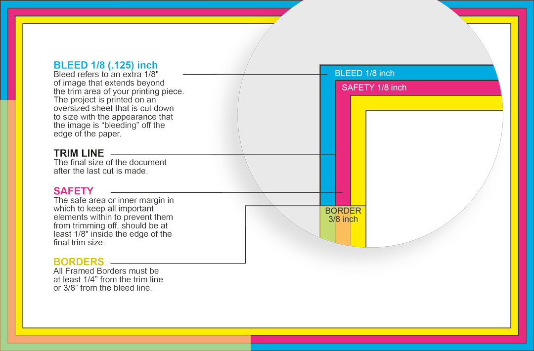
- Trim Line: The final intended edge of your poster (e.g., 18x24 inches).
- Bleed: An extra area of your background image or color (typically 0.125 inches or 1/8 inch) that extends beyond the trim line. If the cut is slightly off, this ensures there's no unprinted white edge on your final product.
- Safe Area (Margin): An area inside the trim line (e.g., 0.25 to 0.5 inches) where all your important content, like text, must be contained to avoid being accidentally trimmed off.
These two images provide a perfect visual breakdown of these zones.
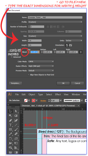
Setting this up from the start in a program like Illustrator or InDesign is the best practice.
How To Set Up a Print File in Adobe Software | NEWPRINT
This article from NEWPRINT provides clear, step-by-step instructions for setting up print files, with a great explanation of bleed.
Read the section titled 'Create a new print file in Adobe Illustrator.' Focus on the explanation of bleed and the specific instructions for setting it to 0.125 inches and the Color Mode to CMYK.
5. Activity: Preparing Your Poster for Print (20 mins)
Let's apply these concepts to the 18x24 inch poster you designed in the previous lesson. We will use Adobe Illustrator, as it is the industry standard for this task due to its superior handling of vector text and layout features.
1. Open and Check Your Document:
- Open your poster file in Illustrator.
- Go to File > Document Setup.
- Color Mode: Ensure this is set to
CMYK Color. If it's RGB, you'll need to go to File > Document Color Mode > CMYK Color. - Bleed: In the Document Setup window, enter
0.125 infor all four sides (Top, Bottom, Left, Right). ClickOK. You will now see a red line outside your artboard—this is the bleed line.
2. Adjust Your Artwork:
- Extend the Background: If you have a background color or image that is meant to go to the edge, make sure it extends all the way to the red bleed line.
- Check the Safe Area: Ensure all of your text and any other critical elements are comfortably inside the artboard, away from the edges. A margin of at least 0.5 inches is a good rule of thumb.
3. Export the Print-Ready PDF:
- Go to File > Save As...
- For
Format, chooseAdobe PDF (pdf). ClickSave. - A new dialog box will appear. Here are the crucial settings:
- Adobe PDF Preset: At the top, select
[Press Quality]. This preset automatically configures many settings for high-resolution printing. - Go to the "Marks and Bleeds" Tab on the left.
- Under
Bleeds, check the box that says "Use Document Bleed Settings." The fields should auto-populate with0.125 in. - Do not check any of the boxes under
Marks(like Trim Marks) unless your printer has specifically requested them.
- Adobe PDF Preset: At the top, select
- Click "Save PDF."
You now have a professional, print-ready PDF file. If you open it, the document's dimensions will be 18.25 x 24.25 inches, accounting for the bleed on all sides.
Conclusion
Congratulations! You've successfully bridged the gap between digital design and physical production. While these steps are technical, they are the foundation of producing professional-quality work that looks as good on paper as it does on your screen.
Key Takeaways:
- Always start by checking your printer's specifications.
- For print, the color mode must be CMYK to ensure accurate color representation.
- The standard resolution is 300 PPI, but for large-format prints viewed from a distance, 75-150 PPI is often sufficient.
- Bleed is the extension of your artwork beyond the trim line to prevent white edges, while the Safe Area protects important content from being cut off.
- The industry-standard deliverable is a Press Quality PDF with bleed settings enabled.
Preview of the Next Lesson:
You've designed a digital wallpaper and a physical poster. How do you showcase them online to attract customers? In the next lesson, we will cover how to create high-fidelity product mockups using smart objects in Photoshop or Photopea, allowing you to present your designs in a realistic and appealing context.