Introduction
Welcome back! In our last two lessons, you designed two distinct wallpapers: a clean, geometric one in Figma and a rich, typographic one in Photoshop. These exercises established your skills in two different design environments. However, a single design is often just the starting point for a commercial product.
This lesson addresses the learning outcome: to generate efficient color variations of a design using adjustment layers or component variants. Your goal is to make money from digital products, and one of the most effective ways to increase the value of a product like a wallpaper pack or a template is to offer it in multiple color themes.
We'll tackle this in two parts, mirroring the tools you've already used:
- In Photoshop: We will use Adjustment Layers to non-destructively and rapidly create color variations for your textured, raster-based typographic wallpaper.
- In Figma: We will explore Component Variants and the more powerful Color Variables to create systematic, scalable themes for your vector-based geometric wallpaper.
This approach builds directly on your previous work and aligns with your preference for systematic, rule-based frameworks.
1. The Theory: A Practical Framework for Color Variation
Before we jump into any software, let's establish a reliable system for creating color variations that look good. Randomly picking colors is inefficient. Instead, we can use a simple, predictable principle based on how light and shadow work in the real world.
The core idea is to modify a single base color into many related variations by adjusting its Hue, Saturation, and Brightness (HSB).
Color in UI Design: A (Practical) Framework
The article 'Color in UI Design: A (Practical) Framework' from Learn UI Design provides the perfect rule-based approach for this. It argues that understanding color variations is more important than traditional color theory.
Please read the sections 'Darker & Lighter Variations', 'Real-World Color Variations', 'The Rules', and 'The Most Important Thing'. Focus on the fundamental principle it highlights for creating variations.
The key takeaway, and our guiding rule for this lesson, is:
- To create a darker variation: Lower the brightness and increase the saturation.
- To create a lighter variation: Increase the brightness and lower the saturation.
This simple inverse relationship is the foundation for creating professional-looking color palettes from a single starting color.
2. Method 1: Adjustment Layers in Photoshop
Let's apply this theory to the typographic wallpaper you created in the last lesson. In Photoshop, Adjustment Layers are the ideal tool for this job. They apply color and tonal changes non-destructively to all the layers below them, meaning you can experiment freely without permanently altering your design.
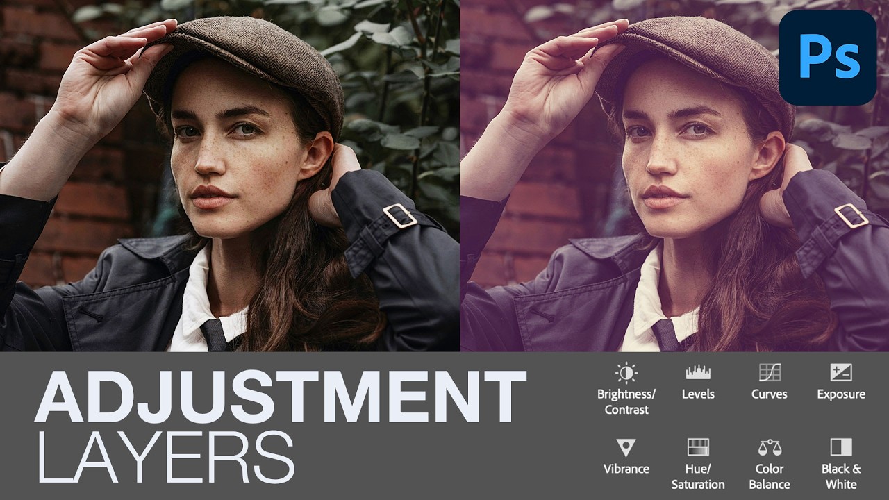
Activity 1: Creating Colorways (20 mins)
Open your typographic wallpaper project in Photoshop. We will use two types of adjustment layers to generate variations.
A. Hue/Saturation Adjustment Layer
This is the most direct tool for changing color.
- Go to the Layers panel, click the half-filled circle icon at the bottom, and select Hue/Saturation.
- An adjustment layer will appear at the top of your layer stack. Make sure it's above all your design and texture layers.
- In the Properties panel for the Hue/Saturation layer, try these two techniques:
- Monochromatic Theme: Check the "Colorize" box. This will convert your entire design to a single hue. You can now adjust the
Hue,Saturation, andLightnesssliders to create different single-color themes (e.g., a sepia tone, a cool blue). - Shifting the Palette: Uncheck "Colorize." Now, simply drag the
Hueslider left or right. This will shift all the colors in your design along the color wheel, creating new, often interesting, color combinations while maintaining the original tonal relationships.
- Monochromatic Theme: Check the "Colorize" box. This will convert your entire design to a single hue. You can now adjust the
B. Gradient Map Adjustment Layer
This is a more powerful method that maps the colors of a gradient to the brightness values of your design.
- Add a Gradient Map adjustment layer (from the same menu as Hue/Saturation).
- By default, it maps black to the shadows and white to the highlights.
- In the Properties panel, click on the gradient preview to open the Gradient Editor.
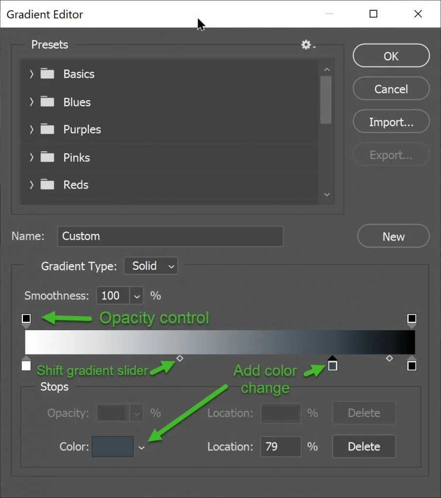
- Experiment by selecting different preset gradients to see how drastically they change the mood of your wallpaper.
- Create a custom gradient using your brand colors. For example, set your darkest brand color for the shadows (left side) and your lightest for the highlights (right side). You can add intermediate colors for the midtones.
Using these two adjustment layers, try to create 3-5 distinct color variations of your typographic wallpaper. You can save each version as a separate JPG or PNG file.
3. Method 2: Variants & Variables in Figma
Now, let's switch gears to the vector world of Figma and your geometric wallpaper. Here, the approach is less about layering effects and more about building a systematic design library. This method is exceptionally powerful for UI design, websites, and template products.
The Concept: Components and Variants
In Figma, a Component is a reusable master element (like a button or icon). An Instance is a copy of that component that stays linked to the master. A Variant is a variation of a component that lives within the same component set. For example, you could have a 'Button' component with variants for 'Primary', 'Secondary', and 'Destructive' states, each with a different color.
Since you have a background in computer science, you can think of a component as a class or a function, instances as objects or function calls, and variants as different states managed by properties passed to that function.
Figma components and variants for beginners
To understand the basics, watch this quick introduction to components and variants from Flux Academy.
Watch from the beginning to 05:54. Focus on the core concepts: what a component is, why you would create a variant (like a 'hovered' state), and how this system helps you avoid repetitive work.
The Modern Approach: Color Variables
While variants are great for component states, Figma's Variables feature is the state-of-the-art way to manage colors across an entire design system—perfect for creating themes like light and dark mode.
Variables allow you to create a library of color "tokens" (e.g., background-color, text-color) and then define different values for these tokens in different Modes (e.g., Light Mode, Dark Mode).
Activity 2: Creating a Dark Mode Theme (20 mins)
Let's apply this to your geometric wallpaper from the first lesson of this module.
Create a Dark & Light Mode with Variables in Figma
This article from Digidop provides a clear, step-by-step guide to creating a dark/light mode toggle using Figma Variables. We will follow this process.
Read through the steps in the article. You don't have to memorize it all at once; we will walk through the key parts. Pay attention to the distinction between the 'Colors' collection (raw hex codes) and the 'Tokens' collection (semantic names).
Now, follow these steps in your Figma file:
-
Define Your Base Colors:
- Open the "Local Variables" panel.
- Create a new collection and name it
Primitive Colors. - For each color in your geometric wallpaper, create a new
Colorvariable and paste in its HEX code (e.g.,brand-blue,neutral-gray-100).
-
Define Your Semantic Tokens:
- Create a second collection and name it
Theme Tokens. - In this collection, create color variables with semantic names that describe their purpose, not their color (e.g.,
wallpaper-background,shape-primary,shape-accent). - For each token, link it to one of your primitive colors. To do this, click the color swatch, go to "Libraries," and select the appropriate variable from your
Primitive Colorscollection.
- Create a second collection and name it
-
Create a New Mode:
- In the
Theme Tokenscollection, click the+icon at the top of the variables table to add a new column. - Rename the first column (Mode 1) to
Lightand the new column toDark. - Now, for each token in the
Darkcolumn, assign a different color from your primitive library. For instance, yourwallpaper-backgroundmight switch fromneutral-gray-100to a dark gray.
- In the
-
Apply and Test:
- Select your wallpaper frame.
- Go through each element and apply the semantic tokens from your
Theme Tokenslibrary to their fill colors. - Once everything is linked, select the main frame of your wallpaper. In the "Layer" section of the design panel on the right, you'll see a small variables icon. Click it, select your
Theme Tokenscollection, and switch betweenLightandDarkto see your wallpaper instantly change themes.
Conclusion
Excellent work. You have now mastered two industry-standard methods for generating color variations, a skill that dramatically increases your efficiency and the value of your digital products.
Key Takeaways:
- A Systematic Rule: Creating color variations isn't guesswork. The principle of inversely adjusting brightness and saturation provides a reliable foundation.
- Photoshop's Non-Destructive Power: For complex, raster-based designs, Adjustment Layers like
Hue/SaturationandGradient Mapare the most efficient tools for creating multiple colorways. - Figma's Systemic Strength: For UI and vector designs, Color Variables and Modes are the ultimate tools for building scalable, themeable products like app templates or website designs.
Preview of the Next Lesson:
You've designed wallpapers for screens, but what about physical products? In the next lesson, we will focus on designing a minimalist poster for personal use. This will bring together your skills in typography and layout, and as you requested early on, we will specifically cover how to prepare a file for large-format printing, including concepts like CMYK color mode, resolution, and bleed.