Introduction
Welcome back! In our last few lessons, we've focused on creating precise, functional vector assets. You deconstructed the work of professional designers to create a style guide and then used that guide to build your own cohesive icon set. This process honed your skills in using grids, keylines, and boolean operations to create clean, systematic designs.
Today, we're shifting from small, functional components to a large-scale, expressive canvas. This lesson focuses on designing a complete vector-based wallpaper using gradients, shapes, and patterns. This is a popular category of digital product, and mastering it will add a significant asset to your potential product lineup. We'll explore systematic ways to handle color and composition, turning abstract tools into aesthetically pleasing results.
By the end of this lesson, you will have designed your first vector wallpaper, ready to be optimized and exported in our next session.
1. A Systematic Approach to Color
You've expressed a desire for rule-based frameworks in design, and color is a perfect area to apply this thinking. A great wallpaper often hinges on a compelling color palette. Before we even open Illustrator, let's establish a system for choosing colors that work together harmoniously.
The following video from The Futur Academy provides five clear, actionable tips for working with color. It moves beyond subjective preference and into objective principles.
How to Not Suck at Color - 5 color theory tips every designer should know
Watch this video from The Futur Academy to learn a systematic approach to color theory. This will be the foundation for the color choices you make in your wallpaper design.
Watch the video from 00:46 to 06:03. As you watch, take note of these five key concepts: Color Harmonies: How to use relationships on the color wheel (like complementary or analogous) as a starting point. Neutral Colors: Their role as a 'supporting cast' to make your main colors stand out. Less is More: The power of starting with a limited palette (e.g., two main colors, two neutrals). Contrast: Why value (lightness/darkness) is often more important than the hue itself. Balance (The 60-30-10 Rule): A simple ratio for distributing your primary, secondary, and accent colors to create visual balance.
Before proceeding, take a moment to choose 1-2 primary colors you like and use a tool like Adobe Color to find a complementary or analogous harmony. Then, pick one or two neutral colors (like a soft grey, beige, or off-black) to support them. This will be your palette for today's exercise.
2. Two Paths to Vector Wallpapers
There are many ways to design a vector wallpaper, but they often fall into two popular categories. Understanding them will help you decide on a creative direction.
- The Gradient-Dominant Approach: This style focuses on creating a rich, atmospheric background using complex color blends. Shapes are often absent or are used to contain the gradient itself. The visual interest comes from the smooth or textured transitions between colors.
- The Pattern-Based Approach: This style uses the repetition of geometric shapes to create a structured, rhythmic design. Gradients can be used as a background layer or to fill the individual shapes within the pattern.
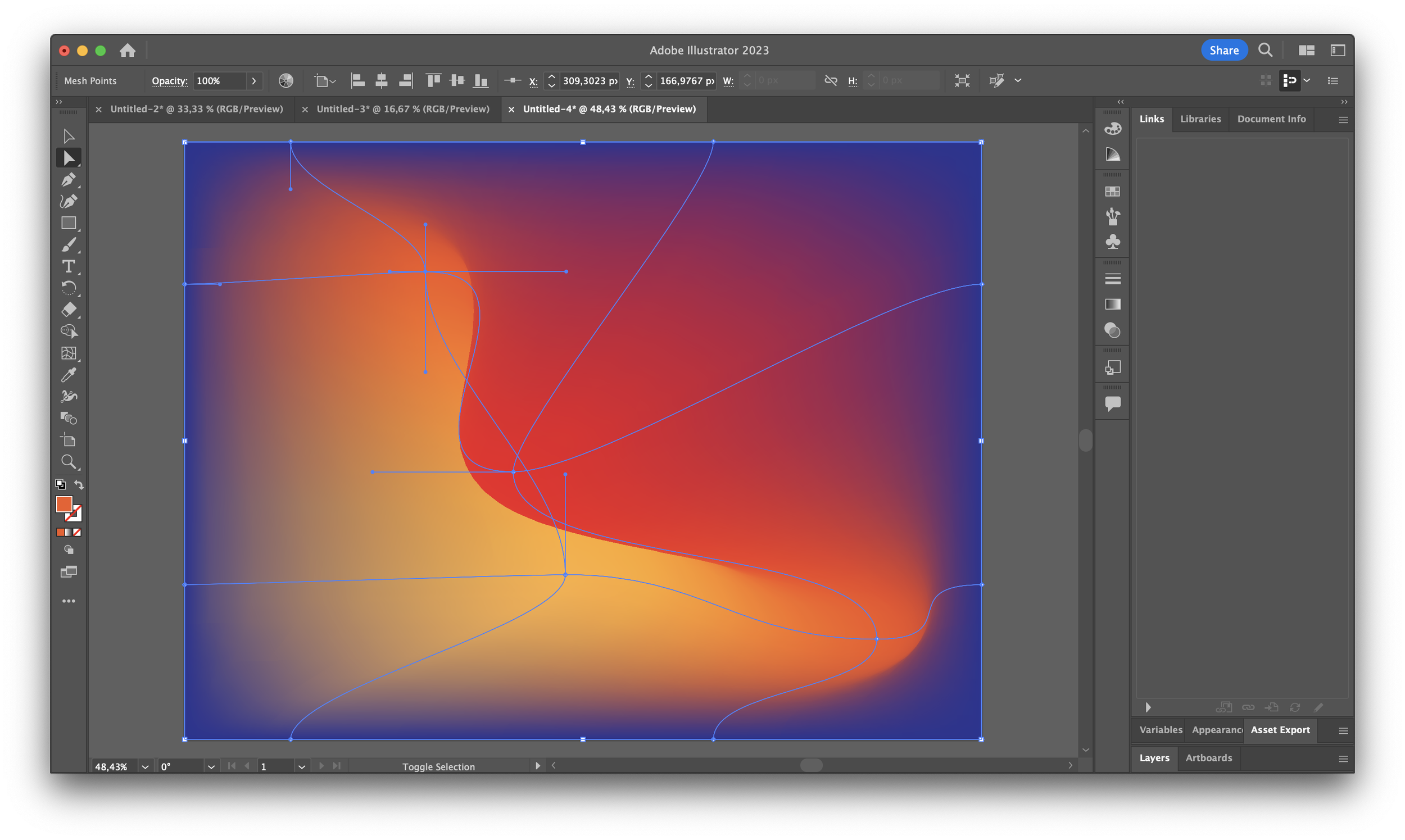
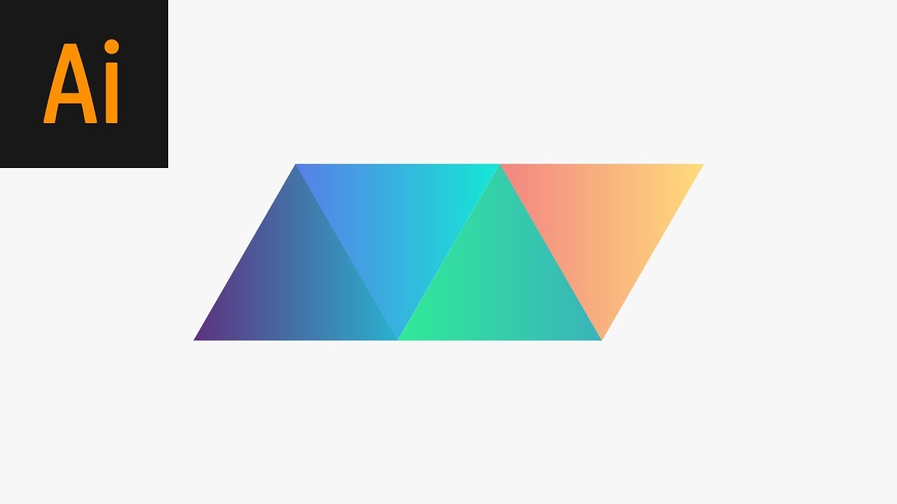
We will now explore the techniques for creating both styles in Adobe Illustrator. Since you have your Visual 1 certification, you should be familiar with the Illustrator interface, but we will focus on specific tools that are ideal for this task.
3. Technique I: Abstract Gradients with Texture
Modern, minimalist wallpapers, like those seen from creators like Oliur, often feature soft, textured gradients. Illustrator's Mesh Tool and Freeform Gradient Tool are perfect for this.
The following tutorial provides a step-by-step written guide. It's systematic and easy to follow. We'll supplement it with a quick video to show the process in motion.
How to Make a Textured Abstract Gradient Background in Illustrator
This tutorial from TutsPlus, titled 'How to Make a Textured Abstract Gradient Background in Illustrator', will walk you through the entire process of creating a gradient-based wallpaper.
Read through the following sections of the article: Section 1, 'How to Set Up a... File': Pay attention to the setup (RGB color mode is correct for screen-based wallpapers). Section 2, 'How to Make Abstract Gradients...': This covers the Mesh Tool (U). Focus on how you add points and apply your chosen color palette to them. Section 3, 'How to Use the Freeform Gradient...': This introduces the more modern Freeform Gradient tool, which allows you to place color stops more organically. Section 5, 'How to Add a Noise Gradient...': This is a crucial final touch. Adding a 'Grain' effect (Effect > Texture > Grain) is what gives the gradient a subtle, sophisticated texture.
To see the Mesh Tool workflow in action, watch this quick, silent tutorial. It helps to visualize the process described in the article.
Mesh Gradient with Grain Texture - Adobe Illustrator Tutorial
This short tutorial from SAINT DESIGN visually demonstrates the creation of a mesh gradient from start to finish, including the application of a grain texture.
Watch the entire video (it's under 4 minutes). Notice how the designer clicks to add mesh points and then uses the Direct Selection Tool (A) to select and color them, creating a smooth, custom blend.
4. Technique II: Seamless Geometric Patterns
The second approach uses repeating geometric shapes. The key here is Illustrator's powerful Object > Pattern > Make feature, which automates the creation of seamless tiles.
This classic tutorial from Abduzeedo shows how to build a complex pattern from a simple shape.
Geometric Pattern in Illustrator - Abduzeedo
This 'Geometric Pattern in Illustrator' tutorial will guide you through creating a tileable pattern from a basic triangle shape and then applying it to a wallpaper-sized artboard.
Read and follow Steps 1 through 7 of the tutorial. Steps 1-5 show you how to construct the basic repeating unit from a single square. Step 6 is the most important part: using Object > Pattern > Make. This command opens the Pattern Options panel and automatically generates a repeating pattern swatch in your Swatches panel. Step 7 shows how to apply your new pattern to a large rectangle.
To combine this technique with gradients, you could:
- Fill the individual triangles in Step 4 with gradients instead of solid colors.
- Follow Steps 8-11 in the tutorial, which show how to overlay a large, transparent gradient on top of the entire pattern to create interesting color and lighting effects.
Your Design Task
Now it's time to create your own wallpaper.
- Set Up Your Document: In Illustrator, create a new document sized for your MacBook Pro's display. A 16:10 aspect ratio is standard, so something like 2880 x 1800 pixels is a good target. Set the Color Mode to RGB.
- Choose Your Path:
- Option A (Gradient-Dominant): Using the color palette you defined earlier, create an abstract wallpaper using either the Mesh Tool or the Freeform Gradient tool. Don't forget to add a subtle Grain effect at the end.
- Option B (Pattern-Based): Create a simple geometric unit and use Object > Pattern > Make to create a seamless pattern. Apply it to your artboard and experiment with layering a transparent gradient on top using Blending Modes (like Overlay or Color Burn).
- Refine: Spend some time adjusting colors, moving gradient points, or tweaking your pattern settings until you're happy with the result. Use the
Edit > Edit Colors > Recolor Artworktool (covered in the TutsPlus article) to experiment with different color combinations quickly.
Don't worry about exporting the file just yet. Simply save your Illustrator (.ai) file.
Conclusion
Great work today. You've learned two powerful, systematic methods for creating vector wallpapers, a valuable digital product. You've seen how to build designs from either expressive color blends or structured, repeating patterns, all grounded in a rule-based approach to color theory.
Key Takeaways:
- A strong wallpaper design often starts with a solid color strategy using principles like color harmony, contrast, and the 60-30-10 rule.
- Gradient-dominant wallpapers can be created using Illustrator's Mesh Tool or Freeform Gradient, with a Grain effect adding modern texture.
- Pattern-based wallpapers are efficiently created by building a base unit and using the Object > Pattern > Make command to generate a seamless, tileable swatch.
- These two techniques can be combined by using gradients within patterns or overlaying them to create depth.
Preview of the Next Lesson:
In our next lesson, "Exporting vector assets in SVG, PNG, and PDF formats, optimized for different use cases," we will take the wallpaper you just designed and walk through the process of exporting it into high-quality, optimized formats suitable for web distribution, print, and use across all your devices.