Introduction
Welcome back! In the last lesson, we mastered the creation of seamless patterns, learning how to design a single tile that could be repeated infinitely. This was our first step into creating scalable design systems.
Today, we're going to apply that system-based thinking to another fundamental digital asset: icons. A professional brand doesn't just have one good icon; it has a whole library where every icon feels like it belongs to the same family. This consistency is achieved not by accident, but by following a strict set of rules.
Your goal in this lesson is to learn how to deconstruct an existing icon style into a replicable guide, defining its grid, stroke weight, and corner radius. This skill is essential for maintaining brand consistency and aligns perfectly with your preference for systematic, rule-based design. Instead of trying to create icons from pure "inspiration," you'll learn to reverse-engineer the work of top designers to understand the principles that make their designs cohesive and effective.
1. What is an Icon Style Guide?
Before we start creating icons, we must first learn to see them. A style guide is a document—a single source of truth—that codifies the visual rules for an icon set. It's the blueprint that ensures every icon, whether it's a "user profile" or a "shopping cart," looks and feels consistent.
Take a look at this professional iconography guide.

As you can see, the final icons are the result of a clearly defined system. For any icon style, we can almost always break down its DNA into three core components:
- The Grid System: The invisible container and structure.
- The Stroke Weight: The thickness of the lines.
- The Corner Style: The sharpness or roundness of the corners.
Let's break down each of these pillars.
2. Pillar 1: The Grid System
Every icon in a set is built within the same invisible frame. This frame, or bounding box, ensures that all icons have a consistent size and optical volume. A common standard size is 24x24 pixels.
Within this box, there is a safe zone (or padding) that prevents the icon's elements from touching the edges. This creates visual breathing room. Finally, keylines—basic geometric shapes like squares, circles, and rectangles—are placed within the safe zone to guide the construction of the icon itself.
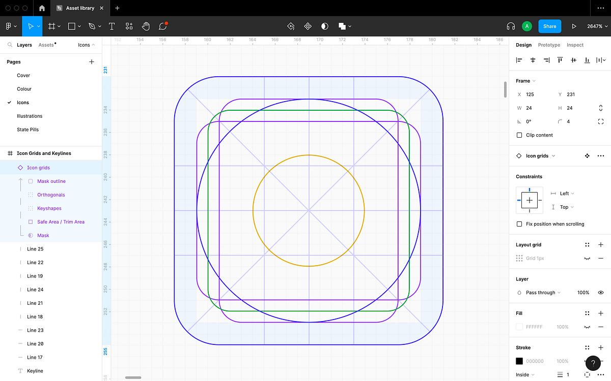
To see how this works in practice, let's watch a short segment from a tutorial on designing an icon library.
How to Design an Icon Library Using Grids in Adobe Illustrator - UX/UI - Material Design System
The video 'How to Design an Icon Library Using Grids' from CryeStudio Design Tutorials will show you how the Google Material Design grid is used to align icons and maintain consistency.
Watch from 03:27 to 05:30. Focus on how the instructor explains the 24-pixel grid, the purpose of the key shapes (circle, rectangle), and the non-negotiable 2-pixel padding (safe zone) around the edges.
The articles "How to Standardize Your Icon Grid and Style" and "How to build a cohesive icon library" also provide excellent written descriptions of this foundational structure. They confirm that standards like a 24x24 px bounding box and a 2px safe zone are common in professional design systems.
3. Pillars 2 & 3: Stroke and Corner Radius
If the grid is the skeleton, the stroke and corners are the visual DNA. These two properties do more than anything else to define the personality of an icon set.
- Stroke Weight: Is the line thickness thin and delicate (e.g., 1px), or bold and substantial (e.g., 2px)? A consistent stroke weight is crucial for a cohesive look.
- Corner Radius: Are the corners sharp and geometric (
0pxradius) for a technical feel, or soft and rounded (2pxradius or more) for a friendlier vibe?
The following resources break this down with concrete examples.
How to build a cohesive icon library for your design system
The article 'How to build a cohesive icon library' from Medium provides a real-world example from HP's design system, showing how they define these properties.
Read the sections titled 'Line weight' and 'Shapes' (both Round and Sharp). Notice the specific values they use: a 'Goldilocks' stroke of 1px, a corner radius of 2px for 'round' icons at a 24px size, and a radius of zero for 'sharp' icons.
Now, let's watch a designer actively making these decisions.
How to Design an Icon Library Using Grids in Adobe Illustrator - UX/UI - Material Design System
In this next clip from the CryeStudio video, the instructor designs a camera icon, explicitly deciding on the corner radius and stroke weight. This shows the thought process behind the rules.
Watch from 05:30 to 08:10, and then from 09:05 to 10:08. Pay attention to: How he sets a consistent 2-pixel corner radius. His deliberation on stroke weight (1px vs. 1.5px vs. 2px) to ensure consistency across the set. The clever use of a colored 'spacer box' (09:25) to measure the negative space between elements, ensuring it's visually consistent with the chosen stroke weight. This is a great systematic trick for analysis.
4. Your Turn: Deconstruct an Icon Set
Now it's time to become a design detective. Your task is to choose a professional icon set and reverse-engineer its style guide. You can find sets on Dribbble, or use a well-known open-source library like Feather Icons or Material Symbols.
Your Toolkit:
You'll use Figma for this analysis. Its measurement tools are perfect for this job.
The Process:
- Select Your Target: Choose an icon set. Find 3-5 representative icons from the set (e.g., a user icon, a settings icon, an arrow). Save them as SVGs and drag them into a new Figma file.
- Establish the Grid:
- Draw a square frame around one of the icons. Adjust the frame size until it neatly contains the icon. This is your Bounding Box (it will likely be 16x16, 20x20, or 24x24 px).
- Measure the empty space between the outermost part of the icon and the edge of your frame. This is the Safe Zone or padding.
- Measure the DNA:
- Select one of the icons. In the right-hand panel, look at the Stroke properties. What is the Stroke Weight? Check a few different icons to confirm it's consistent.
- While the icon is selected, look at the stroke properties again to see the Corner Radius. Is it a single value? Are some corners sharp (
0px) while others are rounded? - Check the line End Caps. Are they butt (square) or round?
- Document Your Findings: Create your replicable guide. The best way to do this is to create a simple table, just like the one in the VibeIcons article "Your Guide to a Flawless Icon Clean Up".
Here is a template you can build in your Figma file using the text tool:
| Property | Definition | Your Finding |
|---|---|---|
| Bounding Box | The standard container size for all icons. | e.g., 24x24 px |
| Safe Zone | The internal padding on all sides. | e.g., 2px |
| Stroke Weight | The default thickness for all icon lines. | e.g., 1.5px |
| Corner Radius | The roundness applied to corners. | e.g., 2px (or 'mixed') |
| End Caps | The style of the ends of open lines. | e.g., Round |
| Style | General description of the icon style. | e.g., Lined, Minimalist |
Fill this table out with the values you discovered during your analysis.
Conclusion
Excellent work. You've now moved beyond simply looking at design to truly seeing its underlying structure. You've learned how to deconstruct a professional icon set into a simple, replicable guide—a skill that is foundational to creating your own cohesive brand assets.
Key Takeaways:
- Consistent icon sets are built on a system of rules, not just artistic talent.
- This system can be deconstructed by analyzing three core pillars: the Grid System (bounding box, safe zone), Stroke Weight, and Corner Radius.
- Documenting these rules in a style guide allows you (or anyone else) to replicate the style perfectly, ensuring brand consistency.
- Tools like Figma give you the power to measure and analyze these properties with precision.
Preview of the Next Lesson:
You've created the blueprint. In our next lesson, "Designing Your First Vector Icon," you'll use the guide you just created to build a brand new icon from scratch. We'll focus on using the Pen and Shape tools in Figma to construct an icon that adheres perfectly to your defined rules, making it a seamless addition to the set.