Hello! Welcome back to our journey into CSS.
In the last lesson, you learned the fundamental skill of targeting HTML elements using element, class, and id selectors. This is like learning how to aim. Now, it's time to learn what to "fire"—the style properties themselves.
Today's lesson focuses on a core part of web design: typography. You will learn how to control the appearance of text using font, color, and size properties. These are the properties you'll use most often to make your application readable, professional, and visually appealing. For your goal of building a writing assistant, clear and well-styled text is especially important.
Recap: Your Current Styles
Let's quickly look at your style.css file. It should contain rules you wrote in the previous lesson, which already use some of the properties we'll discuss today, like color and background-color.
/* From previous lesson */
h1 {
  color: #003366;
}

button {
  background-color: #007bff;
  color: white;
}
...
We'll now formally explore these properties and add more to your toolkit.
Changing Text Color
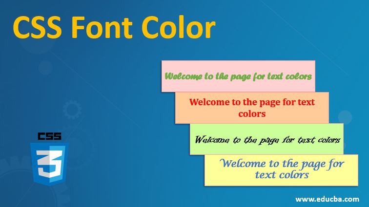
You've already used the color property to change the text color for your <h1> and <button>. This property sets the foreground color of an element's text content.
Colors can be specified in several ways, but the most common are:
- Hexadecimal codes:
#003366(what you've used) - Named colors:
red,blue,white - RGB values:
rgb(0, 51, 102)
For now, sticking with hex codes or named colors is perfectly fine.
Defining Font Family
The font-family property lets you choose the typeface for your text. It's rarely a single choice; instead, we provide a list of fonts, known as a font stack.
The browser reads the list from left to right and uses the first font it finds installed on the user's computer. If it can't find any of your specific choices, it falls back to the final generic family name.
Common generic families:
sans-serif: Clean, modern-looking fonts without small lines on the ends of characters (e.g., Arial, Helvetica).serif: Traditional fonts with small lines (serifs) on the ends of strokes (e.g., Times New Roman, Georgia).monospace: Fonts where every character takes up the same amount of horizontal space (e.g., Courier New), often used for code.
A typical font-family declaration for body text looks like this:
body {
  font-family: Arial, Helvetica, sans-serif;
}
This tells the browser: "Try to use Arial. If that's not available, try Helvetica. If neither is found, just use whatever default sans-serif font you have."
Adjusting Font Size and Weight
Two other crucial properties are font-size and font-weight.
font-size: Controls how large the text is. While you can use pixels (px), it's a best practice to useremunits. Aremunit is relative to the font size of the root HTML element, which allows users to adjust their browser's default font size for accessibility and have your site scale accordingly.font-weight: Controls the thickness or "boldness" of the text. You can use keywords likenormalandbold, or numeric values from100(thin) to900(extra bold).font-weight: normal;is typically400, andfont-weight: bold;is700.
Let's watch a video that puts these concepts together.
CSS Text and Fonts Tutorial for Beginners - Typography
The video 'CSS Text and Fonts Tutorial for Beginners' by Dave Gray provides a clear, practical demonstration of the most important font and text properties. We'll focus on the sections covering size, weight, and family.
Watch the following segments: Font Size and Color (02:08 - 04:17): Pay attention to the explanation of rem units for font-size. Font Weight and Style (12:14 - 14:32): This covers how to make text bold or italic. Font Family (14:32 - 18:59): Focus on how to create a font stack with fallbacks.
Applying What You've Learned
Now, let's update your style.css to improve the typography of your application. Replace or add the following rules. The comments explain the purpose of each line.
Your Task:
Open style.css and make these changes:
/* Apply a base font and color to the whole page */
body {
  font-family: -apple-system, BlinkMacSystemFont, "Segoe UI", Roboto, Helvetica, Arial, sans-serif;
  color: #333333; /* A dark gray is often easier to read than pure black */
  background-color: #f4f7f9; /* The light gray background from before */
}

h1 {
  color: #003366;
  font-size: 2.5rem;   /* 2.5 times the root font size */
  font-weight: 700;    /* Equivalent to 'bold' */
  text-align: center;  /* Let's center the heading */
}

#user-input {
  font-size: 1rem; /* Make the text inside the textarea match the body font size */
  font-family: 'Courier New', Courier, monospace; /* A monospaced font is good for text editing */
  width: 100%;
  min-height: 150px;
  border: 1px solid #ccc;
  border-radius: 4px;
}

button {
  background-color: #007bff;
  color: white;
  border: none;
  padding: 10px 15px;
  font-size: 1rem;     /* Set a font size for the button */
  font-weight: bold;   /* Make the button text bold */
  border-radius: 4px;  /* Slightly rounded corners for the button */
}
After saving the file, refresh your index.html. Your page should now look much more polished and readable. You've applied a clean, system-default font to the body, made your heading larger and bolder, and set specific fonts for your textarea.
Test your understanding!
Imagine you want to add a small descriptive paragraph below your <h1> with the class app-description.
<p class="app-description">This tool helps you analyze and improve your writing.</p>
How would you write a CSS rule to style this paragraph with the following properties?
- Italic text.
- A light gray color (
#666666). - Centered text.
Show answer
You would use a class selector and apply the font-style, color, and text-align properties.
.app-description {
  font-style: italic;
  color: #666666;
  text-align: center;
}
The font-style property is used for italics, and text-align (which you saw in the new code) is used for horizontal alignment.
A Handy Reference
As you continue your journey, having a good reference guide is invaluable. The MDN Web Docs are the industry standard.
Fundamental text and font styling
The article 'Fundamental text and font styling' from MDN is an excellent text-based resource that covers everything we've discussed. You don't need to read it all now, but it's good to know where to find this information.
Briefly scan through the sections on 'Color', 'Font families', 'Font size', and 'Font style, font weight...'. Use this as a reference to reinforce what you learned from the video and our practical exercise.
Conclusion
Excellent progress! You've moved from just selecting elements to actually styling them in a meaningful way. Good typography is a cornerstone of user interface design, and the properties you learned today are essential for creating a professional-looking web application.
Key Takeaways:
color: Sets the text color.font-family: Specifies the typeface using a "font stack" for fallbacks.font-size: Controls the size of the text. Usingremunits is recommended for accessibility.font-weight: Manages the boldness of the text, using keywords (bold) or numbers (700).
In our next lesson, we'll shift our focus from the text inside the boxes to the boxes themselves. You will learn about the CSS box model (margin, padding, border) to manage element spacing and size, giving you control over the layout of your page.