Hello! Let's continue building the foundation for your web application.
In our last lesson, you learned how to style the text inside your HTML elements using font-family, color, and font-size. This gave you control over the readability and appearance of your content.
Today, we shift our focus from the content to the elements themselves. You will learn how to use the CSS box model to manage element spacing and size. This is one of the most fundamental concepts in CSS, as it governs how every element occupies space and relates to others on the page. Mastering this will give you the power to create clean, organized layouts for your writing assistant tool.
Understanding the Box Model
Every element on a web page can be thought of as a rectangular box. The CSS box model describes the different layers that make up this box.
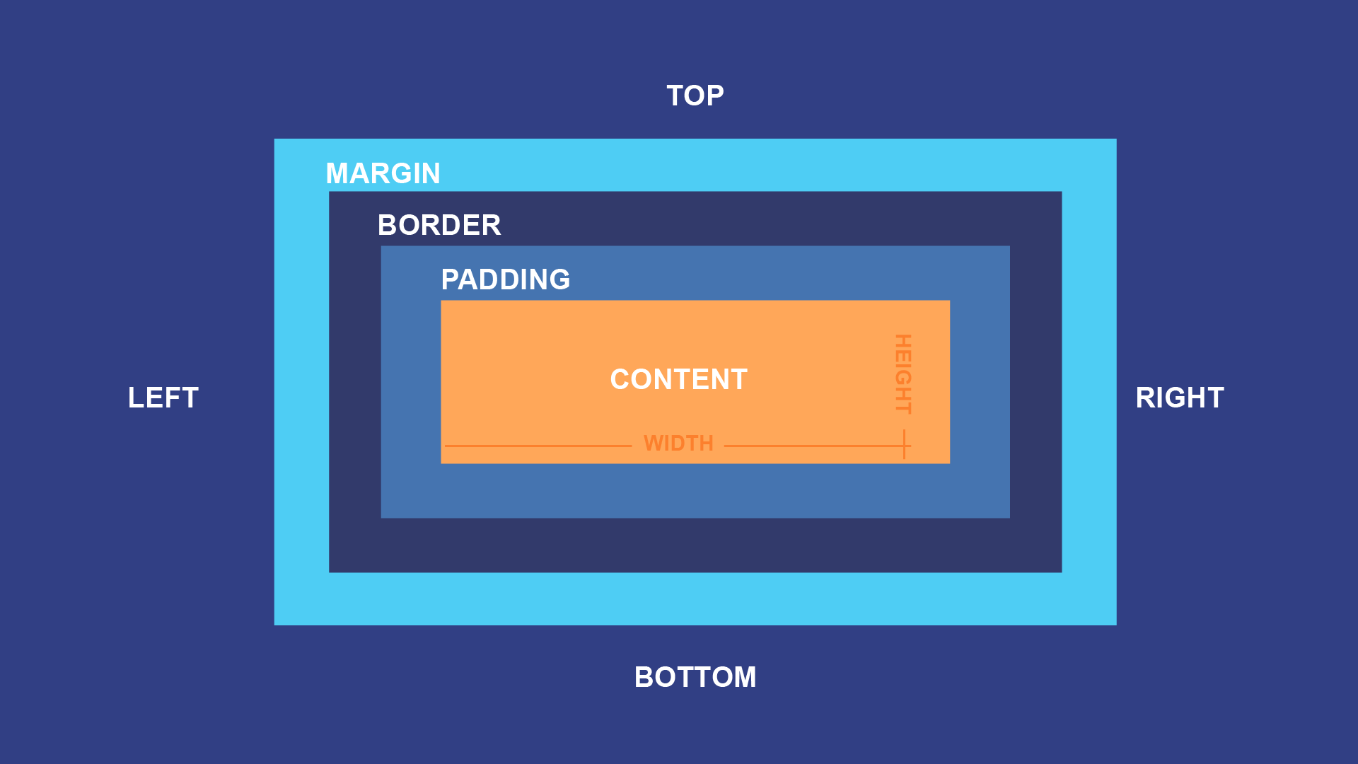
As the image shows, the four layers are:
- Content: The actual text, image, or other media within the element. You styled this in the last lesson.
- Padding: Transparent space inside the border, between the border and the content. Think of it as cushioning for your content.
- Border: A line that goes around the padding and content. You've already used this on your
textarea. - Margin: Transparent space outside the border. It's used to push other elements away and create space between them.
To see these concepts in action, let's watch a quick, clear explanation.
Learn CSS Box Model In 8 Minutes
The video 'Learn CSS Box Model In 8 Minutes' by Web Dev Simplified provides an excellent and concise overview of these four layers.
Watch the segment from 00:30 to 02:48. Focus on how each property—padding, border, and margin—contributes to the final appearance and spacing of the element.
The Sizing Challenge: content-box vs. border-box
By default, when you set an element's width and height in CSS, these dimensions apply only to the content area. The padding and border are then added on top of that size.
For example, if you have:
div {
  width: 300px;
  padding: 20px;
  border: 5px solid black;
}
The total visible width of the div would be 300px (content) + 40px (20px left + 20px right padding) + 10px (5px left + 5px right border) = 350px. This can make layout calculations very unintuitive.
Fortunately, there is a much better way. We can change the box-sizing property to border-box. When you do this, the width and height properties define the total dimensions of the element including padding and border. The content area automatically shrinks to make room for them. This is far more predictable.
Let's see this explained visually.
Learn CSS Box Model In 8 Minutes
Now, continue with the same video to understand how box-sizing: border-box simplifies layout calculations.
Watch the segment from 05:26 to 07:12. Pay close attention to the difference in how the element's final size is calculated before and after applying box-sizing: border-box.
Because border-box is so much easier to work with, it's a standard practice to apply it to every element on the page. We do this with a small piece of CSS called a "reset".
CSS Box Model: Complete Beginners Tutorial
This article, 'CSS Box Model: Complete Beginners Tutorial', reinforces the concept and provides the standard CSS reset snippet that developers use.
Read the sections 'Box Model Variations' and the following short section with the CSS reset code. Focus on understanding why border-box is preferred and how the reset applies this behavior universally.
Practical Application: Tidying Up Your Page
Now let's apply these concepts to your project. We'll add the box-sizing reset and use margin and padding to create a much cleaner layout.
1. Update your HTML structure
First, let's wrap your main content in a <main> element. This is good for semantics (telling the browser what the main content is) and gives us a container to style.
Open index.html and edit it to look like this:
<!DOCTYPE html>
<html lang="en">
<head>
  <meta charset="UTF-8">
  <meta name="viewport" content="width=device-width, initial-scale=1.0">
  <title>AI Writing Assistant</title>
  <link rel="stylesheet" href="style.css">
</head>
<body>

  <main class="container">
    <h1>AI Writing Assistant</h1>
    <textarea id="user-input" placeholder="Enter your text here..."></textarea>
    <button>Analyze Text</button>
  </main>

</body>
</html>
2. Apply Box Model styles in your CSS
Now, open style.css and make the following changes. I've added comments to explain each new rule and property.
/* Add this CSS reset at the VERY TOP of your file */
*, *::before, *::after {
  box-sizing: border-box;
}

/* Update your body style to add some margin */
body {
  font-family: -apple-system, BlinkMacSystemFont, "Segoe UI", Roboto, Helvetica, Arial, sans-serif;
  color: #333333;
  background-color: #f4f7f9;
  margin: 0; /* Remove default browser margin */
}

/* Add this NEW rule for our main container */
.container {
  width: 90%; /* Occupy 90% of the screen width */
  max-width: 800px; /* But don't get wider than 800px on large screens */
  margin: 40px auto; /* Add 40px margin on top/bottom, and 'auto' on left/right to center it */
  padding: 30px; /* Add 30px of inner space */
  background-color: white; /* Give it a white background to stand out */
  border-radius: 8px; /* Give it slightly rounded corners */
  box-shadow: 0 4px 8px rgba(0,0,0,0.1); /* Add a subtle shadow for depth */
}

/* Update your h1 style */
h1 {
  color: #003366;
  font-size: 2.5rem;
  font-weight: 700;
  text-align: center;
  margin-top: 0; /* Remove default top margin from h1 */
  margin-bottom: 30px; /* Add 30px of space below the heading */
}

/* Keep your textarea style */
#user-input {
  font-size: 1rem;
  font-family: 'Courier New', Courier, monospace;
  width: 100%;
  min-height: 150px;
  border: 1px solid #ccc;
  border-radius: 4px;
  padding: 10px; /* Add some padding inside the textarea */
  margin-bottom: 20px; /* Add space between textarea and button */
}

/* Update your button style */
button {
  background-color: #007bff;
  color: white;
  border: none;
  /* Use padding to control the button's size */
  padding: 12px 20px;
  font-size: 1rem;
  font-weight: bold;
  border-radius: 4px;
  /* Make the button a block element to fill width and respect margin */
  display: block;
  width: 100%;
}
After saving both files, refresh index.html in your browser. Your application should now look much more like a real web page, with a centered content box, proper spacing, and a clean structure.
Test your understanding!
Looking at the new CSS for the .container class, if you were to add a border: 10px solid red; to it, would the container get wider on the screen? Why or why not?
Show answer
No, the container would not get wider. Because we set box-sizing: border-box; on all elements, the new 10px border on the left and right would be drawn inside the existing width of the container. The content area inside would shrink to make room for the border, but the overall visible width of the container would remain the same.
Conclusion
Great work today! You've tackled one of the most critical concepts in CSS. By understanding the box model, you can now control the size and spacing of any element on your page with precision.
Key Takeaways:
- Every HTML element is a box with four layers: content, padding, border, and margin.
- Padding adds space inside an element's border.
- Margin adds space outside an element's border, pushing other elements away.
- Using
box-sizing: border-box;is a best practice that makes element sizing more intuitive and predictable.
In our next lesson, we will build upon this knowledge to arrange elements into more complex layouts. You will learn how to use Flexbox, a modern CSS layout module that makes it easy to align and distribute items within a container. This will be key to organizing the different features of your writing assistant.