Hello! Welcome back to your course.
In the last lesson, we focused on the CSS box model, learning how to control the space inside and outside of individual elements with padding and margin. This gave you control over the "breathing room" for your content.
Today, we're taking the next big step in creating your application's layout. We'll move from styling single boxes to arranging multiple boxes together. You will learn how to create a simple, responsive layout for your application using Flexbox. Flexbox is a modern and powerful CSS tool that makes it much easier to align, space, and distribute items within a container, even when their size is unknown.
What do we mean by "responsive"? It means the layout automatically adapts to look good on any device, from a wide desktop monitor to a narrow mobile phone screen.
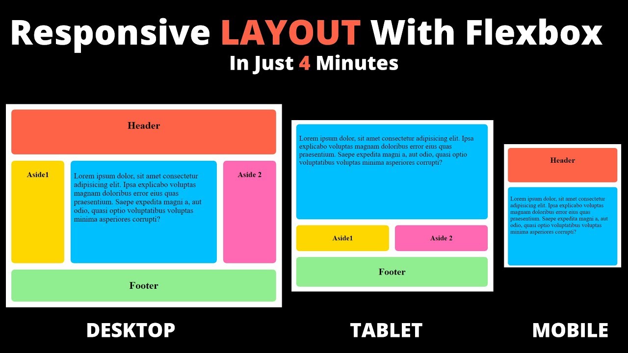
By the end of this lesson, you'll be able to create a flexible two-column layout for your app that stacks into a single column on smaller screens.
The Core Idea: Flex Containers and Flex Items
Flexbox works by defining a "flex container" and the "flex items" inside it.
- Flex Container: The parent element that you want to use to arrange its children. You activate Flexbox by giving this element the CSS property
display: flex;. - Flex Items: The direct children of the flex container. Once their parent is a flex container, you can control them with a new set of powerful properties.
This distinction is crucial. Some Flexbox properties apply only to the container (to arrange all the items), while others apply to the items themselves.
CSS Flexbox Tutorial for Complete Beginners
To start, let's get a clear understanding of this core concept. This article, 'CSS Flexbox Tutorial for Complete Beginners', explains the difference between flex containers and items very clearly.
Read the section titled 'Flex Containers vs. Items'. Focus on the rule: 'only direct children of "flex containers" are "flex items"'.
The Two Axes: Main and Cross
Once you declare a flex container, Flexbox creates two invisible axes:
- Main Axis: The primary direction in which flex items are laid out. By default, this is horizontal (like a row of books).
- Cross Axis: The axis perpendicular to the main axis. By default, this is vertical.
The power of Flexbox is that you can change the direction of the main axis from row to column. All the alignment properties will automatically adjust.
Let's watch a quick video that visualizes these core concepts and introduces the main alignment properties.
Learn Flexbox CSS in 8 minutes
The video 'Learn Flexbox CSS in 8 minutes' provides a fast-paced but clear introduction to the fundamental properties.
Watch from the beginning to 03:15. Pay close attention to how display: flex changes the layout, what flex-direction does, and how justify-content (for the main axis) and align-items (for the cross axis) work.
A Deeper Look at Alignment
As you just saw, justify-content and align-items are the primary tools for positioning items.
justify-content: Distributes items along the main axis.align-items: Aligns items along the cross axis.
To help you master these properties, here is a handy visual guide. It's one of the most popular resources for developers learning Flexbox.

To really solidify your understanding, let's turn to an interactive guide. Playing with the properties yourself is the best way to learn.
An Interactive Guide to Flexbox in CSS
This 'Interactive Guide to Flexbox' uses excellent explanations and live examples to make these concepts click.
Read the sections 'Flex direction' and 'Alignment'. The 'Content vs. items' part with the kebab and cocktail wiener analogy is especially helpful for understanding why justify-content affects the group while align-items can affect items individually. Try out the interactive examples!
Practical Application: Structuring Your App
Let's apply these ideas to your project. We'll create a two-column layout. The left column will hold the text input area, and the right column will eventually display the AI-generated analysis.
1. Update your HTML
First, we need to adjust index.html to have two distinct sections inside your main container.
<!DOCTYPE html>
<html lang="en">
<head>
  <meta charset="UTF-8">
  <meta name="viewport" content="width=device-width, initial-scale=1.0">
  <title>AI Writing Assistant</title>
  <link rel="stylesheet" href="style.css">
</head>
<body>

  <!-- We will turn this 'container' into our flex container -->
  <main class="container">

    <!-- This will be our first flex item (the left column) -->
    <div class="input-section">
      <h1>AI Writing Assistant</h1>
      <textarea id="user-input" placeholder="Enter your text here..."></textarea>
      <button>Analyze Text</button>
    </div>

    <!-- This will be our second flex item (the right column) -->
    <div class="output-section">
      <h2>Analysis</h2>
      <div id="analysis-result" class="result-box">
        <!-- AI results will appear here -->
        Your results will be shown here.
      </div>
    </div>

  </main>

</body>
</html>
2. Apply Flexbox styles in CSS
Now, open style.css. We'll make the .container a flex container and add some styles for our new sections.
/* Find your .container rule and update it */
.container {
  width: 90%;
  max-width: 1000px; /* Increased max-width for a two-column layout */
  margin: 40px auto;
  padding: 30px;
  background-color: white;
  border-radius: 8px;
  box-shadow: 0 4px 8px rgba(0,0,0,0.1);

  /* --- NEW FLEXBOX PROPERTIES --- */
  display: flex; /* This turns the container into a flex container */
  gap: 30px; /* This creates a 30px gap between the flex items */
}

/* --- ADD THESE NEW RULES --- */

/* Style for the flex items (our columns) */
.input-section, .output-section {
  flex: 1; /* This is shorthand for flex-grow: 1, flex-shrink: 1, flex-basis: 0%. It tells both items to grow and fill the available space equally. */
}

/* Style for the placeholder result box */
.result-box {
  border: 1px dashed #ccc;
  padding: 20px;
  min-height: 200px;
  background-color: #f9f9f9;
  border-radius: 4px;
}

/* Adjust heading in output section */
.output-section h2 {
  margin-top: 0;
  color: #003366;
}
Save both files and refresh your browser. You should now see a two-column layout! The input area is on the left, and the analysis area is on the right, with a nice gap between them.
Test your understanding!
In the CSS we just added, both .input-section and .output-section have flex: 1;. What do you think would happen if you changed the CSS for .output-section to flex: 2;?
Show answer
The .output-section would become twice as wide as the .input-section. The flex property (specifically, flex-grow in this case) divides the available space proportionally. With a total of 3 "flex units" (1 + 2), the input section gets 1/3 of the space and the output section gets 2/3.
Making It Responsive
Our layout looks good on a wide screen, but on a mobile phone, two columns would be too squished. This is where responsiveness comes in. We will use a media query to apply different CSS rules for smaller screens.
Specifically, we'll tell the flex container to change its flex-direction from row (the default) to column when the screen is narrow.
Create Responsive Flexbox Layout in 8 Minutes
This video, 'Create Responsive Flexbox Layout in 8 Minutes', demonstrates exactly this technique. Watching someone else do it first makes it much easier to understand.
Watch the section from 06:44 to 07:54. The key part is seeing how a media query is used to change the flex-direction to column at a specific screen width.
Now, let's apply that to our style.css. Add this code to the very bottom of your file.
/* --- ADD THIS MEDIA QUERY AT THE END OF YOUR CSS FILE --- */

/* When the browser window is 768px wide or less... */
@media (max-width: 768px) {
  .container {
    /* ...change the flex direction to stack items vertically */
    flex-direction: column;
  }
}
Save your style.css file. Now, when you view your page, make the browser window narrower. You'll see the layout magically "respond" at the 768px mark, stacking the two columns vertically, which is perfect for a mobile view.
Conclusion
Fantastic work! You've just implemented one of the most important and practical skills in modern web development. You've taken a simple document and turned it into a responsive, professional-looking layout.
Key Takeaways:
- Flexbox is a one-dimensional layout system for arranging items in rows or columns.
- You activate it with
display: flex;on a container element. justify-contentandalign-itemsare your main tools for aligning items on the main and cross axes.- The
flexproperty is a powerful shorthand for controlling how items grow and shrink to fill space. - Media queries allow you to change CSS properties (like
flex-direction) at different screen sizes, enabling responsive design.
In our next lesson, we will explore how to speed up UI development even more by integrating a CSS framework like Bootstrap. These frameworks provide pre-built, styled components (buttons, forms, navbars) that already use concepts like Flexbox, allowing you to build beautiful interfaces very quickly.