Hello! Welcome back to our module on designing sellable Notion templates.
In our last lesson, we focused on the crucial planning stage, creating a blueprint for your template using architecture maps, user flow diagrams, and wireframes. You now have the skills to plan the structural integrity of your template before writing a single block.
This lesson is the bridge between that structural plan and a polished, professional product. We will focus on how to apply visual hierarchy principles using headings, spacing, and dividers to guide the user. A template's functionality is only half the battle; its usability and visual appeal are what make it truly valuable and sellable. Your background in design will be a great advantage here, as we'll be applying classic principles like contrast, space, and flow within the Notion environment.
1. What is Visual Hierarchy?
At its core, visual hierarchy is the art of arranging elements to show their order of importance. It tells the user's brain what to look at first, what's most important, and how different pieces of information are related. A well-designed page doesn't require a manual; it guides the user's eye naturally from one section to the next.

A template with poor visual hierarchy feels cluttered, confusing, and overwhelming. A template with strong visual hierarchy feels intuitive, clean, and professional—precisely the qualities that convince a customer to buy.
Let's start with a foundational article that outlines these principles in the context of Notion.
Design Usable, Delightful Notion Pages
This article, 'Design Usable, Delightful Notion Pages' from Notion.vip, provides an excellent overview of key design principles. We will focus on the sections that deal directly with hierarchy and separation.
Please read the sections titled 'Create visual hierarchy' and 'Space and divide your content.' Pay attention to how different block types (Headings, Callouts, Quotes) and the use of negative space contribute to a page's clarity.
As the article highlights, we can achieve this hierarchy using three main tools in Notion: Size, Spacing, and Grouping.
2. The Tools of Hierarchy in Notion
Let's break down how to implement these principles practically.
Size & Weight: Using Headings
The simplest way to signal importance is with size. Notion provides three levels of headings that are perfect for this.
- Heading 1 (
/h1): Use this once per page for the main title. It's the largest and carries the most visual weight. - Heading 2 (
/h2): Use this for major section titles within your page (e.g., "Projects," "Tasks," "Quick Links"). - Heading 3 (
/h3): Use this for subsections or to label smaller elements within a larger section (e.g., "High Priority Tasks," "Meeting Notes").
By consistently using this H1 > H2 > H3 structure, you create a clear, scannable outline that users can understand at a glance.
Spacing & Separation: Using Dividers and Negative Space
What you don't put on a page is as important as what you do. Space gives your content room to breathe and helps the user distinguish between different sections.
-
The Divider Block: The simplest way to create separation is with the
/dividercommand. It inserts a clean, horizontal line. For a more professional touch, consider the pro-tip from the "10 Rules for Designing a Beautiful & Functional Notion Template" article: place a divider directly after every H2 or H3 title to create a crisp, organized look. -
Negative Space: This is simply empty space. You can create it by hitting
Entera few times between blocks. Don't be afraid of whitespace! It reduces cognitive load and makes your template feel less cramped. A clever trick mentioned in the Notion.vip article is to use an empty column to create horizontal space and control alignment. -
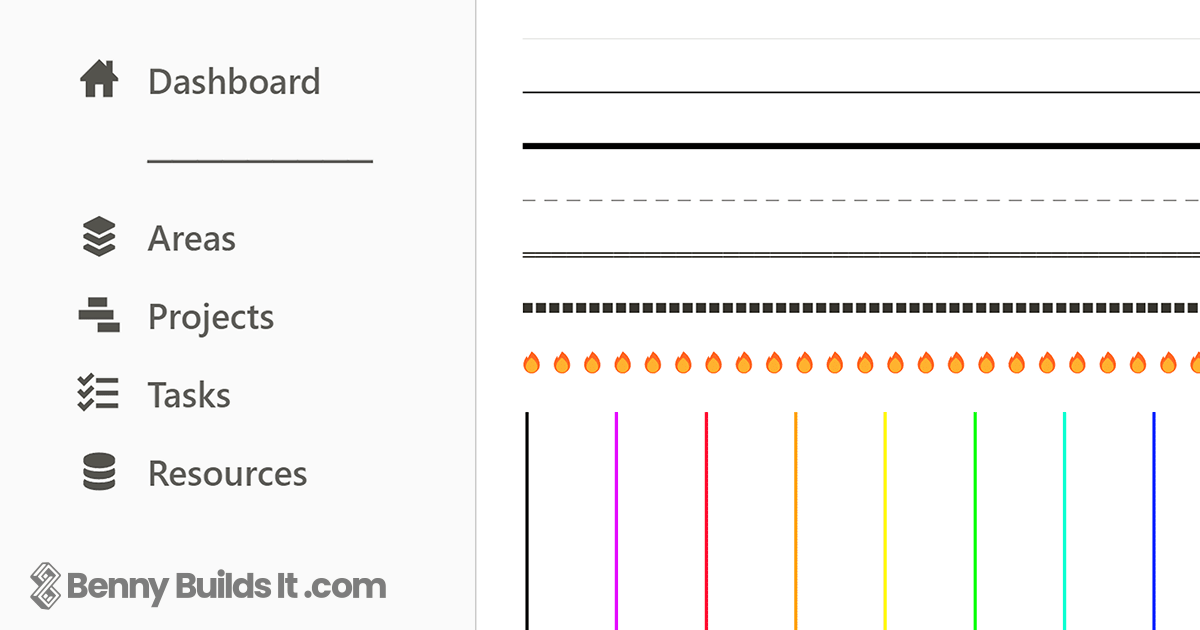
Creative Dividers: You aren't limited to the default gray line. You can use text, emojis, or even formulas to create custom dividers that fit your template's aesthetic.
Grouping & Emphasis: Using Columns and Callouts
Grouping related items tells the user that these things belong together.
- Columns: Columns are one of the most powerful tools for organizing a dashboard. They allow you to place related content side-by-side, creating distinct vertical zones. A key rule for professional templates is the Two-Column Rule.
10 Rules for Designing a Beautiful & Functional Notion Template
The article '10 Rules for Designing a Beautiful & Functional Notion Template' offers some excellent, non-negotiable rules for creating professional layouts. The rule on columns is particularly important.
Read 'Rule 3: Master the Two-Column Rule.' This will give you a clear, simple guideline to prevent your layouts from becoming chaotic.
- Callout Blocks (
/callout): Callout blocks are perfect for creating visual containers. You can place headings, text, and even entire databases inside them to create a bordered section that stands apart from the rest of the page. This is a very common technique in popular templates.
3. Practical Section Design Techniques
Now that we understand the building blocks, let's see them in action. The following videos provide a masterclass in combining headings, dividers, columns, and callouts to create beautiful, functional page sections.
6 INSANELY Simple NOTION Section Design Ideas - HOW TO Guide
This video from Andy Gaught, '6 INSANELY Simple NOTION Section Design Ideas,' is a practical tutorial on different ways to structure content. It's a goldmine of techniques you can apply immediately.
Watch the first three examples (from 00:17 to 09:01). For each one, notice how he combines different blocks to create a distinct look: Simple Headers: Using H2/H3 in columns with dividers. Callout Blocks: Using callouts with default (outlined) backgrounds to frame content. Quote Blocks: Using quote blocks as an alternative to callouts for a different style of emphasis.
the *ultimate* guide to making your notion aesthetic
The video 'the ultimate guide to making your notion aesthetic' by Wesley Anna offers more creative, design-focused techniques. We'll focus on a section that shows how to use callouts as containers for entire databases.
Watch the segment from 21:57 to 25:31. Pay close attention to how she drags a database inside a callout block and then sets the callout color to 'Default background'. This creates a clean, outlined container for your databases, which is a very popular and professional design pattern.
Test your understanding!
You want to create a section on your dashboard for "Quick Links." You want it to be visually distinct but not overpowering. Based on the techniques you've just seen, what are two different ways you could design this section?
Show answer
- The Callout Method: Create a
Heading 2block titled "Quick Links." Below it, create aCalloutblock. Set the callout's background color to "Default background" to create an outline. Inside the callout, list your links to pages. This groups them in a clean, bordered box. - The Column & Divider Method: Create a two-column layout. In one column, add a
Heading 2block titled "Quick Links" and place a/dividerunderneath it. Then, list your links below the divider. This uses space and a simple line to create a clear, separated section.
✍️ Exercise: Apply Visual Hierarchy to a Dashboard
It's time to put theory into practice. Below is a description of a messy, unstructured dashboard for the Project and Task Manager you planned in the last lesson. Your task is to build this dashboard in a new Notion page, applying the principles of visual hierarchy to make it clean, professional, and easy to use.
The "Before" State (A Jumble of Blocks):
Imagine a single-column Notion page with the following blocks in this order:
- A link to a "Projects" page.
- A linked database of "Tasks," showing all tasks.
- A
Heading 1block that says "My Dashboard." - A linked database of "Projects," showing all projects.
- A link to a "Tasks" page.
- A link to an "Archive" page.
- A linked database of "Tasks," this time filtered to show only tasks due today.
- Some welcome text like "Here's what's on your plate for today."
Your Task:
Create a new Notion page and transform this mess into a well-structured dashboard.
- 1. Establish the Main Title: Start with a single
Heading 1at the top of the page. - 2. Create a Two-Column Layout: Use the
/2 columnscommand to structure your main content area. - 3. Design a "Navigation" Section: In the left (or right) column, create a
Heading 2called "Navigation." Place a/dividerbelow it. Group the links to the "Projects," "Tasks," and "Archive" pages here. - 4. Design a "Today's Focus" Section: In the wider, main column, place the welcome text. Below it, create a
Heading 2titled "Due Today." Place the linked view of the "Tasks" database filtered for tasks due today in this section. - 5. Design a "Projects" Section: Below the "Today's Focus" section, create a
Heading 2called "Active Projects." Place the linked view of theProjectsdatabase here. - 6. (Optional Challenge): Enclose the "Navigation" links and the "Due Today" task list within
Calloutblocks with a "Default background" to create clean, outlined containers for each module.
When you're done, you should have a dashboard that is immediately understandable, with clear sections and a logical flow.
Conclusion
In this lesson, you learned how to move from a structural wireframe to a visually organized page. By deliberately using headings for size, dividers and space for separation, and columns and callouts for grouping, you can create a powerful visual hierarchy that guides your user, reduces confusion, and significantly enhances the perceived value of your template.
Key Takeaways:
- Hierarchy is intentional: Good design guides the user's eye using principles like size, space, and grouping.
- Use headings systematically:
H1for the page title,H2for main sections, andH3for subsections. - Embrace space and dividers: Use negative space and divider lines to separate content and improve readability.
- Group with columns and callouts: Use a two-column layout for structure and callout blocks to create clean containers for related content.
Preview of the Next Lesson:
You now have the skills to create a logically structured and visually organized template. The next step is to give it a unique and consistent personality. In the next lesson, you will learn how to develop a consistent aesthetic using icons and a limited color palette. This is where you'll define the "brand" of your template, making it not just functional and usable, but also memorable and desirable.