Hello! Welcome back to the module on designing sellable Notion templates.
In our last lesson, we focused on applying visual hierarchy, using headings, spacing, and dividers to create a clear, logical structure. You now have a template that is organized and easy to follow. This lesson is about giving that structure a soul. We'll be covering how to develop a consistent aesthetic using icons and a limited color palette.
This is where your background in design truly comes into play. We will bridge fundamental design principles with the specific tools Notion provides, moving your template from merely functional to genuinely desirable. A consistent aesthetic not only looks professional but also builds a unique brand identity for your product, making it more memorable and valuable to a potential customer.
1. The Foundation: A Limited Color Palette
The single most important rule for creating a professional aesthetic is to use a limited color palette. A chaotic mix of colors can make even the most organized template feel cluttered and amateurish. A deliberate, consistent color scheme creates harmony, guides the user's attention, and conveys a sense of quality.
Your goal is not to use every color Notion offers, but to choose a few and use them with purpose. A great starting point for this is a classic design principle: the 60/30/10 rule.
How to Apply a Color Palette to Your Design – Tutorial
To understand how to apply color effectively, let's watch a brief segment from The Futur Academy. This video explains the 60/30/10 rule, a foundational concept in design for creating balanced and visually appealing color schemes.
Watch the sections explaining the 60/30/10 rule and how to define your primary, secondary, and accent colors. This runs from approximately 01:12 to 04:02. Focus on how a few chosen colors are assigned specific roles and ratios.
As the video explains, the 60/30/10 rule provides a simple recipe for balance:
- 60% Primary Color: This is your dominant, base color. In Notion, this is almost always the page background (white or off-white in light mode, dark gray in dark mode). It's the canvas.
- 30% Secondary Color: This color is used to support the primary color and create visual interest. It's often used for major headings or the backgrounds of callout blocks.
- 10% Accent Color: This is a contrasting color used sparingly to draw attention to key elements like hyperlinks, buttons, or important highlights.
Finding Your Palette
Before you can apply colors, you need to choose them. A great aesthetic starts with a great palette.
2024 Aesthetic Notion Guide - Build your Dream Setup
The guide '2024 Aesthetic Notion Guide' offers some practical advice on finding color schemes and provides examples of popular themes.
Read the sections '2. Notion Aesthetic Colour Schemes' and 'Popular Aesthetic Themes for Notion in 2024'. Note the recommendation for using a tool like Coolors.co to generate palettes.
- Tip: Go to a site like Coolors.co and use the generator to explore palettes. Look for schemes with 3-5 colors. You can even upload a photo you like and have it extract the color palette for you.
2. Applying Color with Purpose in Notion
Once you have your palette, the key is to apply it consistently.
- Text and Background Colors: Use your secondary color for
H2orH3headings to create structure. Use your accent color for hyperlinks or to highlight a critical word or phrase. - Callout Blocks: The background color of a callout block is a perfect place to use your secondary color to frame an important section.
- Cover Images: Your cover image should be a major part of your aesthetic. Choose an image from Unsplash or upload your own that strongly features your chosen color palette. This immediately sets the tone for the entire page.
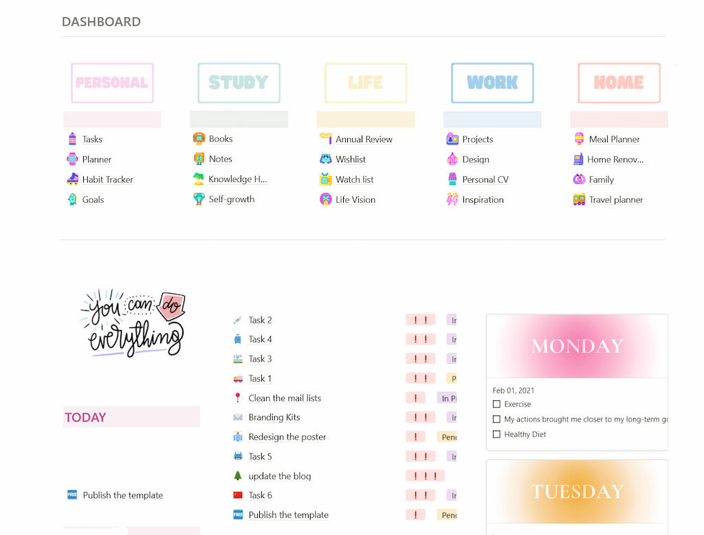
3. Consistent Iconography: The Finishing Touch
Icons are powerful visual cues that make a template scannable and add personality. However, just like with colors, consistency is crucial. Using a mix of different icon styles will undermine your professional aesthetic.
Design Usable, Delightful Notion Pages
The article 'Design Usable, Delightful Notion Pages' has two excellent, concise sections on this topic.
Please read the short sections 'Use icons — consistently' and 'Use colors with purpose'. The key takeaway is to choose a single icon library and a limited color palette, then stick to them.
There are two main approaches to icons in Notion:
1. Notion's Native Icons
Notion has a built-in library of minimalist icons that you can color to match your palette. This is the easiest way to ensure consistency.
Make Your Notion Setup Aesthetic! Hidden Notion Design Tips 2023
This video from Better Creating demonstrates how to use Notion's native icons and color options to theme a workspace.
Watch from 01:01 to 03:01. Pay close attention to how you can select a single color for all native icons, immediately creating a consistent look. Also, notice the tip on using matching icons for related pages and databases (e.g., the same icon for a 'Tasks' database and the dashboard view of it).
2. Custom Icons
For a more unique, branded look, you can upload your own icons. You can find icon packs on sites like Flaticon or The Noun Project. The key is to choose icons from the same family or designer so they share a consistent line weight and style.
Whether you use native or custom icons, they should align with your color palette.

Test your understanding!
You've chosen a minimalist aesthetic for a new template with a palette of black, white, and a single accent color: a muted blue. How would you apply the 60/30/10 rule and iconography to this template?
Show answer
- 60% (Primary): The page background would be white (or light gray), and the main text would be black.
- 30% (Secondary): In this minimalist case, the secondary "color" is really the structure itself (headings, dividers). You might not use a block of color at all, relying on space and hierarchy.
- 10% (Accent): The muted blue would be used sparingly but effectively. You would color all hyperlinks blue. You could also color your
H2headings blue to give them prominence. - Iconography: You would use Notion's native icons and set their color to the same muted blue for every single icon to ensure perfect consistency.
✍️ Exercise: Apply an Aesthetic to Your Dashboard
It's time to bring your project manager dashboard to life. In the previous lesson, you gave it structure. Now, you will give it a consistent, professional aesthetic.
Your Task:
Open the dashboard you structured in the last exercise and apply a complete visual theme.
- 1. Choose a Palette: Go to a site like Coolors.co and find a simple 3-4 color palette you like. Decide which color is your secondary and which is your accent.
- 2. Select a Cover: Find a cover image on Unsplash (or upload your own) that uses the colors from your chosen palette.
- 3. Theme Your Icons: Go through every page and database link on your dashboard and apply an icon. Use Notion's native icons and set them all to the same color from your palette (e.g., your secondary or accent color).
- 4. Apply Text Color: Change the color of your
H2headings to your secondary color to create visual hierarchy. - 5. Use Your Accent Color: Find one or two places to use your accent color for emphasis. This could be for an important link or by changing the background of a "Tip" or "Instructions" callout block.
- 6. Review for Consistency: Zoom out and look at your page. Does it feel cohesive? Do the cover, icons, and text colors all belong to the same visual family? Adjust as needed.
When you're done, you should have a dashboard that not only is well-organized but also has a distinct, professional, and appealing visual identity.
Conclusion
You've now learned how to apply a visual "brand" to the solid structure you built in the last lesson. A sellable template isn't just a tool; it's a product with a distinct look and feel. By carefully curating your aesthetic, you elevate your template's perceived value and create a more enjoyable experience for your user.
Key Takeaways:
- A consistent aesthetic is built on a limited color palette and uniform iconography.
- Use the 60/30/10 rule as a guide to create a balanced color scheme.
- Your cover image is a primary tool for establishing the aesthetic.
- Choose one icon style (e.g., Notion's native icons colored consistently) and stick with it.
- Every design choice—color, icon, cover—should support the overall aesthetic.
Preview of the Next Lesson:
Your template now has a solid structure and a consistent visual brand. The final piece of the core design puzzle is ensuring users can navigate it effortlessly. In the next lesson, we will focus on implementing clear navigation techniques, such as creating a custom table of contents or a dashboard homepage, to ensure your users can find what they need instantly.